Unit -I
Collection and Presentation of Data
Primary data: -
Primary data is the information collected through original or firsthand research. Primary data is more reliable and authenticate as the data is nor changed or altered by any human beings. Also, the data is not published yet. Primary data is gathered by any authorized organization, investigator, and enumerator.
“Data which are gathered originally for a certain purpose are known as primary data.” — Horace Secrist
Sources of primary data
The sources of primary data are as follows
- Experiments: In natural sciences, experiments are most reliable source of data collections. Experiments are conducted for medicine, psychological studies, nutrition and other scientific studies. Experiments are conducted in the fields as well as laboratories. The results of experiments are analyzed by statistical test and thereafter conclusions are drawn.
2. Survey: surveys are used in social science, management, marketing and psychology to some extent. Surveys are conducted in different methods.
3. Questionnaire: Questionnaires consist of list of question either open ended or close ended for which the participants answer. Questionnaire can be conducted via telephone, mail, institute, fax, etc.
4. Interview: Interviews are expensive method of data collection. The interviewer collects information from each respondent independently. It involves in-depth questioning and follow up question. While taking interview, the interviewer can observe the body language and other reaction to the question.
5. Observation: observation can be conducted with or without knowledge of the participants. Observation can be made either natural or artificially created environment.
Advantages
- Date interpretation is better – Depending on the need of marketers, the data collected are examined and interpreted properly rather than relying on secondary data.
2. Efficient spending for information – Under primary research, the data collected specially for the purpose in mind. So, the research funds are used efficiently unlike secondary research where marketer spent for information that is not needed.
3. Proprietary issue – Information from primary research is their own and is not shared by any others. The information can be kept hidden from the competitors and also give added advantage from competitors who rely on secondary data.
4. Addresses specific research issue – Primary research helps the marketers in getting that information which they want to know and report it in ways that benefit them. While information from secondary research may not fit the need of marketers.
5. Greater control – Primary research not only focuses on specific issue, it also enables the marketers to have greater control over the information collected. Such as location, time for completing project, etc.
Demerits
- High cost – primary research are very expensive compared to secondary research. It involves high expenses in preparing, designing and carrying out the research.
2. Time consuming – primary research starts from deciding to undertake a research project to the end point of having result is very time consuming compared to secondary research which can be collected in less time.
3. Inaccurate feedbacks – primary research involves taking feedback from target audience. There are high chances that feedback given is incorrect, as the audience can be biased or just give for sake of it.
4. More number of resources required – the data is collected from other resources like human resource, material which are needed in large quantity to do the survey. Also, the data are collected from skilled person only.
Secondary data
Secondary data are public information that has been collected by others. The data collected from primary research and used by other is referred as secondary data. The secondary data may be obtained from various sources like industry surveys, database and information system, etc.
“The data which are used in an investigation, but which have been gathered originally by someone else for some other purpose are known as secondary data.” — Blair
Sources of secondary data
- Government statistics – government statistics are widely available and easily accessible online. It provide information regarding trade activity, pricing and economic trends, business information, patents, population statistics, heath record, etc
- Books – books are available on any topic you want to research. Books provide insight on how much information is given for a particular topic and you can prepare your literature review.
- Journals – journals provide up to date information on the very specific topic on which you want to research. Journal is one of the most important sources for providing the information on data collected.
- Magazine or newspaper – Newspaper or magazine provide daily information regarding politics, business, sports, fashion, etc which can be used for conducting research.
- Internet – internet is becoming advance, fast and reachable to the masses and much information is available on internet. Almost all journals, books are available on internet. Some are free and others you have to pay price
- Company website – companies website provide lots of information. They have a section called investor relations which contains full of annual reports, regulatory findings and investor presentations that can provide insights into both the individual company’s performance and that of the industry at large.
Advantages
- Ease of access – Secondary research is easily available. In past secondary data was available in libraries or wait for the reports to be shipped. Currently, the data are available online and can be accessed any time.
- Low cost to acquire – the researcher can get information at very low cost compared to carrying out research themselves. Time and money is saved in secondary data.
- Clarification of research question – The use of secondary data helps in clarifying the research question. Sometimes secondary researches are done prior to primary research to clarify the research focus.
- Difficulties in conducting primary research – sometimes primary research are difficult to be conducted due to time, cost, etc. Thus, secondary data are used to carry out the research and accordingly the results are drawn.
Disadvantages
- Quality of research – primary researches are conducted and controlled by the researcher. Thus, it ensures the validity of the information. While secondary researches are conducted by others. Thus, the viability and reliability of the secondary data are questionable.
- Not specific to researcher needs – in many cases, secondary research do not meet the researcher’s needs. While primary research gets information the way researcher wants.
- Incomplete information – In many cases, researcher provide few information. To get the full version of the report they charge expensive fees.
- Not timely – while using secondary research, the researcher should check the date of information. Sometimes out of date reports are available which is not relevant to the current market situations.
Data collection methods can be divided into two categories: secondary methods of data collection and primary methods of data collection.
Secondary data - Secondary data is a type of data that has already been published in books, newspapers, magazines, journals, online portals etc. there is lot of information available in these sources. Therefore appropriate secondary data are used in the study plays an important role in terms of increasing the levels of research validity and reliability.
Primary data –
Primary data collection methods can be divided into two groups: quantitative and qualitative.
Quantitative data collection methods are based in mathematical calculations in various formats. Methods of quantitative data collection and analysis include questionnaires with closed-ended questions, methods of correlation and regression, mean, mode and median and others. Quantitative methods are less expensive and they can be applied within shorter duration of time. These methods are easy to make comparison between the findings.
Qualitative research methods, on the other hand, do not involve numbers or mathematical calculations. Qualitative research is closely associated with words, sounds, feeling, emotions, colours and other elements that are non-quantifiable.
Tabulation is a systematic & logical presentation of numeric data in rows and columns, to facilitate comparison and statistical analysis. The method of placing organized data in tabular form is known as tabulation. Tabulation simplifies complex data and facilitates comparison.
Definition
“Table involves the orderly and systematic presentation of numerical data in a form designed to elucidate the problem under consideration” – According prof. L.R Connor
“Table in its broadest sense is an orderly arrangement of data in column and rows” – According to Prof M.M.Blaire
Objectives of tabulation
- It simplifies the raw data in meaningful form so that common man can easily understand in less time
- It brings essential facts in clear and precise manner
- Data presented in rows and columns helps in detailed comparison
- Tables serve as the best source of organized data for further statistical analysis
- Table saves the space without sacrificing the quality and quantity of data.
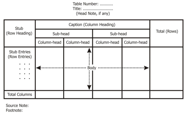
Parts of table
Table number |
|
Title of the table |
|
Caption |
|
Stub |
|
Body |
|
Head note |
|
Source note |
|
Footnote |
|

Types of tabulation
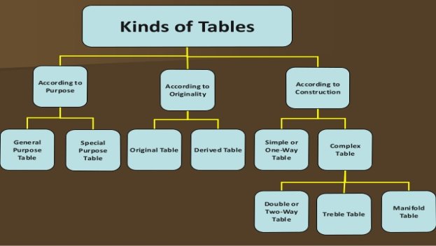
- According to purpose
- General purpose table – general purpose table is a table which is of general use. It does not serve any specific purpose under consideration
b. Special purpose table – special purpose table is prepared with some specific purpose in mind.
2. According to originality
- Original table – an original table is that table in which data are presented in the same manner in which they are collected.
b. Derived table – a derived table is that in which data is not presented in same manner in which they are collected. Here the data are first converted into ratio or percentage and then presented.
3. According to construction
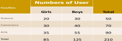
- Simple table – simple table also known as one-way table. Under this data are presented based on one characteristic
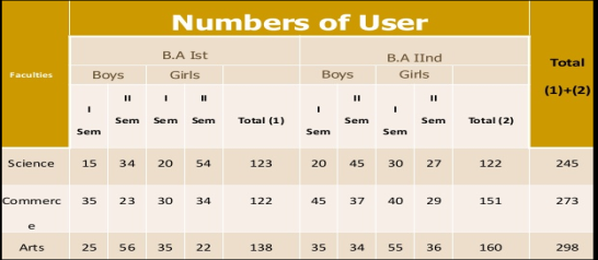
Faculty wise library user
b. Complex tables – in complex table data are presented according to two or more characteristics simultaneously.
The complex tables are
- Two way,
- Three-way table and
- Manifold table
Two-way table – Under this the variable under study is divided into two characteristics

Three-way table - Under this the variable under study is divided into three characteristics
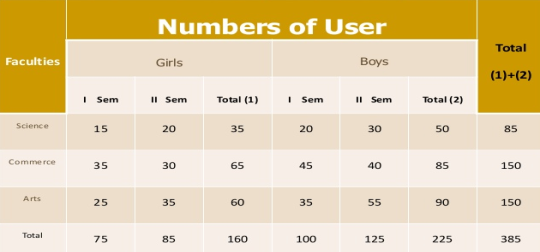
Manifold table - Under this the variable under study is divided into large number of characteristics.
TYPES OF GRAPHICAL REPRESENTATION OF DATA
Here only a few of the standard graphic forms of representing the data are being discussed as listed below:
1. A Histogram
2. A Bar Diagram or Bar Graph
Pie chart
One approach to blessing our subjective data diagrammatically is utilizing an outline. The pie is painted by a circle (Spanning 360). The elements of the pie cut speaking to each class are corresponding to the recurrence of the class. The point that the cut makes at the centre is furthermore corresponding to the recurrence of the classification; really, the plot for a given class is given by:
Classification point at the centre = frequency class × 3600.
The diagram should consistently cling to the domain rule. That is the extent of the domain of the pie committed to any class is that the equivalent on the grounds that the proportion of the info that lies therein class. This principle is often desecrated to change perception and subtly promote a specific purpose of read.
In a chart, the varied observations or parts area unit painted by the sectors of a circle and therefore the whole circle represents the ad of the values of all parts.
Central angle for a component = 
How to make a pie chart or graph?
Construction of making a pie chart or graph can be derived from the given data:
Steps of pie graphs Construction:
1. Calculate the central angle for each component, given by
Central angle for a component = 
2. Draw a circle of convenient radius.
3. Within this circle, draw a horizontal radius.
4. Starting with the horizontal radius, draw radii making central angles corresponding to the values of the respective components, till all the components are exhausted. These radii divide the whole circle into various sectors.
5. Shade each sector with different design.
This will be the required pie chart for the given data.
Pie chart examples on how to do a pie chart:
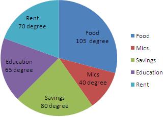
1. Mr. Bin's with a yearly salary of ₹ 10800 plans his budget for a year as given below:
Item | Food | Education | Rent | Savings | Miscellaneous |
Amount (in ₹) | 3150 | 1950 | 2100 | 2400 | 1200 |
Represent the above data by a pie graph.
Solution:
Total amount earned in a year = ₹10800.
Central angle of component =
Calculation of central angles
Item | Amount (in ₹) | Central Angle |
Food | 3150 | (³¹⁵/₁₀₈₀₀×360) ° = 105° |
Education | 1950 | (¹⁹⁵/₁₀₈₀₀×360) ° = 65° |
Rent | 2100 | (²¹/₁₀₈₀₀×360) ° = 70° |
Savings | 2400 | (²⁴/₁₀₈₀₀×360) ° = 80° |
Miscellaneous | 1200 | (¹²/₁₀₈₀₀×360) ° = 40° |
Construction of making pie chart
Steps of construction:
1. Draw a circle of any convenient radius.
2. Draw a horizontal radius of this circle.
3. Draw sectors starting from the horizontal radius with central angles of 105-degree, 65-degree, 70-degree, 80 degree and 40 degree respectively.
4. Shade the sectors differently using different colours and label them.
Thus, we obtain the required pie chart, as shown in the given figure.
Bar graph
We can likewise speak to our information graphically on a Bar Chart or Bar Graph. Here the classifications of the subjective variable are spoken to by bars, where the stature of each bar is the classification recurrence, classification relative recurrence, or class rate.
The bases, all things considered, should be equivalent in width. Having equivalent bases guarantees that the reference diagram holds fast to the zone standard, which for this situation implies that the extent of the complete zone of the bars committed to a classification (= zone of the bar over a classification partitioned by the amount of the zones, everything being equal) should be equivalent to the extent of the information in the class.
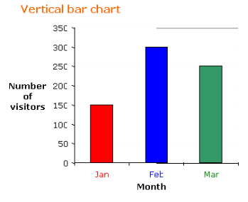
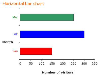
The following table shows the number of visitors to a park for the months January to March.
Month | January | February | March |
Number of visitors | 150 | 300 | 250 |
a) Construct a vertical and a horizontal bar chart for the table.
b) What is the percentage of increase of visitors to the park in March compared to January?
c) What percentage of visitors came in February compared with total number of visitors over the three months?
Solution:
a) If we choose a scale of 1:50 for the frequency then the vertical bar chart and horizontal bar chart will be as shown.
b) Increase in March compared to January is

c) Percentage of visitors in February compared to the total number of visitors is

Histograms
A histogram is a bar chart in which each bar represents a category and its height represents either the frequency, relative frequency (proportion) or percentage in that category.
If a variable can only take on a finite number of values (or the values can be listed in an infinite sequence) the variable is said to be discrete.
- The histogram for a frequency distribution is given below.
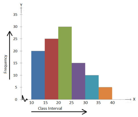
Answer the following.
(i) What is the frequency of the class interval 15 – 20?
(ii) What is the class intervals having the greatest frequencies?
(iii) What is the cumulative frequency of the class interval 25 – 30?
(iv) Construct a short frequency table of the distribution.
(v) Construct a cumulative frequency table of the distribution.
Solution:
(i) 25
(ii) 20 – 25
(iii) 90
(iv)
Class Interval 10 - 15 15 - 20 20 - 25 25 - 30 30 - 35 35 - 40 | Frequency 20 25 30 15 10 5 |
(v)
Class Interval 10 - 15 15 - 20 20 - 25 25 - 30 30 - 35 35 - 40 | Frequency 20 25 30 15 10 5 | Cumulative Frequency 20 45 75 90 100 105 |
Frequency polygons are a graphical device for understanding the shapes of distributions. They serve the same purpose as histograms, but are especially helpful for comparing sets of data. Frequency polygons are also a good choice for displaying cumulative frequency distributions.
Frequency Distribution of Psychology Test Scores.
Lower Limit | Upper Limit | Count | Cumulative Count |
29.5 | 39.5 | 0 | 0 |
39.5 | 49.5 | 3 | 3 |
49.5 | 59.5 | 10 | 13 |
59.5 | 69.5 | 53 | 66 |
69.5 | 79.5 | 107 | 173 |
79.5 | 89.5 | 147 | 320 |
89.5 | 99.5 | 130 | 450 |
99.5 | 109.5 | 78 | 528 |
109.5 | 119.5 | 59 | 587 |
119.5 | 129.5 | 36 | 623 |
129.5 | 139.5 | 11 | 634 |
139.5 | 149.5 | 6 | 640 |
149.5 | 159.5 | 1 | 641 |
159.5 | 169.5 | 1 | 642 |
169.5 | 179.5 | 0 | 642 |
The primary name on the X-pivot is 35. This speaks to a span stretching out from 29.5 to 39.5. Since the most reduced grade is 46, this span has a recurrence of 0. The point named 45 speaks to the stretch from 39.5 to 49.5. There are three scores in this span. There are 147 scores in the span that encompasses 85.
You can undoubtedly observe the state of the appropriation from Figure. The greater part of the scores are somewhere in the range of 65 and 115. Plainly the conveyance isn't symmetric since acceptable scores (to one side) trail off more continuously than 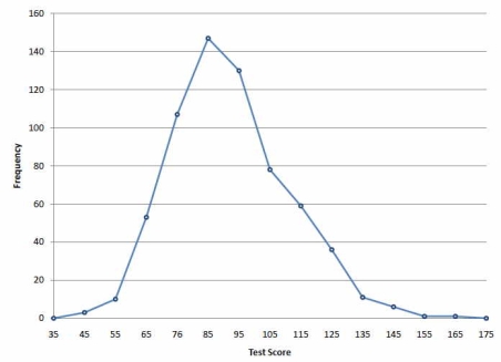
Figure: Frequency polygon for the psychology test scores.
Cumulative frequency or OGIVES
A cumulative frequency polygon for the same test scores is shown in Figure. The graph is the same as before except that the Y value for each point is the number of students in the corresponding class interval plus all numbers in lower intervals. For example, there are no scores in the interval labeled "35," three in the interval "45," and 10 in the interval "55." Therefore, the Y value corresponding to "55" is 13. Since 642 students took the test, the cumulative frequency for the last interval is 642.
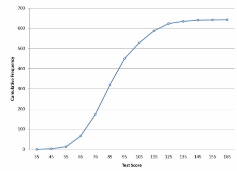
Figure: Cumulative frequency polygon for the psychology test scores.
Frequency polygons are useful for comparing distributions. This is achieved by overlaying the frequency polygons drawn for different data sets. Figure 3 provides an example. The data come from a task in which the goal is to move a computer cursor to a target on the screen as fast as possible. On 20 of the trials, the target was a small rectangle; on the other 20, the target was a large rectangle. Time to reach the target was recorded on each trial. The two distributions (one for each target) are plotted together in Figure . The figure shows that, although there is some overlap in times, it generally took longer to move the cursor to the small target than to the large one.
References
- B.N Gupta – Statistics
- S.P Singh – statistics
- Gupta and Kapoor – Statistics
- Yule and Kendall – Statistics method