Unit - 5
Swing (JFC)
Awt | Swing |
AWT components are heavyweight Components and platform dependent | SWING components are lightweight Components and platform independent |
AWT programs are not portable | Swing programs are portable |
AWT is old Framework for creating GUI | SWING is Latest Framework for creating GUI |
AWT doesn’t follow MVC (Model view controller) i.e., M-Model represent Data V-view representation C-controller act as an interface between model and view | SWING does follow MVC |
AWT supports limited number of GUI control | SWING supports advanced GUI control Jtable, JTabbedPane etc |
More code is needed to implement AWT control functionality | Less code is needed to implement swing control functionality |
AWT components required javax.awt package | SWING components required javax.swing package |
AWT Provides less components than SWING | SWING Provides more power components such as tables, list, scroll panes, tabbed pane, color chooser |
AWT doesn’t supports Pluggable look and feel | SWING supports Pluggable look and feel |
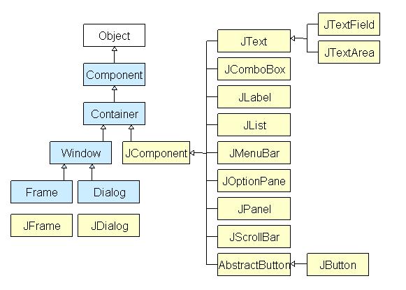
Methods of Component class
The methods of Component class are widely used in java swing
Methods | Description |
Public void add(Component c) | Add a component on another component. |
Public void setSize (int width, int height) | Sets size of the component. |
Public void setLayout(LayoutManager m) | Sets the layout manager for the component. |
Public void setVisible(boolean b) | Sets the visibility of the component. It is by default false. |
JSplitPane is a part of Java Swing. JSplitPane is used to divide only two components.
JSplitPane is to use resize the components. By using the JSplitPane the user can manually resize the component till its minimum size.
JSplitPane can be of two types, one is the vertical and horizontal split pane
Constructor of JSplitPane are:
- JSplitPane(): creates a new split pane that is oriented horizontally
- JSplitPane(int o): creates a new split pane with orientation mentioned.
- JSplitPane(int o, boolean r): creates a new split pane with orientation and redrawing style mentioned.
- JSplitPane(int o, boolean r, Component l, Component r): creates a new split pane with orientation, redrawing style and left and right component mentioned.
- JSplitPane(int o, Component l, Component r): creates a new split pane with orientation and left and right component mentioned.
Commonly used Functions of JSplitPane are:
- GetOrientation(): returns the orientation of the split pane
- GetRightComponent(): returns the right component of the split pane
- GetTopComponent(): returns the top component of the split pane
- IsContinuousLayout(): returns the continuous layout property
- GetBottomComponent(): returns the Bottom component of the split pane
- SetRightComponent(Component c): the right component of the split pane is set to c
- SetLeftComponent(Component c): the left component of the split pane is set to c
- SetTopComponent(Component c): the top component of the split pane is set to c
- SetBottomComponent(Component c): the bottom component of the splitpane is set to c
- SetUI(SplitPaneUI ui): Sets the Look and feel object that renders this component.
- SetResizeWeight(double v):Specifies how to distribute extra space when the size of the split pane changes.
- SetOneTouchExpandable(boolean n) : Sets the value of the one Touch Expandable property, which when true provides a UI widget that can collapse or expand the components on click
- SetDividerLocation(int l): Sets the location of the divider.
- SetDividerSize(int n): Sets the size of the divider.
- SetLastDividerLocation(int n): Sets the last location the divider.
- SetDividerLocation(double p): Sets the divider location as a percentage of the JSplitPane’s size.
- SetContinuousLayout(boolean n): Sets the value of the continuous Layout property, which must be true for the child components to be continuously redisplayed .
- Remove(int index): removes the Component at the specified index.
- Remove(Component c): Removes the child component from the pane.
- IsOneTouchExpandable(): returns the One Touch Expandable property.
- IsContinuousLayout(): returns the continuous Layout property.
- GetMinimumDividerLocation(): returns the minimum location of the divider .
- GetMaximumDividerLocation(): Returns the maximum location of the divider .
- GetDividerSize(): Returns the size of the divider.
- GetDividerLocation(): returns the last value passed to set Divider Location.
- AddImpl(Component c, Object co, int i) : adds the specified component to this split pane.
- SetUI(SplitPaneUI ui): sets the look and feel object that renders this component.
- GetUI(): returns the look and feel object that renders this component.
- ParamString(): returns a string representation of this JSplitPane.
- GetUIClassID(): returns the name of the Look and feel class that renders this component.
- GetAccessibleContext(): gets the Accessible Context associated with this JSplitPane.
The Following programs will illustrate the use of JSplitPane
1. Program to create a horizontal JSplitPane to separate two text areas
Import javax.swing.event.*;
Import java.awt.*;
Import javax.swing.*;
Class solve extends JFrame {
// frame
Static JFrame f;
// text areas
Static JTextArea t1, t2;
// main class
Public static void main(String[] args)
{
// create a new frame
f = new JFrame("frame");
// create a object
Solve s = new solve();
// create a panel
JPanel p1 = new JPanel();
JPanel p = new JPanel();
// create text areas
t1 = new JTextArea(10, 10);
t2 = new JTextArea(10, 10);
// set texts
t1.setText("this is first text area");
t2.setText("this is second text area");
// add text area to panel
p1.add(t1);
p.add(t2);
// create a splitpane
JSplitPane sl = new JSplitPane(SwingConstants.HORIZONTAL, p1, p);
// add panel
f.add(sl);
// set the size of frame
f.setSize(300, 300);
f.show();
}}
Output: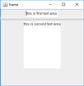
Program to create a Vertical JSplitPane to separate two text areas
Import javax.swing.event.*;
Import java.awt.*;
Import javax.swing.*;
Class solve extends JFrame {
// frame
Static JFrame f;
// text areas
Static JTextArea t1, t2;
// main class
Public static void main(String[] args)
{
// create a new frame
f = new JFrame("frame");
// create a object
Solve s = new solve();
// create a panel
JPanel p1 = new JPanel();
JPanel p = new JPanel();
// create text areas
t1 = new JTextArea(10, 10);
t2 = new JTextArea(10, 10);
// set texts
t1.setText("this is first text area");
t2.setText("this is second text area");
// add text area to panel
p1.add(t1);
p.add(t2);
// create a splitpane
JSplitPane sl = new JSplitPane(SwingConstants.VERTICAL, p1, p);
// set Orientation for slider
Sl.setOrientation(SwingConstants.VERTICAL);
// add panel
f.add(sl);
// set the size of frame
f.setSize(300, 300);
f.show();
} }
Output: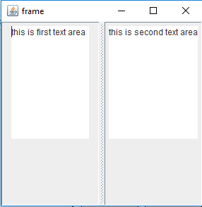
A. JLabel:
The class JLabel can display either text, an image, or both. Label's contents are aligned by setting the vertical and horizontal alignment in its display area.
By default, labels are vertically centered in their display area. Text-only labels are leading edge aligned, by default; image-only labels are horizontally centered, by default.
JLabel class declaration
Public class JLabel extends JComponent implements SwingConstants, Accessible
Commonly used class JLabel constructor
Constructor | Description |
JLabel() | Creates a JLabel instance with no image and with an empty string for the title. |
JLabell(String S) | Creates a JLabel instance with the specified text. |
JLabel(Icon i) | Creates a JLabel instance with the specified image. |
JLabel(String s, Icon I, int horizontalAligment) | Creates a JLabel instance with the specified text, image and horizontal alignment. |
Commonly used Methods:
Methods | Description |
String getText() | It returns the text string that a label display. |
Void setText(String text) | It defines the single line of text this component will display. |
Void setHorizontalAlignment(int alignment) | It sets the alignment of the label's contents along the X axis. |
Icon getIcon() | It returns the graphic image that the label displays. |
Int getHorizontalAlignment() | It returns the alignment of the label's contents along the X axis. |
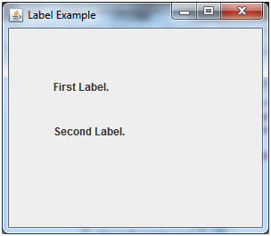
Simple Java JLabel Example:
Import javax.swing.*;
Class LabelExample
{
Public static void main(String args[])
{
JFrame f= new JFrame("Label Example");
JLabel l1,l2;
l1=new JLabel("First Label.");
l1.setBounds(50,50, 100,30);
l2=new JLabel("Second Label.");
l2.setBounds(50,100, 100,30);
f.add(l1);
f.add(l2);
f.setSize(300,300);
f.setLayout(null);
f.setVisible(true);
}
}
Output:
B. JButton:
The JButton class is used to create a labeled button that has platform independent implementation.
When the button is pushed. It inherits Abstract Button class
JButton class Declaration:
The declaration for javax.swing.JButton clas
Public class JButton extends AbstractButton implements Accessible
Commonly used class JButton constructor
Constructor | Description |
JButton() | It creates a button with no text and icon. |
JButton(String s) | It creates a button with the specified text. |
JButton(Icon i) | It creates a button with the specified icon object. |
Commonly used Methods of Abstract Button class:
Methods | Description |
Void setText(String s) | It is used to set specified text on button |
String getText() | It is used to return the text of the button. |
Void setEnabled(boolean b) | It is used to enable or disable the button. |
Void setIcon(Icon b) | It is used to set the specified Icon on the button. |
Icon getIcon() | It is used to get the Icon of the button. |
Void setMnemonic(int a) | It is used to set the mnemonic on the button. |
Void addActionListener(ActionListener a) | It is used to add the action listener to this object. |
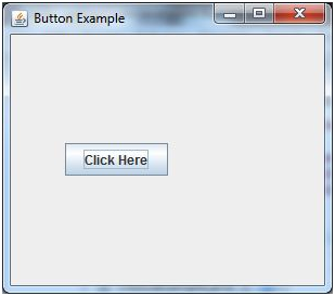
Simple Java JButton Example
Import javax.swing.*;
Public class ButtonExample {
Public static void main(String[] args) {
JFrame f=new JFrame("Button Example");
JButton b=new JButton("Click Here");
b.setBounds(50,100,95,30);
f.add(b);
f.setSize(400,400);
f.setLayout(null);
f.setVisible(true);
}
Output:
C. Java JTextField
The object of a JTextField class is a text component that allows the editing of a single line text.
It inherits JText Component class.
JTextField Class Declaration:
Public class JTextField extends JTextComponent implements SwingConstants
Commonly used the constructor
Constructor | Description |
JtextField() | Create a new text field |
JtextField(String s) | Create a new text field initialize with the specific text |
JtextField(String text,int columns) | Creates a new Text Field initialized with the specified text and columns. |
JtextField(int columns) | Creates a new empty Text Field initialized with the specified number of columns |
Commonly used Methods:
Methods | Description |
Void addActionListener(ActionListener l) | It is used to add the specified action listener to receive action events from this text field. |
Action getAction() | It returns the currently set Action for this Action Event source, or null if no Action is set. |
Void setFont(Font f) | It is used to set the current font. |
Void removeActionListener(ActionListener l) | It is used to remove the specified action listener so that it no longer receives action events from this text field. |
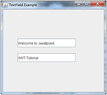
Example:
Import javax.swing.*;
Class TextFieldExample
{
Public static void main(String args[])
{
JFrame f= new JFrame("TextField Example");
JTextField t1,t2;
t1=new JTextField("Welcome to Javatpoint.");
t1.setBounds(50,100, 200,30);
t2=new JTextField("AWT Tutorial");
t2.setBounds(50,150, 200,30);
f.add(t1); f.add(t2);
f.setSize(400,400);
f.setLayout(null);
f.setVisible(true);
} }
Output:
D. JTextArea:
The object of a JTextArea class is a multi-line region that displays text. It allows the editing of multiple line text
. It inherits JTextComponent class
Class declaration
Public class JTextArea extends JTextComponent
Commonly used constructor:
Constructor | Description |
JTextArea() | Creates Text area that display no text initially |
JTextArea(String s) | Creates Text area that display specific text |
JTextArea(int row, int column) | Creates Text area with specific number of row and column that display no text initially |
JTextArea(String s, int row, int column) | Creates Text area with specific number of row and column that display specific text |
Commonly Used methods:
Methods | Description |
Void setRows(int rows) | It is used to set specified number of rows. |
Void setColumns(int cols) | It is used to set specified number of columns. |
Void setFont(Font f) | It is used to set the specified font. |
Void insert(String s, int position) | It is used to insert the specified text on the specified position. |
Void append(String s) | It is used to append the given text to the end of the document. |
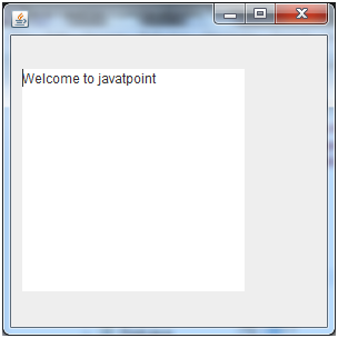
JTextArea Example
Import javax.swing.*;
Public class TextAreaExample
{
TextAreaExample(){
JFrame f= new JFrame();
JTextArea area=new JTextArea("Welcome to javatpoint");
Area.setBounds(10,30, 200,200);
f.add(area);
f.setSize(300,300);
f.setLayout(null);
f.setVisible(true);
}
Public static void main(String args[])
{
New TextAreaExample();
}}
Output:
JavaFX tutorial provides basic and advanced concepts of JavaFX. Our JavaFX tutorial is designed for beginners and professionals.
What is JavaFX?
JavaFX is a Java library used to develop Desktop applications as well as Rich Internet Applications (RIA).
The applications built in JavaFX, can run on multiple platforms including Web, Mobile and Desktops.
JavaFX is intended to replace swing in Java applications as a GUI framework.
It provides more functionalities than swing. Like Swing, JavaFX also provides its own components and doesn't depend upon the operating system.
It is lightweight and hardware accelerated. It supports various operating systems including Windows, Linux and Mac OS.
Features of JavaFX
Feature | Description |
Java Library | It is a Java library which consists of many classes and interfaces that are written in Java. |
FXML | FXML is the XML based Declarative mark up language. The coding can be done in FXML to provide the more enhanced GUI to the user. |
Scene Builder | Scene Builder generates FXML mark-up which can be ported to an IDE. |
Web view | Web pages can be embedded with JavaFX applications. Web View uses WebKit HTML technology to embed web pages. |
Built in UI controls | JavaFX contains Built-in components which are not dependent on operating system. The UI component are just enough to develop a full featured application. |
CSS like styling | JavaFX code can be embedded with the CSS to improve the style of the application. We can enhance the view of our application with the simple knowledge of CSS. |
Swing interoperability | The JavaFX applications can be embedded with swing code using the Swing Node class. We can update the existing swing application with the powerful features of JavaFX. |
Canvas API | Canvas API provides the methods for drawing directly in an area of a JavaFX scene. |
Rich Set of APIs | JavaFX provides a rich set of API's to develop GUI applications. |
Integrated Graphics Library | An integrated set of classes are provided to deal with 2D and 3D graphics. |
Graphics Pipeline | JavaFX graphics are based on Graphics rendered pipeline(prism). It offers smooth graphics which are hardware accelerated. |
High Performance Media Engine | The media pipeline supports the playback of web multimedia on a low latency. It is based on a Gstreamer Multimedia framework. |
Self-contained application deployment model | Self Contained application packages have all of the application resources and a private copy of Java and JavaFX Runtime. |
JavaFX is bundled with a set of APIs that not only support basic graphics programming but also some of the high-level 3D APIs as a part of the core SDK.
The ease and simplicity of graphics programming with JavaFX is remarkable when compared with some of the stalwarts in this arena, such as the Java3D library.
Because JavaFX is focused on an UI development, it provides some excellent features from the ground up in the graphics arena in particular.
The javafx.stage package contains the following:
A Stage class, which is a top-level UI container. Imagine it as the theatrical stage of the drama called graphics programming.
A Screen class, which represents display parameters such as size of the stage, resolution, and so forth.
The javafx.scene package (mostly used) contains these items:
a) A Scene class, which is the second-level container where the act takes place. It is similar to a scene of the drama in action or an act in motion.
b) A Node class is an abstract base class for all the graphical nodes in JavaFX, such as text, images, media, shapes, and so on. They are the actors.
c) A Group class is the subclass of Node, whose purpose is to group several node objects in to a single act.
d) A Canvas class is basically a Node subclass which provides an API to draw shapes using a set of graphics commands. The advantage of Canvas is that we can obtainn its Graphics Context and invoke drawing operations to render custom shapes onscreen.
Now, the abstraction drama (graphics programming) is defined by several actors (Nodes), clubbed for interaction (Group) according to the script (Scene), dramatized on a stage (Stage), where our viewpoint (Screen) is defined by the angle/distance of the stage from the gallery.
Observe in the following code how actors (Node objects: Line and Text objects) are grouped (as a Group with children) in a scene (Scene object) and displayed in a stage (Stage object). Application.launch executes the start method implicitly and the drama is complete.
//...import statements
Public class BareBoneGraphics extends Application
{ public static void main(String[] args)
{ Application.launch(args);
}
Public void start(Stage primaryStage) throws Exception
{ primaryStage.setTitle("Graphics in JavaFX");
Group root=new Group();
Scene scene=new Scene(root,300,250, Color.WHITE);
Root.getChildren().add(new Text(scene.getWidth()/2,
Scene.getHeight()/2,"Graphics is Fun"));
Root.getChildren().add(new Line(0, 5, scene.getWidth(), 5));
Root.getChildren().add(new Line(5, 0, 5, scene.getHeight()));
PrimaryStage.setScene(scene);
PrimaryStage.show();
}
}
Working with Text
Text rendering is one of the common aspects when we play with graphics.
We can apply several parameters to display text in a scene with a variation of font, color, stroke, fill, and rotate, and provide some effects such as shadow and the like.
The following code draws text with the help of a concrete Node class, Text. The characters are displayed randomly with random rotation. Another Text object is displayed with a shadow effect.
//...import statements
Public class RenderingText extends Application {
Public static void main(String[] args)
{ Application.launch(args);
}
Public void start(Stage primaryStage) throws Exception
{ primaryStage.setTitle("Graphics in JavaFX");
Group root = new Group();
Scene scene = new Scene(root, 650, 450, Color.WHITE);
Random random = newRandom(System.currentTimeMillis());
For (int i = 0; i < 500; i++)
{
Text text = new Text(random.nextInt((int) scene.getWidth()),
Random.nextInt((int) scene.getHeight()),
New Character((char)random.nextInt(255)).toString());
Text.setFont(Font.font("Serif", random.nextInt(30)));
Text.setFill(Color.rgb(random.nextInt(255),
Random.nextInt(255), random.nextInt(255), 0.5));
Root.getChildren().add(text);
}
Text text2 = new Text(60, scene.getHeight() / 2, "Graphics is Fun!");
Text2.setFont(Font.font("Serif", FontWeight.EXTRA_BOLD,
FontPosture.REGULAR, 60));
Text2.setFill(Color.RED);
Text2.setFontSmoothingType(FontSmoothingType.LCD);
DropShadow shadow = new DropShadow();
Shadow.setOffsetX(2.0f);
Shadow.setOffsetY(2.0f);
Shadow.setColor(Color.BLACK);
Shadow.setRadius(7);
Text2.setEffect(shadow);
Text2.setStroke(Color.DARKRED);
Root.getChildren().add(text2);
PrimaryStage.setScene(scene);
PrimaryStage.show();
}
}
Listing 2: Manipulating text rendering in a scene

Working with Shapes
JavaFX provides an API to draw both 2D and 3D shapes. 3D shapes are a bit more complex, where concepts such as projection, camera angle, different types of light, and shading techniques come into play.
Let us put that aside for now and concentrate on how we can manipulate 2D shapes. The basic 2D shapes can be used to draw more complex ones when used appropriately.
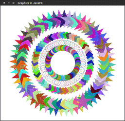
In the following example, Canvas is used as the basic drawing container. Observe how easy it is to manipulate shapes with the help of the Graphics Context object.
Public class DrawingShapes extends Application {
Public static void main(String[] args) {
Application.launch(args);
}
Public void start(Stage primaryStage) throws Exception {
PrimaryStage.setTitle("Graphics in JavaFX");
Group root = new Group();
Canvas canvas = new Canvas(650, 600);
GraphicsContext gc = canvas.getGraphicsContext2D();
Draw2DShapes(gc);
Root.getChildren().add(canvas);
PrimaryStage.setScene(new Scene(root));
PrimaryStage.show();
}
Private void draw2DShapes(GraphicsContext gc)
{ double width = gc.getCanvas().getWidth();
Double height = gc.getCanvas().getHeight();
Random random = new Random(System.currentTimeMillis());
Gc.setFill(Color.rgb(random.nextInt(255), random.nextInt(255), random.nextInt(255), 0.9));
Gc.translate(width / 2, height / 2);
For (int i = 0; i < 60; i++) {
Gc.rotate(6.0);
Gc.setFill(Color.rgb(random.nextInt(255), random.nextInt(255),
Random.nextInt(255), 0.9));
Gc.fillOval(10, 60, 30, 30);
Random.nextInt(255),
Random.nextInt(255), 0.9));
Gc.strokeOval(60, 60, 30, 30);
Gc.setFill(Color.rgb(random.nextInt(255),
Random.nextInt(255),random.nextInt(255), 0.9));
Gc.fillRoundRect(110, 60, 30, 30, 10, 10);
Gc.setFill(Color.rgb(random.nextInt(255), random.nextInt(255),
Random.nextInt(255), 0.9));
Gc.fillPolygon(
New double[] { 105, 117, 159, 123, 133, 105, 77, 87,51, 93 }
New double[] { 150, 186, 186, 204, 246, 222, 246,204, 186, 186 },
10);
}}}
The graphical user interface of every desktop application mainly considers UI elements, layouts and behaviour.
The UI elements are the one which are actually shown to the user for interaction or information exchange.
The package javafx.scene.control provides all the necessary classes for the UI components like Button, Label, etc.
Every class represents a specific UI control and defines some methods for their styling.
Control | Description |
Label | Label is a component that is used to define a simple text on the screen. Typically, a label is placed with the node, it describes. |
Button | Button is a component that controls the function of the application. Button class is used to create a labelled button. |
Radio Button | The Radio Button is used to provide various options to the user. The user can only choose one option among all. A radio button is either selected or deselected. |
Check Box | Check Box is used to get the kind of information from the user which contains various choices. User marked the checkbox either on (true) or off(false). |
Text Field | Text Field is basically used to get the input from the user in the form of text. Javafx.scene.control.TextField represents TextField |
Password Field | Password Field is used to get the user's password. Whatever is typed in the password field is not shown on the screen to anyone. |
HyperLink | Hyperlink are used to refer any of the webpage through your application. It is represented by the class javafx.scene.control.HyperLink |
Slider | Slider is used to provide a pane of options to the user in a graphical form where the user needs to move a slider over the range of values to select one of them. |
Progress Bar | Progress Bar is used to show the work progress to the user. It is represented by the class javafx.scene.control.ProgressBar. |
Progress Indicator | Instead of showing the analogue progress to the user, it shows the digital progress so that the user may know the amount of work done in percentage. |
Scroll Bar | JavaFX Scroll Bar is used to provide a scroll bar to the user so that the user can scroll down the application pages. |
Menu | JavaFX provides a Menu class to implement menus. Menu is the main component of any application. |
ToolTip | JavaFX ToolTip is used to provide hint to the user about any component. It is mainly used to provide hints about the text fields or password fields being used in the application. |
Effects are basically actions that can improve the appearance of the graphics.
JavaFX provides the package named as javafx.scene.effect which contains various classes that can be used to apply effects on the UI graphic components like images and shapes. The effects along with their description
Effect | Description |
Color Adjust | This Effect adjusts the color of the node by varying the properties like Hue, Saturation, Brightness, contrast etc. javafx.scene.effect.ColorAdjust class deals with all the stuff regarding adjustments of colors of the node. |
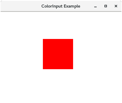
Color Input | Javafx.scene.ColorInput class represents Color Input effect. It makes a coloured rectangle. This displays a rectangular box if applied to a node. |
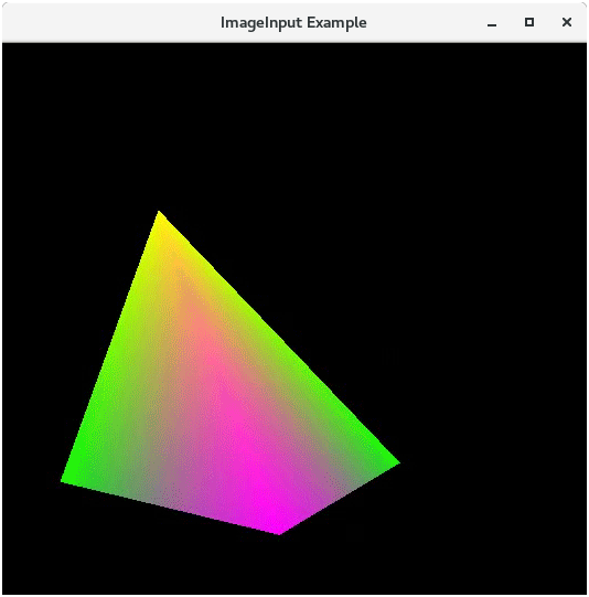
Image Input | Image Input effect is used to bind the image to the scene. It basically passes the specified image to some effect. |
Blend | Javafx.scene.effect.Blend class represents the blend effect. This effect joins the pixels of two inputs and produces the combined output at the same location. There are various blend modes defined in the class which can alter the output appearance. |
Bloom | Javafx.scene.effect.Bloom class represents bloom effect. This effect makes the pixels of a few portions of the component glow. |
Glow | This effect is very much similar to Bloom. This can make the input image glow by enhancing the brightness of the bright pixels. |
Box Blur | The blur makes the image unclear. JavaFX provides the class javafx.scene.effect.BoxBlur which needs to be instantiated in order to apply the blur effect to the nodes. The Box filter is used in the case of Box Blur effect in JavaFX. |
Gaussion Blur | In JavaFX, Gaussion Blur is used to blur the nodes. This class uses Gaussion Convolution Kernel for this purpose. |
Motion Blur | Motion Blur effect is used to make the nodes blur. By applying this effect, the nodes are seemed to be blurred as they are in motion. javafx.scene.effect.MotionBlur class represents this effect. |
Reflection | It adds the reflection of the node on the bottom of the node. The class named as javafx.scene.effect.Reflection represents Reflection effect. |
Sepia Tone | Sepia Tone effect makes the node toned with radish brown color. The class named as javafx.scene.effect.SepiaTone class represents Sepia Tone effect. The resulting nodes are similar to antique photographs. |
Shadow | This duplicates the nodes with the blurry edges. The class named as javafx.scene.effect.Shadow represents Shadow effect. |
Drop Shadow | This is a high level effect that is used to display the duplicate content behind the original content with the specified color and size. |
Inner Shadow | This effect displays the shadow inside the edges of the nodes to which it is applied. |
Lighting | This effect is used to lighten the node from a light source. This effect is represented by javafx.scene.effect.Lighting class. |
Light.Distant | It implements lighting on the node from a distant light source. It is represented by Light.Distant class. |
Light.Spot | It implements lighting on a node from a spot light source. It is represented by Light.Spot class. |
Light.Point | It implements lighting on a node from a point light source. It is represented by Light.Point class. |
How to apply the effect to a node
JavaFX provides a method named as setEffect() which needs to be called through a node object.
We need to pass the effect class object into this method. To apply any effect to the node, we need to follow the following steps.
- Create the node
- Create the object of the respective Effect class which is to be applied on the node.
- Set the properties of the Effect.
- Call setEffect() method through the node object and pass the Effect class object into it.
Color Adjust Effect
JavaFX allows us to adjust the color of an image by adjusting the properties like hue, saturation, brightness and contrast of the color of image. The class javafx.scene.effect.ColorAdjust contains various properties and methods that can be used to apply the Color Adjust effect on the node.
Properties
The properties of the class javafx.scene.effect.ColorAdjust along with their setter methods are described below.
Property | Description | Setter Methods |
Brightness | Adjustment made in brightness of the color. It is a double type property. | SetBrightness(double value) |
Contrast | Adjustment made in contrast of the color. It is of double type property. | SetContrast(double value) |
Hue | Adjustment made in hue of the color. It is of double type property. | SetHue(double value) |
Input | Input value for the effect. It is of double type property. | SetInput(double value) |
Saturation | Adjustment made in saturation of the color. It is of double type property. | SetSaturation(double value) |
Constructors
The class contains two constructors given below.
- Public ColorAdjust(): creates the new instance of Color Adjust with the default parameters.
- Public ColorAdjust(double hue, double saturation, double brightness, double contrast): Creates the new instance of the Color Adjust with the specified parameters.
Example:
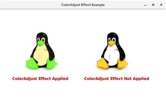
In the below example, the Color Adjust Effect has been applied to the image with the certain properties. The comparison is being shown between the effected image and the original image as the output.
Package application;
Import javafx.application.Application;
Import javafx.scene.paint.Color;
Import javafx.scene.shape.Rectangle;
Import javafx.scene.text.Font;
Import javafx.scene.text.FontPosture;
Import javafx.scene.text.FontWeight;
Import javafx.scene.text.Text;
Import javafx.stage.Stage;
Import javafx.scene.Group;
Import javafx.scene.Scene;
Import javafx.scene.effect.ColorAdjust;
Import javafx.scene.image.Image;
Import javafx.scene.image.ImageView;
Public class ColorAdjustEffect extends Application
{ public void start(Stage primaryStage) throws Exception
{ // TODO Auto-generated method stub
Image img1 = new Image("https://www.javatpoint.com/linux/images
/linux-first.png");
Image img2 = new Image("https://www.javatpoint.com/linux/images/
Linux-first.png");
ImageView imgview1 = new ImageView(img1);
ImageView imgview2 = new ImageView(img2);
Text text1 = new Text();
Text text2 = new Text();
Text1.setText("ColorAdjust Effect Applied");
Text2.setText("ColorAdjust Effect Not Applied");
Text1.setX(50);
Text1.setY(300);
Text2.setX(355);
Text2.setY(300);
Text1.setFont(Font.font("Courier 10 Pitch",FontWeight.BOLD,
FontPosture.REGULAR,16));
Text2.setFont(Font.font("Courier 10 Pitch",FontWeight.BOLD,
FontPosture.REGULAR,16));
Text1.setFill(Color.RED);
Text2.setFill(Color.RED);
Text1.setStroke(Color.BLACK);
Text2.setStroke(Color.BLACK);
Text1.setStrokeWidth(0.2);
Text2.setStrokeWidth(0.2);
Imgview1.setX(100);
Imgview1.setY(90);
Imgview2.setX(400);
Imgview2.setY(90);
ColorAdjust c = new ColorAdjust(); // creating the instance of
The ColorAdjust effect.
c.setBrightness(0.2); // setting the brightness of the color.
c.setContrast(0.1); // setting the contrast of the color
c.setHue(0.3); // setting the hue of the color
c.setSaturation(0.45); // setting the hue of the color.
Imgview1.setEffect(c); //applying effect on the image
Group root = new Group();
Root.getChildren().addAll(imgview1,imgview2,text1,text2);
Scene scene = new Scene(root,700,400);
PrimaryStage.setScene(scene);
PrimaryStage.setTitle("ColorAdjust Effect Example");
PrimaryStage.show();
}
Public static void main(String[] args) {
Launch(args);
}
}
OUTPUT:
B. Color Input
Color Input produces the output similar to a coloured Rectangle.
It doesn't display the node but the rectangular box. It is mainly passed into the other effects as an input.
The class javafx.scene.effect.ColorInput represents the Color Input effect.
The object of this class is passed as an input for the other effects.
Properties
Properties of the class javafx.scene.effect.ColorInput along with their setter methods are described below in the table.
Property | Description | Setter Methods |
Height | It is of double type. It represents the height of the region that is to be filled. | SetHeight(double value) |
Paint | It represents the paint with which the region is to be filled. | SetPaint(Paint value) |
Width | It is of double type. It represents the width of the region that is to be filled. | SetWidth(double value) |
x | It represents the X coordinate of the top left corner of region. | SetX(double value) |
y | It represents the Y coordinate of the top left corner of the region. | SetY(double value) |
Constructors
The class contains two constructors.
- Public ColorInput(): Creates a new instance of Color Input with the default parameters.
- Public ColorInput(double x, double y, double width, double height, Paint paint): Creates a new instance of Color Input with the specified parameters.
Example:
The following example illustrates the working of ColorInput effectDiffe
Package application;
Import javafx.application.Application;
Import javafx.scene.Group;
Import javafx.scene.Scene;
Import javafx.scene.effect.ColorInput;
Import javafx.scene.paint.Color;
Import javafx.scene.shape.Rectangle;
Import javafx.stage.Stage;
Public class ColorInputExample extends Application
{
Public static void main(String[] args)
{
Launch(args);
}
Public void start(Stage primaryStage) throws Exception
{ // TODO Auto-generated method stub
ColorInput color = new ColorInput();
Color.setPaint(Color.RED);
Color.setHeight(100);
Color.setWidth(100);
Color.setX(140);
Color.setY(90);
Rectangle rect = new Rectangle();
Rect.setEffect(color);
Group root = new Group();
Scene scene = new Scene(root,400,300);
Root.getChildren().add(rect);
PrimaryStage.setScene(scene);
PrimaryStage.setTitle("ColorInput Example");
PrimaryStage.show();
}
}
C. Image Input
This effect is mainly used to pass the unmodified image as an input for the other effects. The class javafx.scene.effect.ImageInput represents Image Input effect.
Constructors
The class contains three constructors described below.
- ImageInput(): Instantiate Image Input class with default parameters.
- ImageInput(Image source): Instantiate Image Input with the specified image source.
- ImageInput(Image source, Double X, Double Y): Instantiate Image Input with the default image source and specified coordinates
Example:
Package application;
Import javafx.application.Application;
Import javafx.scene.Group;
Import javafx.scene.Scene;
Import javafx.scene.effect.ImageInput;
Import javafx.scene.image.Image;
Import javafx.scene.paint.Color;
Import javafx.scene.shape.Rectangle;
Import javafx.stage.Stage;
Public class ImageInputExample extends Application
{
Public void start(Stage primaryStage) throws Exception
{ // TODO Auto-generated method stub
Image img = new Image("https://www.javatpoint.com/jogl/imag es/jogl-3d-triangle.gif");
ImageInput imginput = new ImageInput();
Rectangle rect = new Rectangle();
Imginput.setSource(img);
Imginput.setX(20);
Imginput.setY(100);
Group root = new Group();
Rect.setEffect(imginput);
Root.getChildren().add(rect);
Scene scene = new Scene(root,530,500,Color.BLACK);
PrimaryStage.setScene(scene);
PrimaryStage.setTitle("ImageInput Example");
PrimaryStage.show();
}
Public static void main(String[] args)
{
Launch(args);
}
}
D.Blend Effect
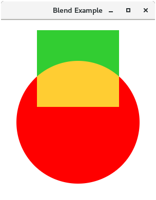
In general, blend effect produces the output that is generated as a result of the mixture of two or more different input nodes.
It takes the pixels of two or more nodes, mix them according to the applied blend mode and produces the output node at the same location.
If the two images are overlapping each other than the blend mode is applied on the overlapped area of both the images.
Properties
The class contains four properties which are described along with their setter methods in the following table.
Property | Description | Setter Methods |
Bottom Input | The bottom input for the blend operation. This is an object type property. | SetBottomInput(Effect value) |
Mode | The mode according to which, the inputs are blend together. | SetMode(BlendMode value) |
Opacity | This is the opacity value of double type. | SetOpacity(double value) |
Top Input | The top input for the blend operation. | SetTopInput(Effect Value) |
Constructors
There are three constructors in this class. for Beginners
- Blend(): Instantiate Blend class with the default values.
- Blend(BlendMode mode): Instantiate Blend class with the specified mode
- Blend(BlendMode, Effect BottomInput, Effect TopInput): Instantiate Blend class with the specified blend mode, Bottom Input effect and Top Input effect
Example:
Package application;
Import javafx.application.Application;
Import javafx.scene.Group;
Import javafx.scene.Scene;
Import javafx.stage.Stage;
Import javafx.scene.shape.Circle;
Import javafx.scene.effect.Blend;
Import javafx.scene.effect.BlendMode;
Import javafx.scene.effect.ColorInput;
Import javafx.scene.paint.Color;
Public class BlendExample extends Application {
Public void start(Stage primaryStage) {
Circle circle = new Circle(150,200,120);
Circle.setFill(Color.RED);
Blend blend = new Blend();
ColorInput color = new ColorInput(70, 20, 160, 150, Color.LIMEGREEN);
Blend.setTopInput(color);
Blend.setMode(BlendMode.ADD);
Circle.setEffect(blend);
Group root = new Group(circle);
Scene scene = new Scene(root, 300,350);
PrimaryStage.setTitle("Blend Example");
PrimaryStage.setScene(scene);
PrimaryStage.show();
}
Public staticvoid main(String args[]){
Launch(args);
}
}
Blend Mode
JavaFX provides various blend modes which can be applied in order to modify the Blend Effect.
Blend Mode | Description | Output |
Add | The color components of the top input are added to that from the bottom input. | 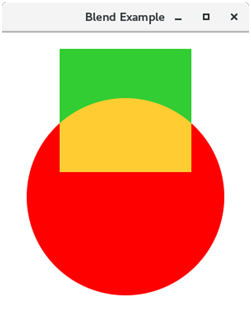 |
Blue | Only Blue components of the bottom input gets replaced by the blue component of top input. | 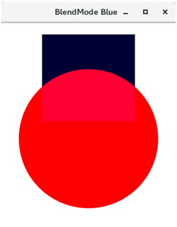 |
COLOR_BURN | The bottom input color gets inverted and divided by the top input color components. The result is again inverted to get the output color. | 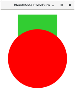 |
COLOR_DODGE | The top color components gets inverted and divide the bottom color components to produce the output color. | 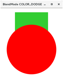 |
DARKEN | The color which is darker of the two input component colors is selected to produce the resulting color. |  |
DIFFERENCE | The darker of the two input color is subtracted from the lighter color to produce the resulting color. | 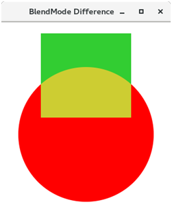 |
EXCLUSION | The two input color components are multiplied and doubled and then subtracted from the sum of bottom color components to produce the desired color. | 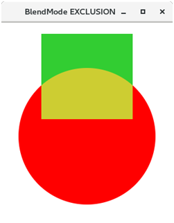 |
GREEN | The green component from the bottom input is replaced by the green input of top component. | 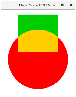 |
HARD_LIGHT | The input color components are either multiplied or screened depending upon the bottom color. | 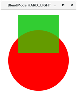 |
LIGHTEN | The lighter color of the two color components is produced as output. |  |
MULTIPLY | Both the color components get multiplied to produce the output color. | 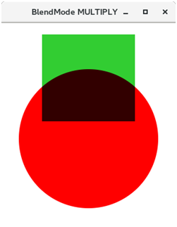 |
OVERLAY | The input color components get either screened or multiplied depending upon the bottom color. |  |
RED | The red components of bottom input get replaced with the red components of top input. | 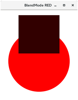 |
SCREEN | Both color components are inverted, multiplied and again inverted to produce the desired result. |  |
SOFT_LIGHT | The input color components become lighten or darken. | 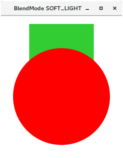 |
SRC_ATOP | The part of the top input that is lying over the bottom input gets blended. | 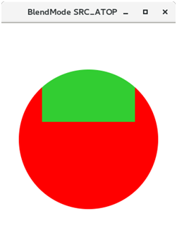 |
SRC_OVER | Top input gets blended over bottom input. | 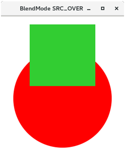 |
Bloom effect
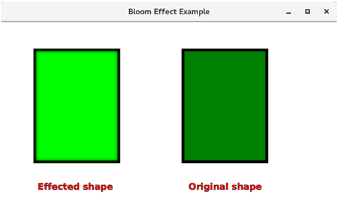
Bloom effect is used to glow pixels of some of the portions of the scene. It is represented by the class javafx.scene.effect.Bloom. This class contains various properties which can be set to the certain values in order to apply the appropriate effects.
Properties
The properties of the class along with the setter methods are described below.
Property | Description | Setter Method |
Input | This property is of type effect. It is used to provide an input to the glow effect. | SetInput(Effect value) |
Threshold | This property is of the type double. It is a minimum value for the luminosity of the pixels. | SetThresholf(Double value) |
Constructors
- Public Bloom(): Creates a new instance of the Bloom class with the default parameters.
- Public Bloom(Double Threshold_Value): Creates a new instance of the Bloom class with the specified parameters.
Example:
Package application;
Import javafx.application.Application;
Import javafx.scene.Group;
Import javafx.scene.Scene;
Import javafx.scene.effect.Bloom;
Import javafx.scene.paint.Color;
Import javafx.scene.shape.Rectangle;
Import javafx.scene.text.Font;
Import javafx.scene.text.FontPosture;
Import javafx.scene.text.FontWeight;
Import javafx.scene.text.Text;
Import javafx.stage.Stage;
Public class BloomEffect extends Application{
Public static void main(String[] args) {
Launch(args);
}
Public void start(Stage primaryStage) throws Exception {
// TODO Auto-generated method stub
Rectangle rect1= new Rectangle(60,50,150,200);
Rectangle rect2 = new Rectangle(325,50,150,200);
Rect1.setFill(Color.GREEN);
Rect1.setStroke(Color.BLACK);
Rect1.setStrokeWidth(5);
Rect2.setFill(Color.GREEN);
Rect2.setStroke(Color.BLACK);
Rect2.setStrokeWidth(5);
Text text1 = new Text();
Text text2 = new Text();
Text1.setText("Effected shape");
Text2.setText("Original shape");
Text1.setX(65);
Text1.setY(300);
Text2.setX(335);
Text2.setY(300);
Text1.setFont(Font.font("Courier 10 Pitch",FontWeight.BOLD,FotPosture. REGULAR,16));
Text2.setFont(Font.font("Courier 10 Pitch",FontWeight.BOLD,FontPostur e.REGULAR,16));
Text1.setFill(Color.RED);
Text2.setFill(Color.RED);
Text1.setStroke(Color.BLACK);
Text2.setStroke(Color.BLACK);
Text1.setStrokeWidth(0.2);
Text2.setStrokeWidth(0.2);
Bloom bloom = new Bloom();
Bloom.setThreshold(0.1);
Rect1.setEffect(bloom);
Group root = new Group();
Root.getChildren().addAll(rect1,rect2,text1,text2);
Scene scene = new Scene(root,600,350);
PrimaryStage.setScene(scene);
PrimaryStage.setTitle("Bloom Effect Example");
PrimaryStage.show();
}
}
Glow Effect
Like Bloom effect, Glow effect is also used to glow the pixels of the image.
it makes the image much brighter.
The class javafx.scene.effect.Glow represents the Glow effect.
The class contains various properties which can be set to the certain values in order to apply the appropriate effect.
Properties
The properties of the class along with the setter methods are described in the following table.
Property | Description | Setter Methods |
Input | This represents the input for the effect. This is an Effect class object type property. | SetInput(Effect value) |
Level | It represents a value which controls the intensity of the glow effect on the node. | SetLevel(double value) |
Constructors
There are two constructors in the class.
- Public Glow(): It is the default constructor. It instantiates the class with the default parameters.
- Public Glow(double level): It creates the instance with the specified level value.
Gaussian Blur Effect
Gaussian Blur Effect is very much similar to Box Blur effect.
The only difference between the both is that the Gaussian Blur effect uses a Gaussian convolution kernel to blur the nodes.
JavaFX provides the class javafx.scene.effect.GaussianBlur to implement Gaussian Blur on the nodes.
This class needs to be instantiated in order to apply an appropriate effect on the node.
Properties
The properties of the class along with the setter methods are described in the following table.
Property | Description | Setter Methods |
Input | This property is of effect type. It represents the input for the effect. | SetInput(Effect value) |
Radius | This property is of double type. It represents the radius of the blur kernel. | SetRadius(Double value) |
Constructors
The class contains two constructors.
- Public GaussianBlur() : creates the new instance with the default value of parameters.
- Public GaussianBlur(double radius) : creates a new instance with the specified value of parameters.
Motion Blur Effect
Motion Blur is similar to the gaussian blur effect. The motion blur effect is also used to blur the nodes. The only difference between the Gaussian Blur effect and Motion Blur effect is that the motion blur effect uses the specified angle with which the nodes is to be blurred.
The class javafx.scene.effect.MotionBlur represents the motion blur effect.
Properties
The properties of the class along with the setter methods are described below in the table.
Property | Description | Setter Methods |
Angle | It represents the angle of the motion effect. It is a double type property. | SetAngle(Double value) |
Input | It represents the input for the effect. It is an Effect object type property. | SetInput(Effect value) |
Radius | It represents the radius of the blur kernel. It is a double type property. | SetRadius(Double radius) |
Constructors
- Public MotionBlur(): instantiates the motion blur class with the default parameters.
- Public MotionBlur(double angle, double radius): instantiates Motion Blur class with the specified angle and radius.
Reflection Effect
In general, Reflection can be defined as the change in the direction. JavaFX allows us to generate the reflection effect on any node.
Reflection effect basically adds the reflection of the node to its bottom.
It is represented by the class javafx.scene.effect.Reflection. We just need to instantiate this class in order to apply the appropriate effect to a node.
Constructors
The class contains two constructors.
- Public Reflection(): Creates a new instance of Reflection with the default parameters
- Public Reflection(double topOffset, double fraction, double topOpacity, double bottomOpacity): Creates a new instance of Reflection with the specified parameters
Properties
The properties of the class along with the setter methods are described in the following table.
Property | Description | Setter Methods |
Bottom Opacity | It is a double type property. It represents the opacity of the reflection at the bottom extreme. | SetBottomOpacity(double value) |
Fraction | It is a double type property. It represents the fraction of the input that is to be displayed in the reflection. | SetFraction(double value) |
Input | It is a object type property. It represents the input for the effect. | SetInput(Effect value) |
Top Offset | It is a double type property. It represents the distance between the top and bottom of the reflection. | SetTopOffset(Double value) |
Top Opacity | It represents the opacity of the reflection at the top of the input. | SetTopOpacity(Double value) |
Sepia Tone Effect
Sepia Tone Effect basically change the tone of the image to the reddish brown color. In JavaFX, the class javafx.scene.effect.SepiaTone represents Sepia Tone effect.
We just need to instantiate this class in order to generate an appropriate effect.
Properties
The properties of the class along with the setter methods are described in the following table.
Property | Description | Setter Methods |
Input | This is a Effect (Object) type property. It represents the input for this effect. | SetInput(Effect value) |
Level | This is a double type property. It represents level value which control the intensity of the sepia effect. | SetLevel(Double value) |
Constructors
The class contains two constructors
- Public Sepiatone(): creates a new instance with default parameters
- Public Sepiatone(double level): Creates a new instance with a specified level value.
Shadow Effect
As its name suggests, this effect creates the shadow of the node by duplicating the node and making its edges blur.
The class named as javafx.scene.effect.Shadow represents the shadow effect. We just need to instantiate this class to generate an appropriate shadow effect.
Properties
The properties of the class along with the setter methods are described in the following table.
Property | Description | Setter Methods |
Blur Type | This is a blur type property. This represents the algorithm which is used to blur the shadow. | SetBlurType(BlurType value) |
Color | This is of color type property. It represents the shadow color. | SetColor(Color value) |
Height | It represents the vertical size of the shadow blur. | SetHeight(double value) |
Input | It represents the input for this effect. | SetInput(Effect value) |
Radius | It represents the radius of the shadow. | SetRadius(double value) |
Width | It represents the horizontal size of the shadow blur. | SetWidth(double value) |
Constructors
The class contains three constructors.
- Public Shadow(): Creates a new instance with the default parameters
- Public Shadow(double radius, Color color): Creates a new instance with the specified radius and color.
- Public Shadow(BlurType blurtype, Color color, double radius): Creates a new instance with the specified radius, color and blur type
Drop Shadow Effect
This effect is similar to the shadow effect. However, in Drop Shadow, the duplicate of the node is displayed behind the original node with the specified size and color.
The class javafx.scene.effect.DropShadow is represents the Drop Shadow effect. We just need to instantiate this class in order to generate an appropriate effect.
Properties
The properties of the class along with the setter methods are described in the following table.
Property | Description | Setter Methods |
Blur Type | This represents the algorithm used to blur the shadow. | SetBlurType(BlurType value) |
SetBlurType(BlurType value) | The color of the shadow blur kernel. This property is of color type. | SetColor(Color value) |
Height | This represents the height of the shadow blur kernel. This property is of double type. | SetHeight(Double value) |
Input | This represents the input for the effect. | SetInput(Effect value) |
Offset X | This represents the X coordinate of the shadow offset. This properly is of double type. | SetOffsetX(Double value) |
Offset Y | This represents the Y coordinate of the shadow offset. This property is of double type. | SetOffsetY(Double value) |
Radius | This represents the radius of the shadow blur kernel. | SetRadius(Double value) |
Spread | It represents the spread of the shadow blur kernel. Is is of double type. | SetSpread(Double value) |
Width | It represents the width of the shadow blur kernel. | SetWidth(double value) |
Constructors
The class contains four constructors
- Public DropShadow(): It creates the instance with the default parameters.
- Public DropShadow(double radius, Color color): It creates the instance with the specified radius and color values.
- Public DropShadow(double radius, double offsetX, double offsetY, Color color): It creates the instance with the specified radius, offset and color values.
- Public DropShadow(BlurType blurtype, Color color, double radius, double spread, double offsetX, double offsetY): It creates the instance with the specified Blur Type, color, radius, spread and offset values.
Inner Shadow Effect
By applying this effect to the node, the shadow is displayed inside the edges of the node.
The class javafx.scene.effect.InnerShadow represents the Inner Shadow effect. We just need to instantiate this class in order to generate an appropriate effect.
Properties
The properties of the class along with the setter methods are described in the following table.
Property | Description | Setter Methods |
Blur Type | This represents the algorithm used to blur the shadow. | SetBlurType(BlurType value) |
Choke | This property is of double type. This represents the choke of the shadow. | SetChoke(Double value) |
Color | The color of the shadow blur kernel. This property is of color type. | SetColor(Color value) |
Height | This represents the height of the shadow blur kernel. This property is of double type. | SetHeight(Double value) |
Input | This represents the input for the effect. | SetInput(Effect value) |
Offset X | This represents the X coordinate of the shadow offset. This properly is of double type. | SetOffsetX(Double value) |
Offset Y | This represents the Y coordinate of the shadow offset. This property is of double type. | SetOffsetY(Double value) |
Radius | This represents the radius of the shadow blur kernel. | SetRadius(Double value) |
Width | It represents the width of the shadow blur kernel. | SetWidth(double value) |
Constructors
The class contains four constructors
- Public InnerShadow(): creates the instance with the default parameters.
- Public InnerShadow(double radius, Color color): creates the instance with the specified radius and color value.
- Public InnerShadow(double radius, double offsetX, double offsetY, Color color): creates the instance with the specified radius, offset and color values.
- Public InnerShadow(BlurType blurtype, Color color, double radius, double choke, double offsetX, double offsetY): creates the instance with the specified Blur Type. Color, Radius, Choke and offset values.
Lighting Effect
This effect is used to lighten a node from a light source. There are various kinds of light sources i.e. Point, Distant and Spot.
The class javafx.scene.effect.Lighting represents the lighting effect. We need to instantiate this class in order to generate an appropriate effect on the node.
Properties
The properties of the class along with the setter methods are described in the following table.
Property | Description | Setter Methods |
Bump Input | It is an Effect object type property. It represents the Bump map input for the effect. | SetBumpInput(Effect value) |
Content Input | It is an Effect object type property. It represents the content input for the Effect. | SetContentInput(Effect value) |
Diffuse Constant | It is a Double type property. It represents the diffuse constant. | SetDiffuseConstant(Double value) |
Light | It is a Light object type property. It represents the light source for the effect. | SetLight(Light value) |
Specular Constant | It is a double type property. It represents specular constant. | SetSpecularConstant(double value) |
Specular Exponent | It is a double type property. It represents Specular Exponent. | SetSpecularExponent(double value) |
Surface Scale | It is double type property. It represents Surface scale of the light. | SetSurfaceScale(double value) |
Constructors
The class contains two constructors.
- Public Lighting(): creates a new instance of Lighting with the default value of light source.
- Public Lighting(Light light): creates a new instance of Lighting with the specified value of light source.
Light.Distant Effect
In this effect, the node is lighten from a distant light source.
The distant light source is the one which is kept at some fair distance from the object and the light is attenuated into one direction from the source to the object.
In JavaFX, the class javafx.scene.effect.Light.Distant represents the Distant light source. We need to instantiate this class to generate the appropriate light on the node.
Properties
The class contains two properties described in the following table.
Property | Description | Setter Methods |
Azimuth | This property is of the type double and it represents the Azimuth of the light. | SetAzimuth(double value) |
Elevation | This property is of double type and it represents the elevation of the light. | SetAlivation(double value) |
Constructors
The class contains two constructors
- Public Light.Distant(): creates the new instance of the class with the default parameters.
- Public Light.Distant(double azimuth, double elevation, Color color): Creates the new instance of the class with the specified parameters.
Light.Point Effect
In this lighting effect, the light source is given a certain position in the 3D space. As the name suggests, the light source is situated at a certain point and the nodes are seemed to be lightened from that particular source. The class javafx.scene.effect.Light.Point represents this light source. We need to instantiate this class in order to generate the appropriate lighting on the node.
Properties
The properties of the class along with their setter methods are described in the following table.
Property | Description | Setter Methods |
X | It is a double type property. It represents the X coordinate of the Light source. | SetX(Double value) |
Y | It is a double type property. It represents the Y Coordinate of the light source. | SetY(Double value) |
Z | It is a double type property. It represents the Z coordinate of the light source. | SetZ(Double value) |
Constructors
The class contains two constructors
- Public Light.Point(): Creates the new instance with the default parameters.
- Public Light.Point(double x, double y, double z, Color color): Creates the new instance with the specified 3D coordinates and light color
The animation can be defined as the transition which creates the myth of motion for an object.
It is the set of transformations applied on an object over the specified duration sequentially so that the object can be shown as it is in motion.
This can be done by the rapid display of frames. In JavaFX, the package javafx.animation contains all the classes to apply the animations onto the nodes.
All the classes of this package extend the class javafx.animation.Animation.
JavaFX provides the classes for the transitions like
- Rotate Transition,
- Scale Transition,
- Translate Transition,
- Fade Transition,
- Fill Transition,
- Stroke Transition, etc.
Steps for applying Animations
- Create the target node and configure its properties.
Rectangle rect = new Rectangle(120,100,100,100);
Rect.setFill(Color.RED);
2. Instantiate the respective transition class
RotateTransition rotate = new RotateTransition();
3. Set the desired properties like duration, cycle-count, etc. for the transition.
Rotate.setDuration(Duration.millis(1000));
Rotate.setAxis(Rotate.Y_Axis);
Rotate.setCycleCount(500);
4. Set the target node on which the transition will be applied. Use the following method for this purpose.
Rotate.setNode(rect);
5. Finally, play the transition using the play() method.
Rotate.play();
Rotate Transition
This transition is used to apply the rotation transition on the node. It rotates the node along any of the three axes over the specified duration.
Rotate Transition is represented by the class javafx.animation.RotateTransition. We just need to instantiate this class in order to generate an appropriate Rotate Transition.
Properties
The properties of the class along with their setter methods are described in the following table
Property | Description | Setter Methods |
Axis | This is an object type property of the class Point3D. This represents the axis of rotate transition. | SetAxis(Point3D value) |
By Angle | This is a double type property. This represents the angle by which the object will be rotated. | SetByAngle(double value) |
Duration | This is the object type property of the class Duration. This represents the duration of the rotate transition. | SetDuration(Duration value) |
From Angle | It is a double type property. It represents the start Angle of the rotate transition. | SetFromAngle(double value) |
Node | It is an object type property of the class Node. It represents the node on which the rotate transition to be applied. | SetNode(Node value) |
To Angle | It is a double type property. It represents the stop angle value for the rotate transition. | SetToAngle(double value) |
Constructors
There are three constructors in the class.
- Public RotateTransition(): creates the new instance of Rotate Transition with the default parameters.
- Public RotateTransition(Duration duration): Creates the new instance of Rotate Transition with the specified duration value
- Public RotateTransition(Duration duration, Node node): creates the new instance of Rotate Transition with the specified duration value and Node on which, it is applied.
Example
In the following example, we have made a rectangle rotating along the Z-axis by 360 degree.
Package application;
Import javafx.animation.RotateTransition;
Import javafx.application.Application;
Import javafx.geometry.Point3D;
Import javafx.scene.Group;
Import javafx.scene.Scene;
Import javafx.scene.paint.Color;
Import javafx.scene.shape.Rectangle;
Import javafx.scene.transform.Rotate;
Import javafx.stage.Stage;
Import javafx.util.Duration;
Public class Rotate_Transition extends Application{
Public void start(Stage primaryStage) throws Exception {
// TODO Auto-generated method stub
//Creating Rectangle
Rectangle rect = new Rectangle(200,100,200,200);
Rect.setFill(Color.LIMEGREEN);
Rect.setStroke(Color.HOTPINK);
Rect.setStrokeWidth(5);
//Instantiating RotateTransition class
RotateTransition rotate = new RotateTransition();
//Setting Axis of rotation
Rotate.setAxis(Rotate.Z_AXIS);
// setting the angle of rotation
Rotate.setByAngle(360);
//setting cycle count of the rotation
Rotate.setCycleCount(500);
//Setting duration of the transition
Rotate.setDuration(Duration.millis(1000));
//the transition will be auto reversed by setting this to true
Rotate.setAutoReverse(true);
//setting Rectangle as the node onto which the ransition will be applied
Rotate.setNode(rect);
//playing the transition
Rotate.play();
//Configuring Group and Scene
Group root = new Group();
Root.getChildren().add(rect);
Scene scene = new Scene(root,600,400,Color.BLACK);
PrimaryStage.setScene(scene);
PrimaryStage.setTitle("Rotate Transition example");
PrimaryStage.show();
}
Public static void main(String[] args) {
Launch(args);
}
}
2. Scale Transition
This transition animates the scaling of the node over the specified duration by the specified factor in any or all of the three directions X, Y, and Z.
In JavaFX, Scale Transition is represented by the class javafx.animation.ScaleTransition.
Property | Description | Setter Methods |
By X | This is a double type property. It represents the incremented stop X factor value. | SetByX(double value) |
By Y | This is a double type property. It represents the incremented stop Y factor value. | SetByY(double value) |
By Z | This is a double type property. It represents the incremented stop Z factor value. | SetByZ(double value) |
Duration | This is an object type property of the class Duration. It represents the duration of scale transition. | SetDuration(Duration value) |
From X | This is a double type property. It represents the start X value of Scale Transition. | SetFromX(double value) |
From Y | This is a double type property. It represents the start Y value of Scale Transition. | SetFromY(double value) |
From Z | This is a double type property. It represents the start Z value of Scale Transition. | SetFromZ(double value) |
Node | This is an object type property of the class Node. It represents onto which, the scale transition is applied. | SetNode(Node node) |
To X | This is a double type property. It represents the stop X scale value of the scale transition. | SetToX(double value) |
To Y | This is a double type property. It represents the stop Y scale value of the scale transition. | SetToY(double value) |
To Z | This is a double type property. It represents the stop Z scale value of the scale transition. | SetToZ(double value) |
Constructors
There are three constructors in the class.
- Public TranslateTransition() : creates the new instance of Translate Transition with the default parameters.
- Public TranslateTransition(Duration duration) : creates the new instance of Translate Transition with the specified duration.
- Public TranslateTransition(Duration duration, Node node) : creates the new instance of Translate Transition with the specified duration and node.
Example
In the following example, we have made a circle translating itself by 400 in the X direction.
Package application;
Import javafx.animation.TranslateTransition;
Import javafx.application.Application;
Import javafx.scene.Group;
Import javafx.scene.Scene;
Import javafx.scene.paint.Color;
Import javafx.scene.shape.Circle;
Import javafx.stage.Stage;
Import javafx.util.Duration;
Public class Translate_Transition extends Application{
Public void start(Stage primaryStage) throws Exception {
// TODO Auto-generated method stub
//Creating the circle
Circle cir = new Circle(50,100,50);
//setting color and stroke of the cirlce
Cir.setFill(Color.RED);
Cir.setStroke(Color.BLACK);
//Instantiating TranslateTransition class
TranslateTransition translate = new TranslateTransition();
//shifting the X coordinate of the centre of the circle by 400
Translate.setByX(400);
//setting the duration for the Translate transition
Translate.setDuration(Duration.millis(1000));
//setting cycle count for the Translate transition
Translate.setCycleCount(500);
//the transition will set to be auto reversed by setting this to true
Translate.setAutoReverse(true);
//setting Circle as the node onto which the transition will be applied
Translate.setNode(cir);
//playing the transition
Translate.play();
//Configuring Group and Scene
Group root = new Group();
Root.getChildren().addAll(cir);
Scene scene = new Scene(root,500,200,Color.WHEAT);
PrimaryStage.setScene(scene);
PrimaryStage.setTitle("Translate Transition example");
PrimaryStage.show();
}
Public static void main(String[] args) {
Launch(args);
}
}
3. Translate Transition
It translates the node from one position to another position over the specified duration.
Transition is done by keep updating the translate X and translate Y properties of the node at the regular intervals.
The speed of the transition depends upon the number of cycles, transition will have in the specified duration.
In JavaFX, the Translate Transition is represented by the class javafx.animation.TranslateTransition.
Properties
The properties of the class along with the setter methods are described in the following table.
Property | Description | Setter Method |
By X | This is a double type property. It represents the incremented X-coordinate value at which, the translation stops. | SetByX(double value) |
By Y | This is a double type property. It represents the incremented Y-coordinate value at which, the translation stops. | SetByY(double value) |
By Z | This is a double type property. It represents the incremented Z-coordinate value at which, the translation stops. | SetByZ(double value) |
Duration | This is an object type property of the class Duration. It represents the duration of Translate transition. | SetDuration(Duration value) |
From X | This is a double type property. It represents the X coordinate value from which the translation starts. | SetFromX(double value) |
From Y | This is a double type property. It represents the Y coordinate value from which the translation starts. This is a double type property. It represents the X coordinate value from which the translation starts. | SetFromY(double value) |
From Z | This is a double type property. It represents the Z coordinate value from which the translation starts. | SetFromZ(double value) |
Node | This is an object type property of the class Node. It represents the node onto which, the scale transition is applied. | SetNode(Node node) |
To X | This is a double type property. It represents the stop X coordinate value of the translate transition. | SetToX(double value) |
To Y | This is a double type property. It represents the stop Y coordinate value of the translate transition. | SetToY(double value) |
To Z | This is a double type property. It represents the stop Z coordinate value of the scale transition. | SetToZ(double value) |
Constructors
There are three constructors in the class.
- Public TranslateTransition(): creates the new instance of Translate Transition with the default parameters.
- Public TranslateTransition(Duration duration): creates the new instance of Translate Transition with the specified duration.
- Public TranslateTransition(Duration duration, Node node): creates the new instance of Translate Transition with the specified duration and node.
4. Fade Transition
It animates the opacity of the node so that the fill color of the node becomes dull.
This can be done by keep decreasing the opacity of the fill color over a specified duration in order to reach a target opacity value.
In JavaFX, the class javafx.animation.FadeTransition represents Fade Transition.
Properties
The properties of the class along with their setter methods are described in the following table.
Property | Description | Setter Methods |
By Value | It is a double type property. It represents the incremented stop opacity value of the Fade transition. | SetByValue(double property) |
Duration | This is an object type property of the class Duration. It represents the duration of this fade transition. | SetDuration(Duration duration) |
From Value | This is a double type property. It represents the start opacity for the fade transition. | SetFromValue(double value) |
Node | This is an object type property of the class Node. This represents the node onto which, the transition is to be applied. | SetNode(Node node) |
To Value | This is a double type property. This represents the stop value of the opacity for the fade transition. | SetToValue(double value) |
Constructors
The class contains three Constructors.
- Public TranslateTransition(): creates the new instance of Translate Transition with the default parameters.
- Public TranslateTransition(Duration duration): creates the new instance of Translate Transition with the specified duration.
- Public TranslateTransition(Duration duration, Node node) : creates the new instance of Translate Transition with the specified duration and node.
5. Fill Transition
It animates the node's fill color so that the fill color can fluctuate between the two color values over the specified duration.
In JavaFX, the class javafx.animation.FillTransition represents the Fill Transition.
Properties
The properties of the class along with the setter methods are described in the following table.
Property | Description | Setter Methods |
Duration | It is an object type property of the class Duration. It represents the duration of the Fill Transition. | SetDuration(Duration duration) |
From Value | It is a double type property. It represents the start color value for the fill transition. | SetFromValue(Color value) |
Shape | It is an object type property of the class Shape. It represents the shape on which the fill transition is applied. | SetShape(Shape shape) |
To Value | This is a double type property. It represents the stop color value for the fill transition. | SetToValue(Color value) |
Constructors
There are five constructors in the class.
- Public FillTransition(): Creates the instance of Fill Transition with the default parameters.
- Public FillTransition(Duration duration): Creates the instance of the Fill Transition with the specified duration.
- Public FillTransition(Duration duration, Color from Value, Color toValue): creates the instance of Fill Transition with the specified duration and the start and end color values.
- Public FillTransition(Duration duration, Shape shape): creates the instance of Fill Transition with the specified duration and the shape object onto which, it is applied.
- Public FillTransition(Duration duration, Shape shape, Color from Value, Color to Value): creates the new instance of Fill Transition with the specified duration, shape and the start and end color values.
6.Stroke Transition
It animates the node's stroke color so that the stroke color can fluctuate between the two color values over the specified duration.
In JavaFX, the class javafx.animation.FillTransition represents the Fill Transition. We need to instantiate this class in order to create an appropriate Fill Transition.
Properties
The properties of the class along with the setter methods are described in the following table.
Property | Description | Setter Methods |
Duration | This is an object type property of the class Duration. It represents the duration of the stroke Transition. | SetDuration(Duration duration) |
From Value | This is a color type property. It represents the initial value of the color for the stroke transition. | SetFromValue(Color value) |
Shape | This is an object type property of the class Shape. It represents the shape onto which the Stroke transition will be applied. | SetShape(Shape shape) |
To Value | This is color type property. It represents the target value of the color for the stroke transition. | SetToValue(Color value) |
Constructors
There are five constructors in the class.
- Public StokeTransition(): Creates the new instance of Stroke Transition with the default parameters.
- Public StokeTransition(Duration duration): Creates the new instance of Stroke Transition with the specified duration value
- Public StokeTransition(Duration duration, Color from Value, Color toValue): creates the new instance of Stroke Transition with the specified duration, the initial value of the color and the target value of the color.
- Public StokeTransition(Duration duration, Shape shape): creates the new instance of Stroke Transition with the specified duration and the shape onto which, the transition is to be applied.
- Public StokeTransition(Duration duration, Shape shape, Color from Value, Color toValue): creates the new instance of Stroke Transition with the specified duration, shape, initial value of the color and target value of the color.
Example
In the following example, the stroke of the circle fluctuates from black to purple.
Package application;
Import javafx.animation.StrokeTransition;
Import javafx.application.Application;
Import javafx.scene.Group;
Import javafx.scene.Scene;
Import javafx.scene.paint.Color;
Import javafx.scene.shape.Circle;
Import javafx.stage.Stage;
Import javafx.util.Duration;
Public class Stroke_Transition extends Application{
Public static void main(String[] args) {
Launch(args);
}
Public void start(Stage primaryStage) throws Exception {
// TODO Auto-generated method stu //Creating Circle
Circle cir = new Circle(200,150,100);
//Setting stroke and color for the circle
Cir.setStroke(Color.BLUE);
Cir.setFill(Color.RED);
Cir.setStrokeWidth(10);
//Instantiating StrokeTransition class
StrokeTransition stroke = new StrokeTransition();
//The transition will set to be auto reserved by setting this to true
Stroke.setAutoReverse(true);
//setting cycle count for the Stroke transition
Stroke.setCycleCount(500);
//setting duration for the Stroke Transition
Stroke.setDuration(Duration.millis(500));
//setting the Initial from value of the Stroke color
Stroke.setFromValue(Color.BLACK);
//setting the target value of the Stroke color
Stroke.setToValue(Color.PURPLE); // setting polygon as the shape onto which the Stroke transition will be applied
Stroke.setShape(cir);
//playing the Stroke transition
Stroke.play();
//Configuring Group and Scene
Group root = new Group();
Root.getChildren().addAll(cir);
Scene scene = new Scene(root,420,300,Color.WHEAT);
PrimaryStage.setScene(scene);
PrimaryStage.setTitle("Stroke Transition example");
PrimaryStage.show();
}
}
7.Sequential Transition
This transition is used to apply the list of animations on a node in sequential order (one by one).
Sequential Transition is important in designing a game which animates its entities in sequential order.
In JavaFX, the class javafx.animation.SequentialTransition is used to represent sequential transition.
We need to pass the list of multiple transition objects into the constructor of this class. These animations will be applied on the node in the sequential order (in the order, they are passed into the constructor).
Properties
The class contains only one property which is described in the following table along with its setter method.
Property | Description | Setter Method |
Node | It is an object type property of the class Node. It represents the node onto which the transition is to be applied. | SetNode(Node node) |
Constructors
There are four constructors in the class.
- Public SequentialTransition(): creates an instance of Sequential Transition with the default parameters.
- Public SequentialTransition(Animation? children): creates an instance of Sequential Transition with the list of animations.
- Public SequentialTransition(Node node): creates an instance of sequential Transition with specified node onto which the sequential transition will be applied.
- Public SequentialTransition(Node node, Animation? children): creates an instance of Sequential Transition with the specified node and the list of animations.
Example
In the following example, we have created a polygon and applied various transitions on it in sequential order.
Package application;
Import javafx.animation.FadeTransition;
Import javafx.animation.PauseTransition;
Import javafx.animation.RotateTransition;
Import javafx.animation.ScaleTransition;
Import javafx.animation.SequentialTransition;
Import javafx.animation.TranslateTransition;
Import javafx.application.Application;
Import javafx.scene.Group;
Import javafx.scene.Scene;
Import javafx.scene.paint.Color;
Import javafx.scene.shape.Polygon;
Import javafx.stage.Stage;
Import javafx.util.Duration;
Public class SequentialTransitionExample extends Application{
Public void start(Stage primaryStage) throws Exception {
// TODO Auto-generated method stub
Polygon poly = new Polygon();
//Setting points for the polyogn
Poly.getPoints().addAll(new Double[] {320.0,270.0,270.0,220.0,270.0,270.0,320.0,120.0,370.0,270.0,370.0,220.0});
//Setting Color and Stroke properties for the polygon
Poly.setFill(Color.LIMEGREEN);
Poly.setStroke(Color.BLACK);
//Setting durations for the transitions
Duration dur1 = Duration.millis(1000);
Duration dur2 = Duration.millis(500);
//Setting the pause transition
PauseTransition pause = new PauseTransition(Duration.millis(1000));
//Setting the fade transition
FadeTransition fade = new FadeTransition(dur2);
Fade.setFromValue(1.0f);
Fade.setToValue(0.3f);
Fade.setCycleCount(2);
Fade.setAutoReverse(true);
//Setting Translate transition
TranslateTransition translate = new TranslateTransition(dur1);
Translate.setToX(-150f);
Translate.setCycleCount(2);
Translate.setAutoReverse(true);
//Setting Rotate Transition
RotateTransition rotate = new RotateTransition(dur2);
Rotate.setByAngle(180f);
Rotate.setCycleCount(4);
Rotate.setAutoReverse(true);
//Setting Scale Transition
ScaleTransition scale = new ScaleTransition(dur1);
Scale.setByX(1.5f);
Scale.setByY(1.2f);
Scale.setCycleCount(2);
Scale.setAutoReverse(true);
//Instantiating Sequential Transition class by passing the list of transitions into its constructor
SequentialTransition seqT = new SequentialTransition (poly,rotate, pause, fade, translate, scale);
//playing the transition
SeqT.play();
//Configuring the group and scene
Group root = new Group();
Root.getChildren().addAll(poly);
Scene scene = new Scene(root,490,450,Color.WHEAT);
PrimaryStage.setScene(scene);
PrimaryStage.setTitle("Sequential Transition Example");
PrimaryStage.show();
}
Public static void main(String[] args) {
Launch(args);
}
}
Media
Modern world's rich internet applications must be capable to play and edit the media files when required.
JavaFX provides the media-rich API that can play audio and video on the user's demand.
JavaFX Media API enables the users to incorporate audio and video into the rich internet applications (RIAs).
JavaFX media API can distribute the media content across the different range of devices like TV, Mobile, Tablets and many more.
For this purpose, the package javafx.scene.media that contains all the necessary classes. javafx.scene.media contains the following classes.
Javafx.scene.media.Media
Javafx.scene.media.MediaPlayer
Javafx.scene.media.MediaStatus
Javafx.scene.media.MediaView
Media Events
The JavaFX team have designed media API to be event driven. The callback behaviour attached with the media functions are used to handle media events. Instead of typing code for a button via a Event Handler, a code is implemented that responds to the triggering of the media player's On XXXX events where XXXX is the event name.
Java.lang.Runnable functional interfaces are used as the callbacks which are invoked when an event is encountered. When playing the media content in javafx, we would create the Lambda expressions (java.lang.Runnable interfaces) to be set on the on Ready event.
Consider the following example.
Media media = new Media(url);
MediaPlayer mediaPlayer = new MediaPlayer(media);
Runnable playMusic = () -> mediaPlayer.play();
MediaPlayer.setOnReady(playMusic);
The playMusic variable is assigned to a lambda expression.
This get passed into the Media player's setOnReady() method. The Lambda expression will get invoked when the onReady event is encountered
Media and media-player events are
Class | Set On Method | Description |
Media | SetOnError() | This method is invoked when an error occurs. It is the part of the class Media. |
Media Player | SetOnEndOfMedia() | The method is invoked when end of the media play is reached. |
Media Player | SetOnError() | This method is invoked when an error occurs. |
Media Player | SetOnHalted() | This method is invoked when the status of media changes to halted. |
Media Player | SetOnMarker() | This method is invoked when the Marker event is triggered. |
Media Player | SetOnPaused() | This method is invoked when a pause event occurs. |
Media Player | SetOnPlaying() | This method is invoked when the play event occurs. |
Media Player | SetOnReady() | This method is invoked when the media is in ready state. |
Media Player | SetOnRepeat() | This method is invoked when the repeat property is set. |
Media Player | SetOnStalled() | This method is invoked when the media player is stalled. |
Media Player | SetOnStopped() | This method is invoked when the media player has stopped. |
MediaView | SetOnError() | This method is invoked when an error occurs in the media view. |
Javafx.scene.media.Media class
The properties of the class are described in the following table. All the properties are the read only except on Error.
Property | Description |
Duration | The duration of the source media in seconds. This property is of object type of the class Duration. |
Error | This is a property set to media exception value when an error occurs. This property is of the type object of the class MediaException. |
Height | The height of the source media in pixels. This is an integer type property. |
OnError | The event handler which is called when the error occurs. The method setOnError() is used to set this property. |
Width | The width of the source media in pixels. This is an integer type property |
Constructors
There is a single constructor in the table.
Public Media(java.lang.String source): it instantiate the class Media with the specified source file.
JavaFX.scene.media.MediaPlayer class
The properties of the class along with the setter methods are described
- Audio Spectrum Interval: This is a double type property. It indicates the interval between the spectrum updates in seconds.
SetAudioSpectrumInterval (double value)
2. Audio Spectrum Listener: This is an object type property of the class Audio Spectrum Listener. It indicates the audio spectrum listener for an audio spectrum
SetAudioSpectrumListener(AudioSpectrumListener listener)
3. Mute: It is a boolean type property. It indicates whether the audio is muted or not.
SetMute(boolean value)
4. Audio Spectrum Num Bands: This is an integer type property. It indicates the number of bands between the audio
Spectrum.setAudioSpectrumNumBands(int value)
5. Audio Spectrum Threshold: This is an integer type property. It indicates the sensitivity threshold.
SetAudioSpectrumThreshold(int value)
6. Auto Play: This is the boolean type property. The true value indicates the playing will be started as soon as possible.
SetAutoPlay(Boolean value)
7. Cycle Count: It is the integer type property. It indicates the number of times, the media will be played.
SetCycleCount(int value)
8. On End of Media: It is an object type property of the interface Runnable. It is set to an Event Handler which will be invoked when the end of the media file is reached.
SetOnEndOfMedia(java.lang.Runnable value)
9. On Error: It is an object type property of the interface Runnable. It indicates the Event Handler which will be invoked when the status changes to halted.
SetOnHalted(java.lang.Runnable value)
10. On Marker: It is an object type property of the class Media Marker Event. It indicates the Event Handler which will be invoked when the current time reaches the media marker.
SetOnMarker(EventHandler<MediaMarkerEvent> onMarker )
11. On Paused: It is an object type property of the interface Runnable. It indicates the Event Handler which will be invoked when the status changed to paused.
SetOnPaused(java.lang.Runnable value)
12. On Playing: It is an object type property of the interface Runnable. It indicates the Event Handler which will be invoked when the status changed to playing.
SetOnPlaying(java.lang.Runnable value)
13. On Ready: It is an object type property of the interface Runnable. It indicates the Event Handler which will be invoked when the status changed to Ready.
SetOnReady(java.lang.Runnable value)
14. On Repeat: It is an object type property of the class Media Marker Event. It indicates the Event Handler which will be invoked when the current time reaches the stop time and will be repeating.
SetOnRepeat(java.lang.Runnable value)
15. On Stalled: It is an object type property of the interface Runnable. It indicates the Event Handler which will be invoked when the status changed to Stalled.
SetOnStalled(java.lang.Runnable value)
16. On Stopped: It is an object type property of the interface Runnable. It indicates the Event Handler which will be invoked when the status changed to Stopped.
SetOnStopped(java.lang.Runnable value)
17. Rate: It is the double type property. It indicates the rate at which the media should be played.
SetRate(double value)
18. Start Time: This property is of the type object of the class Duration. It indicates the time where media should start playing.
SetStartTime(Duration value)
19. stopTime: This property is an object type of the class Duration. It indicates the time offset where the media should stop playing.
SetStopTime(double value)
20. Volume: It is a double type property. It indicates the volume at which the media should be playing.
SetVolume(double value)
Constructors
Public MediaPlayer (Media media)
Playing Audio
We can load the audio files with extensions like mp3,.wav and .aifff by using JavaFX Media API.
We can also play the audio in HTTP live streaming format. It is the new feature introduced in JavaFX 8 which is also known as HLS.
Playing audio files in JavaFX is simple. For this purpose, we need to instantiate javafx.scene.media.
Media class by passing the audio file path in its constructor. The steps required to be followed in order to play audio files are described below.
- Instantiate the javafx.scene.media.Media class by passing the location of the audio file in its constructor. Use the following line of code for this purpose.
Media media = new Media("http://path/file_name.mp3");
2. Pass the Media class object to the new instance of javafx.scene.media.MediaPlayer object.
Mediaplayer mediaPlayer = new MediaPlayer(media);
3. Invoke the MediaPlayer object's play() method when onReady event is triggered.
MediaPlayer.setAutoPlay(true);
The Media File can be located on a web server or on the local file system.
SetAutoPlay() method is the short-cut for setting the setOnReady() event handler with the lambda expression to handle the event.
Playing Video
Playing video in JavaFX is quite simple. In the case of playing video, we need to use the MediaView node to display the video onto the scene.
For this purpose, we need to instantiate the MediaView class by passing the Media player object into its constructor. Due to the fact that, MediaView is a JavaFX node, we will be able to apply effects to it.
Steps to play video files in JavaFX
- Instantiate the javafx.scene.media.Media class by passing the location of the audio file in its constructor. Use the following line of code for this purpose.
Media media = new Media("http://path/file_name.mp3");
2. Pass the Media class object to the new instance of javafx.scene.media.MediaPlayerobject.
Mediaplayer mediaPlayer = new MediaPlayer(media);
3. Invoke the MediaPlayer object's play() method when onReady event is triggered.
MediaPlayer.setAutoPlay(true);
4. Instantiate MediaView class and pass Media player object into its constructor.
MediaView mediaView = new MediaView (mediaPlayer)
5. Add the MediaView Node to the Group and configure Scene
Group root = new Group();
Root.getChildren().add(mediaView)
Scene scene = new Scene(root,600,400);
PrimaryStage.setTitle("Playing Video");
PrimaryStage.show();
Example:
Package application;
Import java.io.File;
Import javafx.application.Application;
Import javafx.scene.Group;
Import javafx.scene.Scene;
Import javafx.scene.media.Media;
Import javafx.scene.media.MediaPlayer;
Import javafx.scene.media.MediaView;
Import javafx.stage.Stage;
Public class JavaFX_Media Example extends Application
{
Publicvoid start(Stage primaryStage) throws Exception { // TODO Autogenerated method stub //Initialising path of the media file, replace this with your file path
String path = "/home/javatpoint/Downloads/test.mp4";
//Instantiating Media class
Media media = new Media(new File(path).toURI().toString());
//Instantiating MediaPlayer class
MediaPlayer mediaPlayer = new MediaPlayer(media);
//Instantiating MediaView class
MediaView mediaView = new MediaView(mediaPlayer);
//by setting this property to true, the Video will be played
MediaPlayer.setAutoPlay(true);
//setting group and scene
Group root = new Group();
Root.getChildren().add(mediaView);
Scene scene = new Scene(root,500,400);
PrimaryStage.setScene(scene);
PrimaryStage.setTitle("Playing video");
PrimaryStage.show();
}
Public static void main(String[] args) {
Launch(args); }
}
We are creating a simple JavaFX application which prints hello world on the console on clicking the button shown on the stage.
Step 1: Extend javafx.application.Application and override start()
As we have studied earlier that start() method is the starting point of constructing a JavaFX application therefore we need to first override start method of javafx.application.Application class.
Object of the class javafx.stage.Stage is passed into the start() method therefore import this class and pass its object into start method. JavaFX.application.Application needs to be imported in order to override start method.
Step 2: Create a Button
A button can be created by instantiating the javafx.scene.control.Button class. For this, we have to import this class into our code. Pass the button label text in Button class constructor.
Step 3: Create a layout and add button to it
JavaFX provides the number of layouts. We need to implement one of them in order to visualize the widgets properly. It exists at the top level of the scene graph and can be seen as a root node. All the other nodes (buttons, texts, etc.) need to be added to this layout.
In this application, we have implemented Stack Pane layout. It can be implemented by instantiating javafx.scene.layout.StackPane class.
Step 4: Create a Scene
The layout needs to be added to a scene. Scene remains at the higher level in the hierarchy of application structure. It can be created by instantiating javafx.scene.Scene class. We need to pass the layout object to the scene class constructor.
Step 5: Prepare the Stage
Javafx.stage.Stage class provides some important methods which are required to be called to set some attributes for the stage.
We can set the title of the stage. We also need to call show() method without which, the stage won't be shown.
Step 6: Create an event for the button
As our application prints hello world for an event on the button. We need to create an event for the button.
For this purpose, call setOnAction() on the button and define a anonymous class Event Handler as a parameter to the method.
Inside this anonymous class, define a method handle() which contains the code for how the event is handled. In our case, it is printing hello world on the console.
Step 7: Create the main method
Till now, we have configured all the necessary things which are required to develop a basic JavaFX application but this application is still incomplete.
We have not created main method yet. Hence, at the last, we need to create a main method in which we will launch the application i.e. will call launch() method and pass the command line arguments (args) to it.
Example:
Package application;
Import javafx.application.Application;
Import javafx.event.ActionEvent;
Import javafx.event.EventHandler;
Import javafx.scene.Scene;
Import javafx.scene.control.Button;
Import javafx.stage.Stage;
Import javafx.scene.layout.StackPane;
Public class Hello_World extends Application{
Public void start(Stage primaryStage) throws Exception {
// TODO Auto-generated method stub
Button btn1=new Button("Say, Hello World");
Btn1.setOnAction(new EventHandler<ActionEvent>() {
Public void handle(ActionEvent arg0) {
// TODO Auto-generated method stub
System.out.println("hello world");
}
});
StackPane root=new StackPane();
Root.getChildren().add(btn1);
Scene scene=new Scene(root,600,400);
PrimaryStage.setTitle("First JavaFX Application");
PrimaryStage.setScene(scene);
PrimaryStage.show();
}
Publicstaticvoid main (String[] args)
{
Launch(args);
}
}
The Application will produce the following output on the screen.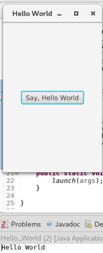
- JavaFX is designed to provide applications with such sophisticated GUI features as smooth animation, web views, audio and video playback, and styles based on Cascading Style Sheets (CSS).
- For more than 10 years, application developers have found Swing to be a highly effective toolkit for building graphical user interfaces (GUIs) and adding interactivity to Java applications. However, some of today's most popular GUI features cannot be easily implemented by using Swing. These features and others described in the following sections can help application developers to meet the full range of modern requirements.
Using FXML
FXML is an XML-based markup language that enables developers to create a user interface (UI) in a JavaFX application separately from implementing the application logic.
Swing has never offered a declarative approach to building a user interface. The declarative method for creating a UI is particularly suitable for the scene graph, because the scene graph is more transparent in FXML.
Using FXML enables developers to more easily maintain complex user interfaces.
Simple Example of FXML
The easiest way to show the advantages of FXML is with an example. Take a look at Figure 1which shows a user interface that includes a border pane layout that has a top and center region, each of which contains a label.
Figure 1 Border Pane Simple Example
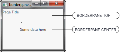
Description of "Figure 1 Border Pane Simple Example"
First, look at how the user interface is constructed and built directly in the source code, as shown in Example 1.
Example 1 Java Code for a User Interface
BorderPane border = new BorderPane();
Label toppanetext = new Label("Page Title");
Border.setTop(toppanetext);
Label centerpanetext = new Label ("Some data here");
Border.setCenter(centerpanetext);
Next, look at Example 2, which shows the same user interface, but in FXML markup. You can see the hierarchical structure of the user interface, which in turn makes it easier to add components and build upon the user interface.
Example 2 FXML Markup for a User Interface
<BorderPane>
<top>
<Label text="Page Title"/>
</top>
<center>
<Label text="Some data here"/>
</center>
</BorderPane>
JavaFX Scene Builder
To help developers build the layout of their applications, JavaFX provides a design tool called the JavaFX Scene Builder. You drag and drop UI components to a JavaFX Content pane, and the tool generates the FXML code that can be used in an IDE such as NetBeans or Eclipse.
CSS Support
Cascading style sheets contain style definitions that control the look of UI elements. The usage of CSS in JavaFX applications is similar to the usage of CSS in HTML. With CSS, you can easily customize and develop themes for JavaFX controls and scene graph objects.
Using CSS as opposed to setting inline styles enables you to separate the logic of the application from setting its visual appearance. Using CSS also simplifies further maintenance of how your application looks and provides some performance benefits.
For more information about CSS, see Skinning JavaFX Applications with CSS and JavaFX CSS Reference Guide.
This topic describes how to use cascading style sheets (CSS) with JavaFX and create a custom look for your application.
Style sheets contain style definitions that control the look of user interface elements. Using CSS in JavaFX applications is similar to using CSS in HTML. JavaFX CSS are based on the W3C CSS version 2.1 specification (avaiLabel at http://www.w3.org/TR/CSS21/) with some additions from current work on version 3 of the specification and some extensions that support specific JavaFX features.
Skinning your UI with JavaFX CSS enables you to change the UI shown in Figure Style 1 to the UI shown in Figure Style 2 just by changing the style sheet used.
Figure Style 1
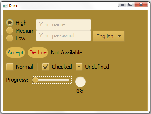
Description of "Figure Style 1"
Figure Style 2
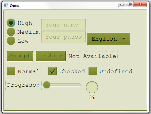
Description of "Figure Style 2"
Default Style Sheet
The default style sheet for JavaFX applications is modena.css, which is found in the JavaFX runtime JAR file, jfxrt.jar. This style sheet defines styles for the root node and the UI controls. To view this file, go to the \jre\lib\ext directory under the directory in which the Java Development Kit (JDK) is installed. Use the following command to extract the style sheet from the JAR file:
Jar xf jfxrt.jar com/sun/javafx/scene/control/skin/modena/modena.css
Figure style 3 shows what the sample UI looks like with the default style sheet.
Figure style 3 Default Style
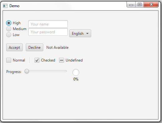
JavaFX Media Support
With the media support provided by the JavaFX platform, you can leverage your desktop application by adding media functionality such as playback of audio and video files. Media functionality is available on all platforms where JavaFX is supported.
Animation
Animation brings dynamics and a modern look to the interface of your applications. Animating objects in a Swing application is possible but is not straightforward.
In the Swing rendering model, painting happens on a double buffer. All alterations of object properties and positions with time are rendered on a double buffer. Only when the painting is completed, is the final result actually painted onto the screen. To show time-based alterations of objects requires significant efforts from a developer using Swing.
In contrast, JavaFX enables developers to animate graphical objects in their applications more easily because of the scene graph underlying the platform and the particular APIs that are specifically created for that purpose.
HTML Content
For a long time, Swing developers have wanted the ability to render HTML content in Java applications. JavaFX brought this feature to life by providing a user interface component that has web view and full browsing functionality.
This guide provides information on how to download and install JavaFX Scene Builder 2.0 on a Windows, Linux, or Mac OS X system. Download information for the JavaFX Scene Builder samples is also included.
JavaFX Scene Builder is a design tool that enables you to drag and drop graphical user interface (GUI) components onto a JavaFX scene.
It can help you to quickly prototype interactive applications that connect GUI components to the application logic. It automatically generates the FXML source code as you define the GUI layout for your application.
How to Install JavaFX Scene Builder 2.0 in Netbeans IDE 8.2
The JavaFX Scene Builder is available as a Windows package (.msi) for the Windows platform, as a Debian package (.deb) or .tar.gz file for the Linux platform, and as a disk image (.dmg) for the Mac OS X platform.
We show you how to install JavaFX Scene Builder 2.0 and integrate JavaFX Scene Builder on NetBeans 8.2.
System Requirements
- Download JDK 8 and install it to successfully
- Download and install the NetBeans IDE 8.2 software to successfully complete (https://netbeans.org/downloads/8.2/rc/)
- Download JavaFX Scene Builder
2.0 (https://www.oracle.com/java/technologies/javafxscenebuilder-1x-archive-downloads.html
To install:
- Download JavaFX Scene Builder from the Additional Resources section of the Java SE Downloads page
At http://www.oracle.com/technetwork/java/javase/downloads/index.html
2. In the JavaFX Scene Builder 2.0 section, accept the license agreement, if you agree to its terms.
3. Click the link for your operating system and follow the prompts to save the installer file.
4. Use the following information to install in your specific platform.
(Windows platform) Run the javafx_scenebuilder-2_0-windows.msi installer file. Respond to the prompts as indicated in the installation wizard.
By default, the JavaFX Scene Builder software is installed at
C:\Program Files\Oracle\JavaFX Scene Builder 2.0 on a Windows platform. If you install JavaFX Scene Builder on a 64-bit Windows machine, the default installation location is C:\Program Files (x86)\Oracle\JavaFX Scene Builder 2.0.
(Linux platform) Extract the Scene Builder 2.0 files from the javafx_scenebuilder-2_0-linux-<platform>.tar.gz to a directory on your local file system, or double-click the javafx_scenebuilder-2_0-linux-<platform>.deb file to open it with Ubuntu Software Center, where <platform> is either x64 or i586. By default, the Scene Builder application is installed at /opt/JavaFXSceneBuilder2.0/.
(Mac OS X platform) Open the
javafx_scenebuilder-2_0-macosx-universal.dmg file and drag the JavaFX Scene Builder 2.0.app application into the Applications folder.
Install JavaFX Scene Builder 2.0 on Windows
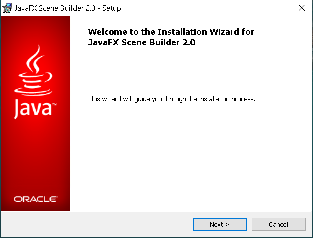
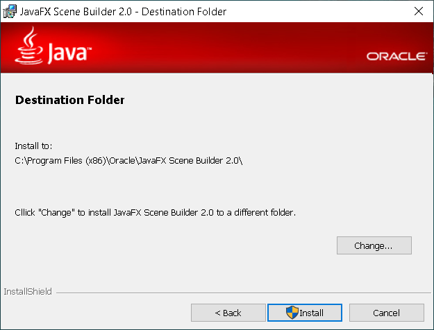
Install NetBeans 8.2 on Windows




Integrate JavaFX Scene Builder on NetBeans 8.2
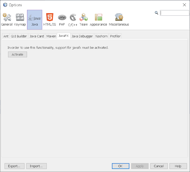
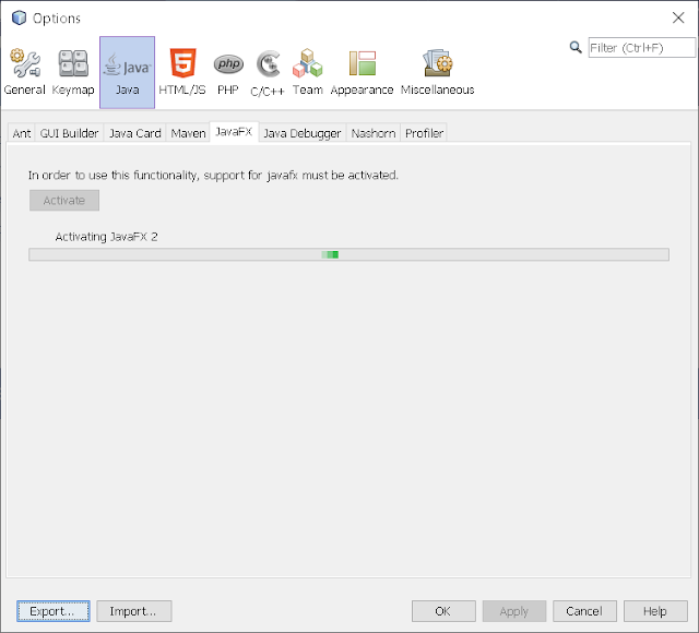
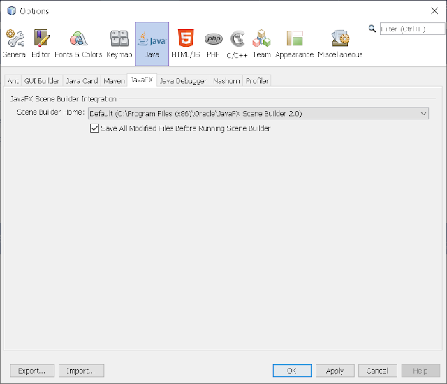
To Finish, press OK!
To get started with Scene Builder, read through the following documentation:
JavaFX Scene Builder Overview - A high level overview of the JavaFX Scene Builder 2.0 tool
JavaFX Scene Builder User Guide - An introduction to the user interface and features of JavaFX Scene Builder 2.0
Getting Started with JavaFX Scene Builder - A step-by-step tutorial for creating the FXML file that defines the user interface of a simple issue tracking application
Using JavaFX Scene Builder with Java IDEs - A tutorial that gives information about how to configure the NetBeans, Eclipse, or IntelliJ IDEs to use with Scene Builder.
Download the JavaFX Scene Builder samples to see some applications you can build using the Scene Builder tool.
- Go to the Additional Resources section of the download page at http://www.oracle.com/technetwork/java/javase/downloads/index.html
- Locate the JavaFX Scene Builder section, click the Samples link, and follow the prompts to save the javafx_scenebuilder_samples-2_0.zip file to your local file system.
- Extract the sample files from the zip file to a directory on your local file system.
Each sample is a NetBeans project and also includes at least one JavaFX layout stored as an FXML file. The <sample>.fxml file can be loaded and edited using the JavaFX Scene Builder.
To run the samples, you must have the JDK 8 software. Since the samples include the corresponding NetBeans projects files, using the NetBeans IDE is the simplest way to run the sample applications. However, you can also run them using the Ant utility, Eclipse, or IntelliJ IDEA. See below for more information.
Using NetBeans IDE
Use NetBeans 8 or later to run the JavaFX Scene Builder 8.0 samples.
- Go to the javafx_scenebuilder_samples-2_0-install directory in which you extracted the sample files.
- Run a sample by opening the project in the NetBeans IDE, compiling it, and then running it. For example, to run the Login application, open the Login project in NetBeans IDE, right-click the project node in the Projects window, and select Run.
Source code for each sample is in the src folder for each NetBeans project.
Using Eclipse or IntelliJ IDEA
See Using JavaFX Scene Builder with Java IDEs for information on how to run the samples in either the Eclipse or IntelliJ IDEA environment.
Using the Ant Utility
If you choose not to run the samples in NetBeans or any other IDE, you can use the Apache Ant utility (version 1.8 or later) to build and run the sample application on the command line. Enter a command similar to that in Example 1-1. Note that the examples shown use JDK 8.
Example 1-1 Ant Command to Run the Sample Application
Ant -f<JavaFX _Sample_App_Name>/build.Xml<TARGET>
The main values for <TARGET> are clean, jar, and run. You can set <TARGET> with the value of -projecthelp to get a list of avaiLabel targets. For example, to run the Login application on the Windows or Mac OS platform, type something similar to that in Example 1-2.
Example 1-2 Using Ant to Run the Login Sample
Ant -f Login/build.Xml run
Uninstalling JavaFX Scene Builder
To uninstall JavaFX Scene Builder, use the standard uninstall process for your operating system.
References:
1. Programming in Java. Second Edition. Oxford Higher Education. (Sachin Malhotra/Saura V Choudhary)
2. CORE JAVA For Beginners. (Rashmi Kanta Das), Vikas Publication
3. JAVA Complete Reference (9th Edition) HerbaitSchelidt.