Unit - 3
Understanding the Interaction
Interaction
Interaction models help us to understand what is going on in the interaction between user and system. They address the translations between what the user wants and what the system does.
It is the communication between user and system.
Models of interaction
Interaction involves minimum two participants: the user and the system.
Both are complex and different from each other and they communicate and view the domain and the task.
The interface must effectively translate between them to allow the interaction between them to be successful. This translation can fail at many points and for many reasons.
The use of models of interaction can help us to understand exactly what is happening in the interaction and identify the difficulties.
They also provide with a framework to compare different interaction styles and to consider interaction problems.
By Norman’s execution–evaluation cycle, the interaction in terms of the goals and actions of the user is briefly discussed .
The terms of interaction
The purpose of an interactive system is to aid a user in accomplishing goals from some application domain. A domain is an area of expertise in real-world activity. For example: graphic design, authoring , process control in a factory etc.
A domain comprises of important concepts. In a graphic design domain, the important concepts are geometric shapes, a drawing surface, a drawing utensil and so on.
Tasks are operations that manipulate the concepts of a domain.
A goal is the required output from a performed task. An intention is a specific action required to meet the goal.
Task analysis involves the identification of the problem space.
The System and User are individually described by means of a language that can express concepts relevant in the domain of the application.
The System’s language is referred to the core language and the User’s language is referred to the task language. The core language describes computational attributes whereas the task language describes psychological attributes.
The system is assumed to be a computerized application but the models apply equally to non-computer applications too. It is also an assumption that by distinguishing between user and system we are restricted to single-user applications.
The emphasis is on single user’s perspective. From this point of view, other users, such as those in a multi-party conferencing system, form part of the system.
The execution–evaluation cycle
The interactive cycle is divided into two major phases: execution and evaluation.
These can be further divided into seven stages. They are as follows:
1. Establishing the goal.
2. Forming the intention.
3. Specifying the action sequence.
4. Executing the action.
5. Perceiving the system state.
6. Interpreting the system state.
7. Evaluating the system state with respect to the goals and intentions.

The interaction framework
The interaction framework attempts a more realistic description of interaction by including the system explicitly, and breaks it into four main components, as shown in Figure.
The nodes represent the four major components in an interactive system – the System, the User, the Input and the Output.
Each component has its own language.
In addition to the User’s task language and the System’s core language, there are languages for both the Input and Output components.
Input and Output together form the Interface.
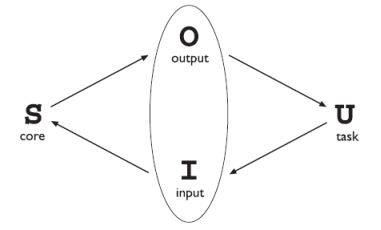
Fig. 1: The general interaction framework (ref 1)
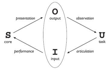
Fig. 2: Translations among components (ref 1)
Assessing overall interaction
The interaction framework is present to judge the overall usability of an entire interactive system.
But, all of the analysis is dependent on the current task in which the User is engaged.
This is not surprising since it is only in attempting to perform a particular task within some domain that we are able to determine if the tools we use are adequate.
- Ergonomics (or human factors) is the study of the physical characteristics of the interaction. The controls are designed in which the interaction takes place.
- A primary focus is on user performance, interface enhancement etc. It certainly touches upon human psychology and system constraints.
- It is a large and established field, which is closely related to HCI.
Arrangement of controls and displays
- In addition to these cognitive aspects of design, physical aspects are also important.
- Sets of controls and parts of the display are grouped logically that allow rapid access by the user. It becomes important when safety-critical applications are concerned such as plant control, aviation and air traffic control.
- Here, users are under pressure and face huge range of displays and controls. It is crucial that the physical layout of these should be appropriate. Indeed, returning to the less critical PC application, inappropriate placement of controls and displays can lead to inefficiency and frustration.
- The possible organizations include the following controls:
functional controls are organized so that whosoever are functionally related are placed together.
sequential controls reflect the order of their use in a typical interaction .
frequency controls are organized as per how frequently they are used, with the most commonly used controls being the most easily accessible.
Health issues
Factors that directly affect the quality of the interaction and the user’s performance are:
Physical position
Here, users are not expected to stand for long periods and for sitting back support should be provided. For a particular position of the body support is needed to allow rest.
Temperature
Slight changes in temperature affect the performance and health. Experiments show that performance deteriorates at high or low temperatures, as users are unable to concentrate efficiently.
Lighting
It depends on the work environment. However, adequate lighting is needed to allow users to see the computer screen without discomfort or eyestrain. The light source should also be positioned to avoid glare.
Noise
Excessive noise can be harmful to health, causing the user pain or loss of hearing. Noise levels should be maintained in the work environment. Noise can be a stimulus to users that can provide needed confirmation of system activity.
Time
The time users spend using the system can be controlled. The excessive use of CRT displays can be harmful to users, especially pregnant women.
The use of color
- Colors used in the display should be as distinct as possible and is not affected by changes in contrast. It is not used to display critical information. If color is used as an indicator it should not be the only cue: additional coding information should be included.
- The colors correspond to common conventions and user expectations. Red, green and yellow are colors that are frequently associated with stop, go and standby respectively. Therefore, red is used to indicate emergency and alarms; green for normal activity and yellow for standby and auxiliary function. These conventions should not be violated.
- Interaction can be seen as a dialog between the computer and the user. The choice of interface style can have a profound effect on the nature of this dialog.
- There are a number of common interface styles including:
Command line interface
• It was the first interactive dialog style that was commonly used and the availability of menu-driven interfaces, it is still widely used.
• It provides a means of expressing instructions to the computer directly, using function keys, single characters, abbreviations or whole-word commands Command line interfaces are powerful in that they offer direct access to system functionality (as opposed to the hierarchical nature of menus), and can be combined to apply a number of tools to the same data.
Menus
• In a menu-driven interface, the set of options available to the user is displayed on the screen, and selected using the mouse, or numeric or alphabetic keys. Since the options are visible they are less demanding of the user, relying on recognition rather than recall.
Natural language
• The means of communicating with computers is by natural language. Natural language is the understanding of both speech and written input and is the subject of much interest and research.
• The ambiguity makes it very difficult for a machine to understand. Language is ambiguous at various levels. The use of natural language in restricted domains is relatively successful.
• Language is vague and imprecise. This gives it its flexibility and allows creativity in expression. Whereas Computers require precise instructions.
Question/answer and query dialog
• It is a simple mechanism for providing input to an application in a specific domain. The user is asked a series of questions in the form of yes/no, multiple choice, or codes and hence led through the interaction step by step. For example: web questionnaires.
• These interfaces are easy to learn and use, but are limited in functionality and power. As such, they are appropriate for restricted domains (particularly information systems) and for novice or casual users.
Form-fills and spreadsheets
• Form-filling interfaces are used for data entry but can also be useful in data retrieval applications. The user is presented with a display resembling a paper form, with slots to fill in. Normally, the form display is based upon an actual form with which the user is familiar, which makes the interface easier to use.
• The user works through the form, filling in appropriate values. The data are then entered into the application in the correct place. Most form-filling interfaces allow easy movement around the form and allow some fields to be left blank. Spreadsheets are a sophisticated variation of form filling.
• WIMP stands for windows, icons, menus and pointers and is the default interface style for the majority of interactive computer systems.
• For example: Microsoft Windows for IBM PC compatibles, Mac OS for Apple Macintosh compatibles and various X Windows-based systems for UNIX.
Point and click
• It is closely related to the WIMP style.
• It clearly overlaps in the use of buttons.
• However, it is closely tied to ideas of hypertext. In addition, it is not tied to mouse-based interfaces, and is also extensively used in touch screen information systems. In this case, it is often combined with a menu-driven interface.
• It is made popular by world wide web pages,
3 Three-dimensional interfaces.
• There is an increase in use of three-dimensional effects in user interfaces.
• The most obvious example is virtual reality, but VR is only part of a range of 3D techniques available to the interface designer.
• A more complex technique uses interfaces with 3D workspaces. The objects displayed in such systems are usually flat, but are displayed in perspective when they are at an angle to the viewer and shrink when they are ‘far away’.
4 THE WIMP INTERFACE
The interaction objects and techniques that are commonly used in WIMP interfaces are buttons, toolbars, palettes and dialog boxes. Most of these elements can be seen in Figure below.
5 Windows
• A window comprises of text or graphics and can be moved or resized. More than one window can be present on a screen at once which allows separate tasks to be visible at the same time. Users can attend to the different windows as they switch from window to another.
• If one window overlaps the other, the back window is partially obscured, and then refreshed when exposed again. Overlapping windows cause’s problems by obscuring vital information, so windows can be tiled when they adjoin but do not overlap each other. Alternatively, windows may be placed in a cascading fashion too.
• Scrollbars are attachment that allows the user to move the contents of the window up and down, or from one side to the other.
• Some systems allow windows within windows. For example, in Microsoft Office applications, such as Excel and Word, each application has its own window and then within this each document has a window.
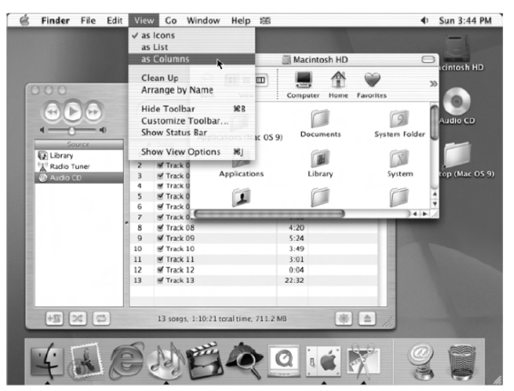
Fig. 3: Elements of WIMP (ref 1)
6 Icons
• A small picture is used to represent a closed window and is known as an icon.
• Many windows are available on the screen by allowing icons at the same time and expand to their full size by clicking on the icon.
• Shrinking a window to its icon is known as iconifying the window.
• When a user does not want to follow a particular thread of dialog, the suspention of that dialog is done by iconifying the window containing the dialog.
• The icon saves space on the screen and serves as a reminder to the user that the dialog can be resumed by opening up the window.
• Icons also represent other aspects of the system, such as a recycle bin for throwing unwanted files, or various disks, programs or functions that are accessible to the user.
• Icons can take many forms like realistic representations of the objects that they stand for, or highly stylized.
• They are arbitrary symbols that are difficult for users to interpret.
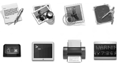
Fig. 4: Icons (ref 1)
7 Pointers
• It is an important component of the WIMP interface, as WIMP relies on pointing and selecting things such as icons.
• The mouse, joysticks and trackballs are an input device capable of such tasks.
• The different shapes of cursor are often used to distinguish modes
• Cursors are used to tell the user about system activity.
• Pointer cursors are like icons, being small bitmap images, but in addition all cursors have a hot-spot, the location to which they point.
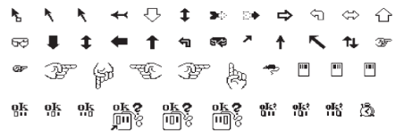
Fig. 5: Pointers (ref 1)
8 Menus
• Menu provides a choice of operations or services that can be performed by the system at a given time.
• Menus gives information cues in the form of an ordered list of operations that can be scanned. This implies that the names used for the commands should be meaningful and informative.
• They are inefficient when they have too many items and hence cascading menus are utilized, where item selection opens up another menu adjacent to the item, allowing refinement of the selection.
• Several layers of cascading menus can be used.
• The main menu is visible to the user all the time, as a menu bar and submenus can be pulled down upon request.
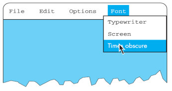
Fig. 6: Pull down menu (ref 1)
9 Buttons
• They are individual isolated regions within a display that can be selected by the user to start specific operations. Theyare referred to as buttons because they are purposely made to resemble like the push buttons that we can find on a control panel.
• ‘Pushing’ the button initiates a command. They are used to toggle between two states, displaying status information .
• Collection of buttons is referred to as check boxes.
10 Toolbars
• Many systems have a collection of small buttons that are placed at the top or side of the window offering commonly used functions.
• The function of the toolbar is similar to a menu bar. Here, the icons are smaller than the equivalent text therefore more functions can be displayed simultaneously.
• Sometimes the content of the toolbar is fixed, but users can customize it.
11 Palettes
• It is a mechanism for making the set of possible modes.
• A palette is usually a collection of icons that are reminiscent of the purpose of the various modes.
• An example in a drawing package would be a collection of icons to indicate the pixel color or pattern that is used to fill in objects, in the same way like an artist’s palette for paint.
• Some systems allow the user to create palettes from menus or toolbars.
12 Dialog boxes
• They are information windows used by the system to bring the user’s attention to some important information, possibly an error or a warning .
• They are used to invoke a sub dialog between user and system for a very specific task that will normally be embedded within some larger task.
• When the user or system wants to save the file, a dialog box can be used to allow the user to name the file and indicate where it is to be located within the filing system.
• When the save sub dialog is complete, the dialog box will disappear.
- It is the defining feature of an interactive system. It is observed in many areas of HCI.
- Speech-based input is difficult, speech-based interaction is easier.
- The most exciting developments are where users can interact with a visualization in real time, changing parameters and seeing the effect.
- Interactivity is also crucial in determining the ‘feel’ of a WIMP environment.
- All WIMP systems have virtually the same elements: windows, icons, menus, pointers, dialog boxes, buttons, etc.
- However, the precise behavior of these elements differs both within a single environment and between environments.
- Interactivity is also critical in dealing with errors.
- Making sure that the user or the system is able to tell when errors have occurred. If users can detect these errors then only they can correct them.
- So, even if errors occur, the interaction as a whole succeeds. This ability to detect and correct is important both at the small scale and at the large scale.
The physical factors in the environment directly affect the quality of the interaction.
This is part of the context where the interaction takes place. But here a single user operates a single, complex machine.
In reality, users work within a wider social and organizational context. This provides the wider context for the interaction and influence the activity and motivation of the user.
The social and organizational factors influence may have on the user’s interaction with the system. These may not be factors over which the designer has control.
However, it is important to be aware so as to understand the user and the work domain.
Full privacy is important to allow users to experiment.
To perform well, the users must be motivated. There are a number of possible ways of motivation, which includes fear, allegiance, ambition and self-satisfaction.
The last of these is influenced by the user’s perception of the quality of the work done, which leads to job satisfaction.
If a system makes it difficult for the user to perform necessary tasks, then consequently performance will be reduced.
The user may also lose motivation if a system is introduced that does not match the actual requirements of the job to be done.
The system introduced may impose a way of working which is unsatisfactory to the users. If this happens there will be three results: the system will be rejected, the users will be resentful and unmotivated, or the user will adapt the intended interaction as per his own requirements which indicate the importance of involving actual users in the design process.
The introduction of new technology can be a motivation to users, particularly if it is well designed and integrated with the user’s current work.
Providing feedback is an important source of motivation for users. If no feedback is given during a session, the user may become bored, unmotivated or, worse, unsure of whether the actions performed have been successful.
Similarly, if a system delay occur, feedback can be used to prevent frustration on the part of the user and the user becomes aware of what is happening and is not simply wondering whether the system is still working or not.
Experience is a difficult thing to pin down and we understand the idea of a good experience, but how to define it.
Extreme experiences such as climbing a rock face to understand that feeling of total engagement that can sometimes happen.
This is called the flow and it is perhaps related to as being ‘in the zone’. This sense of flow occurs when there is a balance between anxiety and boredom.
Doing something we know is not engaging. It happens automatically while thinking of something else.
Alternatively, doing something completely outside our abilities can make us anxious and afraid.
Flow comes when we are teetering at the edge of our abilities, stretching ourself to or a little beyond our limits.
For example: When two people at a party pull the cracker, it bursts apart with a small bang from the gunpowder and the contents spill out. On the other hand the virtual cracker does not attempt to fully replicate each aspect of the cracker, but instead seeks to reproduce the experience. For this, the original crackers experience was deconstructed and each aspect of the experience is produced in the new media.
Time sharing
• The concept of time sharing, in which a single computer could support multiple users.
• Time-sharing systems made programming a truly interactive venture and brought about a subculture of programmers known as ‘hackers’.
• They are single-minded masters who took pleasure in understanding complexity.
• With the advent of time sharing, real human–computer interaction was now possible .
Video display units
• The possibility of presenting and manipulating information from a computer in the form of images can be done on a video display unit (VDU).
• These display screens could provide a more suitable medium than a paper printout for presenting vast quantities of strategic information for rapid assimilation.
• The earliest applications of display screen images were developed in military applications.
Programming toolkits
• The secret to producing computing equipment that aided human problem solving ability was in providing the right toolkit.
• Programmers concentrated on developing the set of programming tools that they would require in order to build more complex interactive systems.
• The idea of building components of a computer system that will allow to rebuild a more complex system is called bootstrapping and has been used for computing.
• The power of programming toolkits is that they can be composed in fixed ways in order to create larger tools. Once they are understood, they can continue to be composed with other tools, and the process continues.
Personal computing
• The future of computing was embodied in small, powerful machines which were dedicated to single users, that is personal computers.
• The personal computing hardware was just becoming feasible.
• As technology progresses, it is now becoming more difficult to distinguish between what constitutes a personal computer, or workstation, and what constitutes a mainframe.
Window systems and the WIMP interface
• Interaction based on windows, icons, menus and pointers – the WIMP interface – is now common.
• But many of the interaction techniques underlying a windowing system were used in NLS and at Xerox PARC in the experimental precursor.
The metaphor
• They are used to describe the functionality of many interaction widgets, such as windows, menus, buttons and palettes. Tremendous commercial successes in computing have arisen directly from a judicious choice of metaphor.
• The danger of a metaphor is usually realized after the initial honey moon period.
Direct manipulation
• The following features of a direct manipulation interface:
visibility of the objects of interest
incremental action at the interface with rapid feedback on all actions
reversibility of all actions, so that users are encouraged to explore without severe penalties
syntactic correctness of all actions, so that every user action is a legal operation
replacement of complex command languages with actions to manipulate directly the visible objects (and, hence, the name direct manipulation).
Language versus action
• Actions performed at the interface replace any need to understand their meaning at system level.
• The user gives the interface instructions and it is then the responsibility of the interface to see that those instructions are carried out.
• The user–system communicates by means of indirect language instead of direct actions.
Hypertext
• A traditional paper is read from beginning to end, in a linear fashion. But within that text, there are often ideas or footnotes that urge the reader to digress into a richer topic.
• The linear format for information does not provide much support for this browsing task. The non-linear browsing structure in the actual documentation is preserved. Nelson coined the phrase hypertext in the mid-1960s to reflect this non-linear text structure.
• In order to reflect the use of such non-linear and associative linking schemes for more than just the storage and retrieval of textual information, the term hypermedia (or multimedia) is used for non-linear storage of all forms of electronic media.
Multi-modality
• A multi-modal interactive system is a system that relies on the use of multiple human communication channels. Each channel for the user is referred to as a modality of interaction.
• All interactive systems can be considered multi-modal, for humans have always used their visual and haptic (touch) channels in manipulating a computer. In fact, we often use our audio channel to hear whether the computer is actually running properly.
• However, genuine multi-modal systems rely to a greater extent on simultaneous use of multiple communication channels for both input and output.
References:
- Alan Dix (2008). Human Computer Interaction. Pearson Education. ISBN 978-81-317-1703-5.
- Gerard Jounghyun Kim (20 March 2015). Human–Computer Interaction: Fundamentals and Practice. CRC Press. ISBN 978-1-4822-3390-2.
- Ben Shneiderman; Catherine Plaisant; Maxine Cohen; Steven Jacobs (29 August 2013). Designing the User Interface: Strategies for Effective Human-Computer Interaction. Pearson Education Limited. ISBN 978-1-292-03701-1.
- Donald A. Norman (2013). The Design of Everyday Things Basic Books. ISBN 978-0-465-07299-6.