UNIT 4
HCI - DESIGN PROCESS
- Interaction design is an important component within the giant umbrella of user experience (UX) design.
- It is the design of the interaction between users and products.
- Most often when discussed about interaction design, the products tend to be software products like apps or websites.
The software design process can be divided into four key phases: user research, design, testing, and implementation. While the process does typically take place in that order, it’s important to note that it is an iterative process.
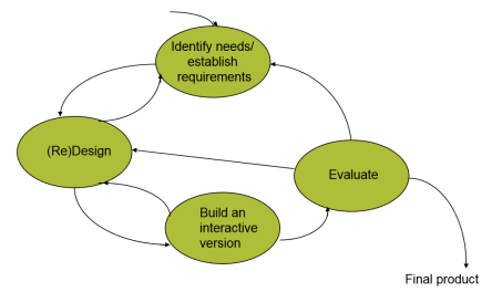
A process cannot guarantee that a development will involve users, it can development will involve users, it can encourage focus on such issues and provide opportunities for evaluation and provide opportunities for evaluation and user feedback
Specific usability and user experience goals should be identified, clearly goals should be identified, clearly documented, and agreed upon and the beginning of the project beginning of the project. They help designers choose between alternative designs and check on progress.
Iteration allows designs to be refined based on feedback. It is important useful if you are trying to innovate. Innovation rarely emerges to innovate. Innovation rarely emerges whole and ready to go. It takes time, evolution trial and error and patience evolution, trial and error, and patience.
Navigation design is the discipline of creating, analyzing and implementing ways for users to navigate through a website or app.
Navigation plays an integral role in how users interact with and use your products. It is how your user can get from point A to point B and even point C in the least frustrating way possible.
To make these delightful interactions, designers employ a combination of design patterns including links, labels and other UI elements. These patterns provide relevant information and make interacting with products easier.
Good navigation design can:
- Enhance a user’s understanding
- Give them confidence using your product
- Provide credibility to a product
It promotes usability. Poor navigation results in fewer users for your product and this is why navigation design is central to user experience design.
It is complex and there are many design patterns to choose from when optimizing the user experience. A design pattern is a general, reusable solution to a problem.
Common navigation design patterns
Hamburger menu
The hamburger menu is often found on mobile, although it is increasingly becoming popular with desktop. The hamburger menu icon is 3 lines and can be clicked or tapped to reveal more navigation options.
Tabs
Tabs are a popular navigation pattern and are commonly found on mobile devices. They’re can be found on the bottom or top of the screen. Because you can only fit so many tabs at the bottom of your screen, you’ll usually find the most important screens in a tabbed navigation.
Vertical navigation
Usually found on the left-hand side of screens, vertical navigation takes up generous screen space but displays a list of global navigation links and can include primary, secondary and tertiary navigation levels.
Call-to-action button
Call to action buttons are used to persuade, motivate and move your audience into an action whether it’s a sign up, a purchase or a download. They are usually given prime of place on websites and must be noticeable.
Breadcrumbs
Inspired by the story of Hansel and Gretel, breadcrumb navigation (or breadcrumb trail), is a secondary navigation system that shows the user where they are in the system.
Eight basic principles of screen design:
- The three questions all screens need to give an answer to
When we arrive at a new screen, we are looking for the answer to three questions:
- Where am I?
- What can I do here?
- How can I move forward?
2. The importance of visual hierarchy
- Visual hierarchy is one of the most important parameters in screen design. We can rank the elements of a given screen according to how bold they are, how emphasized, how easily we spot them.
- This is what we call visual hierarchy. The bold and highlighted elements are at the top of the hierarchy and the tiny stashed elements at the bottom.
- Visual hierarchy helps lead the eye. It determines what order we notice things. This is why it’s important to develop this hierarchy consciously.
3. The copy is part of the design
- Many designers think writing is not in their job description, but this could not be farther from the truth.
- Copywriting is part of design.
- Sketching the copy
- Microcopy – part of the screen design
4. Conventions are important, we should use them
- The web and the mobile world are the most recent achievements of humankind, but even during this short period of time, plenty of solutions were born which the majority of apps use in general.
Conventions for better user experience
- Conventions in screen design are like this: “logo goes in the upper left corner”, “links should be in blue”, the “links should be underlined”, etc.
Innovation versus convention
- People often ask if this contradicts innovation.
5. When designing for the mobile phone, we design for our hands, too
When designing for touch screens, the most important parameter is our own hand, with which we are using the product.
Can we safely tap on a button?
Can our finger reach the button? When designing for mobile, we cannot know how the users will hold the phone, so it is worth creating interfaces which can be used in the majority of cases.
6. Pay attention to the effective surface area ratio
The best user-friendly interfaces are simple and clear. Interfaces like these are easy to understand, people get familiar with them easily, they get used to using them, and feel joy when opening them the next time, too.
7. Aim at simplicity and transparency
This simplicity in screen design is not easy to reach, though. In a design project, new ideas and new information need to appear on the interface appear one after the other. It may be the case that the different departments of the company (or the different participants in the project) consider different things to be important to appear.
8. Be careful with animations and motion
- The first and most important rule: don’t use animations for just the sake of animations. People are wired to focus on moving objects.
- Animations can explain how your interface works. One of the well-known examples is how you minimize the window in your desktop operating system.
Sketches and Diagrams
Sketching is one of the earliest forms of prototyping you can use. It requires very little effort and does not necessarily rely on artistic levels of drawing skill to prove useful, and therein lies its value. Use sketches to illustrate your ideas and launch them into the real world — even the simplest and crudest of sketches can easily achieve that. Sketch simple illustrations of your concepts so that they don’t exist only in your mind, hence allowing you to share these with your team-mates.
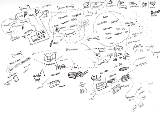
Paper Interfaces
Digital products like mobile apps, websites, and web services, as well as other screen-based products or experiences often require you to create a range of prototyping methods in the run up to the final design and development. Paper interfaces are handy at the early stages of prototyping for digital products. You can create paper interfaces by sketching them out, or by drawing and cutting out usable parts of a user interface (such as a text field or a dropdown menu, etc.).
Storyboards
Storyboarding, as a prototyping method, ensures that we know our users well enough (it would be hard to sketch a storyboard otherwise) and allows us to keep in mind the context of the solution we are designing. It is useful for developing an empathic understanding of users — and for generating high-level ideation and discussions. Storyboards, however, are not very useful for fine-tuning the details of products, because the drawings tend to be more macroscopic in nature.
Lego Prototypes
Lego is a staple of any kid's toy box. Its versatility and ability to spark imagination is what drives the company's success. As a designer, you can take advantage of Lego’s ubiquity and versatility to create quick and simple prototypes of your ideas. The best part of using Lego to build your prototypes is that they become easy to dismantle and tweak; simply detach a part of your Lego prototype, swap it with an alternative design, and play with it to see if it works.
Wire framing is a process where designers draw overviews of interactive products to establish the structure and flow of possible design solutions. These outlines reflect user and business needs. Paper or software-rendered wireframes help teams and stakeholders ideate toward optimal, user-focused prototypes and products.
Wireframes are basic visual guides in which designers propose elements for screens and web pages and show how experimental solutions would flow for target users. Wire framing is invaluable early in the interaction design process for design teams to explore how concepts accommodate user and business needs.
Good wire framing is the skill of creating realistic-looking, lean layouts so your team and stakeholders can quickly determine if concepts are worth developing. Wire framing is distinct from prototyping in the sense that prototyping deals more with testing interactivity and—when done at the highest level of fidelity—sophisticated versions that might closely resemble the released products. However, it’s similar in that you can also do wire framing by hand (e.g., using boxes and lines to represent pictures, text, etc.) or with software and make low- to high-fidelity versions. In low-fidelity wireframing, you use placeholders to mark content and pictures in grayscale. In high-fidelity wireframing, you introduce more realism, including pictures and perhaps even some interactivity. You can adapt well-crafted wireframes far more easily into prototypes for usability testing.
Software choices vary in price (some are free), options (e.g., click-through interactivity) and suitability (e.g., for mobile). When you do wire framing well, you can help safeguard yourself, your team and your brand against pursuing flawed solutions. Good wire framing can also support agile development as team members needn’t wait for sophisticated deliverables.
Wire framing is the Art of Efficiency
The aim is to communicate the structure of a possible solution so your team can identify solid user experience (UX) design foundations to build on and stakeholders can offer feedback on a visual item.
So, you should show what elements your users would expect to find and how these work in flow. To begin, you should:
- Focus on functionality, accessibility, layout and navigation to make a design easier to use, produce and sell – Leave nice-to-have features out.
- Structure a hierarchy with a list of prioritized elements for each page – Determine the information architecture early so you can categorize information clearly.
- Divide the screen into large blocks for content.
- Fine-tune these blocks with details – links, placeholders for images, etc.
- Maintain a clean grid-oriented view of all content – Apply best practice design principles to maximize ease of use.
- Use annotations to help others understand your wireframes faster.
- Put mobile first – When you start wireframing for the smallest screens, you can achieve better consistency across devices.
- With higher-fidelity wireframing, be more specific – Although you shouldn’t overdo content, still show what needs to appear and accurate sizes of fonts, icons, links, etc.
- Keep your wireframes concise – Don’t worry about finer details such as aesthetic appeal.
Interface Design defines how the system will interact with external entities (e.g., customers, users, other systems)
•System Interface sare machine-machine and are dealt with as part of systems integration
•User Interfaces are human-computer and are the focus of this chapter •Principles for UI design
•The UI design process
•Navigation, Input, Output Design
•Mobile & social media UI design
•Non-functional requirements and UI design
Principles of User Interface Design
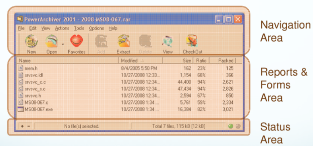
Layout of the screen, form or report
Content Awareness
Aesthetics
User Experience
Consistency refers to the similarity of presentation in different areas of the application
Minimal User Effort
Layout
The arrangement of items on the screen
Like items are grouped into areas
Areas can be further subdivided
Each area is self-contained
Areas should have a natural intuitive flow
Users from western nations tend to read from left to right and top to bottom
Users from other regions may have different flows
User Interface Design Process
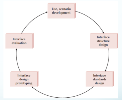
Interface Structure Design
The interface structure defines
The basic components of the interface
How they work together to provide functionality to users
Windows Navigation Diagrams (WND)
Similar to a behavioral state machine
Shows the relationship between all screens, forms, and reports used by the system
Shows how the user moves from one to another
Boxes represent components
Arrows represent transitions from and to a calling state
Stereotypes show interface type
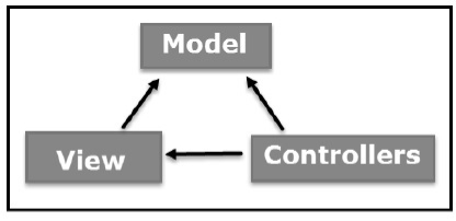
The Model-View-Controller (MVC) is an architectural pattern that separates an application into three main logical components: the model, the view, and the controller. Each of these components are built to handle specific development aspects of an application. MVC is one of the most frequently used industry-standard web development framework to create scalable and extensible projects.
MVC Components
Model
The Model component corresponds to all the data-related logic that the user works with. This can represent either the data that is being transferred between the View and Controller components or any other business logic-related data. For example, a Customer object will retrieve the customer information from the database, manipulate it and update it data back to the database or use it to render data.
View
The View component is used for all the UI logic of the application. For example, the Customer view will include all the UI components such as text boxes, dropdowns, etc. that the final user interacts with.
Controller
Controllers act as an interface between Model and View components to process all the business logic and incoming requests, manipulate data using the Model component and interact with the Views to render the final output. For example, the Customer controller will handle all the interactions and inputs from the Customer View and update the database using the Customer Model. The same controller will be used to view the Customer data.
ASP.NET MVC
ASP.NET supports three major development models: Web Pages, Web Forms and MVC (Model View Controller). ASP.NET MVC framework is a lightweight, highly testable presentation framework that is integrated with the existing ASP.NET features, such as master pages, authentication, etc. Within .NET, this framework is defined in the System.Web.Mvc assembly. The latest version of the MVC Framework is 5.0. We use Visual Studio to create ASP.NET MVC applications which can be added as a template in Visual Studio.
ASP.NET MVC Features
ASP.NET MVC provides the following features −
- Ideal for developing complex but lightweight applications.
- Provides an extensible and pluggable framework, which can be easily replaced and customized. For example, if you do not wish to use the in-built Razor or ASPX View Engine, then you can use any other third-party view engines or even customize the existing ones.
- Utilizes the component-based design of the application by logically dividing it into Model, View, and Controller components. This enables the developers to manage the complexity of large-scale projects and work on individual components.
- MVC structure enhances the test-driven development and testability of the application, since all the components can be designed interface-based and tested using mock objects. Hence, ASP.NET MVC Framework is ideal for projects with large team of web developers.
- Supports all the existing vast ASP.NET functionalities, such as Authorization and Authentication, Master Pages, Data Binding, User Controls, Memberships, ASP.NET Routing, etc.
- Does not use the concept of View State (which is present in ASP.NET). This helps in building applications, which are lightweight and gives full control to the developers.
Thus, you can consider MVC Framework as a major framework built on top of ASP.NET providing a large set of added functionality focusing on component-based development and testing.
References:
- Ben Shneiderman; Catherine Plaisant; Maxine Cohen; Steven Jacobs (29 August 2013). Designing the User Interface: Strategies for Effective Human-Computer Interaction. Pearson Education Limited. ISBN 978-1-292-03701-1.
- Donald A. Norman (2013). The Design of Everyday Things Basic Books. ISBN 978-0-465-07299-6.
- Jeff Johnson (17 December 2013). Designing with the Mind in Mind: Simple Guide to Understanding User Interface Design Guidelines. Elsevier. ISBN 978-0-12-411556-9.
- Alan Cooper; Robert Reimann; David Cronin; Christopher Noessel (13 August 2014). About Face: The Essentials of Interaction Design. Wiley. ISBN 978-1-118-76658-3.
- Alan Cooper (1 January 1999). The Inmates are running the Asylum, Sam’s. ISBN 978-0-672-31649-4.
- John M. Carroll (21 May 2003). HCI Models, Theories, and Frameworks: Toward a Multidisciplinary Science. Morgan Kaufmann. ISBN 978-0-08-049141-7.
- Alan Cooper, Robert Reimann, David Cronin, Christopher Noessel, About Face: The Essentials of Interface Design, Wiley India, ISBN : 9788126559718,4th Ed
- Rogers, Sharp, Preece, Interaction Design: Beyond Human Computer Interaction, Wiley India, ISBN: 9788126544912,3ed
- Wilbert O.Galitz, The Essential Guide to user Interface Design, Wiley India, ISBN: 9788126502806