UNIT 5
HCI - DESIGN RULES , GUIDELINES AND EVALUATION TECHNIQUES
Learnability: the ease with which new users can begin effective interaction and achieve maximal performance
Flexibility: the multiplicity of ways the user and system exchange information
Robustness: the level of support provided the user in determining successful achievement and assessment of goal-directed behaviour
Principles of learnability
Predictability
– determining effect of future actions based on past interaction history
– operation visibly
Synthesizability
– assessing the effect of past actions
– immediate vs. Eventual honesty
Familiarity
– how prior knowledge applies to new system
– guessability; affordance
Generalizability
– extending specific interaction knowledge to new situations
Consistency
– likeness in input/output behaviour arising from similar situations or task objectives
Principles of flexibility
Dialogue initiative
– freedom from system imposed constraints on input dialogue
– system vs. User pre-emptiveness
Multithreading
– ability of system to support user interaction for more than one task at a time
– concurrent vs. Interleaving; multimodal
Task migratability
– passing responsibility for task execution between user and system
Principles of robustness
Observability
– ability of user to evaluate the internal state of the system from its perceivable representation
– browsability; defaults; reachability; persistence; operation visibility
Recoverability
– ability of user to take corrective action once an error has been recognized
– reachability; forward/backward recovery; commensurate effort
Responsiveness
– how the user perceives the rate of communication with the system
– Stability
Task conformance
– degree to which system services support all of the user's tasks , task completeness; task adequacy
A standard typically includes one or more of the following kinds of information (usually for each recommendation):
- Rationale and principles. Why this recommendation is good design practice. Sometimes this includes the empirical human factors research on which the recommendation is based.
- Examples. How the recommendation might be implemented, sometimes in more than one way.
- Exceptions. Situations and conditions in which the recommendation might not apply.
- References. Sources of additional information about individual recommendations or about the topic of the standard as a whole.
Finally, some standards (particularly those of international, national, or military
- Strive for Consistency.
- Cater to Universal Usability.
- Offer Informative feedback.
- Design Dialogs to yield closure.
- Prevent Errors.
- Permit easy reversal of actions.
- Support internal locus of control.
- Reduce short term memory load.
To improve the usability of an application it is important to have a well designed interface. Shneiderman's "Eight Golden Rules of Interface Design" are a guide to good interaction design.
1 Strive for consistency.
Consistent sequences of actions should be required in similar situations; identical terminology should be used in prompts, menus, and help screens; and consistent commands should be employed throughout.
2 Enable frequent users to use shortcuts.
As the frequency of use increases, so do the user's desires to reduce the number of interactions and to increase the pace of interaction. Abbreviations, function keys, hidden commands, and macro facilities are very helpful to an expert user.
3 Offer informative feedback.
For every operator action, there should be some system feedback. For frequent and minor actions, the response can be modest, while for infrequent and major actions, the response should be more substantial.
4 Design dialog to yield closure.
Sequences of actions should be organized into groups with a beginning, middle, and end. The informative feedback at the completion of a group of actions gives the operators the satisfaction of accomplishment, a sense of relief, the signal to drop contingency plans and options from their minds, and an indication that the way is clear to prepare for the next group of actions.
5 Offer simple error handling.
As much as possible, design the system so the user cannot make a serious error. If an error is made, the system should be able to detect the error and offer simple, comprehensible mechanisms for handling the error.
6 Permit easy reversal of actions.
This feature relieves anxiety, since the user knows that errors can be undone; it thus encourages exploration of unfamiliar options. The units of reversibility may be a single action, a data entry, or a complete group of actions.
7 Support internal locus of control.
Experienced operators strongly desire the sense that they are in charge of the system and that the system responds to their actions. Design the system to make users the initiators of actions rather than the responders.
8 Reduce short-term memory load.
The limitation of human information processing in short-term memory requires that displays be kept simple, multiple page displays be consolidated, window-motion frequency be reduced, and sufficient training time be allotted for codes, mnemonics, and sequences of actions.
Maps and location based services are used in a whole range of different contexts. Whenever a person wants to do something, the action takes place in the current context. People rely on their abilities and experiences to handle different situations in the here and now. Mobile use contexts include situations where it is difficult to look at or attend to the screen, noisy environments like busy streets or railway stations and environments with external vibrations like public transport. To work in these kinds of environments an application cannot rely solely on screen based information – the visual design needs to be complemented by interaction using sounds, gestures and touch.
The HaptiMap project has performed basic research on how to design multimodal map and navigation interfaces, and results from this research has been tested in a set of applications developed within the project. To help other developers gain access to our results, we have encapsulated working designs as modules in the HaptiMap toolkit – a software package that is intended to make it easier for developers to include multimodal interaction in their applications – or to add more multimodality to existing products.
It provides an adaptable toolkit to aid developers in including accessibility functionality into cross-platform, multi-modal mobile applications which can avail of a range of sensors, display and audio characteristics or externally attached devices. This is compatible with the major mobile platforms; Android, iOs, Windows and Symbian. The toolkit offers different ways of accessibly perceiving geographic data while presenting an infrastructure for acquiring such data from multiple sources.
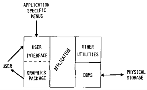
It is a mechanism for cleanly separating process or business logic from Graphical user interface (GUI) code in a computer program. It is designed to support N-tier architectures by strictly defining and enforcing the boundary between the business logic and the GUI.
A fairly rigid Software architecture is nearly always implied by the UIMS, and most often only one paradigm of separation is supported in a single UIMS. A UIMS may also have libraries and systems such as graphical tools for the creation of user interface resources or data stores.
Generally, multiple UIMS systems cannot be used at the same time, so choosing the correct model for your UIMS is a critical design decision in any project. The choice of system is dependent upon the system(s) you wish to create user interfaces for, and the general style of your application.
For example, if you want to create a web based front end, or just a standalone application or both that would be an important factor in choosing. If you want to deploy to the Macintosh, Windows and Linux, that would further influence your choice of a UIMS system.

Evaluation has three main goals:
–To assess the extent and accessibility of the system’s functionality
–To assess users’ experience of the interaction
–To assess users’ experience of the interaction
And to identify any specific problems with the system.
The system’s functionality is important must accord with the user’s requirements. –Evaluation at this level may measuring the user’s performance with the system to assess the effectiveness of the system in supporting the task.
•User’s experience of the interaction •User’s experience of the interaction –How easy the system is to learn, its usability and the user satisfaction with it. –It may include his enjoyment and emotional response, particularly in the case of aim to entertainment.
•Identify specific problem with the design –This may aspects of the design which, when used in their intended context, cause unexpected results, or confusion amongst user.
•We will consider evaluation techniques under two broad headings: expert analysis and user participation.
•Cognitive walkthrough –Originally proposed by Polson and colleagues as an attempt to introduce psychological theory into the informal and subjective walkthrough the informal and subjective walkthrough technique. –The main focus is to establish how easy a system is to learn (by hands on, not by training or user’s manual).
To do walkthrough, you need four things:
1.A specification or prototype of the system.
2.A description of the task the user is to perform on the system.
3.A complete, written list of the actions needed to complete the task with the proposed system. To complete the task with the proposed system.
4.An indication of who the users are and what kind of experience and knowledge the evaluators can assume about them.
The evaluation try to answer the following four questions:
1. Is the effect of the action the same as the user’s goal at that point?
2. Will users see that the action is available?
3. Once users have found the correct action, will. Once users have found the correct action, will they know it is the one they need?
4. After the action is taken, will users understand the feedback they get?
•Heuristic evaluation –
Heuristic is a guideline or general principle or rule of thumb that can guide a design decision or be used to critique a decision that has already been made. 3-5 evaluators is sufficient. –Severity rating on a scale of 0-4 (less-most) 0 = I don’t agree that this is a usability problem at all 1 = Cosmetic problem only: need not be fixed unless extra 1 = Cosmetic problem only: need not be fixed unless extra time is available on project 2= Minor usability problem: fixing this should be given low priority 3= Major usability problem: important to fix, so should be given high priority 4= Usability catastrophe: imperative to fix this before product can be released (Nielsen)
Nielsen’s ten heuristics are:
1.Visibility of system status
2.Match between system and the real world
3.User control and freedom
4.Consistency and standards
5.Error prevention 6.Recognition rather than recall
6.Recognition rather than recall
7.Flexibility an efficiency of use
8.Aesthetic and minimalist design
9.Help users recognize, diagnose and recover from errors
10.Help and documentation
•Model-based evaluation –
Dialog models can be used to evaluate dialog sequences for problems, ex. Unreachable states, circular dialogs and complexity.
•Using previous studies in evaluation •Using previous studies in evaluation –Ex. Usability of different menu types, the recall command names, and the choice of icons.
•Styles of evaluation –Laboratory studies; take part in controlled tests. –Field studies; into the user’s work environment in order to observe the system in action.
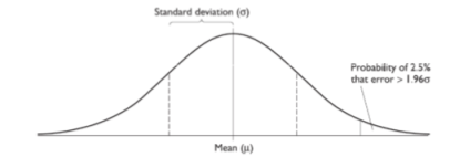
•Empirical methods: experimental evaluation –participants should be chosen to matchthe expected user population as closely as possible. And sample size must be large enough to be representative of the population.
•Empirical methods:
Hypothesisis the prediction of the outcome of an – Hypothesis is the prediction of the outcome of an experiment. •Stating that a variation in the independent variable will cause a difference in the dependent variable. •By disproving the null hypothesis, which states that there is no difference in the dependent variable between the levels of the independent variable.
•Empirical methods: experimental evaluation –
Experimental design •How many participants are available and are they representative of the user group? •Experimental method: –Between-subjects => participant is assigned to a different condition (experimental and control conditions)
•Empirical methods: experimental evaluation –Statistical measures => lookat the data (freak event) and save the data.

Factors distinguishing evaluation techniques –Design vs. Implementation
•The main distinction is in evaluation in implementation is a physical artifact exists, something concrete can be is a physical artifact exists, something concrete can be tested. –Laboratory vs. Field studies
•Field studies retain naturalness of the user’s environment but do not allow control over user activity.
•Ideally the design process should include both styles of the evaluation.
•Factors distinguishing evaluation techniques –Subjective vs. Objective
•Bias in subjective techniques should be recognized and avoided by using more than one evaluator.
•Objective techniques should produce repeatable results, which are not dependent on the persuasion of the particular evaluator. The particular evaluator. –Qualitative vs. Quantitative measures
•Quantitative measurement is usually numeric and can be easily analyzed using statistical techniques.
•Qualitative measurement is opposite, but can provide important detail that cannot be determined from.
Factors distinguishing evaluation techniques –Information provided •Low-level information (Ex. Which font is most readable) => an experiment can be designed to measure a particular aspect of the interface. •Higher-level information (Ex. Is the system usable?) => can be gathered using questionnaire and interview => can be gathered using questionnaire and interview techniques, which provide a more general impression of the user’s view of the system. –Immediacy of response.
•Factors distinguishing evaluation techniques –Intrusiveness •Most immediate evaluation techniques run the risk of influencing the way the user behaves. –Resource •Resources to consider include equipment, time money, participants, expertise of evaluator and context. Participants, expertise of evaluator and context. •Some decisions are forced by resource limitations. Ex. It is not possible to produce a video protocol without access to a video camera.
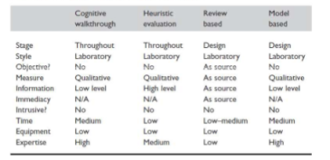
A classification of analytic evaluation techniques

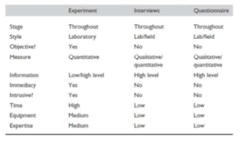
A classification of experimental and query evaluation techniques

References:
- Ben Shneiderman; Catherine Plaisant; Maxine Cohen; Steven Jacobs (29 August 2013). Designing the User Interface: Strategies for Effective Human-Computer Interaction. Pearson Education Limited. ISBN 978-1-292-03701-1.
- Donald A. Norman (2013). The Design of Everyday Things Basic Books. ISBN 978-0-465-07299-6.
- Jeff Johnson (17 December 2013). Designing with the Mind in Mind: Simple Guide to Understanding User Interface Design Guidelines. Elsevier. ISBN 978-0-12-411556-9.
- Alan Cooper; Robert Reimann; David Cronin; Christopher Noessel (13 August 2014). About Face: The Essentials of Interaction Design. Wiley. ISBN 978-1-118-76658-3.
- Alan Cooper (1 January 1999). The Inmates are running the Asylum, Sam’s. ISBN 978-0-672-31649-4.
- John M. Carroll (21 May 2003). HCI Models, Theories, and Frameworks: Toward a Multidisciplinary Science. Morgan Kaufmann. ISBN 978-0-08-049141-7.
- Alan Cooper, Robert Reimann, David Cronin, Christopher Noessel, About Face: The Essentials of Interface Design, Wiley India, ISBN : 9788126559718,4th Ed
- Rogers, Sharp, Preece, Interaction Design: Beyond Human Computer Interaction, Wiley India, ISBN: 9788126544912,3ed
- Wilbert O.Galitz, The Essential Guide to user Interface Design, Wiley India, ISBN: 9788126502806