UNIT 2
Data
Classification of data is the process of arranging the data into homogenous groups according to their common characteristics. Raw data cannot be easily understood and not fit for analysis and interpretation. Therefore arrangement of data helps the user in comparison and analysis.
Example- population of a state can be grouped according to sex, age, etc
Definition
“Classification is the process of arranging data into sequences according to their common characteristics or separating them into different related parts.” - Prof. Secrist
Objectives of data classification
- To consolidate the huge data in such a way that similarities and differences are easily understood.
- It helps in comparison and analysis of data
- Classification of data ensures prominent data are collected and optional data are separated
- To allow a statistical method of the material gathered.
- To study relationships
Types of classification
- Geographical classification – when the data classified according to the geographical location or regions (like states, cities, regions, zones, areas, etc). It is called geographical classification. It is also known as areal or spatial classification.
Ex- production of food grains are classified in different states in India
S.No | Name of states | Total food grains (000’ tones) |
1 | Andhra pradesh | 1093.00 |
2 | Bihar | 12899.09 |
3 | Karnataka | 1834.70 |
4 | Punjab | 41289.00 |
5 | Orissa | 3600 |
2. Chronological classification – classification of data on the basis of time (like months, years, etc) of their occurrence are called chronological classification. This type of classification is suitable for data which takes place in course of time such as population, production, sales, etc.
Ex – profit of a company from 2001 to 2005
S.No | Year | Profits (in 000 Rs) |
1 | 2001 | 77 |
2 | 2002 | 88 |
3 | 2003 | 89 |
4 | 2004 | 94 |
5 | 2005 | 99 |
3. Qualitative classification – under this classification, the data are classified on the basis of some attributes or quality such as sex, colour, literacy, honesty, intelligence, religion, etc. In this the attributes cannot be measured. This sort of classification is known as descriptive classification.
For example, Population can be divided on the basis of marital status as married or unmarried etc.
4. Quantitative classification – quantitative classification states that classification of data according to some characteristics that can be measured such as height, weight, income, sales, profit, etc.
Ex – students are classified according to weights
S.No | Weight | No. Of students |
1 | 30-40 | 77 |
2 | 40-50 | 60 |
3 | 50-60 | 50 |
4 | 60 - 70 | 20 |
5. Alphabetical classification – when data are arranged according to alphabetical order is called alphabetical classification
Ex – state wise classification of population in alphabetical order
S.No | Name of states | Population |
1 | Andhra Pradesh | 157 |
2 | Bihar | 150 |
3 | Karnataka | 200 |
4 | Punjab | 700 |
5 | Orissa | 450 |
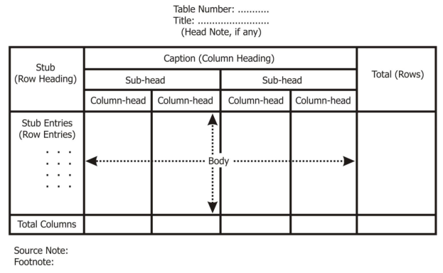
Tabulation is a systematic & logical presentation of numeric data in rows and columns, to facilitate comparison and statistical analysis. The method of placing organized data in tabular form is known as tabulation. Tabulation simplifies complex data and facilitates comparison.
Definition
“Table involves the orderly and systematic presentation of numerical data in a form designed to elucidate the problem under consideration” – According prof. L.R Connor
“Table in its broadest sense is an orderly arrangement of data in column and rows” – According to Prof M.M.Blaire
Objectives of tabulation
- It simplifies the raw data in meaningful form so that common man can easily understand in less time
- It brings essential facts in clear and precise manner
- Data presented in rows and columns helps in detailed comparison
- Tables serve as the best source of organized data for further statistical analysis
- Table saves the space without sacrificing the quality and quantity of data.
Parts of table
Table number |
|
Title of the table |
|
Caption |
|
Stub |
|
Body |
|
Head note |
|
Source note |
|
Footnote |
|

Types of tabulation
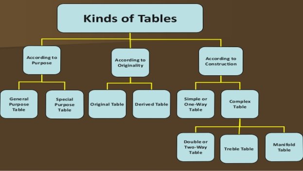
- According to purpose
- General purpose table – general purpose table is a table which is of general use. It does not serve any specific purpose under consideration
b. Special purpose table – special purpose table is prepared with some specific purpose in mind.
2. According to originality
- Original table – an original table is that table in which data are presented in the same manner in which they are collected.
b. Derived table – a derived table is that in which data is not presented in same manner in which they are collected. Here the data are first converted into ratio or percentage and then presented.
3. According to construction
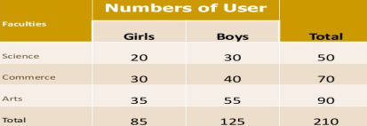
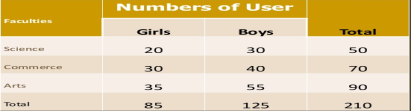
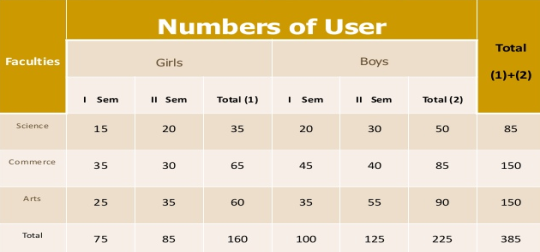
- Simple table – simple table also known as one way table. Under this data are presented based on one characteristics
Faculty wise library user
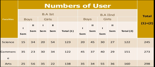
b. Complex tables – in complex table data are presented according to two or more characteristics simultaneously.
The complex tables are
- Two way,
- Three way table and
- Manifold table
Two way table – Under this the variable under study is divided into two characteristics
Three way table - Under this the variable under study is divided into three characteristics
Manifold table - Under this the variable under study is divided into large number of characteristics.
“The transformation of data through visual methods like graphs, diagrams, maps and charts is called representation of data”
Diagrams and graphs drawn on the basis of data collected then they will be easily understood and appreciated by all. It also saves time and energy.
Significance of diagrams and graphs
- They are attractive and impressive
- They make data simple and intelligible
- They make comparison possible
- They save time and labour
- They have universal utility
- They give more information
- They have great memorizing effect.
General guideline
Title |
|
Size |
|
Paper used |
|
Scale |
|
Index |
|
Footnote |
|
Selection of proper type of diagram |
|
Types of diagrams
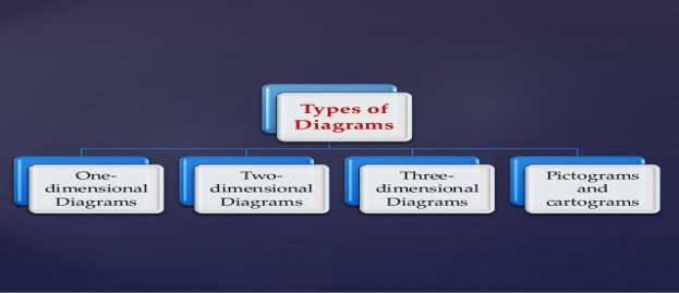
One dimensional diagram: In such diagrams only length is considered and width is not considered.
Following are the types of one dimensional diagram
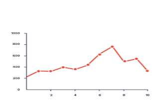
- Line diagram
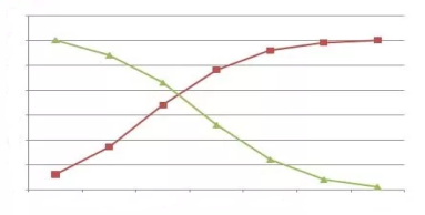
Line diagram are simple mathematical graph that are drawn by plotting the data connecting one variable on the horizontal X axis and other variable of data on the vertical Y axis.
2. Bar diagram
It is also called a columnar diagram. The bar diagrams are drawn through columns of equal width. The bar graphs data are represented in bars. The bars can be made in any direction (vertical or horizontal).
Bar diagrams are of four types
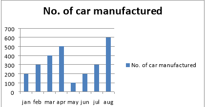
Simple bar diagram – a simple bar diagram is constructed for an immediate comparison. It represents only one classification of data.
Ex- number of car manufactured every month
Month | No. Of car manufactured |
Jan | 200 |
Feb | 300 |
Mar | 400 |
Apr | 500 |
May | 100 |
Jun | 200 |
Jul | 300 |
Aug | 600 |
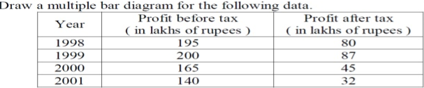
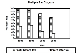
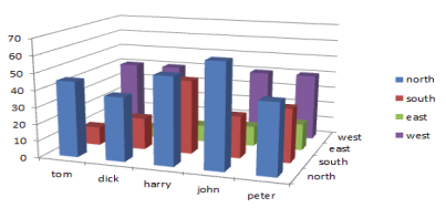
Multiple bar diagram – Multiple bar diagram is used for comparing two or more sets of statistical data. Bars are drawn side by side to represent the set of values for comparison. To distinguish, the bars are colored differently.
Ex –
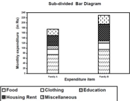
Sub divided bar diagram – the bar is subdivided into various parts in proportion to the values given in the data and the whole bar represents the total. It is also called as component bar diagram. The subdivisions are distinguished by different colour.
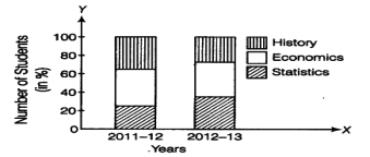
Percentage bar diagram – Like sub divided bar diagram, in this case also the data of one particular period is put on single bar in terms of percentage.
Two dimensional diagrams:
Two dimensional diagrams are those where the length as well as width of bar are considered in the construction of diagrams. These are called area or surface diagram.
Following are the types of two dimensional diagrams
Rectangle diagram – rectangular diagram is one where both length and width are considered while constructing it. The two sides represent two different characteristic of data
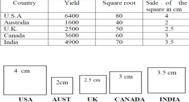
Square diagram – These areas should be proportional to the magnitudes of the data. For square diagrams, the square root of the given figures will give the measurement of the sides of the square.
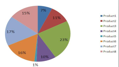
Pie diagram or circular diagram – under such diagrams the component parts and the totals are shown. The area of the circle is proportional to the square of its radius. Pie chart should be used on percentage basis and not on an absolute basis.
3. Three dimensional diagrams –
It consists of cubes, cylinders, spheres, etc. under three dimensional diagram, length, width and height are taken into consideration. They are also known as cubic diagram.
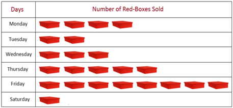
4. Pictogram diagram –
Pictogram is a technique of presenting data through appropriate pictures. It is also called as picture graph or pictograph
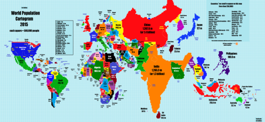
5. Cartogram –
Cartograms are used to represent data on geographical basis. These diagrams are effective when message is communicated to the common people. It is also called map diagram.
Ex – weather conditions in different states
Graph
A graph is a visual form of presentation of statistical data. A graph is more attractive than a table of figure. It helps the common man to understand more efficiently and effectively. It facilitates comparisons between two or more phenomena very easily.
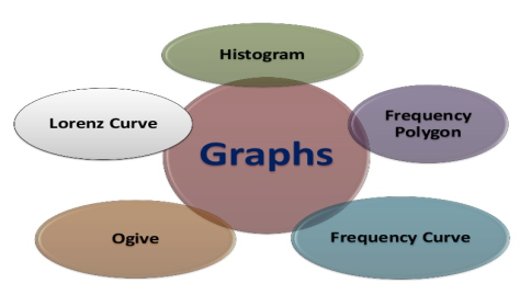
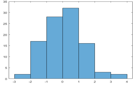
Histogram – histogram is a bar graph representing the frequency of occurrence by classes of data. In histogram data are plotted as a series of rectangle. ‘X axis’ consist of class intervals and ‘Y axis’ shows the frequencies. It is also called stair case or block diagram. Histogram is not suitable for open ended classes.
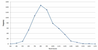
Frequency polygon –a frequency polygon is a graph where midpoints of each interval are joined by using lines. The heights of the points represent the frequencies. It is usually done by creating a histogram or by calculating the midpoints of each interval from the frequency distribution table.
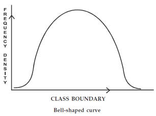
Frequency curve – a frequency curve is a smooth curve obtained by joining the midpoints of all rectangles forming histogram. It is drawn by using free hand. The curve should begin and end at the base line.
Ogive – An ogive graph shows cumulative frequency in statistics. It estimates the number of observation less than a given value or more than a given value. Cumulative frequency is obtained by adding to the given value
Less than ogive method - The frequencies of all preceding classes are added to the frequency of a class.
More than ogive class - The frequencies of the succeeding classes are added to the frequency of a class
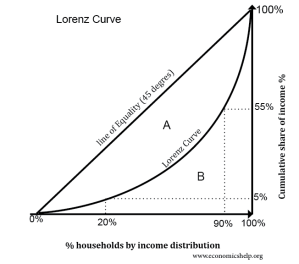
Lorenz curve – It is the graphical representation of income and wealth. It was developed by Max O. Lorenz in 1905. The Lorenz curve shows how wealth, revenue, land, etc are not equally distributed among the people.
Sources
- B.N Gupta – Statistics
- S.P Singh – statistics
- Gupta and Kapoor – Statistics
- Yule and Kendall – Statistics method


