Unit - 5
Big Data Analytics and Model Evaluation
For numeric results, K-Means clustering is one of the most commonly used prototype-based clustering algorithms. The centroid or mean of all the data points in a cluster is the prototype of a cluster in k-means. As a consequence, the algorithm works best with continuous numeric data. When dealing with data that includes categorical variables or a mixture of quantitative and categorical variables.
K-Means Clustering is an unsupervised learning approach used in machine learning and data science to solve clustering problems. K specifies the number of predefined clusters that must be produced during the process; for example, if K=2, two clusters will be created, and if K=3, three clusters will be created, and so on.
It allows us to cluster data into different groups and provides a simple technique to determine the categories of groups in an unlabeled dataset without any training.
It's a centroid-based approach, which means that each cluster has its own centroid. The main goal of this technique is to reduce the sum of distances between data points and the clusters that they belong to.
For numeric results, K-Means clustering is one of the most commonly used prototype-based clustering algorithms. The centroid or mean of all the data points in a cluster is the prototype of a cluster in k-means. As a consequence, the algorithm works best with continuous numeric data. When dealing with data that includes categorical variables or a mixture of quantitative and categorical variables.
The technique takes an unlabeled dataset as input, separates it into a k-number of clusters, and continues the procedure until no better clusters are found. In this algorithm, the value of k should be predetermined.
The k-means clustering algorithm primarily accomplishes two goals:
● Iteratively determines the optimal value for K centre points or centroids.
● Each data point is assigned to the k-center that is closest to it. A cluster is formed by data points that are close to a specific k-center.
As a result, each cluster contains datapoints with certain commonality and is isolated from the others.
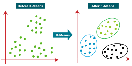
Fig 1: Working of the K-means Clustering Algorithm
Pseudo Algorithm
- Choose an appropriate value of K (number of clusters we want)
- Generate K random points as initial cluster centroids
- Until convergence (Algorithm converges when centroids remain the same between iterations):
● Assign each point to a cluster whose centroid is nearest to it ("Nearness" is measured as the Euclidean distance between two points)
● Calculate new values of centroids of each cluster as the mean of all points assigned to that cluster
K-Means as an optimization problem
Any learning algorithm has the aim of minimizing a cost function. We'll see how, by using centroid as a cluster prototype, we can minimize a cost function called "sum of squared error".

The sum of squared error is the square of all points' distances from their respective cluster prototypes.
We get by taking the partial derivative of the cost function with respect to and cluster prototype and equating it to 0.


Cluster centroids are thus the prototypes that minimize the cost function.
Key takeaway:
K-Means clustering is one of the most commonly used prototype-based clustering algorithms.
The algorithm works best with continuous numeric data.
When dealing with data that includes categorical variables or a mixture of quantitative and categorical variables.
K-Means is a more effective algorithm. Defining distances between each diamond takes longer than computing a mean.
Hierarchical clustering, also known as hierarchical cluster analysis or HCA, is another unsupervised machine learning approach for grouping unlabeled datasets into clusters.
The hierarchy of clusters is developed in the form of a tree in this technique, and this tree-shaped structure is known as the dendrogram.
Although the results of K-means clustering and hierarchical clustering may appear to be comparable at times, their methods differ. As opposed to the K-Means algorithm, there is no need to predetermine the number of clusters.
There are two ways to hierarchical clustering:
● Agglomerative - Agglomerative is a bottom-up strategy in which the algorithm begins by grouping all data points into single clusters and merging them until only one remains.
● Divisive - Because it is a top-down method, the divisive algorithm is the inverse of the agglomerative algorithm.
Why we need hierarchical clustering?
Why do we need hierarchical clustering when we already have alternative clustering methods like K-Means Clustering? So, as we've seen with K-means clustering, this algorithm has some limitations, such as a set number of clusters and a constant attempt to construct clusters of the same size. We can utilise the hierarchical clustering algorithm to tackle these two problems because we don't need to know the specified number of clusters in this algorithm.
Key takeaway
Clustering is the process of grouping data. Based on some similarity measure, the resulting groups should be such that data within the same group should be identical and data within different groups should be dissimilar.
K-Means clustering is one of the most commonly used prototype-based clustering algorithms. The algorithm works best with continuous numeric data.
When dealing with data that includes categorical variables or a mixture of quantitative and categorical variables.
K-Means is a more effective algorithm. Defining distances between each diamond takes longer than computing a mean.
A time series is a collection of observations of category or numerical variables that are linked together by a date or timestamp. The time series of a stock price is a good example of time series data. The basic structure of time series data is shown in the table below. The observations are recorded every hour in this scenario.
Timestamp | Stock - Price |
2015-10-11 09:00:00 | 100 |
2015-10-11 10:00:00 | 110 |
2015-10-11 11:00:00 | 105 |
2015-10-11 12:00:00 | 90 |
2015-10-11 13:00:00 | 120 |
Plotting the series is usually the initial stage in time series analysis, and this is usually done with a line chart.
The most typical use of time series analysis is to anticipate future values of a numeric value based on the data's temporal structure. This indicates that the current observations are utilised to forecast future values.
Traditional regression approaches are ineffective due to the data's temporal ordering. We need models that take into consideration the temporal ordering of the data in order to produce reliable forecasts.
The Autoregressive Moving Average model is the most extensively used Time Series Analysis model (ARMA). The model is divided into two sections: an autoregressive (AR) component and a moving average (MA) component. The model is then known as the ARMA(p, q) model, with p denoting the autoregressive part's order and q denoting the moving average part's order.
Autoregressive Model
AR(p) stands for autoregressive model of order p. It's written like this in math:
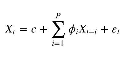
Where {φ1, …, φp} are the parameters to be estimated, c is a constant, and t is the white noise random variable. The values of the parameters must be constrained in order for the model to remain stationary
Moving Average
The moving average model of order q is denoted by the symbol MA(q).
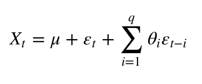
Where the θ1, ..., θq are the parameters of the model, μ is the expectation of Xt, and the εt, εt − 1, ... Are, white noise error terms.
Autoregressive Moving Average
The ARMA(p, q) model is a combination of AR(p) and MA(q) models, as can be shown.

Consider the AR component of the equation, which aims to estimate parameters for Xt -i observations in order to predict the value of the variable in Xt. In the end, it's a weighted average of previous values. The MA part follows the same procedure, but with the addition of the error of prior observations, εt − i. As a result, the model's final outcome is a weighted average.
The following code snippet shows how to use R to create an ARMA(p, q).
# install.packages("forecast")
Library("forecast")
# Read the data
Data = scan('fancy.dat')
Ts_data <- ts(data, frequency = 12, start = c(1987,1))
Ts_data
Plot.ts(ts_data)
Plotting the data is usually the first step in determining whether the data has a temporal structure. The graphic shows that there are large increases at the end of each year.
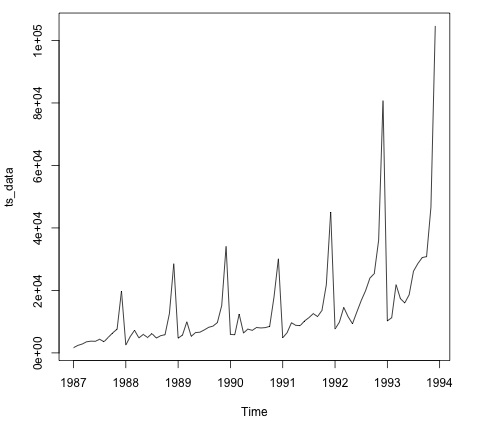
The code below applies an ARMA model to the data. It runs multiple model combinations and chooses the one with the least amount of inaccuracy.
# Fit the ARMA model
Fit = auto.arima(ts_data)
Summary(fit)
# Series: ts_data
# ARIMA(1,1,1)(0,1,1)[12]
# Coefficients:
# ar1 ma1 sma1
# 0.2401 -0.9013 0.7499
# s.e. 0.1427 0.0709 0.1790
#
# sigma^2 estimated as 15464184: log likelihood = -693.69
# AIC = 1395.38 AICc = 1395.98 BIC = 1404.43
# Training set error measures:
# ME RMSE MAE MPE MAPE MASE ACF1
# Training set 328.301 3615.374 2171.002 -2.481166 15.97302 0.4905797 -0.02521172
Key takeaway
A time series is a collection of observations of category or numerical variables that are linked together by a date or timestamp. The time series of a stock price is a good example of time series data.
The data includes language that defines freelancer profiles as well as the hourly rate they charge in USD. The goal of the next section is to fit a model that can forecast a freelancer's hourly salary based on their expertise.
The code below demonstrates how to turn raw text, which in this case has user skills, into a bag of words matrix. We utilise the tm R library to accomplish this. This means that we establish a variable for each word in the corpus with the number of occurrences of each variable.
Library(tm)
Library(data.table)
Source('text_analytics/text_analytics_functions.R')
Data = fread('text_analytics/data/profiles.txt')
Rate = as.numeric(data$rate)
Keep = !is.na(rate)
Rate = rate[keep]
### Make bag of words of title and body
X_all = bag_words(data$user_skills[keep])
X_all = removeSparseTerms(X_all, 0.999)
X_all
# <<DocumentTermMatrix (documents: 389, terms: 1422)>>
# Non-/sparse entries: 4057/549101
# Sparsity : 99%
# Maximal term length: 80
# Weighting : term frequency - inverse document frequency (normalized) (tf-idf)
### Make a sparse matrix with all the data
X_all <- as_sparseMatrix(X_all)
We can fit a model that will give us a sparse solution now that we have the text represented as a sparse matrix. The LASSO is a good alternative in this instance (least absolute shrinkage and selection operator). This is a regression model that may pick the most important features to predict the outcome.
Train_inx = 1:200
X_train = X_all[train_inx, ]
y_train = rate[train_inx]
X_test = X_all[-train_inx, ]
y_test = rate[-train_inx]
# Train a regression model
Library(glmnet)
Fit <- cv.glmnet(x = X_train, y = y_train,
Family = 'gaussian', alpha = 1,
Nfolds = 3, type.measure = 'mae')
Plot(fit)
# Make predictions
Predictions = predict(fit, newx = X_test)
Predictions = as.vector(predictions[,1])
Head(predictions)
# 36.23598 36.43046 51.69786 26.06811 35.13185 37.66367
# We can compute the mean absolute error for the test data
Mean(abs(y_test - predictions))
# 15.02175
We now have a model that can forecast a freelancer's hourly salary based on a set of abilities. The model's speed will improve as more data is collected, but the code to implement this pipeline will remain the same.
When using machine learning methods to model text, the bag-of-words model is a way of encoding text data.
The bag-of-words approach is easy to learn and use, and it's proven to be effective in tasks like language modelling and document classification.
The bag-of-words model for feature extraction in natural language processing.
A bag-of-words model, or BoW for short, is a method of extracting text attributes for use in modelling, such as machine learning techniques.
The method is straightforward and adaptable, and it may be used to extract information from documents in a variety of ways.
A bag-of-words is a text representation that describes the frequency with which words appear in a document. It entails two steps:
A list of terms that are well-known.
A metric for determining the existence of well-known terms.
Because any information about the sequence or structure of words in the document is deleted, it is referred to as a "bag" of words. The model simply cares about whether or not recognised terms appear in the document, not where they appear.
The assumption is that documents with comparable content are similar. Furthermore, we can deduce something about the document's significance solely from its content.
You can make the bag-of-words as simple or as complex as you want. The difficulty arises from deciding how to create a vocabulary of known words (or tokens) as well as how to rate the existence of known terms.
Limitations
The bag-of-words paradigm is simple to learn and use, and it provides a lot of customization options for your individual text data.
It's been used to solve challenges like language modelling and documentation classification with tremendous success.
Nonetheless, it has some flaws, including the following:
● The vocabulary must be carefully designed, especially in order to regulate the size, which has an impact on the document representations' sparsity.
● Sparsity: Sparse representations are more difficult to model, both in terms of computational complexity (space and time complexity) and in terms of information difficulty (models must harness so little information in such a huge representational space).
● Meaning: When you disregard word order, you're ignoring the context and, as a result, the meaning of the words in the document (semantics). Context and meaning can determine the difference between the same words organised differently ("this is fascinating" vs "is this interesting"), synonyms ("old bike" vs "used bike"), and much more if they are modelled.
Key takeaway
The bag-of-words approach is easy to learn and use, and it's proven to be effective in tasks like language modelling and document classification.
The bag-of-words model for feature extraction in natural language processing.
A difficulty with scoring word frequency is that it causes very common words to dominate the document (e.g., a higher score), yet they may not carry as much "informational content" for the model as rarer but maybe domain specialised words.
One method is to rescale the frequency of words based on how frequently they appear in all texts, penalising frequent words like "the" that appear frequently across all publications.
Term Frequency – Inverse Document Frequency, or TF-IDF for short, is a scoring method in which:
● Term Frequency is a metric that measures how frequently a term appears in the current document.
● Inverse Document Frequency (IDF) is a metric for determining how uncommon a word is across documents.
The results are based on a weighted average, which means that not all words are equally relevant or intriguing.
The ratings have the effect of highlighting words in a document that are unique (contain useful information).
The technique of investigating social structures using networks and graph theory is known as social network analysis (SNA). It classifies networked systems as nodes (individual actors, persons, or items in the network) and ties, edges, or links (relationships or interactions) that connect them. Social media networks, memes spread, information circulation, friendship and acquaintance networks, business networks, knowledge networks, difficult working relationships, social networks, collaboration graphs, kinship, disease transmission, examples of social structures commonly visualised through social network analysis.
Sociograms, in which nodes are represented as points and links are depicted as lines, are frequently used to display these networks. These visualisations allow you to examine networks qualitatively by changing the visual depiction of their nodes and edges to reflect different qualities.
In modern sociology, social network analysis has become a crucial technique. It is now widely available as a consumer tool in the fields of anthropology, biology, demography, communication studies, economics, geography, history, information science, organisational studies, political science, public health, social psychology, development studies, sociolinguistics, and computer science (see the list of SNA software).
SNA has two distinct advantages. To begin with, it can process a vast amount of relational data and define the overall topology of a relational network. Tem and parameter selection, such as in-degree and out-degree centrality, to confirm the network's influential nodes. SNA context and choose the parameters to use to identify the "centre" based on the network's characteristics. The communication structure and position of persons may be precisely characterised by examining nodes, clusters, and relations.
History
Early sociologists such as Georg Simmel and Émile Durkheim spoke on the necessity of analysing patterns of relationships that connect social actors, which laid the groundwork for social network analysis. Since the early twentieth century, social scientists have used the term "social networks" to describe complex sets of relationships between members of social systems at various dimensions, from interpersonal to worldwide.
Jacob Moreno and Helen Jennings created basic analytical procedures in the 1930s. In 1954, John Arundel Barnes began using the phrase systematically to define patterns of relationships, embracing both public and social science notions such as bounded groupings (e.g., tribes, families) and social categories (e.g., gender, ethnicity). Ronald Burt, Kathleen Carley, Mark Granovetter, David Krackhardt, Edward Laumann, Anatol Rapoport, Barry Wellman, Douglas R. White, and Harrison White were among the first to apply systematic social network analysis to their research.
SNA has been frequently employed in research on second language learning when studying abroad. Anheier, Gerhards and Romo, Wouter De Nooy, and Burgert Senekal have all used network analysis in the study of literature. Indeed, social network analysis has been used in a variety of academic fields as well as in practical applications such as money laundering and terrorist prevention.
Key takeaway
The technique of investigating social structures using networks and graph theory is known as social network analysis (SNA). It classifies networked systems as nodes (individual actors, persons, or items in the network) and ties, edges, or links (relationships or interactions) that connect them.
Business analysts are a term used to describe those who specialise in business analytics. Company analysts are in great demand because business decisions are more complex than ever before, and analysts assist in ensuring that those decisions are based on the most accurate, valid, and reliable data.
Analysts are experts in data analytics, particularly in the corporate world. Analysts are familiar with the primary business processes and how they are influenced by trends both outside and inside the company.
Analysts may concentrate their knowledge on stakeholder analysis, marketing, finances, risk, and information technology, depending on the business's current strategic priorities.
Business analytics is a data management solution and a subset of business intelligence that involves using methodologies like data mining, predictive analytics, and statistical analysis to analyse and transform data into useful information, identify and predict trends and outcomes, and make better, data-driven business decisions.
The following are the primary components of a typical business analytics dashboard:
● Data Aggregation: Data must first be obtained, sorted, and filtered, either through volunteered data or transactional records, before it can be analysed.
● Data Mining: To detect trends and establish links, data mining for business analytics filters through enormous datasets using databases, statistics, and machine learning.
● Association and Sequence Identification: the discovery of predictable activities that are carried out in conjunction with other acts or in a sequential order.
● Text Mining: For qualitative and quantitative analysis, it examines and organises big, unstructured text databases.
● analyses historical data from a given time period in order to create educated predictions about future occurrences or behaviours.
● Prediction Business Analytics: Predictive business analytics employs a number of statistical techniques to build predictive models that extract data from datasets, discover patterns, and provide a score for a variety of organisational outcomes.
● Businesses can use simulation tools to test out best-case scenarios once patterns have been discovered and predictions have been made.
● For easy and quick data interpretation, visual representations such as charts and graphs are provided.
The essentials of business analytics are typically classified as descriptive analytics, which analyses historical data to determine how a unit may respond to a set of variables; predictive analytics, which examines historical data to determine the likelihood of specific future outcomes; or prescriptive analytics, which combines descriptive analytics and predictive analytics to provide insight into what happened.
The operation and management of clinical information systems in the healthcare industry, the tracking of player spending and development of retention efforts in casinos, and the streamlining of fast food restaurants by monitoring peak customer hours and identifying when certain food items should be prepared based on assembly time are just a few examples of business analytics applications.
Modern, high-quality business analytics software solutions and platforms are designed to ingest and process the massive datasets that businesses confront and can use to run their operations more efficiently.
Key takeaway
Business analysts are a term used to describe those who specialise in business analytics. Company analysts are in great demand because business decisions are more complex than ever before, and analysts assist in ensuring that those decisions are based on the most accurate, valid, and reliable data.
Model evaluation is a technique for determining whether or not models are correct when applied to test data. The test data is made up of data points that the model has never seen before.
Model selection is a strategy for picking the best model after the individual models are evaluated based on the relevant criteria.
Types of model selection
Resampling methods
Resampling methods are basic strategies for rearranging data samples to see if the model works well on data samples that haven't been trained on. To put it another way, resampling allows us to see if the model will generalise effectively.
Random Split
Random Splits are used to sample a percentage of data at random and divide it into training, testing, and, ideally, validation sets. The advantage of this strategy is that the original population is likely to be well represented in all three groupings. Random splitting, to put it another way, prevents biassed data sampling.
It's crucial to remember that the validation set is used in model selection. The validation set is the second test set, and it's understandable to wonder why there are two test sets.
The test set is used to evaluate the model during the feature selection and tuning phase. This signifies that the model parameters and feature set have been chosen to produce the best results on the test set. As a result, the validation set is used for the final evaluation, which contains wholly unseen data points (not used in the tuning and feature selection modules).
Time-Based Split
There are several forms of data that cannot be split randomly. For example, if we need to train a weather forecasting model, we can't divide the data into training and testing sets at random. The seasonal pattern will be thrown off! Time Series is a phrase used to describe this type of data.
A time-wise split is employed in such instances. The training set can include data from the previous three years as well as the first ten months of this year. The testing or validation set can be saved for the last two months.
There's also the concept of window sets, in which the model is trained until a specific date and then tested on future dates iteratively, with the training window changing by one day each time (consequently, the test set also reduces by a day). The advantage of this method is that it stabilizes the model and prevents overfitting when the test set is very small (say, 3 to 7 days).
Time-series data, on the other hand, has the disadvantage that the occurrences or data points are not mutually independent. A single occurrence could have an impact on all subsequent data inputs.
A change in the ruling party, for example, could have a significant impact on population numbers in the years ahead. Alternatively, the infamous coronavirus pandemic will have a significant impact on economic data in the next years.
In this situation, no machine learning model can learn from previous data because the data points before and after the occurrence are vastly different.
K-Fold Cross-Validation
The cross-validation technique shuffles the dataset at random and then divides it into k groups. Following that, when iterating over each group, the group should be considered a test set, while the rest of the groups should be combined into a training set. The model is then tested on the test group, and the process is repeated for the remaining k groups.
As a result, at the end of the process, one will have k different test group findings. The best model can then be readily chosen by selecting the model with the highest score.
Stratified K-Fold
The technique for stratified K-Fold is similar to that of K-Fold cross-validation with one major difference: unlike k-fold cross-validation, stratified k-fold considers the values of the target variable.
If the target variable is a categorical variable with two classes, for example, stratified k-fold assures that each test fold has the same ratio of the two classes as the training set.
This makes the model evaluation more accurate and the model training less biassed.
Bootstrap
One of the most powerful methods for obtaining a stable model is to use Bootstrap. Because it is based on the concept of random sampling, it is similar to the random splitting technique.
The first step is to figure out how big your sample will be (which is usually equal to the size of the original dataset). After that, a random data point from the original dataset must be chosen and added to the bootstrap sample. Following the addition, the sample must be returned to the original sample. This procedure must be repeated N times, with N denoting the sample size.
As a result, the bootstrap sample is created by sampling data points from the original dataset with replacement, which is a resampling technique. This indicates that numerous instances of the same data point can be found in the bootstrap sample.
The model is trained on the bootstrapped sample and then tested on any data points that were not included in the bootstrapped sample. Out-of-bag samples are what they're called.
How to evaluate models?
Multiple measures can be used to evaluate models. The correct evaluation metric, on the other hand, is critical and often depends on the problem being solved. A thorough understanding of a variety of metrics can aid the evaluator in finding a good match between the problem description and a metric.
Classification metrics
A matrix called the confusion matrix can be generated for each classification model prediction, displaying the number of test instances correctly and erroneously classified.
It looks like this (assuming that the goal classes are 1 - Positive and 0 - Negative):
| Actual 0 | Actual 1 |
Predicted 0 | True Negatives (TN) | False Negatives (FN) |
Predicted 1 | False Positives (FP) | True Positives (TP) |
TN: Number of accurately classified negative cases
TP: Total number of accurately classified positive cases
FN: The number of positive cases that were mistakenly labelled as negative.
FP: The number of positive cases that were incorrectly labelled as negative.
The Holdout Method is the most basic way to evaluate a classifier. The data set (a collection of data items or examples) is divided into two sets using this method: the Training set and the Test set.
A classifier is a programme that assigns data objects in a collection to one of several target categories or classes.
Example
Spam and non-spam e-mails are separated in our inbox.
The accuracy, error rate, and error estimates of the classifier should all be determined. It can be done in a variety of ways. The 'Holdout Method' is one of the most basic approaches for classifier evaluation.
The data set is partitioned in the holdout technique so that the maximum data goes to the training set and the remaining data belongs to the test set.
The hold-out approach for training a machine learning model is to split the data into multiple splits and use one split for training and the other splits for validating and testing the models. Both model evaluation and model selection are done using the hold-out method.
When all of the data is used to train the model using various algorithms, the problem of evaluating the models and choosing the best one remains. The main goal is to figure out which model has the lowest generalisation error out of all the others. In other words, which model outperforms all others in predicting future or unknown datasets? This necessitates the use of a technique that allows the model to be trained on one dataset and tested on another. Here's where the hold-out strategy comes into play.
Hold-out method for Model Evaluation
The hold-out approach for model evaluation is a methodology for dividing a dataset into training and test datasets and then analysing model performance to find the best model. The hold-out method for model evaluation is depicted here.
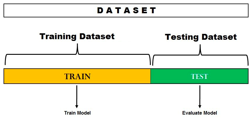
Fig 2: Hold-out method for model evaluation
You'll notice that the data set is divided into two pieces in the diagram above. One split is set aside or reserved for the model's training. Another set is set aside or held back for model testing and evaluation. The split % is determined by the amount of data that is available for training. In most cases, a 70-30 percent split is utilised to split the dataset, with 70% of the dataset being used for training and 30% being used for testing the model.
If the goal is to compare models based on model accuracy on the test dataset and select the best model, this technique is ideal. However, there's a chance that attempting to employ this strategy will result in the model fitting well to the test dataset. In other words, the models are trained on the test dataset to enhance model accuracy, assuming the test dataset reflects the population. As a result, the test error becomes a generalisation error estimate that is optimistically biassed. That, however, is not desirable. Because it was trained to fit well (or overfit) the test data, the final model fails to generalise well to unknown or future datasets.
The hold-out approach is used to evaluate models in the following way:
● Divide the data into two sections (preferably based on 70-30 percent split; However, the percentage split will vary).
● Train the model on the training dataset; pick a fixed set of hyper parameters while training the model.
● On the held-out test dataset, test or evaluate the model.
● To get a model that can generalise better on the unknown or future dataset, train the final model on the full dataset.
Note that this method is used to evaluate models employing a fixed number of hyper parameters and partitioning the dataset into training and test datasets. Another method is to divide the data into three sets and use these three sets to select a model or tune hyperparameters.
Random Sub-sampling Method
Let's take a closer look at how random subsampling works:
● We produce 'k' replicas of provided data using Random Subsampling, which executes 'k' iterations of the full dataset.
● A fixed number of observations is picked without replacement for each iteration [for each replica] and set aside as a test set.
● Each iteration fits the model to the training set, and each test set yields an estimate of prediction error.
● Let Ei denote the estimated PE (prediction error) in the ith test set. The average of the individual estimations Ei yields the genuine error estimate.

Pros - For sparse datasets, it is a better strategy than the Hold out method.
Cons - There's a probability that the identical record in the test set will be selected for subsequent iterations.
Example
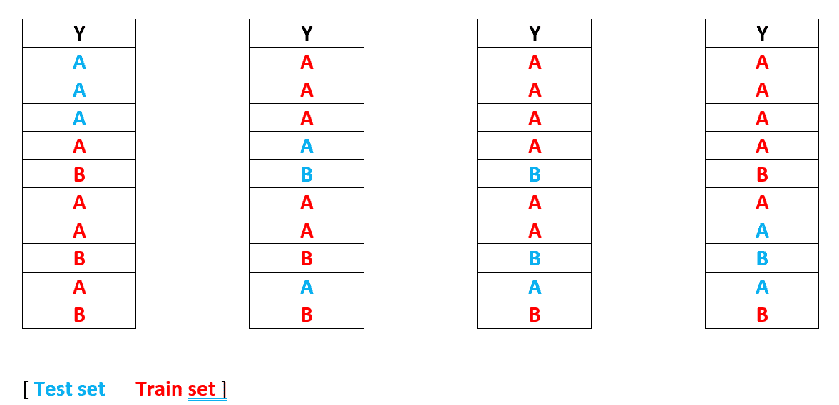
As previously stated,
Let's say we choose k = 4 as the number of iterations;
Then we make k copies of the provided data set and divide them into train and test sets. (To form the train-test split, we apply the without replacement approach for each iteration — the same as the hold out method).
The model is then fitted to each train set before being evaluated on the test set. We now have four errors, and the final error is the average of the four.
This method is preferable to the Hold out method since we may receive a different test-train set each time. As a result, if all records from class B are present in the training set, the model will be able to learn B patterns more effectively.
In terms of drawbacks, there's a potential that the same record may be selected repeatedly in test sets.
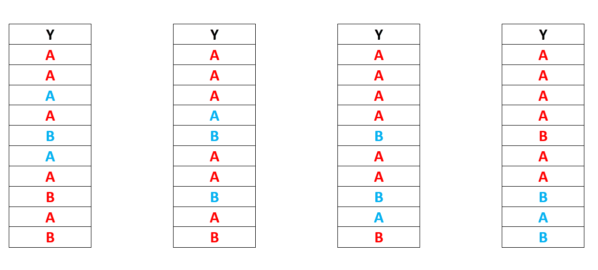
As you can see, we have a majority of B in the test set in iteration 2,3,4. We will run into the same issue again, in which our model will be unable to learn for the B class and will fail validation.
Another effective way for resolving this issue is K-fold Cross Validation.
Key takeaway
The Holdout Method is the most basic way to evaluate a classifier. The data set (a collection of data items or examples) is divided into two sets using this method: the Training set and the Test set.
A large number of configuration parameters affect parallelism, I/O behaviour, memory settings, and compression in big data processing systems (e.g., Hadoop, Spark, Storm). Parameter settings that are incorrect can result in serious performance and stability difficulties. Regular users and even experienced administrators, on the other hand, struggle to understand and tune them for optimal performance.
Existing approaches to parameter tuning for batch and stream data processing systems are investigated and classified into six categories: rule-based, cost modelling, simulation-based, experiment-driven, machine learning, and adaptive tuning. We describe the advantages and disadvantages of each strategy and discuss some important research questions related to autonomous parameter tweaking.
Automated parameter tuning strategies are a promising, yet difficult, method for improving system performance. The following are the major challenges:
● Large and complex parameter space: Hadoop, Spark, and Storm each have over 200 settings that can be customised. To make matters worse, some factors may have varying effects on the performance of different jobs, and certain groups of parameters may have dependent effects on each other (i.e., a good setting for one parameter may depend on the setting of a different parameter)
● System scale and complexity: System administrators may need to install and adjust hundreds to thousands of nodes, some of which are equipped with different CPUs, RAM, storage media, and network stacks, as data analytics platforms have expanded in scale and complexity. Furthermore, observing and modelling workload performance while using MapReduce or Spark workloads with iterative stages and tasks in parallel or serial is difficult.
● Lack of input data statistics: Because data is generally stored in semi- or unstructured files and is opaque until retrieved, data statistics are nearly never available for MapReduce and Spark applications. The input data for stream applications is a real-time data stream that often experiences large workload fluctuations.
Classification of Approaches:
The challenge of performance optimization has been addressed in the past by partially or totally automating the process of determining near-optimal parameter values for running jobs in big data processing systems. This assessment examines existing parameter-tuning methods for addressing diverse difficulties such as high throughput and resource utilisation, quick response time, and cost-effectiveness. Different tactics or techniques are presented in response to the numerous difficulties and circumstances mentioned. These approaches are divided into six groups by us:
● Rule-based - Users can tune various system parameters using rule-based procedures, which are based on the knowledge of human experts, online courses, or tuning instructions. They normally don't require any models or log data, and they're good for fast getting the system up and running.
● Cost modeling - Analytical (white-box) cost functions generated based on a comprehensive understanding of system internals are used in cost modelling methodologies to create efficient performance prediction models. To build the model, you'll usually need a few experimental logs and some input information.
● Simulation-based techniques leverage modular or whole system simulation to create performance prediction models, allowing users to replicate an execution with various parameter settings or cluster resources.
● Experiment-driven techniques run a programme, i.e., an experiment, multiple times with varying parameter values, directed by a search algorithm and feedback from the actual runs' logs.
● Machine learning approaches use machine learning algorithms to create performance prediction models. They usually look at the complicated system as a whole, assuming no (or limited) knowledge of the system's inner workings (i.e., they treat the system as a black box).
● While an application is operating, adaptive approaches tune configuration parameters adaptively, that is, they can adjust parameter values as the environment changes using a variety of methods. They make it possible to fine-tune both ad hoc and long-running programmes.
Feature Comparison among the Six Parameter Tuning Approaches
Feature | Rule-based | Cost modeling | Simulation | Experiment-driven | Machine learning | Adaptive |
Key modeling technique | Rules | Cost functions | Simulation | Search algorithms | ML models | Mixed |
#of parameters modeled | Few | Some | Some | Many | Many | Some |
System understanding | Strong | Strong | Strong | Light | No | Strong |
Need for history logs | No | Light | Light | Strong | Strong | Light |
Need for data input stats | No | Light | Light | No | Strong | Light |
Real tests to run | No | Some | No | Yes | Yes | Yes |
Time to build model | Efficient | Efficient | Medium | Slow | Slow | Medium |
#of metrics predicted | Few | Few | Some | Few | Many | Some |
Prediction accuracy | Low | Medium | Medium | Medium | High | Medium |
Adapt to workload | Adaptive | Light | Light | No | No | Adaptive |
Adapt to system changes | No | No | Light | No | Adaptive | Light |
The goal of model interpretation is to better comprehend model decision-making policies. This is to provide justice, accountability, and openness, which will give humans the confidence to apply these models to real-world situations with significant corporate and societal implications. As a result, there are strategies that have been around for a long time that can be utilised to better understand and interpret models.
The following two major categories can be used to categorise them.
● Clustering and dimensionality reduction are examples of exploratory analysis and visualisation approaches.
● Precision, recall, accuracy, the ROC curve and the AUC (for classification models) and the coefficient of determination (R-square), root mean-square error, and mean absolute error are all measures used to evaluate model performance (for regression models)
Exploratory Analysis and Visualization
The idea of exploratory analysis is not something altogether new. Data visualisation has been one of the most successful ways for extracting latent insights from data for many years. Some of these strategies can assist us in discovering essential features and meaningful representations from our data, which can indicate what factors may influence a model's ability to make judgments in a human-readable format.
Because we frequently deal with a vast feature space (curse of dimensionality), dimensionality reduction techniques are quite effective here. Reducing the feature space lets us understand and see what might be affecting a model to make specific judgments. The following are a few of these methods.
● Principal Component Analysis (PCA), Self-Organizing Maps (SOM), and Latent Semantic Indexing are all methods for reducing dimensionality.
● t-Distributed Stochastic Neighbor Embedding in Manifold Learning (t-SNE).
● Variational autoencoders: A variational autoencoder-based automated generating technique (VAE).
● Hierarchical Clustering is a type of clustering.
The module sklearn.cluster can be used to cluster data that hasn't been tagged.
Each clustering algorithm is divided into two parts: a class that implements the fit method to learn clusters from train data, and a function that produces an array of integer labels corresponding to the different clusters when given train data. The labels_ field for the class contains the labels applied to the training data.
Input data
One thing to keep in mind is that the algorithms in this module can accept various types of matrices as input. Standard data matrices of shape (n samples, n features) are accepted by all techniques. These can be found in the sklearn.feature extraction module's classes. Shape similarity matrices (n samples, n samples) can be used with AffinityPropagation, SpectralClustering, and DBSCAN. These can be found in the sklearn.metrics.pairwise module's routines.
A time series is a collection of observations made at regular intervals over time. A time series might be hourly, daily, weekly, monthly, quarterly, or annual, depending on the frequency of observations. You may also have seconds and minute-by-second time series, such as the number of clicks and user visits each minute, etc. Why bother analysing a time series in the first place? Because it is the first step in the process of developing a series forecast. Furthermore, time series forecasting has huge economic significance because crucial company data such as demand and sales, number of website visitors, stock price, and so on are all time series data. So, how does one go about studying a time series? Time series analysis is gaining a deeper grasp of the series' underlying characteristics so that you may make more relevant and accurate projections.
So how to import time series data?
A time series' data is often stored in.csv files or other spreadsheet formats, and it is divided into two columns: the date and the measured value. To read the time series dataset (a csv file on Australian Drug Sales) as a pandas dataframe, use the read csv() function in the pandas package. By specifying parse dates=['date'], the date column will be parsed as a date field.
From dateutil.parser import parse
Import matplotlib as mpl
Import matplotlib.pyplot as plt
Import seaborn as sns
Import numpy as np
Import pandas as pd
Plt.rcParams.update({'figure.figsize': (10, 7), 'figure.dpi': 120})
# Import as Dataframe
Df = pd.read_csv('https://raw.githubusercontent.com/selva86/datasets/master/a10.csv', parse_dates=['date'])
Df.head()
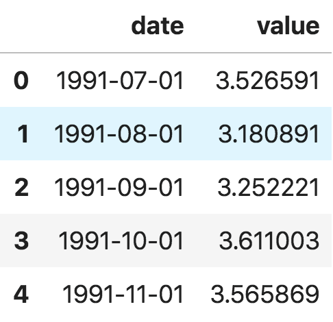
You can also import it as a pandas Series with the date as the index. To do so, simply use the index col option in the pd.read csv() function.
Ser = pd.read_csv('https://raw.githubusercontent.com/selva86/datasets/master/a10.csv', parse_dates=['date'], index_col='date')
Ser.head()
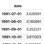
The 'value' column is put higher than the date column in the series to imply that it is a series.
Machine Learning is used to solve two types of problems: regression and classification. When our dependent variable is continuous, we utilise regression techniques or models, and when the dependent variable is categorical, we use classification approaches.
Various assessment metrics are used to check the quality or performance of a Machine Learning model when it is developed. Accuracy, Confusion Matrix, Classification report (i.e. Precision, Recall, F1 score), and AUC-ROC curve are used to evaluate classification models.
Confusion matrix
The Confusion Matrix is a graphic depiction of actual vs predicted values. It is a table-like structure that gauges the performance of our Machine Learning classification model.
Looking at the confusion matrix is a much better technique to assess a classifier's performance. The basic concept is to keep track of how many times examples of class A are categorised as class B. For example, you may check at the 5th row and 3rd column of the confusion matrix to see how many times the classifier confused images of 5s with images of 3s.
A binary classification problem's Confusion Matrix looks like this:
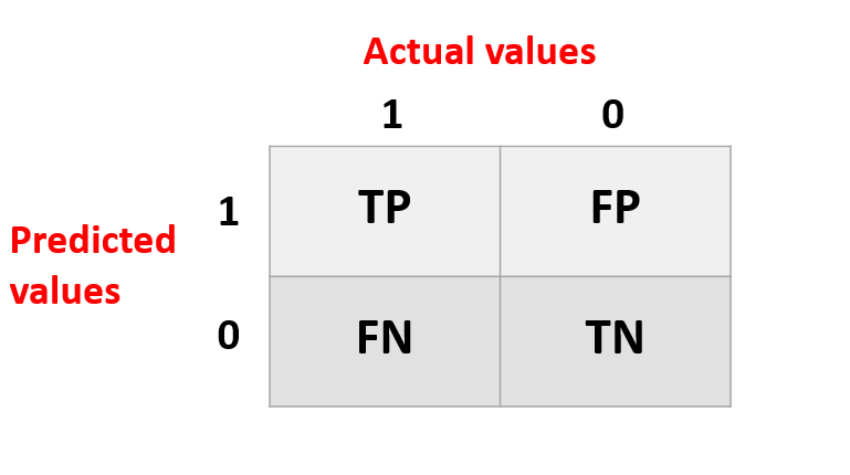
Elements of Confusion Matrix
It depicts various combinations of Actual vs. Predicted values. Let's take a look at each one individually.
True Positive: Values that were both truly positive and projected to be positive.
FP stands for False Positive, which refers to results that were truly negative but were incorrectly forecasted as positive. Type I Error is another name for it.
FN stands for False Negative, which refers to values that were actually positive but were incorrectly forecasted as negative. Type II Error is another name for it.
TN: True Negative: Values that were both negative and projected to be negative.
The confusion matrix provides a lot of information, but you might prefer a more simple metric at times.
Precision
Precision = (TP) / (TP+FP)
The number of true positives (TP) is equal to the number of false positives (FP).
Making one single positive prediction and ensuring it is correct (precision = 1/1 = 100 percent) is a simple technique to achieve perfect precision. This would be ineffective since the classifier will discard all positive instances except one.
Recall
Recall = (TP) / (TP+FN)
Your 5-detector is no longer as gleaming as it was when you examined its accuracy. Only 72.9 percent of the time (precision) is it true when it believes an image represents a 5. Furthermore, it only detects 75.6 percent of the 5s (recall).
When you need a quick way to compare two classifiers, it's typically easier to combine precision and recall into a single metric called the F1 score.
AUC - ROC curve
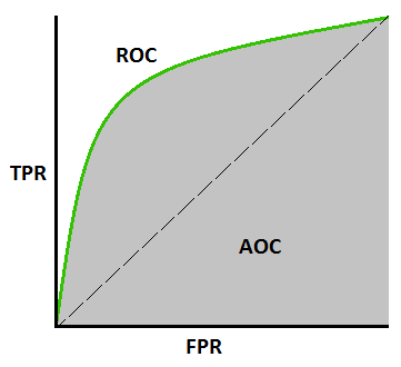
The Area Under the Curve (AUC) - ROC curve is a performance statistic for classification issues at various threshold levels. AUC represents the degree or measure of separability, whereas ROC is a probability curve. It indicates how well the model can distinguish between classes. The AUC indicates how well the model predicts 0 classes as 0 and 1 courses as 1. The higher the AUC, the better the model predicts 0 classes as 0 and 1 classes as 1. By analogy, the higher the AUC, the better the model distinguishes between people who have the condition and those who do not.
The ROC curve is plotted with TPR on the y-axis and FPR on the x-axis, with TPR on the y-axis and FPR on the x-axis.
How Does the AUC-ROC Curve Work?
A greater X-axis value in a ROC curve suggests a higher number of False positives than True negatives. While a higher Y-axis value implies a greater number of True positives than False negatives, a lower Y-axis value suggests a lower number of True positives. As a result, the threshold is determined by the ability to balance False positives and False negatives.
Let's delve a little deeper to see how our ROC curve would appear for various threshold values, as well as how the specificity and sensitivity would change.
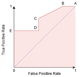
We can try to comprehend this graph by creating a confusion matrix for each point that corresponds to a threshold and discussing our classifier's performance:
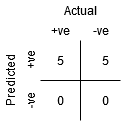
The maximum sensitivity and lowest specificity are found at point A. This means that all Positive class points are correctly classified, while all Negative class points are wrongly classified.
Any point on the blue line represents a circumstance in which True Positive Rate equals False Positive Rate.
All points above this line represent a situation in which the proportion of correctly categorised points in the Positive class exceeds the proportion of mistakenly identified points in the Negative class.
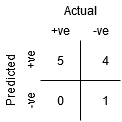
Point B has a higher Specificity than Point A, although having the same Sensitivity. In other words, compared to the prior threshold, the amount of wrongly Negative class points is fewer. This means that this threshold is superior to the one before it.
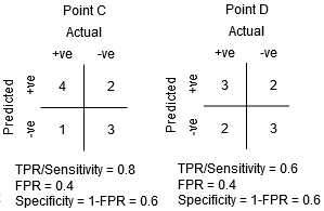
For the same Specificity, the Sensitivity at point C is higher than the Sensitivity at point D. This signifies that the classifier predicted a higher number of Positive class points for the same number of erroneously categorised Negative class points. As a result, the point C threshold is superior to point D.
Now, depending on how many erroneously categorised points we want to tolerate for our classifier, we'll pick point B or C to predict whether you'll be able to defeat me in PUBG.
“False hopes are more dangerous than fears.”–J.R.R. Tolkein
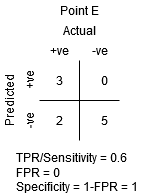
The maximum level of specificity is at point E. There are no False Positives in the model's classification. All of the Negative class points are accurately classified by the model! If our problem was to provide ideal song recommendations to our users, we would choose this location.
Can you figure out where the point on the graph that corresponds to a perfect classifier would be based on this logic?
Yes! It would be in the top-left corner of the ROC graph, which corresponds to the cartesian coordinate (0, 1). The classifier would accurately classify all of the Positive and Negative class points since both the Sensitivity and Specificity would be at their highest.
Elbow plot
The optimal number of clusters into which the data can be grouped is a crucial stage in any unsupervised technique. One of the most prominent approaches for determining the ideal value of k is the Elbow Method.
The provided method is now demonstrated utilising the K-Means clustering methodology and the Python Sklearn module.
Step 1: Importing the essential libraries.
From sklearn.cluster import KMeans
From sklearn import metrics
From scipy.spatial.distance import cdist
Import numpy as np
Import matplotlib.pyplot as plt
Step 2: Data Creation and Visualization
# Creating the data
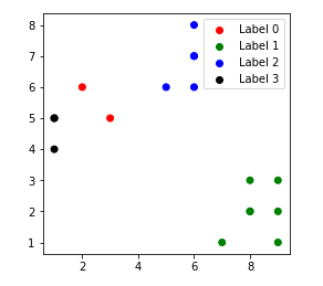
x1 = np.array([3, 1, 1, 2, 1, 6, 6, 6, 5, 6, 7, 8, 9, 8, 9, 9, 8])
x2 = np.array([5, 4, 5, 6, 5, 8, 6, 7, 6, 7, 1, 2, 1, 2, 3, 2, 3])
X = np.array(list(zip(x1, x2))).reshape(len(x1), 2)
# Visualizing the data
Plt.plot()
Plt.xlim([0, 10])
Plt.ylim([0, 10])
Plt.title('Dataset')
Plt.scatter(x1, x2)
Plt.show()
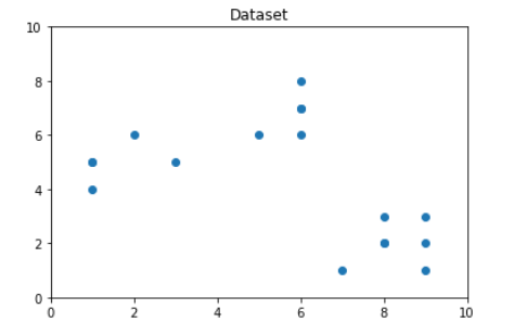
We can observe from the above graphic that the ideal number of clusters is around 3. However, simply visualising the data does not necessarily result in the correct solution. As a result, we'll show you how to do the following.
Now we'll define the following terms:-
● Distortion: The average of the squared distances from the cluster centres of the respective clusters is used to compute distortion. The Euclidean distance measure is commonly employed.
● Inertia: Inertia is defined as the total of the squared distances between samples and the cluster centre.
We cycle through the values of k from 1 to 9 and calculate the distortion and inertia for each value of k in the specified range.
Step 3: Create the clustering model and calculate the Distortion and Inertia values:
Distortions = []
Inertias = []
Mapping1 = {}
Mapping2 = {}
K = range(1, 10)
For k in K:
# Building and fitting the model
KmeanModel = KMeans(n_clusters=k).fit(X)
KmeanModel.fit(X)
Distortions.append(sum(np.min(cdist(X, kmeanModel.cluster_centers_,
'euclidean'), axis=1)) / X.shape[0])
Inertias.append(kmeanModel.inertia_)
Mapping1[k] = sum(np.min(cdist(X, kmeanModel.cluster_centers_,
'euclidean'), axis=1)) / X.shape[0]
Mapping2[k] = kmeanModel.inertia_
Step 4: Tabulating and Visualizing the results
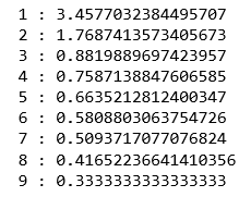
a) Using the different values of Distortion:
For key, val in mapping1.items():
Print(f'{key} : {val}')
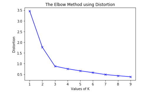
Plt.plot(K, distortions, 'bx-')
Plt.xlabel('Values of K')
Plt.ylabel('Distortion')
Plt.title('The Elbow Method using Distortion')
Plt.show()
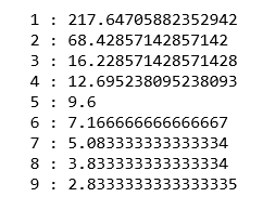
b) Using the different values of Inertia:
For key, val in mapping2.items():
Print(f'{key} : {val}')
Plt.plot(K, inertias, 'bx-')
Plt.xlabel('Values of K')
Plt.ylabel('Inertia')
Plt.title('The Elbow Method using Inertia')
Plt.show()
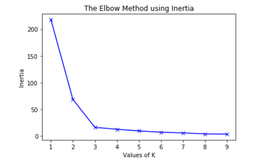
To find the optimal number of clusters, we must find the value of k at the "elbow," that is, the point at which the distortion/inertia begins to decrease linearly. As a result, we find that the best number of clusters for the given data is three.
The clustered data points for varied value of k:-
1. k = 1
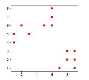
2. k = 2
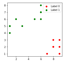
3. k = 3
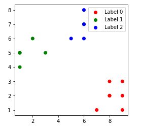
4. k = 4
References:
- Jiawei Han, Micheline Kamber, and Jian Pie, “Data Mining: Concepts and Techniques” Elsevier Publishers Third Edition, ISBN: 9780123814791, 9780123814807
- EMC Education Services, “Data Science and Big Data Analytics- Discovering, analyzing Visualizing and Presenting Data”
- DT Editorial Services, “Big Data, Black Book”, DT Editorial Services, ISBN:
9789351197577, 2016 Edition