UNIT 2
Mobile Web
Mobile web allows Internet access from mobile devices like smartphones and tablets.
A media for smartphones and tablets
Mobile web consist with accessing websites through smartphones and tablets. It's a completely distinct media.
A smartphone may be a mobile that has numerous functions like accessing Internet, downloading and using apps, checking email, and incorporates elements like GPS and camera, etc. Smartphone usage has blossomed since 2007 and that they are now the dominant model on the market.
Tablets were introduced in 2010. They provide an equivalent functionality as computers (Internet access, software installation, accessing multimedia content, etc.), but touchscreen technology and reduced size allow maximum mobility.
Mobile technology's success (smartphones and tablets), has increase the stakes of mobile web. Latest figures show that 85% of individuals who possess a smartphone access Internet a minimum of once each day from their phone. By 2014, mobile access will surpass more traditional sorts of Internet access, for this reason mobile web may be a major focus for any company's communication strategy.
Mobile web gateways
It is not always possible to require the time to manually enter a web address into one's smartphone. Users need faster access, an alternate gateway to physically entering a web address.
New technology was developed to bypass this problem and facilitate mobile web access. QR Code is currently the leading gateway for mobile web. Scanning a QR Code is fun and takes but 10 seconds. Other gateways exist, like NFC, augmented reality, and new emerging technologies like audio detection, motion detection, etc.
Mobile websites' design
Because a mobile or a tablet's screen is smaller than a daily computer screen, design, ergonomics, and content all got to be shaped to the distinct characteristics of this media.
Therefore a webpage that's visited from a computer would have a special layout when visited from a mobile . This is often why a mobile website must adapt to the format's limitations.
On top of this, a technical barrier exists. Internet connection on a smartphone works via a 3G connection, which may be a lot slower than a standard Internet connection. So as to avoid slow and frustrating usage, a mobile web page's content must be as light as possible. Unitag's U.me tool allows users to make their own mobile website, specifically adapted to smartphones and tablets. Creating your own mobile website is formed easy and fun!
From mobile web to web app
A web app is a complicated mobile website. It support for higher levels of interaction with users by taking full advantage of mobiles' functionalities.
Mobile Web Eras
The first mobile web platform was developed but 15 years ago. Analysing this history can help us to know the technologies behind the mobile web, and compatibility issues.
The mobile Internet appeared at the top of the last millennium. a good range of operators began to offer mobile web browsing, with one or two devices with Wireless Application Protocol (WAP) browsers.
At years ago mobile devices connected to the web employing a voice call as a modem communication. So, every minute you were connected was charged as a voice call minute. The devices with browsers had black and white screens without image support and will display only three or four lines of text on the screen.
This early version of the mobile Internet was a failure. It had been expensive and didn't offer any useful services. The general user experience was very poor. a couple of years later, 2.5G technologies like the overall Packet Radio Service (GPRS) appeared on the market. These technologies allowed us to browse the web and be charged consistent with the amount of kilobytes transferred, regardless of what percentage minutes we were connected to the web .
This first mobile web was defined by the WAP 1.0 standard. That standard suggested Wireless terminology (WML) an XML version designed for mobile devices that wasn't compatible with the HTML standards because the document type for the online content. The devices communicated with the operators’ WAP gateways using WAP protocols, and therefore the gateways translated the communications to HTTP and passed them on to the destination web servers. WAP 1.X isn't recommended today, because it has been replaced by new technologies.
Mobile browsers during this era were called “WAP browsers,” and websites using this standard were called “WAP sites” “WAP” was used rather than “web.” This created a perceived distinction between the 2 (WAP seemed to vary from the Web).
At this point , the de facto standard for publishing WAP sites on the web was the utilization of the WAP subdomain. So, for instance , we could access Yahoo!’s WAP site using the URL http://wap.yahoo.com. Even today, it's not uncommon to search out this domain pattern in use for mobile websites.
The last OMA standard, WAP 2.0, was released in 2002. The primary WAP 2.0 devices appeared in 2002, and almost every device on the market today is WAP 2.0 compatible. This standard is nearer to the web standards than the previous version and allows HTTP communication between the device and therefore the server. The WAP gateway acts only as a proxy within the operator network.
WAP 2.0 deprecated WML and created XHTML MP (Mobile Profile), along side other companion standards. Surprisingly, after this new standard was released the word “WAP” dropped out of usage and “mobile web” began to be used. So, if we mention a “WAP site” today, it'll be understood that we are pertaining to a WAP 1.1 website.
Many sites continued to use the WAP subdomain for mobile websites, while others started using the opposite de facto standard for publishing mobile websites, the m subdomain therein “m” for mobile. For instance , today we will access the Google Mobile website using http://m.google.com, or the favored Facebook social networking site using http: //m.facebook.com.
Even now, nearly 10 years after WAP 2.0 was released, it's still normal to seek out WAP 1.1 sites using WML on the web. The sole well-known desktop browser which will render WML pages without a plug-in is Opera.
The dotMobi era
DotMobi (.mobi) may be a top-level domain (TLD) approved by the internet Corporation for Assigned Names and Numbers (ICANN) in 2005 and made available to the general public at the end of 2006. It had been approved to be used because the main domain for the mobile Internet and it had the support for several software companies, Internet companies, manufacturers, and operators. So, if you've got the domain yourcompany.com, you must use yourcompany.mobi for your mobile website. The thought was original and a few big companies have gotten on board (for example, Nokia uses nokia.mobi), but it’s not also supported as everyone wanted. For instance , there's no browser with a shortcut to .mobi once you are typing during a URL address there are shortcuts for .com, .net, and .org.
The TLD is managed by mTLD, an organization with many services and web portals centred on the mobile web. Any .mobi site should be WAP 2.0 compatible, but there's no technical obligation for this. You'll buy a dotMobi domain from any registrar and host it anywhere, with none limitation.
The main criticism of dotMobi is that it created two Internets, a desktop Web (.com, .net, etc.) and a mobile Web (.mobi), instead of promoting one Web which will be browsed from different devices.
On-Device Portals and rich clients
As WAP 2.0 had limited multimedia features and there have been porting problems between platforms, many medium and huge websites began to create applications to be installed on mobile devices that might allow mobile users to browse their content and services. Yahoo! was one among the first big portals to make an On-Device Portal (ODP), called Yahoo! Go. It offered a far better experience for mobile users to access Yahoo!’s web services, with options not available for a web browser. The other great advantage is that an icon for the web site appears within the user’s applications menu or maybe on the house screen. It had been discontinued in 2010 and replaced with a new mobile website.
The disadvantage, of course, is that a special version of the ODP must be created for each platform: Java ME, BlackBerry, Windows Mobile, Symbian, iPhone, and so on. There also are many companies offering ODP solutions to distribute web content via operators or websites. These solutions also are referred to as rich clients. For instance , Google Maps offers the interface and Facebook features a mobile website and a rich client for a few devices, like Symbian and iOS devices.
Mobile Web 2.0
Mobile Web 2.0 began in 2007, with the new smartphones that appeared on the market (iPhone, Nokia N95, Android devices, etc.). These devices introduced great changes for the mobile web: WiFi support, 3G, full desktop browsers, Ajax or Flash support, and streaming video. At an equivalent time, thousands of social networks, blogs, and user-generated content portals appeared.
All these ingredients created Mobile Web 2.0, which so far has advanced quite Web 2.0 itself. That’s why we will find HTML 5 mobile browsers, but a couple of HTML 5 desktop browsers on the market today. Clearly, the market really wanted to make better mobile web experiences than those delivered only with WAP 2.0.
Mobile Web 2.0 sites typically have many of the subsequent features:
• Ajax or Rich Internet Application experience
• Geolocation
• Offline working capability
• Social networking activities
• Contextual ads
• On-demand/live video streaming
• HTML 4/5, CSS 2/3, JavaScript
• Touch/multitouch support
As we will see social networks are increasingly being accessed from mobile devices, and therefore the predicted trend is for continued growth.
ANDRIOD OS (OS) is developed by the Open Handset Alliance (OHA) that's Google-led. Android OS is open source. Due to this characteristic, variety of manufacturers prefer android as the operating system for their new devices. Because of this number of various devices Android has been cause a fragmentation problem that mobile application behaviour varies by devices which are developed by different manufacturers .
Android Fragmentation is the problem of "writing a one code for an app and run the code on all the android devices". More generally, it is inability problem to develop an application depending upon any reference operating context [36] and got the same behaviour in all other operating context suitable for the application.
Android Fragmentation is the problem of "writing a one code for an app and run the code on all the android devices". More generally, it is inability problem to develop an application depending upon any reference operating context and got the same behaviour in all other operating context suitable for the application.
Classification of Android Fragmentation
Android fragmentation issue can be classified as operating system fragmentation and device fragmentation. The device fragmentation is split into hardware fragmentation or API fragmentation.
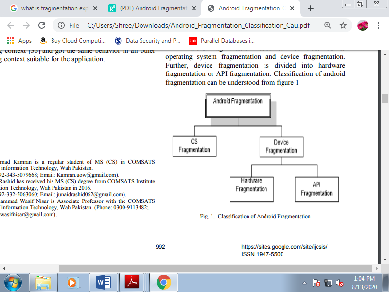
Figure 2.4(I) Classification of Android Fragmentation
A. Operating System Fragmentation
There is variety of various OS in Android started from Froyo to Lollipop. These different OS for one platform results in OS fragmentation. Figure shows current distribution and it doesn't contain versions that have but 0.1% distribution.
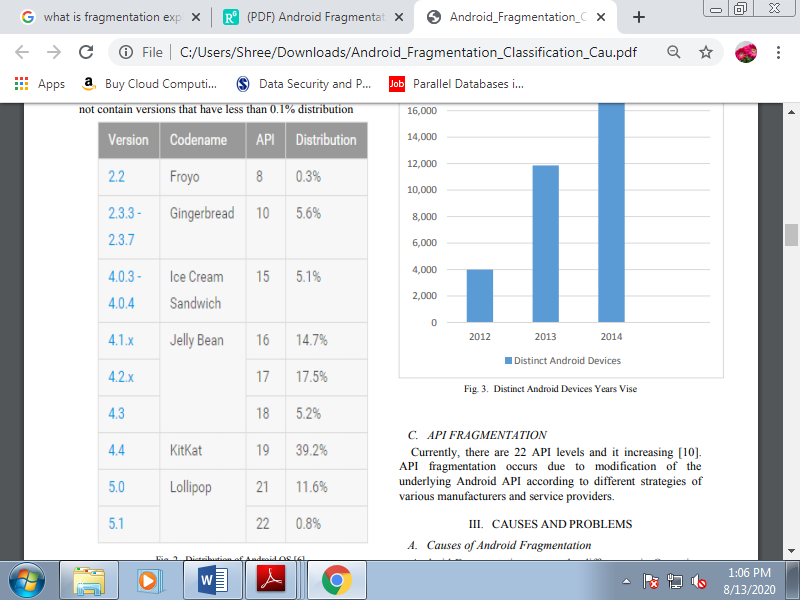
Figure 2.4(II) Distribution of Android OS
B. Hardware Fragmentation
There are 38 android device vendors which are officially supported by android OS . Consistent with open signal report dated August, 2014 on android fragmentation there 18,796 distinct android based hardware devices which is 35% quite what open signal report in report dated June, 2013 on android fragmentation, which was 11,868 distinct android based hardware devices which is 300% quite what open signal report dated August 2012 i-e 3,997. These growing ratio of a spread of android based devices has different hardware features, most significantly different screen sizes that each one causes hardware fragmentation.
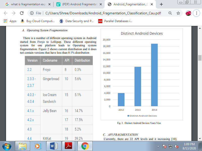
Figure 2.4(III) Distinct Android Devices Years Vies
C. API Fragmentation
Currently, there are 22 API levels and it increasing. API fragmentation occurs due to modification of the underlying Android API consistent with different strategies of varied manufacturers and service providers.
DRIOD operating system (OS) [30] is developed by the
Open Handset Alliance (OHA) [34] that is Google-led.
Android OS is open source [1]. Due to this characteristic, a
Number of manufacturers prefer android as the operating
System for their new devices. Because of this number of
Different devices Android has been cause a fragmentation
Problem that mobile application behavior varies by devices
Which are developed by different manufacturers .
Display
A mobile device features a very small screen compared with a desktop. While in desktop development we mention 17-, 19-, and 21-inch screen sizes (diagonally), in mobile development we mention 1.5, 2.3, or 3 inches. It’s really a big difference. Similarly, while in desktop development we refer 1024×768 pixel resolution, in mobile development we mention 1 / 4 or half that.
Resolution
Resolution is that the primary concern in mobile design. What percentage pixels (width and height) are available on a given device? This was the only portability problem for several years within the area of mobile development.
There are not any mobile device standards regarding screen resolution. One device may have a resolution of 128×128 pixels, and another 800×600. But if we mention devices sold from 2007, we will separate most of them into four basic groups:
• Low-end devices: 128×160 or 128×128 pixels
• Mid-end devices (group #1): 176×220 or 176×208 pixels
• Mid-end devices (group #2) and high-end devices: 240×320 pixels
• Touch-enabled high-end devices and smartphones: 240×480, 320×480, 360×480, 480×800, 480×854, or 640×960 pixels
Today, the foremost widely available screen resolution is 240×320 pixels. This is often also referred to as QVGA (Quarter VGA), because the 1990s VGA standard was 640×480 pixels. An iPhone 3GS, for instance , features a resolution of 320×480 pixels; this is often referred to as HVGA (Half VGA).There also are still many of devices with custom resolutions.
Physical dimensions
The resolution isn’t the only thing we will mention with reference to a mobile device’s screen. One feature as important because the resolution is that the physical dimensions of the screen (in inches or centimetres, diagonally or measured as width/height), or the relation between this measure and therefore the resolution, which is understood because the PPI (pixels per inch) or DPI (dots per inch). This is often important, because while our first thought could also be that a screen with a resolution of 128×160 is “smaller” than a screen with a resolution of 240×320 which will be a false conclusion.
One of the phones I owned back in 2006, because of a gift from Nokia, was an N90. The device was sort of a brick, but the good feature was its resolution: 352×416. The matter was that the screen size was very almost like those of other devices on the market at the time that used resolutions like 176×208. Every programmer thought that more available pixels meant a much bigger screen, so why bother increasing the font? “Let’s use the additional space to suit more elements,” everyone thought. Wrong.
The Nokia N90 features a display size of 1.36″ × 1.6″ (3.45 cm × 4.07 cm) = 259 PPI (or 0.0979 mm dot pitch), as compared with other devices with an identical screen size, which have between 130 and 180 PPI.
Aspect ratio
A device’s aspect ratio refers to the ratio between its longer and shorter dimensions. There are vertical (or portrait) devices whose displays are taller than they're wide, there are horizontal (or landscape) devices whose displays are wider than they're tall, and there also are some square screens. To complicate our lives as programmers even more, today there also are many devices with rotation capabilities.
Such a device are often either 320×240 or 240×320, depending on the orientation. Our websites got to remember of this and offer a good experience in both orientations.
Today, there are many various input methods for mobile devices. One device may support just one input method or many of them. Possibilities include:
• Numeric keypad
• Alphanumeric keypad (ABC or QWERTY)
• Virtual keypad on screen
• Touch
• Multitouch
• External keypad (wireless or not)
• Handwriting recognition
• Voice recognition
And in fact any possible combination of those , sort of a touch device with an optional onscreen keyboard and also a full QWERTY physical keyboard. If you're thinking that QWERTY seems like a Star Trek Klingon’s word, go now to your keyboard and appearance at the primary line of letters below the numbers. That’s the reason for the name; it’s a keyboard layout organized for the smoothest typing within the English that was created in 1874. This layout is preserved in many onscreen keyboards.
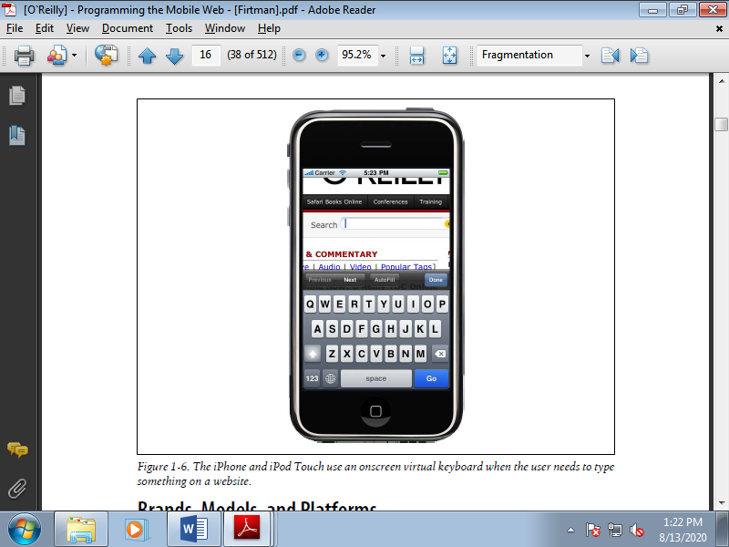
Figure 2.5(I) The iPhone and iPod Touch use an onscreen virtual keyboard when the user needs to type something on a website.
The Mobile Browsing Experience
The mobile browsing experience varies among different devices, and even among different browsers running on an equivalent device. The user interfaces work very differently.
Browsing Types
A mobile website are often navigated using different techniques. Every mobile browser uses one or many of those modes of navigation. The modes are:
• Focus navigation
• Cursor navigation
• Touch navigation
• Multitouch navigation
1. Focus navigation described is following figure is that the most frequent mechanism used for browsing websites on low- and mid-end devices. With this mode, a border or a background colour is employed to point out the user where the main target is. Generally it's utilized in non-touch devices, therefore the user uses the cursor keypad to navigate between links and scroll the web site . Pressing the down key makes the browser change the main focus to subsequent focusable object (e.g., a link, a text field, or a button), or scroll a few of lines within the content if there's no other focusable object nearby.
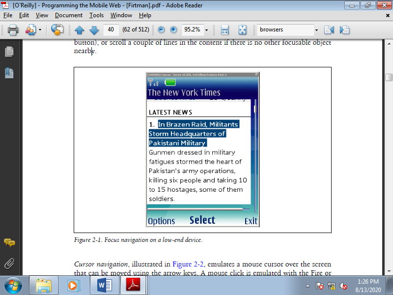
Figure 2.6(I) Focus navigation on a low-end device.
2. Cursor navigation emulates a mouse cursor over the screen which will be moved using the arrow keys. A click is emulated with the fire or Enter key. For a far better experience, many browsers jump the cursor to a close-by focusable object to reduce the distance the user has got to move the pointer to use a link or a button.
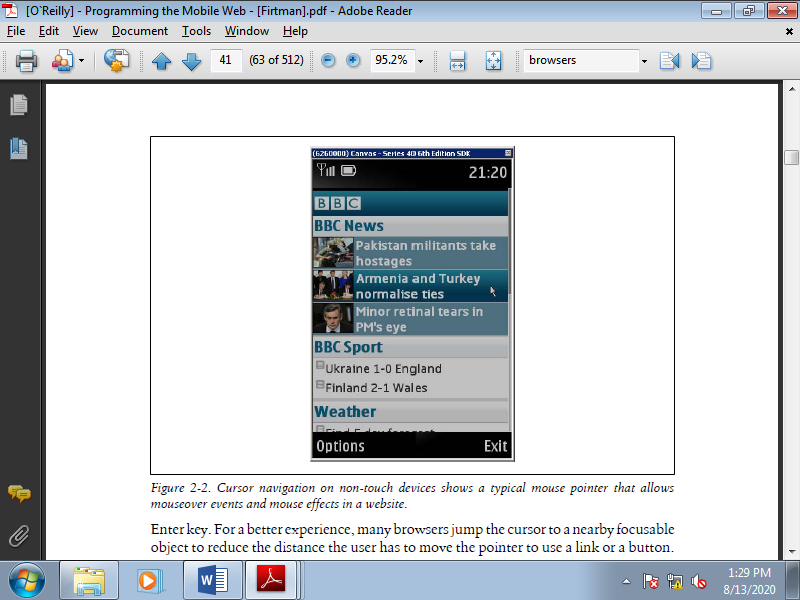
Figure 2.6(II) Cursor navigation on non-touch devices shows a typical mouse pointer that allows mouseover events and mouse effects in a website.
3. Touch navigation may seem obvious, but we'd like to remember of one thing: the user may navigate employing a finger or a stylus. The differences in design are often huge; precision is far lower if fingers are used. Touch devices allow the user to use detectable gestures to simply perform some actions. Some devices also are multi-touch, allowing the users to pick many objects at an equivalent time and incrementing the amount of gestures which will be detected.
Zoom Experience
Analysing how browsers manage zoom options reveals two differing types of browser. The primary type offers basic zoom capabilities: the web page is usually rendered at 1:1 scale to the initial design, and therefore the user can only change the font size. If the planning doesn’t fit on the screen, the scrollbar comes in to resolve the problem.
The second type offers smart zoom capabilities: the web page are often viewed at any zoom scale the user wants, and therefore the zooming action affects the font size, images, and therefore the website as an entire . Supported a user gesture or menu option, we will switch from a full-page view to a paragraph view.
Some browsers use smart zooming like on a desktop: if a paragraph extends beyond the page width, once you concentrate you would like to scroll horizontally (Safari on iOS is one example). Some others reflow the text when zoomed in to suit the page width (the Android browser does this), and still others (such as Opera Mini) reflow the page even when zoomed out.
Reflow Engines
Some mobile browsers aim to supply a far better experience to mobile users browsing websites that weren't designed for mobile devices by reflowing the pages to a one-column design. The smart zoom option has began to replace this technique, but there are still some browsers that use a reflow algorithm. For instance , the results of using Opera Mini’s “Mobile View” on the page displayed on the left.
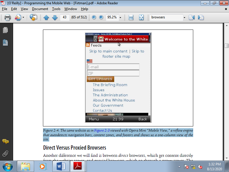
Figure 2.6(III) The same website as in above Figure viewed with Opera Mini “Mobile View,” a reflow engine that autodetects navigation bars, content zones, and footers and shows us a one-column view of the site.
Direct Versus Proxied Browsers
Another difference we'll find is between direct browsers, which get content directly from the web site server, and proxied browsers, which undergo a proxy server. The proxy server usually does many of the subsequent actions on the fly:
• Reduces the content, eliminating features that aren't mobile-compatible
• Compresses the content including image
• Pre-renders the content, so it are often displayed within the browser faster
• Converts the content, so we will see Flash Video in devices with no Flash support
• Encrypts the content
• Caches the content for quick access to frequently visited sites
• Multipage Experience
There are very different approaches to multipage browsing. This will be initiated by the user, or by the developer opening a pop-up window or a link during a new window. Different browsers take different approaches:
• Only one page support
• Multiple windows
• Windows stacks
• Tab navigation
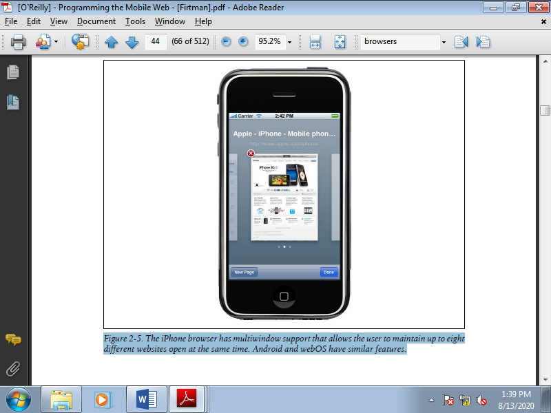
Figure 2.6(IV). The iPhone browser has multi-window support that allows the user to maintain up to eight different websites open at the same time. Android and webOS have similar features.
The WebKit Engine
WebKit is an open source layout engine for web browsers. It renders HTML and CSS websites and may execute JavaScript. It had been created by Apple to be utilized in its Safari browser for Mac OS X, and later Windows and iOS. As an open source project, there are many ports of the rendering engine, and today we will find many applications using it for instance , Google Chrome and Adobe AIR.
The great thing about WebKit is that nearly everyone within the mobile world is using it. This suggests that even on very different mobile devices we will expect very similar web rendering with simple mark-up and styles, which is nice news for developers.
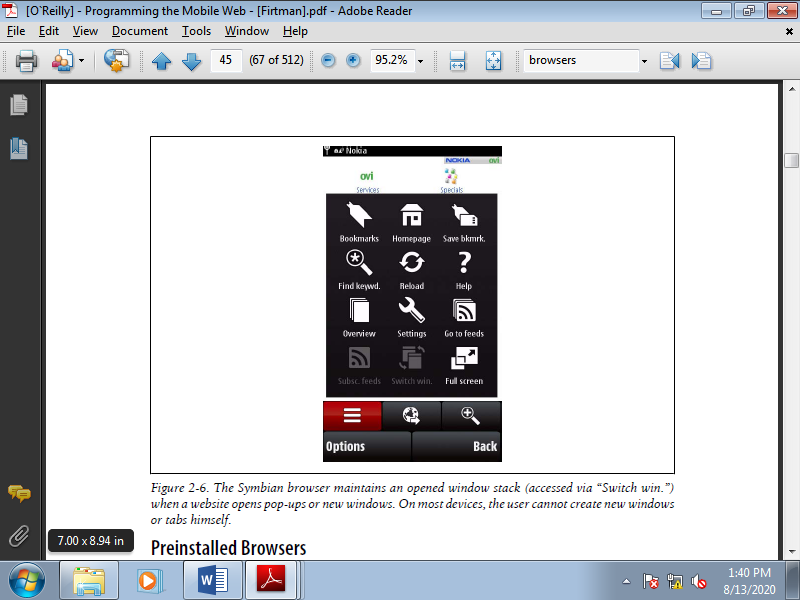
Figure 2.6(V) The Symbian browser maintains an opened window stack (accessed via “Switch win.”) when a web site opens pop-ups or new windows. On most devices, the user cannot create new windows or tabs himself.
Preinstalled Browsers
Practically every phone has a preinstalled browser. So, there are minimum browser varieties than phone varieties.
1. NetFront
NetFront may be a mobile browser created by the japanese company ACCESS, targeting low and mid-end devices. It's licensed by the manufacturer, and that’s why we will find devices of the many different brands using an equivalent browser engine. NetFront is installed on thousands of Sony Ericsson, LG, Samsung, and ZTE devices, also as on Amazon Kindle ebook readers. It had been also included with the old Palm OS.
It has many various versions and it uses its own rendering engine. From NetFront 3.5, it supports cursor navigation and a feature called Smart-Fit that reorganizes websites to suit into one column without horizontal scrolling.
2. Myriad
The Openwave browser was for several years one among the well-liked mobile browsers to be preinstalled on low-end devices. In conjunction with NetFront, it's used for the majority of low- and mid-end browsing. Openwave was acquired by Myriad in 2008, and since that point it's been referred to as the Myriad browser. Like NetFront, it's used by many vendors, including Motorola, LG, Sharp, and Kyocera. Up to version 7 it used its own rendering engine, but the corporate has announced that subsequent version will use WebKit.
3. Internet Explorer
Microsoft has its own mobile browser, called Internet Explorer Mobile. Formerly referred to as Pocket Internet Explorer (PIE), it are often considered one among the primary mobile browsers on the market. The first version was released in 1996, for Windows CE 1.0. Up to version 6.5, it had its own rendering engine (based on IE4). Windows Mobile 6.5 was supported Internet Explorer 6. This version uses a desktop IE-derived engine and provides a far better browsing experience with smart zoom capabilities.
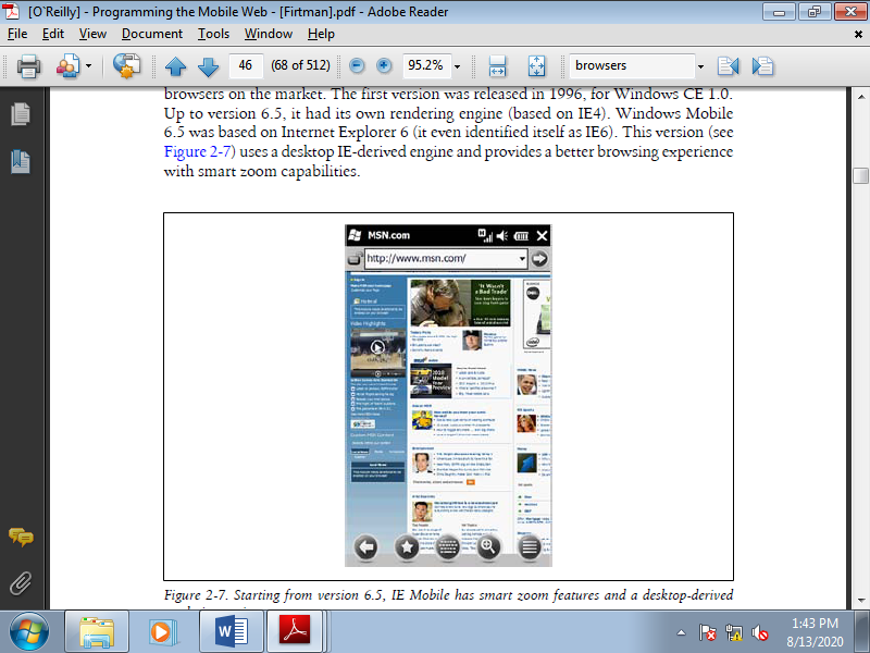
Figure 2.6(I) starting from version 6.5, IE Mobile has smart zoom features and a desktop-derived rendering engine.
The new OS , Windows Phone 7, is predicated on Silverlight and has a completely multi-touch UI. It comes with a new version of Internet Explorer Mobile, supported the IE7 engine with some IE8 features mixed. It's likely to supply similar behaviour to Internet Explorer 7, and multi-touch support.
4. Safari on iOS
Safari may be a WebKit-based browser bundled with iOS that gives an excellent browsing experience and smart zoom options. It's updated with every OS change to incorporate new features that allow us to make better user experiences.
Safari on iOS is currently the only mobile browser to support a variety of latest features, including people who allow us to make animations, transitions, 3D, and Flash-like experiences using HTML, JavaScript, and CSS, but without Flash. This browser is meant just for touch and multitouch navigation. It doesn’t support focus or cursor navigation due to the lack of a keyboard within the devices on which iOS is installed.
5. Nokia Series 40 browser
Every Nokia Series 40 device comes with a built-in browser created by Nokia. Up to Series 40 5 th edition, it had been a simple browser without smart zoom capabilities, designed with low- and mid-end devices in mind. It had been basically attention navigation browser, supported Nokia’s own rendering engine.
Beginning serial 40 6 th edition, the browser is WebKit-based (similar to Nokia’s S60 browser), creating a replacement browsing experience for low and mid-end devices. The most problem with this browser is that the low and mid-end devices aren't created with high-quality hardware, which may cause some performance problems.
In 2010, Nokia acquired a browser company called Novarra that gives proxy-based web support. It's possible that new Series 40 devices created after this writing will accompany a proxy-based browser supported Novarra’s solutions to supply a far better and faster browsing experience in these types of devices.
6. Sony Ericsson browsers
If we analyse Sony Ericsson’s non-smartphone devices that's , those not supported an OS like Symbian or Windows Mobile we will find three primary browsers in use, counting on the device’s release date:
• Sony Ericsson WAP browser before 2004
• Sony Ericsson browser from 2004 to 2006
• NetFront browser (version 3.3, 3.4, or 3.5) from 2006
Other browsers, like Opera and even Openwave, were also preinstalled in some devices. Devices that shipped with NetFront 3.4 or 3.5 support cursor navigation.
7. Obigo browser
The Obigo mobile browser from Obigo/Teleca claimed 14% browser market share in 2007 (before the smartphone revolution). It are often found in Samsung, LG, Motorola, and Sony Ericsson devices and in many CDMA devices from some operators, like Verizon. Obigo also offers a widget solution implemented by LG Mobile.
The Obigo Q7 supports major web standards plus smart zooming, multiple windows, and RSS. It can run in several operating systems, including Symbian, Windows Mobile, Linux, and various native platforms.
8. Motorola Mobile Internet Browser (MIB)
Motorola devices supported the Motorola proprietary OS go together with a simple proprietary browser that permits focus navigation and page scrolling. The last version was 2.2.As a sign of its limits, it can only render documents up to 10 KB.
Some other older devices came with the Openwave, Obigo, or Opera browser preinstalled. An equivalent device model shipped at different dates and in several markets didn't necessarily come with an equivalent browser.
9. Symbian browser
In 2005, Nokia created an open source WebKit-based mobile browser for the S60 platform using Symbian (also referred to as the S60 OSS Browser). It supports smart zoom features and was installed on every S60 device since that year. Depending on the device, it supports focus, cursor, and touch navigation.
Many devices support quite one navigation type; as an example , the Nokia N97 supports touch navigation, and cursor navigation when the keyboard is opened.
Some older devices that use an older Nokia proprietary browser without modern features are still on the market.
10. Android browser
The Android OS comes with its own browser, supported WebKit. It's called the Android browser (not Chrome, differentiating it from Google’s desktop WebKit-based browser) and may be a very powerful browser with touch support. It's often compared in terms of its standards and extension support to Safari on iOS.
The Android browser supports multiple windows, smart zooming, and lots of other advanced features.
11. WebOS browser
The new Palm OS comes with a WebKit-based browser that supports the newest web technologies. It supports touch navigation and a card concept that permits the user to open many websites at an equivalent time and flip between them employing a finger. Starting with OS 1.4, the webOS browser is predicated on a special version of the WebKit engine, so there could also be differences before and after 1.4.
12. BlackBerry browser
Every RIM device comes with a mobile browser with focus navigation and, more recently, touch navigation support. Many versions of the browser are available, based on the device. There are devices with trackball and cursor navigation, older devices with focus navigation, and newer smartphones with touch support.
The first generation of the BlackBerry browser was included with Device Software version 4.5 and earlier. The second generation, available from version 4.6, had a totally redesigned rendering engine. There are still tons of first-generation browsers in devices on the market today, so we'll got to target them if we are targeting BlackBerry users.
BlackBerry devices running OS 6.0 will have a WebKit-based browser more almost like other smartphone browsers. BlackBerry recently acquired Torch Mobile, creators of the Iris browser, which within the future are going to be available just for BlackBerry devices. A BlackBerry are often connected to the web in several ways, counting on the device and therefore the operator’s plan.
13. BlackBerry browser
You access the web using your company’s corporate intranet proxy. The documents are transcoded, compressed, and encrypted by the BlackBerry Enterprise Server, using your company’s security policies.
14. Internet browser
You can access the Internet directly using the BlackBerry Internet Solution as a compressor proxy.
15. WAP browser
You can access the Internet directly using your operator’s WAP gateway such as 1.0 or 2.0.
16. WiFi browser
You access the web directly use a Wireless LAN connection. Newer BlackBerry devices support many browsers. The available browsers depend upon whether you're a private customer with or without a BlackBerry server account or a company customer; there's no simple rule. The various browsers appear on the device as different applications, but they're mainly an equivalent rendering engine connecting through different networks.
17. Samsung WebKit browser
The Samsung WebKit browser is installed with the new Bada OS. At the time of this writing there aren’t yet any Bada devices on the market, and no information is out there about the browser. The demo shows a modern browser with smart zoom features.
18. MicroB (Maemo browser)
MicroB, the browser installed in Maemo (now MeeGo) devices (Linux-based Nokia devices), uses Mozilla’s Gecko rendering engine, an equivalent one utilized in Firefox. That's why MicroB is extremely almost like Firefox and understands a number of the unique features of that browser.
MicroB was developed by Nokia and supports plug-ins, almost like Firefox. However, thanks to the lack of some XUL features, Firefox plug-ins must be rewritten to work on MicroB. Available plug-ins include Adobe Flash Player, Greasemonkey, Adblock, Gears, and Windows Media Player. The web site for the MicroB are often found at http: //browser.garage.maemo.org.
User-Installable Browsers
The market complicates things further: we also got to believe user-installable browsers. These are free and commercial web browsers that you simply can install after you purchase a tool . Sometimes they're included on the device by the seller or the operator during a particular country or region.
1. Opera Mobile
Opera has lost the desktop browser war, but it took its experience in browser creation and entered the mobile world in 2000. Opera Mobile has been installed on 125 million smartphones since 2004.
Opera Mobile may be a full browser with tab and cursor navigation that comes factory preinstalled on some devices and is usually preinstalled by the carrier using an o.e.m license, replacing the default device browser.
Opera Mobile is additionally a product available to be downloaded by the end user for Windows Mobile and Symbian devices. The newest versions support smart zooming, widgets, Opera DragonFly (a toolkit for developers), and Opera Turbo, a service that compresses sites on Opera’s servers, reducing traffic by up to 80%.
2. Opera Mini
My Opera addiction continues: Opera Mini is one among the simplest Java ME applications ever produced. It's a free browser that works on almost any device, including Android and iOS devices (iPhone, iPod, iPad). It supports “the full web” as a proxied browser.
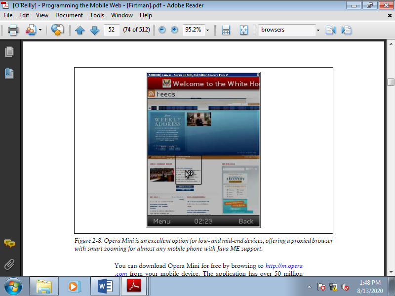
Figure 2-8. Opera Mini is a superb option for low- and mid-end devices, offering a proxied browser with smart zooming for nearly any mobile with Java ME support.
This means that if you browse using Opera Mini, you won’t be accessing websites directly. Instead, the application will contact an Opera Mini server which will compress and pre-render the websites. This enables very quick full web navigation for each device, whether low-end or smartphone.
From version 4, it supports video playback, Ajax, offline reading, and smart zooming, even in low-end devices. From version 5, it also supports tabbed browsing, a password manager, and touch navigation in devices with touch support.
3. Firefox for mobile
The Mozilla Foundation arrived a small amount late to the mobile browser world. At the time of this writing, Mozilla offers a downloadable Firefox version for Maemo devices (the Nokia N900, for example), and a version for Android has been announced. Updated information is out there at http://www.mozilla.com/mobile.
You can download the mobile version of Firefox from http://m.firefox.com. It uses an equivalent Gecko engine because the Firefox 3.6 desktop browser. For alpha releases, you'll find information using the code name Fennec, at http://www .mozilla.org/projects/fennec.
4. UC Browser
The UC Browser (formerly referred to as UCWEB) is that the #1 browser within the Chinese market and is now available in English for other markets. It's a proxy-based browser supporting full HTML and JavaScript, multiple windows, and lots of advanced features. Free downloads are available for Java ME, Windows Mobile, Symbian, and even iPhone devices (only those with jailbreak). Android and BlackBerry versions are announced, too. You'll download the browser from http://www.uc.cn/English.
5. SkyFire
SkyFire may be a free proxied browser for Windows Mobile, BlackBerry, and S60 with full web support and support for Flash and video streaming. Websites are pre-rendered on the SkyFire server, using the Gecko rendering engine (the same as Firefox/Fennec). You'll download it from http://www.skyfire.com.
6. Bolt
Bolt is another free proxied browser that permits the user to ascertain full websites, including video and audio content. It's supported Java ME, like Opera Mini, and it’s also compatible with BlackBerry devices. A Bolt Lite version without multimedia support is out there for low-end devices. You'll download Bolt from http://www.boltbrowser .com.
7. Chromium
Chromium is that the name of the open source project for the Google Chrome desktop browser. As it’s an open source project, anyone can create a port for various mobile devices. At the time of this writing, there are non-official compilations for Maemo (N900), but Google has not officially ported the browser to any mobile devices.
Browser Overview
That list of browsers is a lot to digest. Table compares key features of the commonly used browsers in the market.
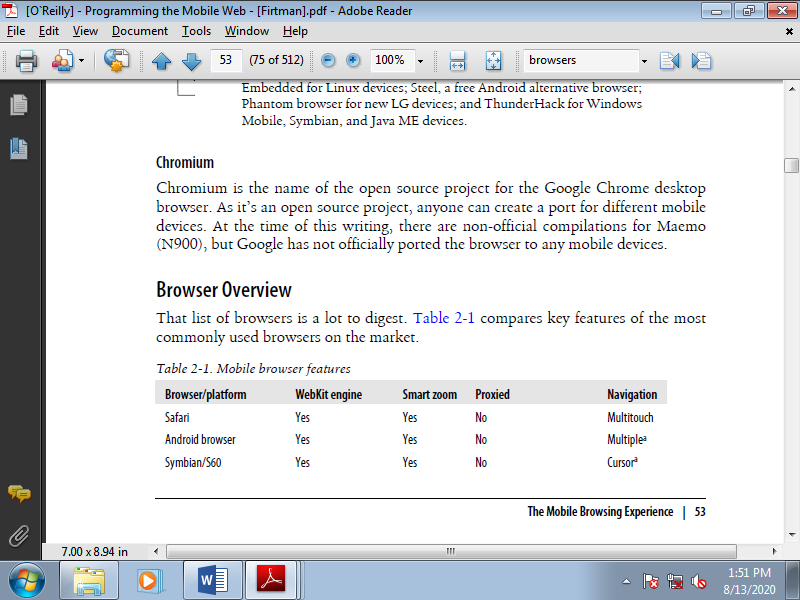
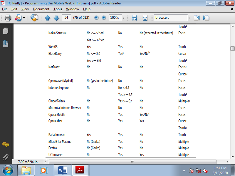
Table shows Mobile browser features
Web Platforms
Developers benefit of native functionality across mobile devices. Quite a smaller, web such as interface, an Android, BlackBerry, WP7, or iOS device make a phone calls also as record and transmit contextual information like geolocation.
As bad because it is to figure into any particular corner, we all have comfort zones and favourite platforms. Just confine mind that this fragmentation is bad for marketing, design, and user experience; this same market fragmentation is completely terrible for application creators to unravel exciting new puzzles. Remember of comfort zones and safety nets, and obtain able to evolve.
A. Android
Android features a diverse ecosystem, with fewer institutionalized restrictions and a wider sort of mobile devices than other popular systems. The Android user base has grown to be a robust competitor within the mobile market, but the flexibility of Android design can introduce new issues. Development of the Android OS is led by Google, and backed by a worldwide and growing user base. Google maintains user interface guidelines in an online repository at http://developer.android.com/guide/practices/ui_guidelines/index.html .
Interface Tips
Following are the hints for Android application design:
• Android convention is to put view-control tabs across the highest, and not the bottom, of the screen.
• Use the most application icon for temporal, hierarchical navigation, rather than a “back” button and main icon link to the home screen.
• Don’t mimic interface elements or recycle icons from other platforms. Consider example , list items shouldn't use carets to point deeper content.
• Parallax scrolling is common in Android applications.
• Android development can reach home-screen “widget” tools.
Accessibility
Google provides guidelines and proposals , like testing with the preinstalled and always-free TalkBack.
B. IOS
Apple maintains strict design standards, which are detailed and updated online. IOS interface documentation and general mobile design strategies are available from Apple, including design strategies and case studies.
Interface Tips
Apple can reject an application from the official App Store because of design problems. Follow the present guidelines closely such as:
• iPhone users generally hold from the bottom of the device, so main navigation items should be in reach of user thumbs.
• Target areas for controls need to minimum of 44 x 44 points.
• Support standard iOS gestures, like swiping down from the top to reveal the Notification Center.
• Larger iPad screens are great for custom multi-finger gestures, but non-standard gestures and never be the sole way to reach and use important features.
Accessibility
Provides Apple’s Accessibility Programming Guide for detailed guidelines on VoiceControl, Speech Synthesis, and VoiceOver. Accessible touch and gestural controls are available on the iPad and later generation iPhones in that screen magnification and color contrast adjustments also are available.
C. BlackBerry OS
BlackBerry OS is the mobile device of choice in government or corporate environments. BlackBerry is with native support of corporate emails; and runs on many devices with hard keypads, which is favoured by users with accessibility issues also as late adopters to touch-screen interfaces.
Interface Tips
When designing a BlackBerry mobile application consider following standards:
• Use BlackBerry UI components, not the tabs or other components of alternate platforms.
• Use standard interaction behaviours for an intuitive experience.
• Link common tasks to the BlackBerry track pad consistent with standard actions:
• Press the track pad: default , like revealing the menu
• Press and hold track pad: Activate available pop-up box
• Press track pad and choose Shift: Highlight content
• Press track pad and choose Alt: Zoom
• Move finger along track pad: Cursor or mouse is move accordingly
Accessibility
BlackBerry mobile devices contains the text-based push-delivery messages, closed captions on multimedia content, and hearing-aid compatibility for hearing accessibility issues. Low-vision users can use the Clarity theme and other screen adjustments, and enjoy tactile keyboards. Predictive text and AutoText aid users with mobility and cognitive issues.
D. Windows Phone 7
Developed by Microsoft, Windows Phone 7 (WP7) is currently smaller contender, focused on consumer markets. Using the “Metro” theme, features are divided into “Live Tiles” that link to applications.
Microsoft maintains design-impacting requirements for hardware, including six dedicated hardware buttons such as back, start, search, camera, power, and volume, a minimum of 4 GB of flash memory, and Assisted GPS. Microsoft also keeps a set of WP7 design resources.
Interface Tips
Windows Phone 7 interfaces are minimalist, using empty space to lend clarity to the appliance .
• WP7 uses movement over gradients for on-screen elements to immerse users within the application experience.
• Users will enter a WP7 application from a “tile,” which may display dynamic and real-time information. Tile images is within the PNG format, 173 pixels that is 173 pixels at 256 dpi.
• Do not use a “back” button to navigate back the page stack. All WP7 devices have a dedicated hardware button which always be used instead.
• Give users a distinctly WP7 experience. Panorama controls slide horizontally through panes, and pivot controls list panes users can visit. Uniform Page Shuffle presents non-hierarchical information users can shuffle through; “leaf-blowing turn” flips content area into focus, scattering and tilting tiles leaving focus.
Accessibility
WP7 devices include many standard accessibility features such as colour and contrast adjustment to themes for low-vision users. Many, but not all, devices are compatible with TTY, TDD, and hearing aids.
E. Mobile Web Browsers
If a mobile application sends users to a web site, that website was optimized for mobile browsers. Similarly, mobile web applications should follow key mobile design methods. An excellent resource for design best practices for mobile web browsers is published by the W3C.
Interface Tips
• Test for a standardized experience when websites are accessed from a range of mobile browsers.
• Provide minimal navigation at the top of the page, and use consistent navigation mechanisms.
• Do not change or refresh the present window, or cause pop-ups, without informing the user and providing the means to prevent it.
• Limit content to what the user has requested, and what the user’s device can display by avoiding large image files.
• Specify default input formats; when possible, provide preselected defaults.
Accessibility
The W3C Web Accessibility Initiative provides introductions, solutions, and resources to create accessible mobile websites and mobile web applications.
Mobile Development Tools are software designed to help within the creation of mobile applications. This is performed in multiple ways, for instance , there are native mobile development tools, but cross-platform mobile development tools.
• Native mobile development tools can assist you create specialised apps that operate with ease and top quality , and may benefit of all features on their designated platform.
• Cross-platform mobile development tools on the opposite hand make it possible to make a generic app for multiple platforms simultaneously, greatly cutting the prices and time needed to make an app, but this comes with a trade-off. Non-platform specific applications made during a cross-platform environment tend to possess more issues and lower quality compared to native applications.
Developers can choose from different approaches to cross-platform app development, with hybrid mobile app development and rapid mobile app development (RMAD), or ‘codeless’ mobile app development. Low-code or no-code tools may appeal to organisations that don’t have the in-house knowledge and/or can’t afford to rent developers; however, the setback with these options is that they don’t leave the maximum amount control or customisation.
A. Native Mobile Development Tools
A native development tool is a software which allows developers to make applications to be used during a single particular system family, platform or device, like Android, iOS, or Windows. A native app is specially made and coded for a selected mobile platform in its native programing language, these are:
• iOS (Objective-C or Swift)
• Android (Java or Kotlin)
• Windows Phone (C#)
There are different guidelines for every of those platforms and developers got to stick with them as they differ in typography, graphic styles, gestures, visual effects, data entry and more.
1. Xcode

Xcode introduces a new way to design and build software. Swift is an innovative new programing language for Cocoa and Cocoa Touch and, when combined with Xcode tools, makes programming a delightfully live experience. Live rendering within Interface Builder displays your hand-written UI code within the design canvas, instantly reflecting changes you type in code.
Xcode contains everything developers required to create applications for Mac, iPhone, iPad, Apple TV, and Apple Watch. Xcode provides developers a unified workflow for user interface design, coding, testing, and debugging.
2. Android Studio
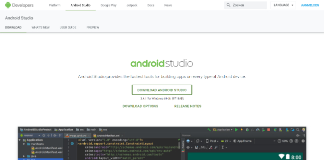
Android Studio is an Android development Software built by Google. Its implementation editor is extremely useful for Android developers. Android studio provides shortcuts for coding and designing and its layout designer makes it very easy to use, which helps reduce time spent on coding. Android studio also provides drag and drop features to design the layout of your projects.
3. AppCode
AppCode is an IDE for iOS/macOS development. Additionally to working with Objective-C, Swift and C/C++ programming languages, it also supports web technologies like JavaScript, HTML, XML, CSS, and more. It provides a range of valuable integrations including among others CocoaPods manager and built-in Reveal support. Additionally to the advantages AppCode provides to developers such as saving their time on automating routine tasks, locating and fixing errors, taking advantage of intelligent support from the IDE, and increasing their overall productivity, this is a equally valuable asset for your business.
B. Cross-Platform Mobile Development Tools
With cross-platform mobile development, programmers on one platform can develop apps for one or more other platforms or mobile operating systems at same time. This will enable developers to use an equivalent code base for various platforms. Meaning that such generic apps are published and used on both an Android Phone and an iPhone.
This greatly reduces the time and costs needed for creating an application, there also are down sides. Because of it being one and therefore the same code base, these generic apps tend to possess more platform-specific issues and a lower quality than a native application. This in fact varies per application, system and platform used.
This category is split into three platforms:
• Coding Platforms
• Low-Coding Platforms
• No-Coding Platforms
Coding Platforms
Coding platforms provide you with full control over your entire development process. The downside is that it requires knowledge over your chosen coding language. But this trade-off is undoubtedly worthwhile if you'll streamline your app to perfection and have perfect control over your application.
4. Appcelerator
Appcelerator is a mobile development tool which speeds up time to plug with cross-platform development and testing and simplified access via optimised APIs. Real-time mobile analytics are available on the platform, helping to power user engagement and measure results. Appcelerator uses one JavaScript code base for rich native mobile apps and cloud-connected mobile apps.
5. Xamarin
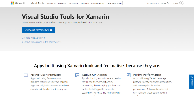
Xamarin is a mobile application development platform that supports designers and developers to build native iOS, Android and Windows applications employing a single shared .NET code base. An Integrated Development Environment (IDE), Xamarin utilises Visual Studio Tools to create native mobile applications. The platform offers a number of features such as code editing, refactoring, debugging, testing and cloud-publishing. Additionally, the platform provides access to on-demand content from Xamarin’s university curriculum and monthly Azure credit.
6. Adobe PhoneGap

Adobe PhoneGap allows you to figure with one code base, but with a special set of technologies. PhoneGap is an open source, cross-platform tool that builds apps with HTML, CSS, JavaScript, and Web APIs. A PhoneGap application is actually a set of HTML pages wrapped during a native app shell, which are then pushed out to native platforms via native APIs. With PhoneGap, developers create files in HTML, CSS and JavaScript like they might when creating a web site. These files are stored during a local directory or within the cloud, then when they’re run on a tool , they access device features through plugins.
This makes PhoneGap apps lighter-weight and highly reusable, but they need less of a native feel, and therefore the quality of the UI goes to depend more on the web View engine of the OS rendering it. Note: Adobe PhoneGap is predicated on Cordova technology. If you're developing a hybrid mobile app, you'll either create it using proper Cordova or choose Adobe’s ecosystem for using PhoneGap distribution of Cordova.
7. Ionic
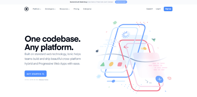
Ionic is an easy-to-use, and easy-to-learn framework that permits for quick prototyping with a good CLI. Integration with Angular makes for an enjoyable environment to code in. Built on standard web technology, Ionic helps teams build and ship beautiful cross-platform hybrid and Progressive Web Apps with ease. The Ionic Framework may be a free, open source mobile UI toolkit for developing high-quality cross-platform apps for native iOS, Android, and the web all from one codebase.
8. React Native
Developed by the Facebook community, React Native a cross-platform framework supported JavaScript technology. It enables developers to create enhanced and native-like apps using a single code base. The aim of this framework is to create first-rate native application experiences using JavaScript and React. This unique JavaScript technology makes possible to develop a cross-platform mobile application that appears and seems like a native one but it's coded by one team of engineers simply using React and JavaScript.
9. MobiLoud
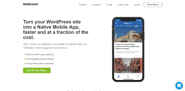
MobiLoud may be a WordPress plugin that permits businesses of all sizes to make native mobile applications for iOS and Android devices. It integrates with WordPress websites to convert them into native mobile apps and support users to publish the apps on the Apple App Store and Google Play. Features of the MobiLoud platform include performance monitoring, push notifications, external link embedding, login and subscriptions, mobile advertising, offline access and analytics. MobiLoud facilitates white label branding that helps users customize the brand , style, color, font and content within their app.
10. Ninox
Ninox may be a cloud-based platform for building custom database applications, with solutions for Mac, iPhone, iPad, and web browsers. The platform allows users to make custom apps using built-in templates, custom actions, scripting, and drag-and-drop formulas to attach multiple databases.
Custom forms, fields, and triggers are created, and calculations are built using the visual formula editor. Ninox are often accustomed create a good kind of application types, covering event management, invoicing, customer relationship management (CRM), task management, meeting management, and more. Additionally teammates are often invited to collaborate, and users can control the permissions granted to every collaborator. Devices are often synced in real-time, allowing users to access and work on their apps from multiple devices.
11. Sencha

Sencha is an app development company that gives products to enable developers to make web applications for desktops, tablets, and smartphones. Its Ext JS product features high-performance UI components like Pivot Grid, D3 Adapter, HTML5 Calendar, and more. Sencha equips developers with frameworks, tools, and services to assist build amazing web application experiences. With a longstanding commitment to web technologies, Sencha reduces the value and complexity of developing and delivering enterprise applications across multiple device types.
12. NativeScript
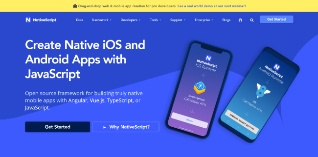
NativeScript allows you to make native iOS and Android apps, with one codebase, using the web skills like JavaScript and CSS and therefore the libraries you already love. NativeScript is an open-source framework that builds native applications using other frameworks like Vue.js or Angular and languages like Typescript or Javascript.
13. Onsen UI

Onsen UI possesses a rich kind of UI components specially designed for mobile apps. It provides tabs, side menu, stack navigation and lots of other components like lists and forms. All animations in Onsen UI are tuned and optimised to perform well on a good range of devices. Onsen UI is simple to find out while being a strong tool to make complex mobile apps. Onsen UI has many learning resources including official documentation, an interactive tutorial and a community forum where your questions get answered.
Low-Coding Platforms
Want to form the method less time consuming? Then these low-coding platforms could be what you’re trying to find . These platforms are ready to efficiently streamline your development process, by limiting the quantity of coding that's required. Instead the platform itself will assist you with specialized building programs, yet still allowing customisation with coding.
14. OutSystems
OutSystems may be a low-code app development platform that permits users to create , deploy, manage, and alter enterprise-grade mobile and web apps faster. It includes quite 140 ready-to-use user interface patterns and templates to accelerate UI development. OutSystems provides multiple types of support options to assist its users maximise the utilization of the software. These include unlimited email support, knowledge domain resources, online training and tutorials, exclusive webinars, and a customer on-boarding program.
15. Fliplet
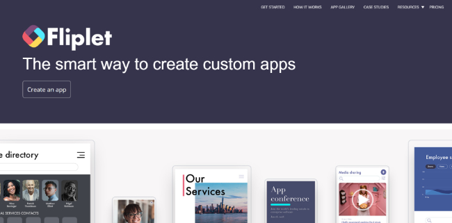
Fliplet empowers clients like Accenture, Deloitte and Colgate to form bespoke apps like marketing apps, training apps, sales enablement apps and internal communication apps. Fliplet offers a drag and drop interface for non-technical people to make their own bespoke apps and relieve the pressure thereon to require care of app content and infrastructure.
The licence allows a user to form as many apps as they need one per campaign, per event or even per key client if desired. Fliplet’s enterprise clients enjoy a world class design and user experience expertise also as proactive online support. Fliplet works with Apple, Android and Windows and meets enterprise-grade security requirements.
16. TrackVIA
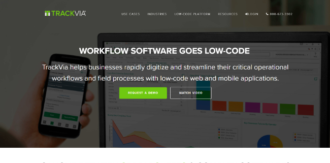
TrackVia could also be a low-code alternative to spreadsheets, legacy databases and complicated enterprise systems. Track, manage and automate critical business processes or operational workflows with greater efficiency, speed and ease. TrackVia does this by making it easy to collect data accurately, analyse that data in real time, and take immediate action through automated tasks, alerts or even emails. TrackVia allows you to require care of control of your application needs even without a programming background.
No-Coding Platforms
If you've got no prior knowledge of coding whatsoever, lately , you'll can create an app that’s perfectly fitted to your company. This is often made possible through the utilization of no-coding platforms, they supply you with services, such as, a drag-and-drop interface, allowing you to make an application without typing a line of code. The downside is that because it’s made to be simple and efficient, it removes an outsized chunk of customisation and adaptability that comes with coding.
17. AppSheet
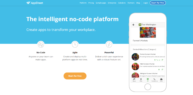
AppSheet support anyone to create powerful mobile apps for iOS and Android apps directly from their own data sources. Data was extracted from multiple sources, including Box, Dropbox, OneDrive, Google Drive, and Smartsheet. Once an app is made , users then customise the branding and features offered, with interactive emulator to preview the app.
AppSheet support both a basic editor and a complicated editor for app customisations. The essential editor covers the foremost basic and important app features and functions, such as the app logo, view controls, app name, security level and sign-in requirements, and offline functionality, also allowing users to directly edit spreadsheet data and reorganise spreadsheet structure.
18. Quick Base

Quick Base is application building platform allows users to make customised business apps with no coding required. The enterprise-ready solution provides tools including workflow automations, notifications and reminders, task management, team collaboration, interactive dashboards, and more. Quick Base with easy web forms for fast data collection, point-and-click integration with other cloud apps and data sources, robust APIs, unlimited reports and dashboards, customisable home pages, and right-sized governance including role-based access control.
19. Alpha anywhere
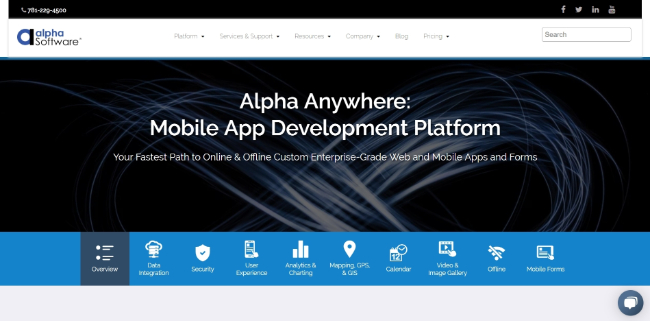
The Alpha platform is a unified mobile and web app development and deployment environment with distinct “no-code” and “low-code” components. Using the Alpha TransForm no-code product, business users and developers can take advantage of all the capabilities of the smartphone to show any form into a mobile app in minutes, and power users can add advanced app functionality with Alpha TransForm’s built-in programing language . IT developers use the Alpha Anywhere low-code environment to develop complex web or mobile business apps from scratch, integrate data with existing systems of record and workflows, and add additional security or authentication requirements to guard corporate data.
20. BuildFire
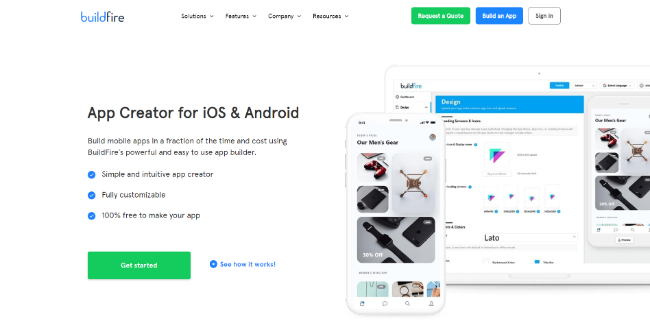
BuildFire provides the simplest of both worlds, with high-end custom development capabilities as a simple , intuitive DIY platform. The elegant drag-and-drop UI makes it easy to create your own iOS or Android application. The platform supports quite 10,000 apps, and is powerful and enough to scale with you to satisfy your business’s needs as you grow.
Reference Text Book
1. Jeff McWherter, Scott Gowell, Professional Mobile Application Development, John Wiley & Sons, Ref: www.it-ebooks.org
2. Maximiliano Firtman, Programming the mobile Web, Oreilly, 2nd Edition, 2013, ISBN: 978-1-449-33497-0
Reference link
1. Https://mopinion.com/mobile-development-tools-an-overview/