UNIT 3
Application Architectures and Designs
A. Navigation
When creating your mobile web concept, before coding you must define what is going to be within the navigation tree for the user. To do that, you would like to know what services and information are going to be available for the mobile user. Always remember the 80/20 law: 80% of your desktop site won't be useful to mobile users. Therefore, you would like to research the 20% you must be that specialize in.
There are some tips need to follow:
• Define the use cases for instance, find a product price, find a store near you, call us, or perform a research.
• Order the use cases by the foremost frequent for a mobile user. Use your best guess, statistical information, and usefulness tests to stay this order updated.
• Do your best to form every use case successful in no quite three clicks or at a page depth of no quite three.
• Define approximately three main sections below the home page. If you would like more, you should separate your service into more mobile pages.
• Always offer a link to the desktop website.
• Determine whether locating the user is beneficial for your services.
• Reduce the form pages for user input to the minimum.
• Avoid startup or welcome screens.
• Do your best to predict users’ input supported the context and their browsing history to scale back the amount of selection pages and clicks required.
B. Context
Mobile user features a different context than a desktop user. Following are the possible contexts:
• Where is that the user?
• Why is that the user accessing your mobile website?
• What’s the user looking for?
• What are you able to offer from a mobile perspective to assist solve the user’s problem?
• Where will the user be when accessing your website? Walking on the street, using public transportation, at the office, traveling as a tourist?
The context define many things about navigation, use cases, and therefore the usability needs for mobile site.
C. Progressive Enhancement
Progressive enhancement could also be an easy but very powerful technique utilized in web design that defines layers of compatibility that allow any user to access the essential content, services and functionality of a web and providing an enhanced experience for browser with better support of standards.
The term was coined by Steven Champeon in 2003, and while this approach wasn’t defined for the mobile web specifically, it's really perfect for mobile web design. The concept subverts the standard web design strategy, mentioned as “graceful degradation,” where designers develop for the most recent technologies and browsers and their designs automatically work with the lesser functions available on older browsers.
This system isn't useful for mobile browsers because, as we'll see, there are serious compatibility issues within the mobile world. If we develop a web site for the newest device, it's going to not automatically work on other, less advanced devices.
Progressive enhancement has the subsequent core principles:
• Basic content is accessible to all or any browsers.
• Basic functionality is accessible to all or any browsers.
• Semantic markup contains all content.
• Enhanced layout is provided by externally linked CSS.
• Enhanced behavior is provided by unobtrusive, externally linked JavaScript.
• End user browser preferences are respected.
The objective is to have one only code that's compatible with all devices. We shouldn’t create lowest common denominator websites with great care that they're going to be compatible with all devices, and that we shouldn’t create overly complex mobile websites which will only work on high-end smartphones.
In the mobile web, a progressive enhancement approach also will include some server side detection and adaptation which will be mandatory for a few specific mobile markup (sending an SMS. From point of view, a mobile web design approach should have the subsequent layers which will be added employing a progressive enhancement strategy:
1. Create valid and semantic markup containing only the content no CSS, no frames or iframes, no JavaScript, and no Ajax. All the content and services on the web site should work with this easy version.
2. Insert within the document any special tags or classes required for device-specific functionality, like call-to links or a file upload form control.
3. Optionally, from the server, decide which MIME type you'll be using and recognize the device.
4. Optionally, from the server, replace the special tags inserted in step 2 with real markup depending on the device capabilities.
5. Add one CSS layer for basic devices, one for high-end devices, and one for a few specific smartphones. You’ll insert all the markup at an equivalent time using CSS media queries, or use a server-side mechanism to make a decision which CSS file to use.
6. Add an unobtrusive basic JavaScript layer for form validation and other basic features.
7. Add an unobtrusive Ajax layer for content updating, capturing the onclick event of each link.
8. Add an unobtrusive JavaScript layer and a CSS layer for advanced features (animations, effects, geolocation, offline storage, etc.
9. Optionally add widget support using a new layer.
D. Different Version Approach
A different approach is to make n different versions and redirect the user to the appropriate one depending on the device detected. The most problem with this approach is that we'd like to take care of n different versions of an equivalent document.
If this may be your strategy, expect to wish a minimum of 4 versions for a successful mobile website, with an optional fifth. If you create fewer versions, some users will probably have a nasty experience together with your site.
Using a server-side adaptation mechanism, you'll reduce the number of required versions to two: one for low- and mid-end devices and one for high-end devices and smartphones. Within the high-end and smartphone world it'll be better to use an adaptation strategy for the various features that aren't compatible with all devices. Broadly, here are the features you'll got to consider for every device category:
Low-end devices
Basic XHTML markup, maximum screen width of 176 pixels, basic CSS support (text color, background color, font size), no JavaScript
Mid-end devices
Basic XHTML markup, average screen width of 240 pixels, medium CSS support (box model, images), basic JavaScript support (validation, redirection, dialog windows)
High-end devices
XHTML or HTML 4 markup, average screen width of 240 pixels, advanced CSS support (similar to desktops), Ajax and DOM support, optional touch support, optional orientation change support (for an average screen width of 320 pixels)
Advanced smartphones
HTML 5, large screen size and high resolution, touch support, support for CSS extensions (animations, effects) and Ajax, storage, geolocation
Old devices (optional)
WML
Designing a mobile website are often a challenge at the start. Unless you're performing on a website for less than one device, forget about creating a particular pixel-by-pixel web design. Mobile website will look different on every device it’s viewed on.
A mobile website ideally consists of vertically scrollable documents. The standard two or three-column design isn't suitable for mobile websites. Every mobile web document features a few identified zones:
• Header
• Main navigation
• Content modules
• Second-level navigation
• Footer
When you are creating a mobile version of an existing desktop website, you would like to know that you simply are mobilizing the web site, not minimizing it. Minimizing a desktop website simply involves displaying an equivalent content on a smaller screen. Mobilizing is quite that; it requires understanding the context and offering your services and content during a manner that's useful and allows for quick access by the user.
Some best practices include:
• Avoid horizontal scrolling.
• Maintain visual consistency together with your desktop site, if you've got one.
• Reduce the amount of text.
• Use legible fonts on every screen; don’t believe the resolution.
• Use background colors to separate sections.
• Keep the most navigation to 3 or four links.
• Maintain the entire link count at no quite 10 per page.
• For low- and mid-end devices, don’t insert quite one link per line.
• Use all the available width for links, list elements, text inputs, and every one possible focusable elements.
• Provide a go to Top link within the footer.
• Provide a Back button within the footer.
• Provide the most-used features at the top.
• Group large lists by categories, each with no quite 10 items.
• Minimize the amount of user text input required.
• Save the user’s history and settings for future predictive usage.
• Split large text articles into pages.
• Try your color palette in several environments. Users could also be during a place with poor lighting, on public transport, at the beach in bright sunlight, or in an office with fluorescent lighting.
• Provide different styling for touch devices.
• believe fluid (liquid) designs for best adaptation.
• Use lists instead of tables.
• Don’t use text images.
• For touch and cursor-based devices, use full-width links in order that a link will activate if the user clicks on any pixel within the line containing it. Confirm there's just one link in each line.
• Use high-quality color images and fancier features stuff for smartphones.
• For cursor navigation, create medium-sized clickable zones for the cursor, moving by 5 or 10 pixels whenever. Don’t make the user travel tons using the cursor; design all the clickable buttons near one another.
• If you're providing a shortcut, a widget, or an offline version of your mobile website, create an alert at the top of the design alerting the user to download it. Don’t show that alert after many views or after the user has entered the download area.
Another excellent resource is Design for Mobile, which provides a listing of mobile web design patterns with explanations and examples. Among the Design4Mobile patterns recommend that you simply read the following:
• Screen Design Basics: presents dozens of small tips for markup.
• Screen Design Patterns: provides a listing of common solutions for designing buttons, list-based layouts, fisheye lists, zoom lists, search results, breadcrumbs, carousels, and text input fields.
• Application Navigation: describes the way to manage list navigation, auto completion, the back button, and other stuff.
Glyphish is free iPhone-styled gallery where you'll find icons to use for lists, tabs, and buttons.
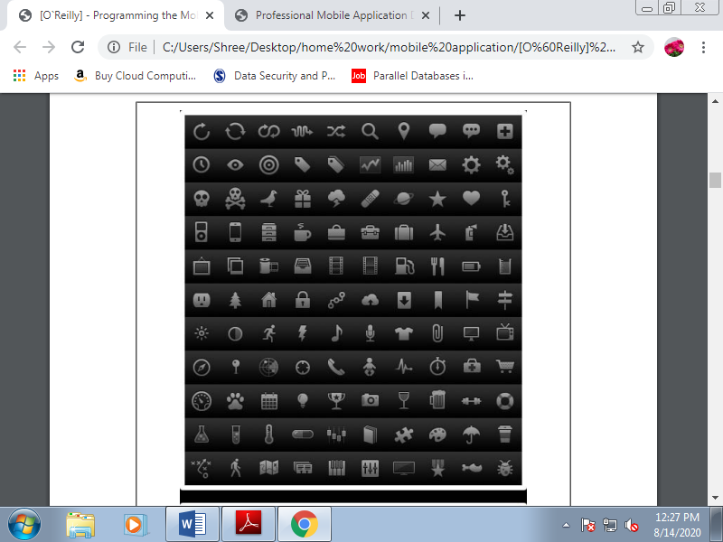
Figure 3.2(I) Some of the free icons for touch devices available at Glyphish.
A. Touch Design Patterns
Touch devices have unique features in terms of design and usefulness. With an equivalent amount of effort, the user can access every pixel on the screen; this encourages a special way of thinking about a design. Another difference is that the user will use her finger for touch selection. A finger is big compared to a mouse pointer, and therefore the hit zone should reflect this.
Here are some useful design tips for touch devices:
• When the user touches the screen, parts of it'll be obscured. Believe what is going to be hidden, and if it's important. Consider both right- and left-handed users.
• Provide an inexpensive amount of space between clickable elements.
• For frequently used buttons and links, provide a big clickable area (minimum 40 pixels width and height).
• For less frequently used buttons, you'll use a smaller area (minimum 25 pixels).
• Provide quick feedback when slightly is accepted.
• believe how scrolling will work.
• When using form input fields, attempt to insert the label above and hints below, to not the proper or left of the input field. Generally, touch devices with virtual keyboards concentrate on the sector when the user moves the main target thereto , therefore the user won't see what's at the right or left of the input field while typing.
- Use finger gestures on compatible devices.
- Use infinite lists rather than pagination. An infinite list features a “More” final item that the user can click to dynamically add more elements to the list. For performance purposes, you must reduce the amount of pages shown at an equivalent time.
When adding new pages, the simplest way to approach this is often to eliminate the first page from the DOM and make a “Previous” first item when the count reaches n pages. Doing this ensures that you simply won't have quite n pages shown at an equivalent time.
- Use an auto-clear textbox feature for the foremost common text inputs. This is often just an X icon at the right of the text input box that the user can click to automatically clear the input.
- Use the long-press design pattern for contextual actions. This suggests that if the user presses a zone for two seconds or more, you'll show a pop-up menu with contextual options.
- Prefer bottom-fixed to top-fixed tab navigation. The bottom of the screen is nearer the finger while browsing than the top zone.
- Analyze native touch applications for usability ideas.
B. Official UI Guidelines
Official user interface guidelines from the manufacturers are another source of inspiration for mobile web design. Here, you'll find guidelines, samples, tips, and descriptions of common mistakes. Many of the rules specialize in native application development, but we will apply most parts of them to mobile web design, too.
The foremost important guides are:
• iPhone Human Interface Guidelines
• UI Guidelines for BlackBerry Smartphones
• Motorola’s Best Practices for UI
• Forum Nokia UI Visual Guidelines
• Sony Ericsson’s UI Style Guidelines
• UI Guidelines for Windows Mobile
• UI Guidelines for Android a fragment of the iPhone Human Interface Guidelines is shown in Figure.
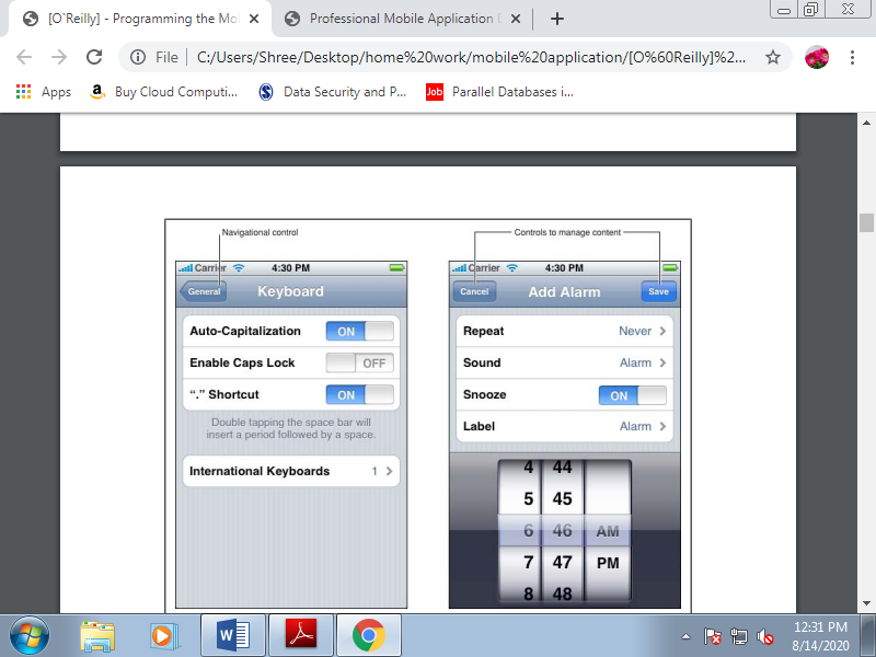
Figure 3.2(II) Official UI guidelines provide information about how your design should follow the user’s well-known interface.
Before starting our mobile web markup work, let’s take a look at a number of the simplest tools, IDEs, and emulators available for our use.
A. Working with Code
For coding our markup, JavaScript, and CSS, we will use almost any web tool available within the market, including Adobe Dreamweaver, Microsoft Expression Web, Aptana Studio, or maybe a text editor. Some tools, like Dreamweaver, work better with mobile markup and permit us to validate against mobile web standards. During this editor, once we create a new document we will choose XHTML Mobile because the document type. In mobile web development, it's often easier and cleaner to figure directly with the code.
B. Emulators and Simulators
The most useful tools for our work are going to be emulators and simulators. Generally speaking, an emulator may be a piece of software that translates compiled code from an original architecture to the platform where it's running. It allows us to run an OS and its native applications on another OS. Within the mobile development world, an emulator may be a desktop application that emulates mobile device hardware and a mobile OS, allowing us to test and debug our applications and see how they're working.
The browser, and even the OS, isn't aware that it's running on an emulator, so we will execute an equivalent code which will execute on the important device.
Emulators are created by manufacturers and offered to developers for free of charge, either standalone or bundled with the Software Development Kit (SDK) for native development. There also are OS emulators that don’t represent any real device hardware but rather the OS as an entire. These exist for Windows Mobile and Android. On the opposite hand, a simulator may be a less complex application that simulates a number of the behavior of a device, but doesn't emulate hardware and doesn't work over the real OS.
These tools are simpler and fewer useful than emulators. A simulator could also be created by the device manufacturer or by another company offering a simulation environment for developers. Because the simulator doesn't simulate all the device features, we will also find tools which will not be helpful for mobile web development but rather for other technologies, like Java ME.
In mobile browsing, there are simulators with pixel-level simulation, and others that neither create a skin over a typical desktop browser (e.g., Firefox or Safari) with real typography nor simulate their rendering engines. For mobile web development, we'll find emulators from Nokia, Symbian, BlackBerry, Android, Palm Pre, and Windows Mobile and simulators from Apple for the iPhone.
A multiple mobile browser simulator is out there from Adobe, called Device Central, but we'll not find any help from Sony Ericsson, LG, Motorola, or Samsung with their proprietary OSs. Some browser-based emulators, just like the Opera Mini emulator, also are available.
1. Android emulator
The Android emulator is out there in conjunction with the SDK to make native Java applications for Android. The Android emulator is out there for Windows, Mac OS X, and Linux. Once you’ve downloaded it, create a folder for the contents on your disk drive and unzip the package. Within the folder where you extracted the package, there's an android terminal command on Mac OS X/Linux and an SDK Setup.exe application for Windows that opens the Android SDK and AVD Manager, where you'll download and configure Android platforms after installing the base SDK.
Opening the Android emulator are often a little tricky the first time. You’ll open it from an IDE like Eclipse, but first you would like to put in the Android plug-in and make a native empty application. Alternatively, you'll open the emulator from a console window or from the SDK and AVD Manager.
Once you’ve installed a platform, you would like to make a new Virtual Device using the SDK and AVD Manager. Creating a new device involves selecting the target, defining a name, and specifying the dimensions of the SD card, the screen size, and other optional hardware features. One you’ve created the device, you'll attend Virtual Devices and click on Launch to succeed in a result just like the one. You’ll also install new tools from vendors, just like the Droid device for Motorola.
With the emulator opened, you'll open a mobile website by finding the browser using your mouse and typing the URL in its location bar. Up to Android 2.0, the emulator doesn’t support opening local files, so you’ll got to set up a local web server (e.g., Apache) or upload your files to a web server on the net.
2. Nokia emulators
Nokia has always had the higher emulators, since the start of mobile web development. Rather than one emulator per device, you’ll find one emulator for every version of every platform. You’ll download emulators for Series 40 (mid- and low-end devices) and for S60 (Symbian smartphones) at http://www.forum.nokia.com. In some cases there also are specific model emulators with specific features, like for the Nokia N97.
Unfortunately, Series 40 and S60 Nokia emulators, like that shown in Figure 4-5, are available just for the Windows OS , and a few of the old ones have problems with Windows Vista and Windows 7. It’s an honest idea to install a minimum of the last three emulators for every platform; for instance, Series 40 6th edition, Series 40 5th edition FP1 (Feature Pack 1), and Series 40 3rd edition FP2.
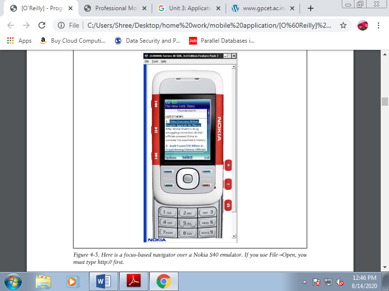
Figure 3.3(I) Here may be a focus-based navigator over a Nokia S40 emulator. If you employ File→Open, you want to type http:// first.
If you would like to emulate a Nokia device, first find the right platform version for that device at http://forum.nokia.com/devices then download the emulator for that platform. Nokia guarantees that each device supported an equivalent platform version has an equivalent browser and rendering engine and even an equivalent hardware features.
The Nokia emulators will add shortcut icons to your Start menu, so it'll be easy to seek out them. Once you’ve launched the emulator, you'll open the browser and type within the URL or use the shortcut File→Open, which allows you to type or paste a URL or browse for a enter your local filesystem. The emulator will open the browser automatically.
Nokia S40 emulators support the use of localhost or 127.0.0.1 to attach together with your desktop host computer.
3. IPhone simulator
Only available for Mac OS X, the iPhone Simulator offers a free simulation environment including Safari. It’s not an emulator, so it doesn't really provide a hardware emulation experience and isn't a real performance indicator. However, it's perfectly suitable for seeing how your website is rendering and the way your code is working. It’s especially convenient for loading local or remote files by typing within the URL field using your desktop keyboard. The SDK may take a short time to download, because it’s quite 2 GB. You’ll download the newest version of the OS, during which case you'll switch between versions using the Hardware→Version menu option. With the Simulator, you'll also select if you would like to simulate an iPhone or an iPad.
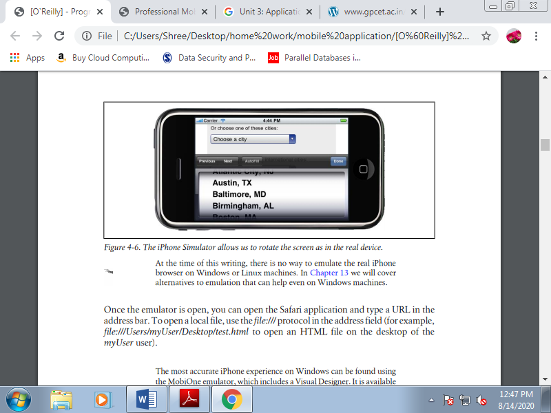
Figure 3.3(II) The iPhone Simulator allows us to rotate the screen as in the real device.
4. Palm emulator
Palm has been within the emulator marketplace for quite 10 years and has always had great support for these tools. It’s available for Windows, Mac OS X, and Linux. To use it, you want to have Sun VirtualBox, a free virtualization tool available from http://www.virtualbox.org, installed on your machine. If everything goes OK, you'll open the Palm emulator from the start menu, the command line/Terminal, or your applications list.
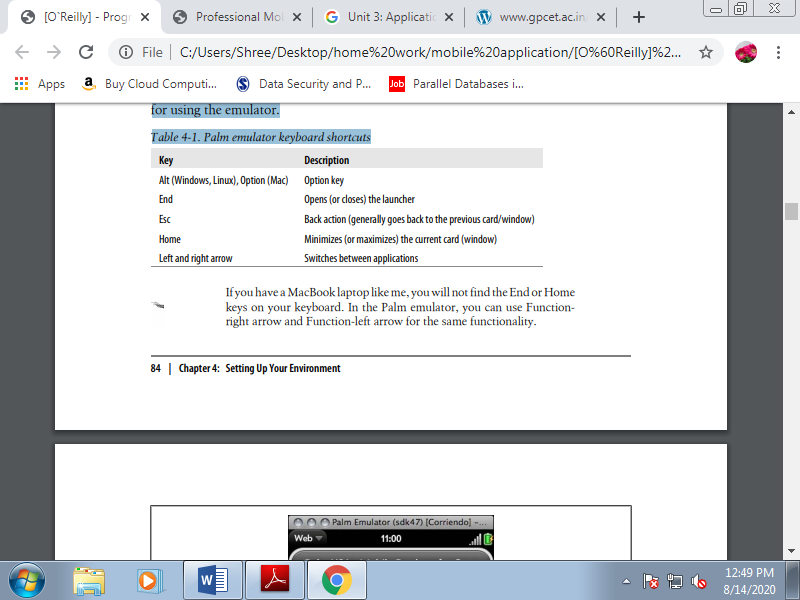
In the Palm emulator, you'll open the applications menu together with your mouse and choose Web to type a URL. This emulator are often a little confusing initially because it doesn’t support an onscreen keyboard; we only see the screen of the device. Shortcuts which will be helpful for using the emulator.
Table 3.3(III) Palm emulator keyboard shortcuts
5. BlackBerry simulators
Research in Motion (RIM), vendor of the favored BlackBerrys, has done an excellent job with emulators, with one only problem: it's very difficult to make a decision which one to download and use. Dozens of various installers are available at http://www.blackberry .com/developers; you'll download the proxy server, plug-ins for Eclipse and Visual Studio for web developers, and therefore the simulators. All the tools are compatible only with the Windows OS.
The primary requirement is to download the BlackBerry Email and MDS Services Simulator Package. This proxy allows any simulator to access the network and emulates email services and an enterprise server. Before opening a browser, you would like to start out this service on your computer.
The first step is to select the smartphone you want to emulate and choose either the carrier you would like, or the OS version.
You'll also click the “view all BlackBerry Smartphone Simulator downloads” link and choose the suitable version of the BlackBerry simulator from the list of quite 20 available choices, starting with version 3.6. Every version features a choice of simulators available for several combinations of BlackBerry device and operator firmware. For instance, if you select version 4.2, you'll download a BlackBerry 8100 simulator with one among the subsequent operator options:
• Operator-less
• Cingular Wireless
• Vodafone
• TIM
• Telefonica
• Rogers Wireless
• T-Mobile USA
• Orange
• O2
Additionally, there are different versions of the OS available for an equivalent device and for an equivalent operators. You’ll either select the operator-agnostic firmware (Generic) or the firmware for a selected operator to download.
Table 3.3(IV) List of BlackBerry simulators and device models available for every version
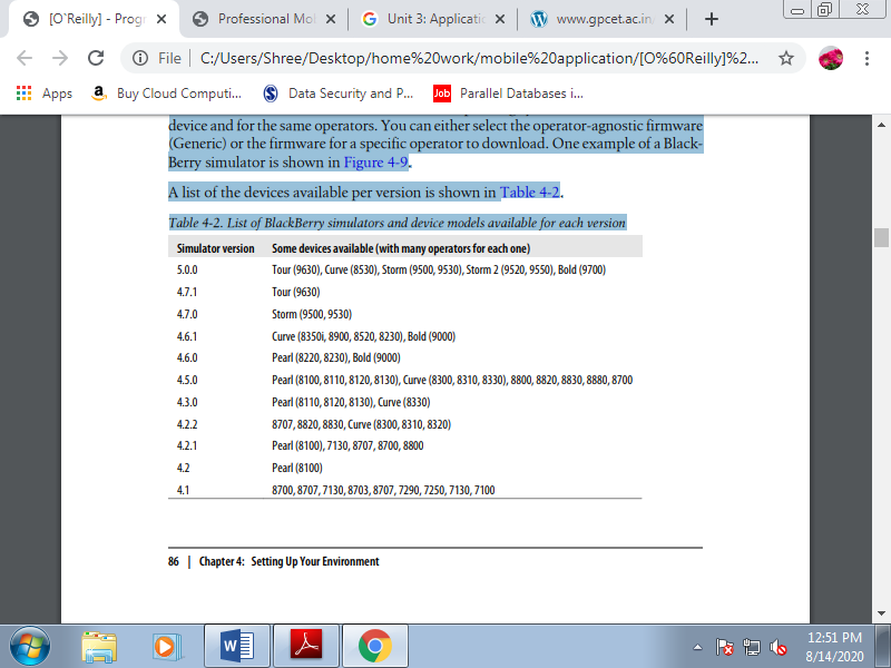
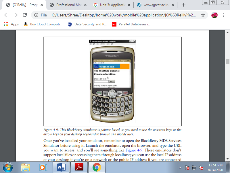
Figure 3.3(V) This BlackBerry simulator is pointer-based, so you would like to use the onscreen keys or the arrow keys on your desktop keyboard to browse as a mobile user.
Once you’ve installed your emulator, remember to open the BlackBerry MDS Services Simulator before using it. Launch the emulator, open the browser, and type the URL you would like to access. These emulators don’t support local files or accessing them through localhost; you'll use the local IP address of your desktop if you’re on a network or the general public IP address if you're connected on to the web.
6. Windows Mobile emulators
You can download Windows Mobile emulators alongside Visual Studio 2008 or 2010, or without the IDE in standalone mode. The emulator isn’t available with the free Express versions of Visual Studio, and that they work only on Windows-based computers.
You'll got to download:
• The Microsoft Device Emulator
• Windows Mobile emulator images or images from manufacturers
• Virtual PC 2007 for Internet connectivity
• ActiveSync (only for Windows XP or 2003 Server) or Windows Mobile Device Center (only for Windows 7, Vista, or 2008 Server) of these packages are available for free of charge.
If you’re using a version before 6.0, shortcut icons won't automatically appear within the Start menu after installation. You’ll got to locate the installation folder and execute the Emulator Device Manager (the file dvcemumanager.exe). The Emulator Device Manager lists all the installed images; you'll right-click on one and choose Connect from the context menu. However, your work isn't finished yet.
One among the foremost common problems with Windows Mobile emulators is that the web connection doesn’t compute of the box. You would like to try to some setup before connecting to the network. To attach the emulator with the network, follow these steps:
1. With the emulator opened, right-click it within the Device Manager and choose Cradle.
2. Within the Device Manager, choose File→Configure. On the Network tab, check “Enable NE2000 PCMCIA network adapter and bind to.”
3. Press okay to save your changes and make a bridge between your real network and a virtual network within the emulator.
4. Within the emulator, attend the network settings. The situation may change between Windows Mobile versions, but it was found near Start menu→Settings→Connections. Choose Network Cards and choose the web from the dropdown list.
5. Repeat this process for every emulator.
6. Open a champagne bottle and enjoy
7. Windows Phone emulator
Remember that starting in 2010, Microsoft will stop evolving the Windows Mobile OS and replace it with Windows Phone 7. The entire platform is new, including the mobile browser. To install the Windows Phone emulator you must use Visual Studio 2010. It includes the emulator, and you'll also use Internet Explorer. To install it, you'll need Windows Vista or Windows 7.
8. i-mode HTML simulator
If Japanese people are likely to use your website, you must consider testing it for NTT DoCoMo i-mode devices. Fortunately for people like me, who don't read Japanese, the company has created an English version of its website containing most the relevant development information. A simulator for its devices is additionally available for Windows. The primary one is suitable for simulation of devices released before May 2009, and therefore the other is for the second generation of devices, starting in May 2009.
9. Opera Mobile emulator
In 2010, Opera released the primary emulator for its Opera Mobile browser, available for Mac OS X, Linux, and Windows. The emulator runs the precise same code because the mobile version, so it's accurate. Additionally to the browser, the package includes an Opera Widgets Mobile Emulator, a desktop version of the widget engine available for Symbian and Windows Mobile.
With this emulator you'll also debug your mobile web applications using Dragonfly, a debugging service for Opera. You’ll download the emulator for free of charge at http://www.opera.com/developer/tools. You’ll also download the Opera Debug Menu, a group of shortcuts to Opera’s developer focused features, from an equivalent URL.
10. Openwave simulator
We have already talked about Openwave, a browser installed on many low- and mid-end devices from a spread of vendors before 2008. The company has since been acquired by Myriad Group, but we will still download different versions of the simulator.
11. Adobe Device Central
However, while Adobe Device Central is great for Flash Lite emulation, it’s not so good for websites. The tool is included with Adobe Dreamweaver, Adobe Flash Professional, and a few of the suites and has an updated list of devices, including their screen sizes and Flash Lite capabilities. However, for browser emulation it's just a miniature WebKit browser on the desktop.
It doesn’t provide real simulation in terms of typography, browser bars, and markup rendering. To simulate a web site open the HTML source in Dreamweaver and choose File→Preview→Device Central or, from version CS5, use File→Open.
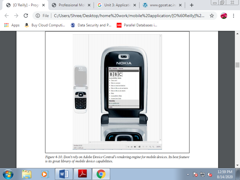
Figure 3.3(VI) Don’t rely on Adobe Device Central’s rendering engine for mobile devices. Its best feature is its great library of mobile device capabilities.
C. Online simulators
Online simulators are an alternative choice for exploring the mobile web.
1. Opera Mini Simulator
At http://www.opera.com/mini/demo, you'll enjoy a full Opera Mini simulation during a Java applet. This URL is for the newest version of the software, but you'll also find simulators for previous versions, like 4.2 at http://www.opera.com/mini/demo/?ver=4.
Opera also offers an emulator for Opera Mobile that works on Windows, Mac OS X, and Linux and may be downloaded for free of charge at http://www.opera.com/developer/tools.
2. Ready.mobi.
The website http://ready.mobi features a great testing tool. It also has a web simulator for a few older devices, like the following:
• Nokia N70
• Samsung Z105
• Sony Ericsson K850i
• Motorola v3i
• Sharp GX-10
3. IPhone web simulation.
Some websites, like http://www.testiphone.com and http://www .iphonetester.com, attempt to simulate the iPhone browser, but the experience isn’t the important thing; they're just iframes with the skin of the iPhone.
WML was incorporated into the WAP 1.1 standard and was the first standard of the mobile web. It wasn’t standardized by the planet Wide Web Consortium (W3C), but rather by the WAP Forum, an organization made from many players from the mobile industry performing on standards during this market.
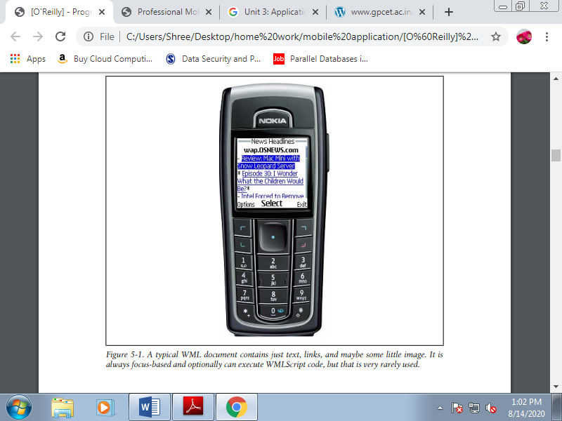
Figure 3.4(I) A typical WML document contains just text, links, and perhaps some little image. It's always focus-based and optionally can execute WMLScript code, but that's very rarely used.
In fact, some modern browsers supported WebKit (iPhone, Android, Palm) don't read this format anymore. It had been the markup for WAP 1.1, and therefore the first version was created in 1998! Just believe what mobile phones were like therein year. Still, if you look for “filetype:wml” in Google, you’ll find quite 2 million results using this format. And Google didn't index the bulk of the WAP 1.1 mobile web!
Internal no audited private reports of U.S. Traffic on The Weather Channel’s mobile site indicate that 50 of traffic in 2008 was WML-only, decreasing to 20 in 2009 and even less in early 2010. A WML file is an XML file, normally using the .wml extension.
It’s almost like HTML in some ways and really different in others. Let’s take a look at a typical WML file:
<?xml version="1.0"?>
<!DOCTYPE wml PUBLIC "-//WAPFORUM//DTD WML 1.1//EN"
"http://www.wapforum.org/DTD/wml_1.1.xml" >
<wml>
<card id="home" title="Welcome to Old Mobile">
<p mode="wrap">this is a <b>typical</b> paragraph in WML</p>
<p mode="wrap">It can include images,
<a href="http://wap.yahoo.com">External Links</a> and
<a href="#two">Internal Links</a>.
</p>
</card>
<card id="two" title="Second screen">
<p>This is like a second page in the same document</p>
</card>
</wml>
Recognize many tags found in HTML here, like p, b, and a, and that they have equivalent functionality. Other tags the 2 standards have in common include img, br, and input.
Firstly, a WML file starts with a root wml tag after the DOCTYPE declaration. A WML document is additionally called a deck. Every deck can contain many cards. A card, identified by a tag with an equivalent name, is one visible page during a browser; it's just like the contents of a body tag in HTML. WML file can contain many pages within the same document. This was an excellent feature for speeding up the performance of the mobile web within the early 2000s.
WML was conceived for mobile devices. We'll find tags and attributes supporting mobile device functionality for e.g., voice calls, keyboard support, adding contacts to the phonebook, and accessing the SIM card within the standard. The simplest part is that we will use the well-known anchor tag to make an absolute link, a link to a relative document, or a link to a different card within the same document using the #card_name URL.
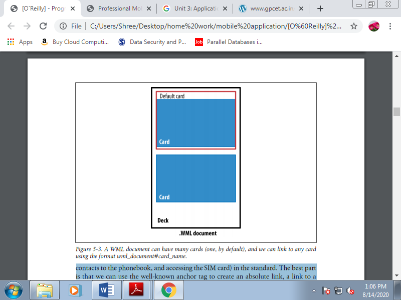
Figure 3.4(II) A WML document can have many cards, and we can link to any card using the format wml_document#card_name.
A. WML wasn't alone
WML doesn't generally support GIF, JPG, or PNG images. Images in WML files were in WBMP (Wireless Bitmap) format. WML also supports scripting employing a language called WMLScript, loosely supported ECMAScript. They aren’t worth discussing; just know that they existed and ask your grandchildren about them. A WBMP file is simply a 1 bit per pixel bitmap file, in black and white. Other common scenarios involved compiled WML and WMLScript files. These files were compiled by the developer or by a proxy or WAP gateway between the user and therefore the web server.
B. Serving WML
To serve WML, you only got to configure your server to deliver the proper MIME type.
Table 3.4(III) WAP 1.0 MIME types and extensions
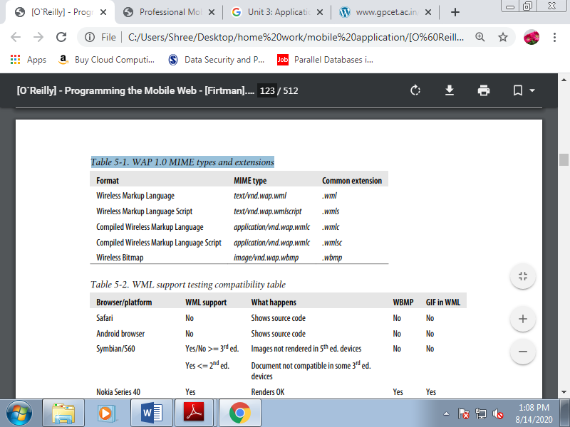
Table 3.4(IV) WML support testing compatibility table
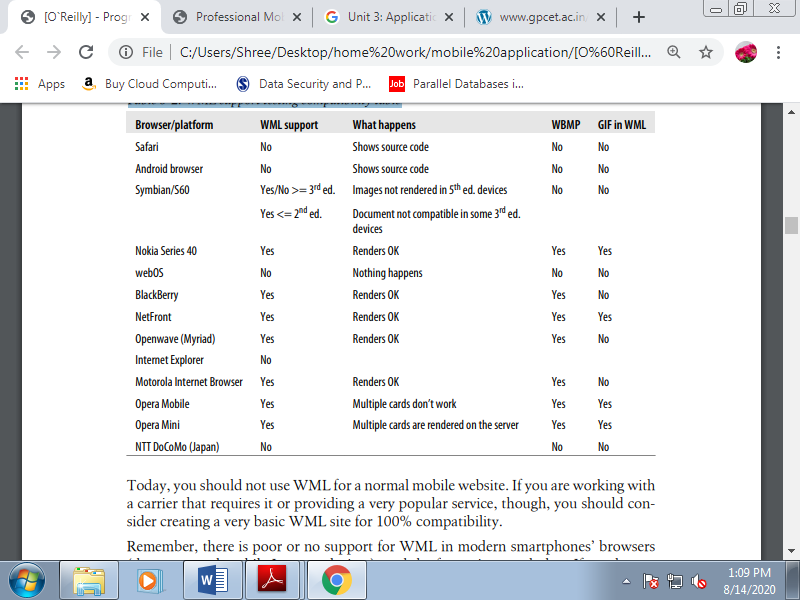
Today, you must not use WML for a traditional mobile website. If you're working with a carrier that needs it or providing a really popular service, though, you should consider creating a really basic WML site for 100% compatibility. Remember, there's poor or no support for WML in modern smartphones’ browsers, and therefore the future is even darker. If you've got a WML-only site, you must consider migrating it quickly; you're losing valuable customers.
XHTML MP is predicated on the W3C’s XHTML Basic, and that they are almost a same. It accepts XHTML Basic and MP as valid markup.
XHTML Mobile Profile is subset of XHTML. It’s XML-based, so we'd like to follow the strict rules. If you've got never worked with XHTML 1.0 or 1.1 for the web, let’s analyze the differences compared with working with HTML:
• The file must have a root element (html tag).
• Every tag name and tag attribute must be in lowercase.
• Every attribute value must be enclosed in quotes.
• Every tag must be closed. Tags like <img><input>and <br>don’t have to be closed HTML, but they are doing got to be closed XHTML. The overall rule is to use self-closed tags, like <br/>
. • The tags got to be closed reverse order. If you open a paragraph then a link, you want to close the link before closing the paragraph.
• XHTML entities must be formed. A compulsory space should be and an ampersand character should be &.
• All attributes must have a value. For example, <option selected> is invalid; you can use <option selected="selected">.
• The DOCTYPE declaration is mandatory, and therefore the XML opening tag is optional. In fact, for mobile browsers we should always not insert the XML opening tag.
A. Available Tags
XHTML MP, as a subset of XHTML derived from HTML, will look familiar to most web developers.
The tags available in both XHTML Mobile Profile 1.2 and XHTML Basic 1.1 are listed in Table. Some features, like scripting support, were added in XHTML MP 1.1 et al., like object support, within the last standard (1.2).
Table 3.5(I) HTML tags available in XHTML MP 1.2 and Basic 1.1
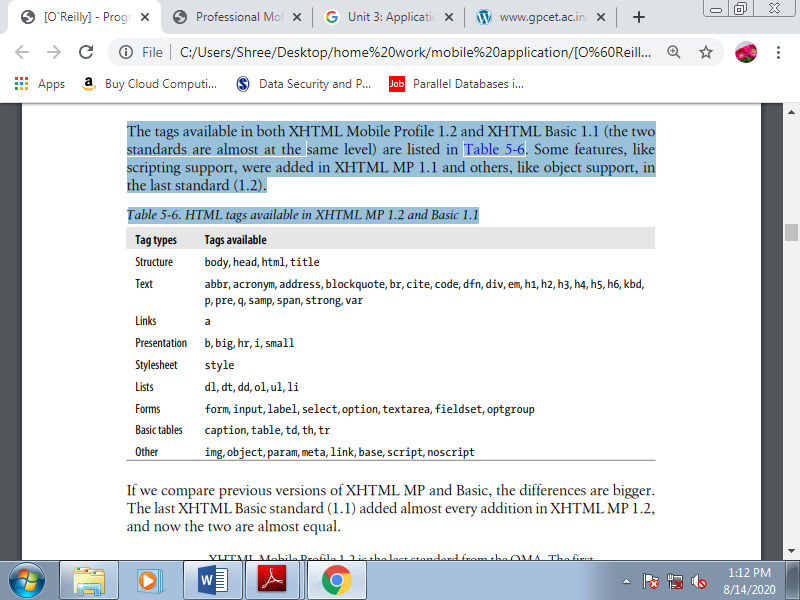
If we compare previous versions of XHTML MP and Basic, the differences are bigger. The last XHTML Basic standard (1.1) added almost every addition in XHTML MP 1.2, and now the 2 are almost equal.
We can still use a tag that's not supported in our declared DOCTYPE. It’ll not validate against the DTD, but most mobile browsers will simply ignore the tag with none error visible to the user.
B. Official Noncompatible Features
Every WAP 2.0 browser on the market today should understand and render the tags listed in Table. However, in XHTML MP, there also are several tags, techniques, and technologies that are officially not supported. We’ll still test them in every browser, though, because as we’ve seen there are many full HTML browsers on the market, et al. Which will understand some noncompatible features. All of the subsequent are officially unsupported:
• Nested tables (table inside other tables)
• Full table tags: thead, tbody, rowspan, and colspan attributes
• Full form tags: input type=“image,” input type=“file”
• Editing: ins, del
• Image maps
• Frames
• Iframes
• Deprecated formatting tags: e.g., font, dir, menu, strike, u, and center
We’ll check all browsers for compatibility with those features, also because the following:
• Adobe Flash
• Microsoft Silverlight
• The XMLHttpRequest object (Ajax)
• SVG
• The canvas tag
• Other embedded objects: Windows Media, QuickTime, Java applets
• Multimedia tags: audio and video
• Opening links in new tabs or windows we'll also verify which URL schemas are available for every browser.
C. Creating Our First Compatible Template
Let’s create a really simple markup template which will be compatible with all devices. You simply use the source code view if you're using a visual web tool, like Adobe Dreamweaver or Microsoft Expression Web. Feel comfortable with nonintrusive, semantic HTML code for mobile web development. Our template will appear as if this:
<?xml version="1.0" ?>
<!DOCTYPE html PUBLIC "-//WAPFORUM//DTD XHTML Mobile 1.2//EN"
"http://www.openmobilealliance.org/tech/DTD/xhtml-mobile12.dtd">
<head>
<title>First Template</title>
</head>
<body>
<h1>First Template</h1>
<h2>Programming the Mobile Web</h2>
<p>Welcome to the first template of this book</p>
<p>It <strong>should work</strong> in every mobile browser in the market</p>
<ol>
<li><a href="http://m.yahoo.com" accesskey="1">Yahoo!</a></li>
<li><a href="http://m.google.com" accesskey="2">Google</a></li>
<li><a href="http://m.bing.com" accesskey="3">Bing</a></li>
</ol>
<p><img src="images/copyright.gif"
Alt="(C) mobilexweb.com" /></p>
</body>
</html>
Here are some comments on this code:
• We are using the XHTML MP DOCTYPE.
• We are using standard header tags for titles: h1 ... h6, not p or div tags.
• We are using the paragraph tag (p) to enclose text.
• We are using an ordered list to point out a link menu. The choice numbers match the accesskey attributes of the anchor (a) tags.
• we offer a width, height, and alternate text for all images.
As these images prove, this code works on every platform. Using this exact code, we'll create an excellent iPhone experience within the following pages. There could also be some little changes to the code, but not so many. Our goal are going to be to stay our document template as simple as this one, even for very complex HTML 5 web apps.
The Standard At the time of this writing, HTML 5 may be a draft for the longer term standard for website markup. It’ll replace both XHTML 1.1 and HTML 4.0, adding new markup, deprecating some existing tags, and adding some new JavaScript APIs.
Mobile browsers are very hungry for new features in web applications, and this hunger has driven these browsers to own partial support of HTML 5 before it’s available in desktop browsers. Many of the new elements that are proposed are semantic tags intended to reduce divitis .
To the present end, the draft standard includes new tags like section, article, footer, nav, video, audio, canvas, and command. It also adds support for brand new sorts of form controls, including tel, search, url, email, datetime, date, month, week, time, number, range, and color. For input tags, it also defines the attributes placeholder, autofocus, required, autocomplete, and pattern.
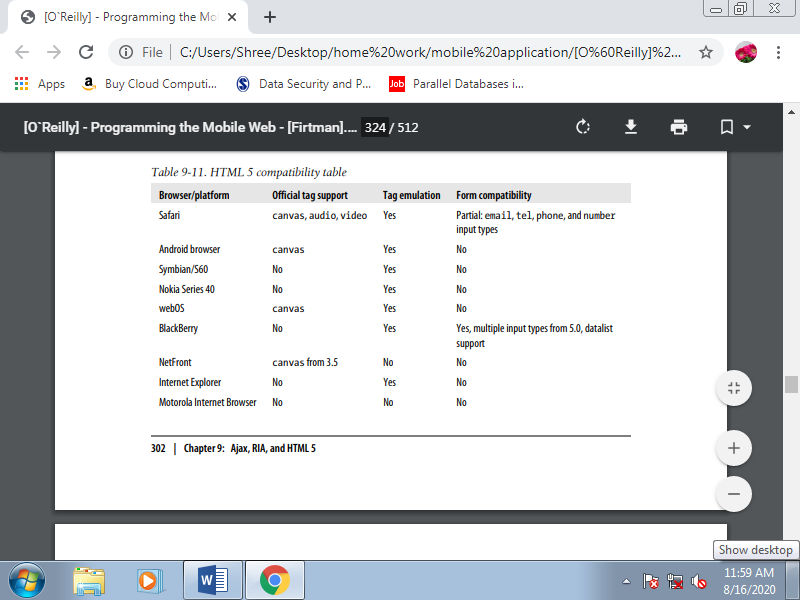
Unfortunately, with a couple of exceptions, the HTML 5 support in mobile browsers today isn't about markup and attributes. It primarily includes the JavaScript API additions. However, many of the new semantic tags (e.g., section, article, or footer) can still be utilized in smartphone browsers; they're going to just be ignored until support for them is added, and within the meantime we will emulate the incompatible tags and event behavior using CSS styles and JavaScript.
On compatible devices, the video and audio tags allow users to play the media object defined using the src attribute without having Adobe Flash Player or the other plugin installed. This object are often managed through JavaScript. An excellent way to use progressive enhancement here is that the tags allow us to insert children for noncompatible devices, and that we can use another player solution there:
<video src="video.avi" controls>
<!-- This will be rendered on noncompatible browsers -->
<object data="player.swf" type="application/x-shockwave-flash">
<param value="video.flv" name="movie"/>
</object>
</video>
Table 3.6(I) HTML 5 compatibility table
A. Editable Content
HTML 5 introduces an attribute called contenteditable that allows any text HTML element to be edited by the user. For example:
<p contenteditable="true"> </p>
<div contenteditable></div>
The element will answer text input events, like blur or focus. Most desktop browsers support this attribute, including Internet Explorer 6, because it had been originally an extension of that browser. It’s been utilized in many online tools for documents, spreadsheets, and presentation management. No mobile web browsers currently support the contenteditable attribute, but WebKitbased browsers like Android and Safari can emulate this behavior using a textarea with a -webkit-appearance of none:
<textarea style="-webkit-appearance: none"></textarea>
B. New Input Types
HTML 5 adds new form input types which will be used on compatible devices. Incompatible browsers will generally show a typical text input instead. The new input types include number, email, search, url, color, date, datetime, time, week, month, and range. Even when the new fields invite the user to insert dates and numbers, we'll always read the value as a string.
The only difference from type="text" is a few quite visual hint to assist the user with filling within the field: for instance, when the input is defined as email the virtual onscreen keyboard changes to include an @, with range the user gets a slider, and choose lists are provided for date inputs.
At the time of this writing, only BlackBerry 5.0 has full support for these new input types. Safari on iOS partially supports a number of them, and it's very possible that other platforms will add this support soon. The kinds that have specific attributes are date and range, which add two new attributes for limits: min and max. For example:
<input type="date" min="2010-01-01" max="2020-01-01" id="date" />
<input type="range" min="21" max="110" id="age" />
These new controls also accept the step attribute for instance, showing every 10 minutes during a time input control but it seems that at the time of this writing no mobile browsers support it.
C. Data Lists
HTML 5 also adds a new data list tag that's useful for autocomplete features. As of this writing, only the BlackBerry browser included with version 5.0 or newer of the OS supports it. We will define an information list with an ID and a group of child option elements:
<datalist id="dataCountries">
<option>France</option>
<option>Portugal</option>
<option>Spain</option>
</datalist>
Then, we can use that list for suggestions in a text input, matching the list attribute with the data list’s id:
<input type="text" id="txtCountry" list="dataCountries" />
The data list will not have any UI if it is not associated with more than one form elements.
When the user focuses on an associated text input, the browser will suggest options related the data list.
On noncompatible browsers, the user may see the option’s values. We can replace
<option>value</option> with <option label="value" /> to avoid this problem.
Web browsers have an excellent feature that creates our lives much easier. If we use any selector or attribute that the browser doesn’t understand, the browser will just ignore it. This may be very helpful within the following pages. Usage of CSS 2.1, CSS 3.0, CSS Mobile Profile, and WAP CSS is that the same; we specify CSS selectors and attributes for those selectors.
The standards only tell us which selectors and attributes are supported, and that we will find browsers that don't properly render standard ones and do properly render noncompatible tags. If you're curious about having W3C-valid markup, remember that XHTML Basic 1.0 doesn’t support CSS, and 1.1 added support, but just for a method or link tag with external styles. The W3C standard doesn’t support the inner styles defined within the style attribute. WCSS, or WAP CSS, may be a CSS 2.0 subset, like CSS MP.
A. WCSS extensions
The Open Mobile Alliance standard added to CSS 2 some new attributes that we will use in mobile browsers. As this is often how CSS defines extensions, every new attribute features a dash (-) as a prefix.
1. Access key
The first attribute is -wap-accesskey; it's the counterpart of the XHTML accesskey attribute. It are often used with any interactive element. The possible values are the digits 0 through 9 and therefore the special values * and #. For a few browsers on devices with numerical keypads, this attribute are often wont to create shortcuts to access those elements. Some browsers do nothing with it, some browsers set the main target thereon element when the user presses the key, and other browsers directly fire the action related to it.
We can only assign an equivalent key to at least one element within the same page. That’s why the -wap-accesskey attribute is beneficial only with ID selectors or with inline styles. You shouldn’t use this attribute with element or class selectors. Subsequent three samples all have an equivalent result:
<a href="http://mobilexweb.com" accesskey="0">Our website</a>
<input type="submit" value="Send" accesskey="9" />
<a href="http://mobilexweb.com" style="-wap-accesskey: 0">Our website</a>
<input type="submit"" value="Send" style="-wap-accesskey: 9" />
<style type="text/css">
#linkWeb {
-wap-accesskey: 0;
}
#btnSubmit {
-wap-accesskey: 9;
}
</style>
<a href="http://mobilexweb.com" id="linkWeb">Our website</a>
<input type="submit"" value="Send" id="btnSubmit" />
2. Marquee
If you’ve been doing web development for an extended time, like me, you almost certainly hate the nonstandard marquee element that a lot of people won’t to insert in sites. WAP CSS revived this system to make small animations without images that don't require Flash. A marquee is usually a text that scrolls from one side of the screen to the other, wrapping around continuously.
In some mobile browsers it can contain any HTML code, including images and even tables. However, don’t scroll an excessive amount of heavy markup, for the sake of your visitors and therefore the performance of your website. To make floating, scrolling text, use any paragraph element, like p or div, define the display attribute as -wap-marquee.
Table 3.7(I) Marquee WAP CSS attributes
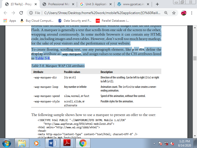
The following sample shows how to use a marquee to present an offer to the user:
<!DOCTYPE html PUBLIC "-//WAPFORUM//DTD XHTML Mobile 1.0//EN"
"http://www.wapforum.org/DTD/xhtml-mobile10.dtd">
<html xmlns="http://www.w3.org/1999/xhtml">
<head>
<meta http-equiv="Content-Type" content="text/html; charset=UTF-8" />
<title>Mobile Web Test</title>
<style type="text/css">
.offer {
Display: -wap-marquee;
-wap-marquee-dir: rtl;
-wap-marquee-speed: medium;
-wap-marquee-loop: infinite;
-wap-marquee-style: scroll;
}
.offer strong {
Color: red;
}
</style>
</head>
<body>
<div class="offer"><strong>Fly to the Moon</strong> Special offers this month starting at US$ 145.000. Apply now and see us from the sky.</div>
<h1>TravelWithUs.com</h1>
(...)
</body>
</html>
Try to avoid marquees for important information. You'll want to use them to scale back the space taken up by information that's indirectly relevant, or to have some quite animation free of plug-ins. Avoid the usage of links, images, or the other non-text markup inside a marquee, and make an alternate CSS stylesheet for noncompatible devices.
3. CSS form extensions
Another great enhancement in WAP CSS is that the ability to define useful information for form input. Now let’s see what extensions are included within the standard.
Table 3.7(II) WAP CSS form extension attributes
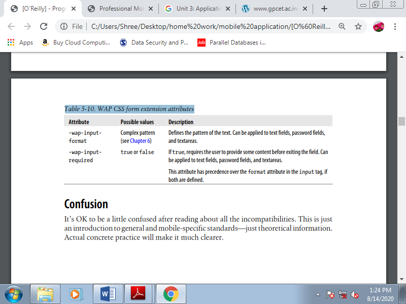
CSS is extremely forgiving. If the browser encounters a selector or attribute that it cannot understand, it'll just ignore that rule. Many standards within the mobile CSS world and noted the CSS extensions available in WAP CSS. Whether we plan to use CSS 2.1, CSS 3.0, CSS Mobile Profile, WAP CSS, or WebKit extensions, it'll be just the same; we’ll use CSS selectors, and attributes for those selectors.
The standards only tell us which of them are supported. What’s more, we'll find some browsers that don't render standard styles but do render nonstandard ones. If you’re curious about having W3C-valid markup, remember that XHTML Basic 1.0 doesn’t support CSS, which version 1.1 added support, but just for a method or link tag with external styles.
The W3C standards don’t support the inner styles defined within the style attribute. And to be perfectly honest, within the world, we won’t worry an excessive amount of about standards in CSS; we'll simply do whatever we'd like to do to make the foremost compatible stylesheet, and this may by default include official standards and extensions.
A. Where to Insert the CSS
The first question to answer is: where should we tell the browser what styles to apply? We have many options:
• <style> tags inside the XHTML or HTML markup
• External stylesheets as .css files
• style attributes inside the tags
The third option might seem like the most efficient approach, but it is not the best one. That said, there are times when it is useful. For the CSS WAP extensions for form controls, for instance, it is easiest to insert inline styles to avoid defining IDs and ID selectors for each control:
<input type="text" name="name" style="-wap-input-format: A*a" />
A fourth option is specified in the WAP CSS standard, but it is not implemented and not recommended as it offers no advantages. It looks like this:
<?xml-stylesheet href="style.css" media="handheld" type="text/css" ?>
If the website you are creating is a one-page document, it will be faster to include the CSS in the <style> XHTML tag to avoid a request and a rendering delay. The other ideal situation for this technique is if your home page is very different from the other pages in your site. Otherwise, odds are good that external stylesheets will help you manage your site more efficiently.
B. Media Filtering
The primary factor to think about is whether or not we are performing on a desktop XHTML site or a mobile-specific one.
1. Desktop websites
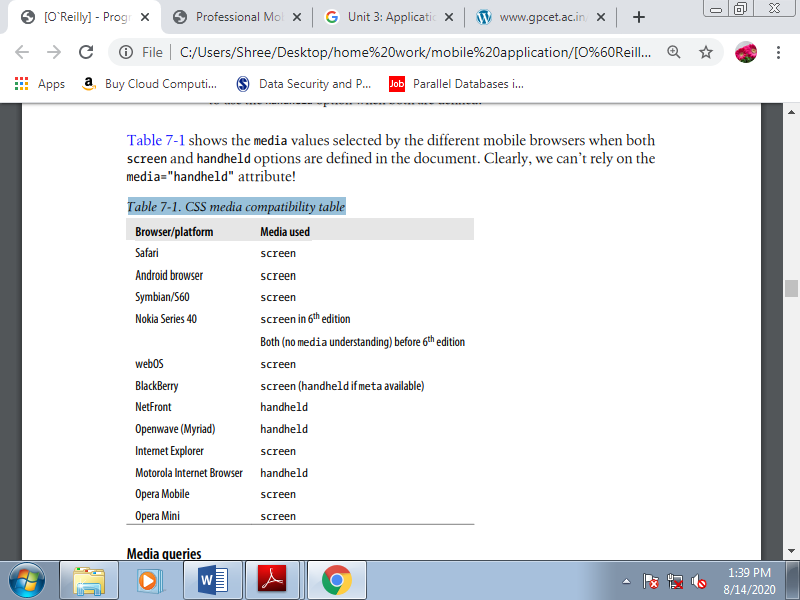
If we plan to use just one XHTML site for both desktop and mobile devices, our only option for changing the planning and layout is that the CSS file. This example may be a good fit the media attribute. The CSS standard allows us to define quite one stylesheet for an equivalent document, taking under consideration the possibility of a site being rendered on differing types of media. The foremost used values for the media attribute are screen, print, and handheld.
There also are other values, like tv and braille, but no browsers currently support these. The 2 stylesheets can define different properties for an equivalent elements, and that we can even use display: none to stop some elements from being shown on mobile devices:
<link rel="stylesheet" type="text/css" media="screen" href="desktop.css" />
<link rel="stylesheet" type="text/css" media="handheld" href="mobile.css" />
However, this “ideal” situation becomes hell once we test it. Many modern mobile browsers believe screen stylesheets because they will render any desktop website. And other browsers use screen once they think it's a desktop website and use handheld once they think it's a mobile website, depending on the DOCTYPE, a meta tag, or the user’s view preferences.
Table 3.8(I) CSS media compatibility table
2. Media queries
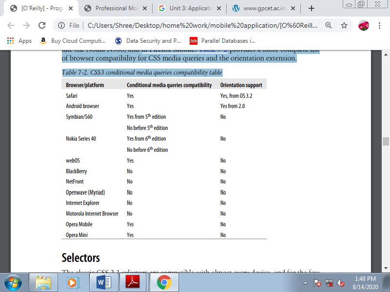
CSS3 involves our help with media queries. These complex media definitions include conditions about the screen size and media values allowed. For instance, we will say: “Apply this stylesheet for devices supporting only screen and with a maximum device width of 480.” this may apply to an iPhone, because in landscape mode it's a screen width of 480px and it doesn’t support print, hand held, or the other media type. Here’s the way to write this as a conditional media query:
<link type="text/css" rel="stylesheet" media="only screen and (max-device-width:
480px)" href="iphone.css" />
We can target non-iPhone desktop devices with a filter saying: “Apply this stylesheet for browsers supporting at least screen and with a minimum device width of 481.” This query is written as :
<link media="screen and (min-device-width: 481px)" href="notiphone.css"
Type="text/css" rel="stylesheet" />
Some browsers also understand CSS media queries inside the same stylesheet file. For example, consider the code which will change the background color displayed on an iPhone:
@media only screen and (max-device-width: 480px) {
Body {
Background-color: red;
}
}
An extension for conditional media queries is the orientation media query, allows to define different styles for different orientations. There are two possibilities: orientation:portrait and orientation:landscape. For a device running iOS 3.2 or later, you can use the orientation media query as follows:
<link rel="stylesheet" media="all and (orientation:landscape)" href="land.css" />
<link rel="stylesheet" media="all and (orientation:portrait)" href="port.css" />
The orientation query also works in Android from 2.0, in MicroB for MeeGo devices like the Nokia N900, and in Firefox Mobile. Table provides a more complete list of browser compatibility for CSS media queries and the orientation extension.
Table 3.8(II) CSS3 conditional media queries compatibility table
C.Selectors
The classic CSS 2.1 selectors are compatible with almost every device, and for the few that don’t recognize them entirely, it may not be worth the effort to create alternatives.
The mobile CSS–compatible selectors we can trust for every device are:
1. Universal: * (compatible but not recommended)
2. Element: tagName
3. Class: .className
4. Unique ID: #elementId
5. Descendant: selectorselector
6. Child: selector > selector
7. Multiple: selector, selector
8. Pseudoclasses (link, visited, active, focus): selector:pseudoclass
Some mobile browsers also understand some additional styles to CSS 2.1. A compressed list of other selectors to use for these mobile browsers is:
1. Selector with attribute: selector[attribute]
2. Selector with attribute condition: selector[attribute<operator>value]
3. Negation: selector:not(selector)
4. Immediately preceded by: selector + selector
5. Preceded by: selector ~ selector
6. Pseudoclasses (after, before, root, nth-child(n), first-child, last-child, empty, and others): selector:pseudoclass
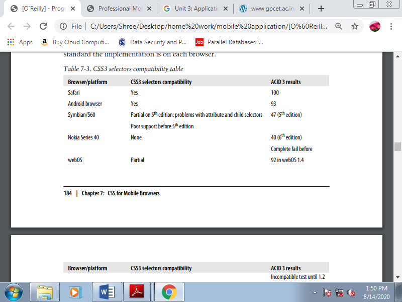
CSS3 selectors should be used just for noncritical features for the essential behavior. For instance, we will use one style for input tags and, as long as the device supports it, another style for various input types. For vital features, we should always think about using class selectors instead.
Table lists the browsers compatibility with CSS3 selectors, also as their ACID 3 results. The acid test may be a well-known test from the online Standards Project that evaluates how almost like the quality the implementation is on each browser.
Table 3.8(III) CSS3 selectors compatibility table
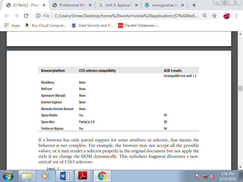
If a browser has only partial support for a few attribute or selector, meaning the behavior isn't complete. For instance, the browser might not accept all the possible values, or it's going to render a selector properly within the original document but not apply the design if we modify the DOM dynamically. This stylesheet fragment illustrates a noncritical use of CSS3 selectors:
Input {
Background-color: yellow;
Border: 1px solid gray;
}
/* The next style will only work in CSS3-compatible browsers */
Input[type=button] {
Background-color: silver;
}
D. CSS Techniques
1. Reset CSS Files
It is quite common in desktop web design to make a CSS hack to reset all the default margins and padding for common HTML elements. We will use this system when developing for the mobile web, with some considerations: we should always only reset the weather we are getting to use, we should always avoid the usage of the worldwide selector (*) for performance purposes, and if we are using an external reset CSS file we should always consider merging it with our local CSS file.
Some browsers always create a margin round the whole document that can't be deleted. And within the browsers that do allow you to delete the margin, remember that a zero margin might not be a good design decision.
2. Box Model
The box model, show how the browser represents every context box. Every block element (paragraph, image, title) features a content size, padding, borders, and outer margins. The sum of all of those defines the ultimate size of the entire box. Fortunately, most mobile browsers have good compatibility with all of those features.
3. Text Format
Showing text is that the most common situation during a mobile website, and styling it during a way that maximizes compatibility are often a little tricky. Bold (font-weight: bold) and italics (font-style: italic) are reliably compatible, but support for other text-formatting features varies.
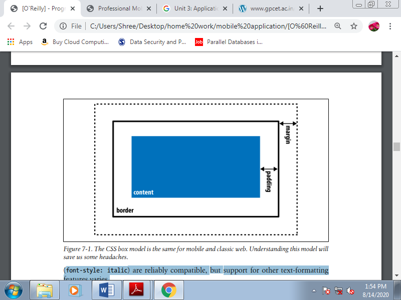
Figure 3.8(IV) The CSS box model is that the same for mobile and classic web. Understanding this model will save us some headaches.
Font family
This will be our first problem in styling text for mobile browsers. There are not any standards in terms of fonts for mobile operating systems, and most platforms have just one system font.
We can provide specific font names (like Arial, Verdana, or Times New Roman) or generic font types (like serif, sans-serif, monospace, cursive, or fantasy).
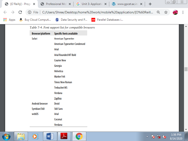
For the simplest compatibility, you should use the default font and apply other attributes (color, size, etc.). If you would like to define a font name, you must consider providing a list of alternatives. If the primary font isn’t available, the browser will try the second, then the third, then on; if none of the listed fonts is available, it'll use the default one.
Table 3.8(V) Font support list for compatible browsers
Custom fonts
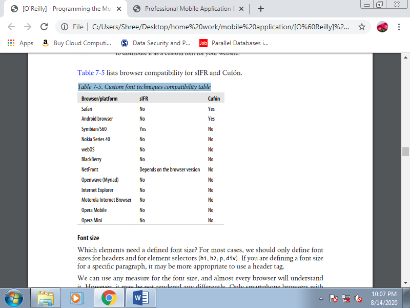
If you thought defining a system font was a headache, using custom fonts is even worse. No browsers support the CSS @font-face rule. If you would like to use your own font for text, you must think again. If it’s a matter of life or death, you'll think about using an image or a special approach on compatible browsers: sIFR on Flash-enabled devices, or Cufón for HTML 5 devices.
Compatibility is restricted, though, and albeit these solutions work, they will be slow. SIFR may be a nonintrusive JavaScript and Flash technique that replaces normal HTML text with a Flash movie with an equivalent text and an embedded vector font
Table 3.8(VI) Custom font techniques compatibility table
Font size
For many cases, we should always only define font sizes for headers and for element selectors (h1, h2, p, div). If you're defining a font size for a selected paragraph, it's going to be more appropriate to use a header tag. Use any measure for the font size, and almost every browser will know it . However, it's going to be not rendered any differently. Only smartphone browsers with smart zoom support allow any font size to be rendered (like 13.5px in Safari on iOS).
For most of the mobile browsers, the simplest font size technique is to use relative constants (xx-small, x-small, smaller, small, medium, large, larger, x-large, xx-large). Operating systems have different font support. A number of them have only three possible sizes for text, and if we use the typical pixel definitions, two different sizes could also be rendered identically.
If we use relative constants (e.g., large), we've more probability of that text being rendered during a larger font. Another compatible way of specifying font sizes is to use em values. Using em values is ideal for supporting different screen sizes and DPIs because this unit is relative and scalable to the quality font within the device. The default font size is usually the right size within the OS for normal paragraph text, and for normal text we should always leave it that way.
Text alignment
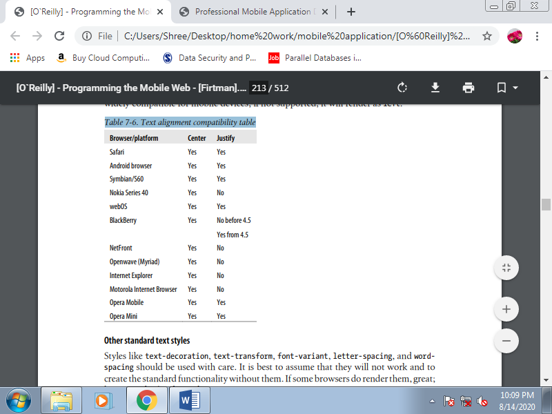
We can align the text using text-align over a block element with a value of right, left, center, or justify. As shown in Table justify value is that the least widely compatible for mobile devices; if not supported, it'll render as left.
Table 3.8(VII). Text alignment compatibility table
Other standard text styles
Styles like text-decoration, text-transform, font-variant, letter-spacing, and wordspacing should be used with care. It's best to assume that they're going to not work and to make the quality functionality without them. If some browsers do render them, great; however, don’t believe them.
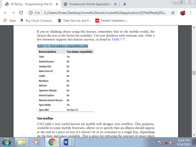
Text shadows
Another non-mobile CSS 2.1 feature is text-shadow. It allows us to define the colour , x-offset, y-offset, and blur radius of a shadow to be applied to a text selector. For instance , we will produce a shadowed headline like that shown in Figure with code like this:
h1 {
Text-shadow: 0.1em 0.1em #AAA
}
If you’re thinking about using this feature, remember that in the mobile world, the clearer the text is the better for usability.
Table 3.8(VIII) Text shadow compatibility table
Text overflow
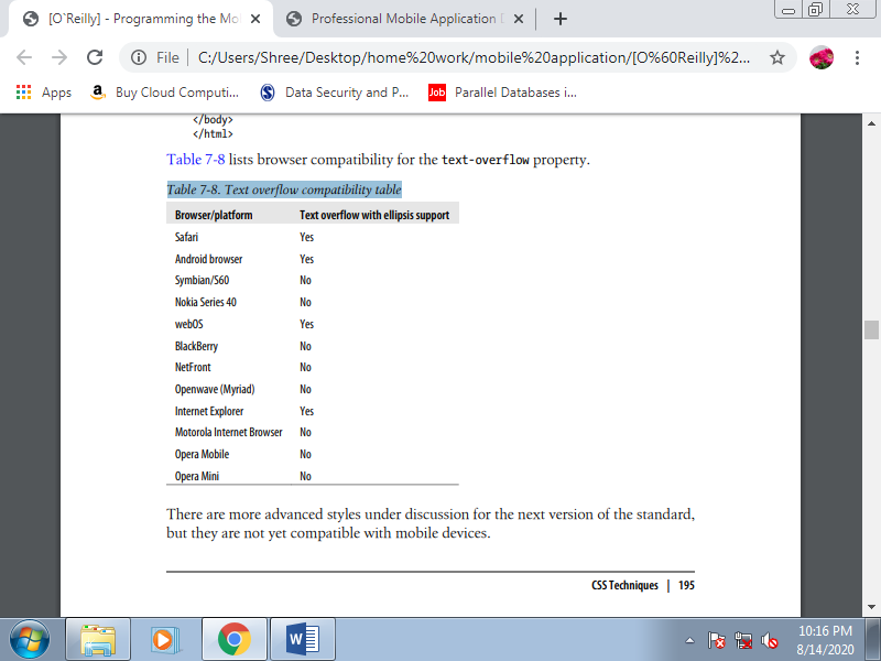
CSS3 adds a really useful feature for mobile web designs: text overflow. This property, available in some mobile browsers, allows us to specify that an ellipsis should appear at the end of a piece of text if it doesn’t fit in its container during a single line, depending on the font and space available. This is often great for reducing the quantity of space taken up by links, and for previews or summaries which will be shown completely during a details page after the user clicks on them.
For instance, we will show a title, and an outline with text-overflow set to ellipsis. When the user clicks on the title, via JavaScript, we remove the text-overflow property and therefore the whole text is shown. This maximizes the quantity of content we will display on a page. This feature also works well on devices that support both landscape and portrait orientations: with text overflow we will assure the usage of just one line in both modes.
To use this feature, the paragraph must have overflow: hidden to avoid the continuing of the overflow text on subsequent line, whitespace: nowrap to avoid wrapping, and a few value for text-overflow. In mobile browsers, the possible values for text-overflow are clip and ellipsis. The ellipsis value causes an ellipsis to seem after the last character that matches within the box. Clip is that the default value, which truncates the text without showing the ellipsis.
Here is a sample that produces :
<!DOCTYPE html PUBLIC "-//WAPFORUM//DTD XHTML Mobile 1.0//EN"
"http://www.wapforum.org/DTD/xhtml-mobile10.dtd">
<html xmlns="http://www.w3.org/1999/xhtml">
<head>
<meta http-equiv="Content-Type" content="text/html; charset=utf-8" />
<title>Documento sin título</title>
<style type="text/css">
ul p {
Text-overflow: ellipsis;
Overflow: hidden;
White-space: nowrap;
}
</style>
</head>
<body>
<h1>Latest news</h1>
<ul id="news">
<li>
<a href="#">Teletransporter discovered</a>
<p>Beam me up, Scotty! Finally scientists from London have discovered
Teletransportation</p>
</li>
<li>
<a href="#">Teletransporter discovered</a>
<p>Beam me up, Scotty! Finally scientists from London have discovered
Teletransportation</p>
</li>
</ul>
</body>
</html>
Table 3.8(IX) Text overflow compatibility table
IPhone text adjustment
Safari on iOS supports a CSS style especially for controlling the dimensions of text prepared for the zooming action: -webkit-text-size-adjust. This style accepts values of auto, none, and a percentage. By default, iOS overwrites the site’s font sizes to permit the text to be read with none problems when the user zooms over a paragraph.
Override this behavior with this style, turning it off or defining a percentage zoom level to be applied on the default font defined for the desktop website. If we would like to enhance a desktop website for iPhone browsing, we should always leave this style set to auto. However, if we are creating a mobile-only website, we'll typically want to define our own font sizes, so we should always turn this feature off:
Body {
-webkit-text-size-adjust: none
}
If a paragraph is ready to be read during a desktop browser with an outsized viewport width, we will change this behavior using the -webkit-text-sizeadjust attribute to enhance the iPhone reading experience without changing the desktop appearance.
E. Common Patterns
Even the foremost unique mobile web designs typically believe a core set of common style patterns.
1. Display Properties
The most standard display values (none, block, inline) are supported, but during a limited way. If you modify the value dynamically via JavaScript, many browsers won't render the change. There also are other table and column values that I don't recommend using in mobile websites: inline-table, table-column, table-cell, and others. They’re not common in desktop websites either, due to Internet Explorer’s lack of compatibility. If we do want to point out tabular data, we should always create the tables in HTML, not use the table layout CSS features.
The style display: none are going to be used a lot in JavaScript and Ajax development.
Absolute and floating positions
The standard position (position: static) is that the most generally compatible and is suggested for mobile websites. This suggests that every element are going to be rendered in its normal position within the document. Floating elements work alright on most mobile devices.
However, even on devices with average-sized screens it’s best to not have quite two floating elements within the same row. This will be approached using float: left and float: right. Relative positioning (position: relative) is trickier in mobile browsers. It defines movement (using top, bottom, and right, left) from the first position as a static element. a clear element are often used after floating elements to make sure that no floating elements are allowed on the proper , the left, or each side of the element.
Fixed positioning isn't compatible with all mobile browsers and isn't recommended. The matter is that in mobile browsers we are scrolling a window, not the contents. Depending on the zoom and therefore the viewport size, a fixed position can have different meanings.
Table 3.8(X) CSS position compatibility table
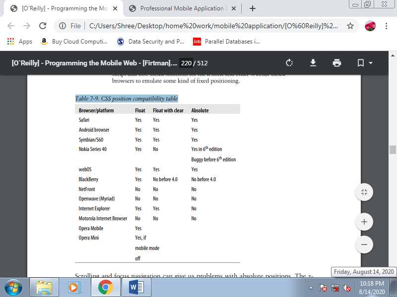
Scrolling and focus navigation can give us problems with absolute positions. The zindex also can give us problems on low- and mid-end devices.
According to the WAP CSS standard, the position and z-index properties are optional, so whether or not they are supported or not is up to every browser.
Rounded corners
Designers seem to like rounded corners, and for years this was the nightmare of each web developer who needed to get out a box with this feature. Table-based layouts for rounded corners are inappropriate for the mobile web, so we will only believe CSS solutions. If a tool doesn’t render the style, forget about rounded corners for that device.
Table 3.8(XI) Rounded corners compatibility table
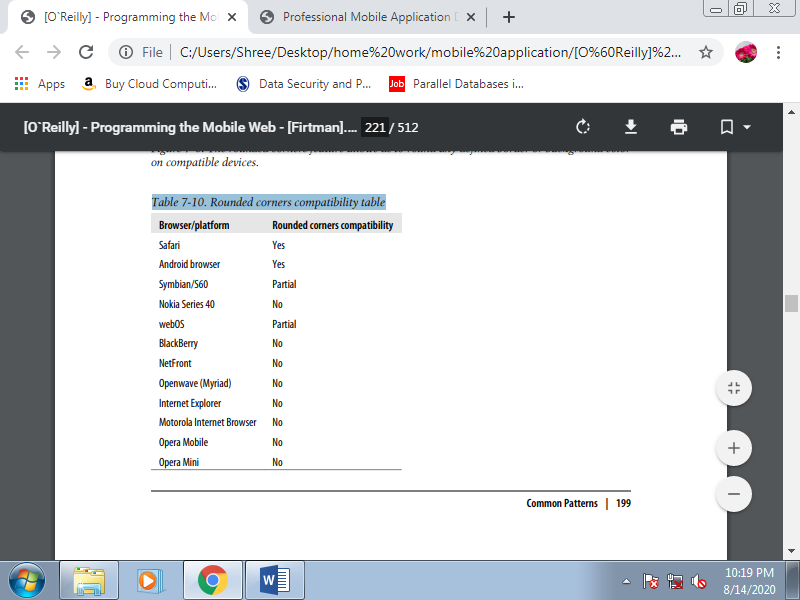
WebKit has an extension for rounded corners (-webkit-border-radius); Mozilla also has one (-moz-border-radius), but with very low compatibility in mobile devices.
The -webkit-border-radius attribute can be defined as one value (like 5px or 10%), two values (top-bottom and left-right), or four values giving the radius of each corner separately. These are samples of different styles:
.rounded {
-webkit-border-radius: 10px;
}
.rounded2 {
-webkit-border-radius: 10px 20px;
}
.rounded3 {
-webkit-border-radius: 3em 2em 3em 2em;
}
Titles
A common approach for low- and mid-end devices is to rely on header tags and CSS to provide a simple solution for title design. The best way is to define a 100% width, a background color, a top and bottom border, and the padding:
h1 {
Width: 90%;
Text-align: center;
Background-color: red;
Color: white;
Border-top: 6px solid #500;
Border-bottom: 6px solid #500;
Padding: 8px 20px;
Clear: both;
Font-size: larger;
}
Pseudoclasses
The pseudoclasses link, active, focus, and visited are compatible with all XHTML browsers and standards. The question is: when do the pseudoclasses work? Some situations are well known: for instance, link is used for not-visited hyperlinks and visited is used if the links are within the previous browsing history.
What about the main target and active pseudoclasses, though? The behavior can vary in browsers with focus-based, cursor-based, and touch-based navigation. The well-known hover pseudoclass isn't available within the WAP CSS standard, but it's compatible with most non-touch devices, assuming an identical behavior to focus. In-tuned devices, there isn’t a mouseover event; the screen doesn’t detect the finger position until the user taps it.
Some mobile UIs for touch devices implement a two-tap pattern; if we tap once over a component, it'll be sort of a hover effect, and if we tap again, it'll be a click. This will be through with JavaScript and event handling.
Backgrounds
Changing the background color was the primary new feature in XHTML MP that each WML developer used. It had been heaven after the old black and white WML. Every mobile browser understands the background property and its specific definitions, like back ground-image and background-repeat.
However, we'd like to recollect that on mobile devices, the context of the user are often very different from a desktop. It’s not recommended to use a complex background, and it’s best to use strongly contrasting foreground and background colors. In compatible browsers, it'll be very helpful to use data URI patterns for backgrounds to reduce network requests.
One feature which will be buggy on mobile devices is that the use of background-attachment: fixed. This enables the background image to be fixed even after scrolling. Specifying multiple background images isn't good practice for mobile browsers. Symbian S60 browsers appear to be among the few that support it. Some WebKit-based browsers, like mobile Safari, also accept some CSS3 attributes as extensions, like -webkit-background-origin and -webkit-background-size.
Overflow
A common design pattern in desktop websites is to use a div with a fixed size, and content larger than that size. Using the overflow property, we will define a value of scroll, auto, visible, or hidden to point what to try and do with the content that's outside the bounds of the element. If we use a value of scroll, the div will have its own scrollbar on supporting devices. The utilization of overflow is discouraged, just like the iframe technique.
Even with compatible devices, there are usability problems; for one thing, it’s tough for the user to inform if she’s moving the most scrollbar or the inner scrollbar. And if it works, there are a lot of bugs in mobile browsers, from touch devices with the scroll not working to devices that hide the overflow content without providing scrollbars. Even less compatible are the CSS3 overflow-x and overflow-y properties.
Content
The content attribute allows us to use the after and before pseudoclasses to define a picture, some text, or an attribute value to be inserted after or before the selector. The matter is that these pseudoclasses aren't defined within the WAP CSS subset, in order that they will work in some devices but not in others. Some browsers allow us to use the content property to any selector, but this is often not usually recommended because it'll lead us to insert text and content within the CSS rather than the (x)HTML document. The subsequent sample will add two stars after the link’s text and a bullet image before:
a:after {
Content: " ** "
}
a:before {
Content: url('bullet.gif');
}
Opacity
Alpha transparency of elements inside a mobile website won't work in many low and mid-end devices, so we should always use it with care and knowing that it's going to not have a clear effect. The opacity CSS 2.1 property wasn't defined within the WAP CSS subset, but we will still use it and compatible browsers will render it.
List design
The last chapter used tons of ordered and unordered lists. Now’s the time to use CSS to define our own design for every list. For doing this we've the standard list properties in CSS list-style-type, list-style-image, and list-style-position and therefore the compressed list-style. The compatibility for these styles within the mobile web is great, excepting some little differences within the bullets; for instance, some devices show a square for a bullet, although it’s defined as a circle. The utilization of images as bullets can enhance our designs. On compatible devices remember that we will use small data URI images.
Visibility
The visibility property allows us to hide and show a component dynamically. This property is roofed by all mobile standards and that we are free to use it with the values visible and hidden. The collapse value are often more problematic.
Cursor management
CSS allows any web designer to define which mouse cursor should be utilized in any situation. Within the mobile world this is often useful just for devices supporting cursor-based navigation, though, because they're the only browsers that show some quite cursor over the screen. The foremost useful cursors for mobile sites are default, pointer, and progress.
The other cursors available are often very difficult to use in any mobile situation. We should always use the pointer cursor for defining non-link clickable zones, which can be handled by a JavaScript event function. The progress cursor is usually applied to the body dynamically with JavaScript to point to the user that a current operation is functioning. In browsers supporting focus and touch navigation, we should always generate this pattern employing a modal pop-up window with a floating loading image.
CSS Sprites may be a great modern web design technique for reducing the amount of image server requests on an internet page. There are a lot of online resources and books available on this system. For now, suffice it to mention that if you've got many images in your site, you'll reduce all of these to at least one big image with all the originals inside and use a CSS mask to work out which portion of it to point out in each container.
This system features a great impact on web performance, except for mobile applications, we should always consider before using it and analyze the possible problems. First, we'd like full background-position CSS property compatibility. The second consideration is that we'll not be using img tags. In their place, we'll use any block element (div) or any block-converted element using display: block, like a span or a tag. This suggests that we cannot provide alternative text for the pictures, and therefore the browser won’t skills much space to allocate for every image until it renders the CSS file.
Finally, in some browsers this system can have an impression on rendering performance, because the large image are going to be duplicated in memory for every usage. We’d like to balance the performance gained through the reduction of requests with the performance lost within the rendering engine in some browsers.
A. CSS Sprites Alternatives
The idea behind optimizing the amount of requests to the server is extremely interesting, even if you reject the usage of CSS Sprites. That’s why we'd like to believe alternatives to the present technique for a few specific situations.
1. Inline images
As we discussed within the last chapter, inline images are an excellent technique for compatible browsers. When designing for browsers that understand them, we will copy the first sample and replace the URL of every image with the data: representation.
2. Join images
If the pictures are near each other horizontally or vertically, as in our sample, we will consider joining all the pictures into one. The concept is analogous to CSS Sprites, but we found out the image as a single-use background, adjusting the margins and padding in order that the weather are properly aligned with the various parts of the image. This system can have poor results on old devices with limited support for margins and padding.
3. Box borders
If you were thinking of using CSS Sprites to define the borders of an oblong area, there's a WebKit extension which will assist you. Within the following section, we'll get deeper into this.
B. WebKit Extensions
The open source project WebKit added many extensions to CSS, and a number of other of those are under discussion for addition to CSS3. Within the mobile world we've many WebKit flavors (Safari, Android, webOS, Symbian, etc.), and therefore the extensions compatibility isn’t perfect across all of them.
The following may be a list of the foremost common WebKit extensions, in compressed form:
• -webkit-border-radius defines a rounded-corner box. Modern mobile browsers also know it as border-radius.
• -webkit-box-shadow defines a shadow for a block element. • -webkit-columns specifies the width and count of columns.
• -webkit-border-image specifies an image to use because the border for a box
• -webkit-text-stroke defines a color to use for the stroke of the text.
• -webkit-text-fill-color defines a color to use for filling the text.
1. Text Stroke and Fill
The stroke and fill properties are a handy way of making fancy effects in titles without the utilization of images. For example:
<h1 style="-webkit-text-stroke: blue; -webkit-text-fill-color: yellow">
Great Title!
</h1>
2. Border Image
The border image extension is a superb solution to the matter of making a dynamically sized rectangle with custom borders. Its implementation is extremely almost like CSS Sprites, and usage is straightforward. This system is beneficial for buttons, titles, content zones, and each area where we would like a custom border design without using tables.
The attribute to use is -webkit-border-image, and therefore the commonest syntax is:
-webkit-border-image: url top right bottom left x_repeat y_repeat;
The url is that the image location (or inline image), and therefore the four edge values (top, right, bottom, left) are distance values to be used from the image’s sides. The middle box defined by the space not employed by these four values are going to be used for the middle pattern. For instance, if we define 5 because the top, the box to which we are applying this style will have because the top border the highest 5px of the border image.
The x_repeat and y_repeat values are optional and may be defined together of the subsequent constants:
Repeat
The portion of the image extracted using the highest and bottom for y_repeat and using the left and right for x_repeat is repeated until it fills the available width/height of the box.
Round
The image is repeated until it fills the available width/height of the box, but with none partial tile at the end; it's stretched in order that it fits within the available space an entire number of times. This value has no effect in many mobile browsers.
Stretch
The image is stretched to fill the whole width or height of the box without repetition. The border image is cut in nine pieces. Four are used as corners and therefore the others are used as background images for sides and center.
3. Safari-Only Extensions
Safari on iOS has added tons of extensions to the CSS standards, and even to WebKit . These extensions work only in Safari for iPhone, iPad, and iPod Touch. The Android and webOS browsers also understand a number of these extensions, counting on which WebKit version they're supported. The CSS extensions are often grouped into categories as follows:
• Transitions
• Animations
• 2D and 3D transforms
• Miscellaneous
The CSS extensions for iPhone are quite spectacular. They permit you to make Flash like experiences and 3D transformations using only CSS. This is often great, though also sometimes painful because it all must be coded in CSS, a language not built for this type of interaction.
Table 3.9(I) Common CSS extensions for Safari on iOS
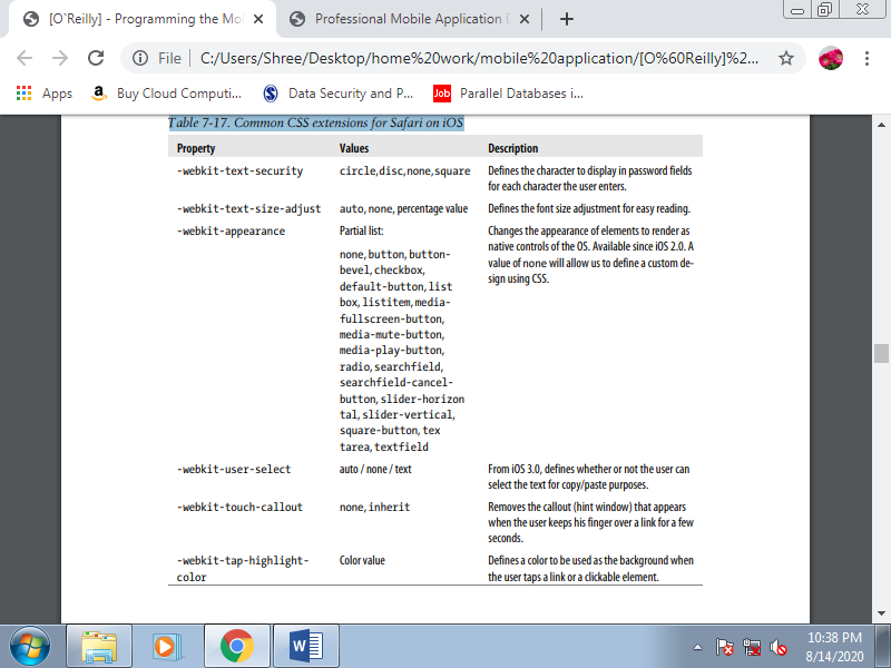
A. Heading Structure
The <head> is a part of a mobile web document are very almost like that during a desktop web document, with the addition of some new tags useful only in mobile browsers. First we’ll define a title, as for the other website. The space available for the title during a mobile browser is little compared with a desktop browser. The page title is used because the heading at the top of the screen on some devices; other devices also use the title because the default text for bookmarks and therefore the history list.
Every mobile title must be:
1. Meaningful
Avoid duplicate titles for each page of your mobile site using only your name. However, on your home or entry page, don’t use “Home Page,” use your company or product name and keep it very short. This might be the foremost bookmarked page.
2. Short
Keep the title between four and eight words long. If mentioning the name of your company, do this last. Use small words first; some old devices truncate the title after 10 or 12 characters.
3. Concise
Don’t waste words. For instance, avoid using “Mobile” within the title; the user knows that she is using a mobile device.
B. Icons for the Mobile Web
In the early 2000s, everyone rushed to insert favicon.ico files in their websites’ root files to check how the icons would be added to Internet Explorer’s address bar. Today, within the desktop web those icons are more useful for tab iconography.
For performance purposes, mobile browsers don’t search for a favicon.ico enter the basis folder if we don’t explicitly specify an icon to be used. In valid XHTML, the way to add an icon file is to use the subsequent link tag:
<link rel="icon" type="image/png" href="favicon.png" />
Originally, the icons were in Windows ICO format, but these files are difficult to export from well-known graphic editors and aren't optimized in size. Today, you'll use GIF or PNG for mobile compatibility.
Originally the icon size had to be 16×16 pixels, but now they will be any square size and therefore the browser will resize them. Safari on iOS adds another sort of icon (WebClip), which is out there if the user adds the web site to the home screen. Following metatag, which may coexist with the other icon tag:
<link rel="apple-touch-icon" href="iphone_icon.png" />
The body is that the most significant section of the document, because it will define the content that the user will see. Key best practices include:
• Avoid formatting tags.
• Use semantically correct, clean XHTML; we'll define styles later with CSS.
• Don’t create a document larger than 25 KB. Larger documents cause problems on old browsers.
• If you've got a lot of text to point out, separate the content into many pages.
• Don’t use tables for layout.
A. Main Structure
A typical mobile document are going to be divided into four main sections:
1. Header
2. Main navigation
3. Content
4. Footer
The header should be as simple as possible, using an h1 title and/or a logo or company banner. The most navigation should be no quite five main links, ordered by likelihood of use during a mobile context. The content is obvious; the footer should include very brief copyright information, a home link, a back link, and optionally other related links.
This is often a simplification, I know, but most mobile pages should fit this structure. If your structure is more complex, give some careful thought as to if that complexity is important.
The basic document structure should appear as if this. Separating every section with a div tag isn't necessary for the document definition, but it's useful later for CSS styling. The most navigation are often an unordered list (ul) rather than a div:
<body>
<div id="header">
<h1>Mobile Web</h1>
</div>
<ul id="nav">
<li><a href="Tests">Tests</a></li>
<li><a href="Blog">Blog</a></li>
<li><a href="Contact">Contact</a></li>
</ul>
<div id="content">
</div>
<div id="footer">
</div>
</body>
The main content div should have as children only the tags h2–h6, p, ul, and, if necessary, another div. However, using CSS and perhaps JavaScript libraries prepared for smartphones, we will take this easy markup and make great experiences for high-end devices. Employing a simple document structure are going to be one among our greatest practices within the mobile world, to avoid duplication.
1. Go to top
Some mobile browsers, like Safari, allow the user to tap with a finger within the top section of the screen to scroll the page to the top. Other browsers have keyboard shortcuts for that. And lots of others don’t have any such mechanism, or if they are doing, it’s so obscure that the majority users probably don’t know what it’s. So, it's an honest mobile web practice to insert an anchor at the top of the page and a link to that anchor at the bottom:
<body>
<div id="header">
<a name="top"></a>
<h1>Mobile Web</h1>
</div>
...
<div id="footer">
<ol>
<li><a href="#top">Go to Top</a></li>
<li><a href="/">Go Home</a></li>
</ol>
</div>
</body>
B. Images
It’s often said that a picture is worth thousand words. This is often true within the mobile web, too. However, we'd like to search out a balance with reference to the amount of images during a document. Every image adds to the network traffic, number of requests, and load time. For now, we are talking about the img tag.
This tag should be used only for:
• a corporation logo
• a piece of writing or product photo
• A map
Don’t use the image tag for:
• Buttons
• Icons for links or menus
• Backgrounds
• Visual separators
• Titles
This doesn’t mean that we won’t use images for any of these purposes we just won’t use the image tag. The image tag is semantically correct for images that the user understands as images in their title, not for visual aids. An arrow icon for a link isn’t considered as a picture for a traditional user. It’s just a button, or a link. We’ll follow an equivalent rule.
1. Tag usage
The mandatory attributes for an img tag are src, width, height, and alt. It's vital to define the width and height of each image during a mobile document. This may reduce the initial rendering time, because the mobile browser won’t got to await the image to load to understand what proportion space it'll take up and the way to draw the remainder of the content.
The choice text is additionally mandatory, because the user can disable images or they will be very slow to load, and therefore the document must work without them. The alt text should provide enough information for the user to know what's missing.
2. Formats
There’s excellent news here. Almost every mobile browser understands normal web image formats: GIF, JPEG, and PNG. The suggestion is to use PNG because, because of its openness and since it's the mandatory format for Java ME, every phone with a browser understands PNG. That said, there are some differences with reference to index and alpha transparency.
For animation, the quality in mobile web development is Animated GIF. As Flash isn’t included in many browsers, and even when it's included it are often slow, banners and animations are going to be most generally compatible using this classic format.
3. Inline images
For a mobile website, this system is extremely useful. A knowledge URI may be a mechanism for outlining a URL with embedded content. For instance, we will define an img tag with the image itself inside it, without using an external file. This will be done employing a base64 encoding of the image file basically, storing the binary file as a group of visible ASCII characters during a string.
This is often great for little images, icons, backgrounds, separators, and anything that doesn’t merit a new request to the server. Where is that the catch? Not every mobile browser is compatible with this feature.
The best part about data URIs is that they will be utilized in a CSS file, with caching and multipage support.
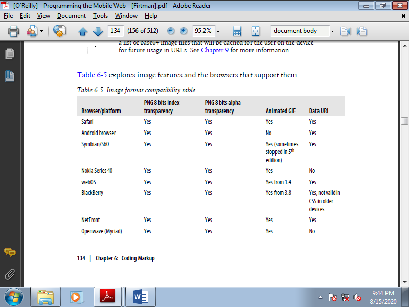
Table 3.11(I) Image format compatibility table
4. Local pictograms
Local pictograms the japanese carriers have created a de facto standard for using small icons in HTML without really using images and requests. The pictures are supported a listing of dozens of icons available to use, with the important rendering done by the browser. For instance, say you'd wish to insert a heart icon. Every compatible browser will display a heart icon, but you would possibly not know the precise image that the browser will use.
Today, NTT i-mode services include Basic Pictograms (176) compatible with all devices and Expansion Pictograms added in HTML 4.0. Other Japanese carriers have their own pictograms, so if you would like to cover all Japanese carriers there are a lot of conversion tables between codes. To display these pictograms, you'll just embed the code into your HTML or define them as Unicode standard characters using 香, where 9999 should get replaced with the pictogram number.
This is often a really underused feature within the occidental world. Even the iPhone supports these icons, although I even have not seen too many websites using them. IOS has supported an Emoji keyboard since version 2.2, and therefore the browser allows Emoji pictograms for users worldwide. The list is long there are quite 450 Emoji and therefore the icons have great designs. Moreover, remember, they're images that don’t use network resources! for instance , for the iPhone we will show a message with a smiley at the end with the subsequent code:
<p>Thanks for your message! </p>
There is Windows program that shows every pictogram we can use. It is called iEmoji, and you can download it from http://www .mobilexweb.com/go/iemoji.
The OMA standardized pictograms in XHTML MP using an object tag:
<object data="pict:///core/arrow/right" />
The standards support alternative content. That is, if the pictogram is not available, you can add a child to the object with an alternative. The alternative can be another pictogram or a classic image:
<object data="pict:///time/season/summer">
<object data="pict://weather/sunny">
<img src="images/sun.png" alt="Sunny" />
</object>
</object>
The pictogram sets aren't standardized between browsers, and that’s why today they're not widely utilized in mobile websites.
The Openwave browser also supports its own icon mechanism. Icons are often included within the img tag with the localsrc attribute, or with CSS using background-image or list-style-image. There are 562 different icons available; visit http://mobilexweb.com/go/openwaveimages to find the entire list. For instance, to point out a back arrow image, we will use the icon name or number:
<img localsrc="back" />
<img localsrc="511" />
Openwave also works with WAP standard pictograms using the object tag and a URL like pict:///<image path>. For example:
<object data="pict:///core/action/stop" standby="Stop loading..." name="stop"/>
5. Using images effectively
Out of all of those complications and possibilities, some guidelines emerge:
• Use images in XHTML just for logos, photos, and maps.
• Compress the images with normal web image methods.
• Define the width, height, and alternative text for each image.
• Use data URIs for little images whenever possible.
• Leave icons, buttons, backgrounds, and visual alert images for CSS.
• Open your mind to the usage of Emoji and pictograms with known compatible devices.
• Avoid the usage of image maps.
• Analyze the utilization of canvas or SVG for compatible devices and for a few graphic types.
C. Lists
Using standard lists will help us a lot in defining our designs later and for semantic search engine optimization. For the mobile web, we should always use the subsequent list types:
Ordered lists (ol tag)
For navigation link menus
Unordered lists (ul tag)
To present lists of comparable objects
Definition lists (dl tag)
To point out key/value details
The last one is probably the lesser-known list tag in web development. For instance , if we are showing a product detail page, in many browsers it’s better to use a definition list instead of a table for attributes:
<h2>iPhone 3GS</h2>
<dl>
<dt>Price</dt>
<dd>300 EUR</dd>
<dt>Memory</dt>
<dd>32Gb</dd>
<dt>Network</dt>
<dd>3G, Wifi, Bluetooth</dd>
</dl>
The dt tag is employed for the key and therefore the dd tag for the value . This is often very useful, semantically correct, and clearer than using a table. Later, with CSS, we will rearrange the elements.
D. Links
Hyperlinks are the center of the web, and this is for the mobile web, too. You would possibly think there isn’t much to mention about links, but that’s not the case.
Every link during a mobile website should have the well-known href attribute, set to the URL of the specified resource, and therefore the most significant links on the page can have an accesskey attribute assigned for straightforward access via keyboard shortcuts, on devices that support access keys. The target attribute should be avoided, unless you're developing for smartphones with tab or multipage support.
If you're making a link to the desktop version of your website, use rel="alternate" to specify that the link is to an equivalent page in an alternate format.
1. New windows
Some browsers accept the target="_blank" attribute (from the XHTML MP standard), but counting on the browser the behavior is different. Some browsers simply open the URL within the same window, others create a new tab or window, and still others open the new URL as a modal pop-up, during which case the user cannot return to the primary page until he closes the new one.
2. Navigation lists
A navigation list is any list of links that are related in some manner and listed one after the other. The recommended way to create such a list is with ol or ul tags. With the ordered list, the amount of the key to press to access each option is printed for us for free of charge , but we still got to add the accesskey attributes to the a tags by hand:
<ol>
<li><a href="option1.html" accesskey="1"></li>
<li><a href="option2.html" accesskey="2"></li>
</ol>
3. Linking to phone features
There are some URL schemes that a lot of mobile browsers understand to speak with some phone features. One standard, the Wireless Telephony Application Interface (WTAI), is a component of the WAP 1.X standard. The WTAI libraries are preinstalled on the phones and may be accessed by other applications, like the browser. To use these libraries, use the syntax wtai://<library name>/<function name>[(;parameter)*].
Making a call
Remember: most mobile devices also are phones! So, why not create link-to-call actions? If you’re creating a business guide, or maybe for your own unique phonebook, most of the people will like better to call an individual rather than filling during a form on the device. Fortunately, there are some URLs which will help us. The primary de facto standard is to use the tel:<phone number> scheme. This is often called the i-Mode format:
<a href="tel:+1800229933">Call us free!</a>
Some devices also allow sending DMTF tones after the decision has been answered by the destination. This is often useful for accessing tone-controlled services, helpdesk systems, or voicemail; you'll tell the link, “call this telephone number and, when the decision is answered, press 2, wait 2 seconds, then press 913#”. You are doing this using the postd parameter after the number: the syntax is ;postd=. You'll use numbers, *, and # , also as p for a one-second pause and w for a wait-for-tone pause:
<a href="tel:+1800229933;postd=4">Call us free!</a>
This function doesn’t work on all mobile devices, but on devices that don’t understand it, the primary telephone number should at least be called. The compatibility list for this feature is complex, and I don’t recommend relying on it.
Sending email
Some modern devices with browsers also have mail applications that can react to the classic web mailto: protocol. The syntax is mailto:<email_destina tion>[?parameters].The detected parameters can change from device to device but generally include cc, bcc, subject, and body. The parameters are defined in a URL format (key=value&key=value), and the values must be URI-encoded. Here are some samples:
<a href="mailto:info@mobilexweb.com">Mail us</a>
<a href="mailto:info@mobilexweb.com?subject=Contact%20from%20mobile"> Mail us</a>
<a href="mailto:info@mobilexweb.com?subject=Contact&body=This%20is%20the%20body">
Mail us</a>
Generally, if we want to insert a newline in the body of the email we can use the Carriage Return plus Line Feed characters (%0D%0A). This does not currently work with the Mail application in iOS, but we can insert HTML tags inside the body, so we can use <br> for the mobile Safari browser:
<a href="mailto:info@mobilexweb.com?subject=Contact&
Body=This%20is%20the%20body%0D%0AThis%20is%20a%20new%20line">Mail us</a>
<a href="mailto:info@mobilexweb.com?subject=Contact&
Body=This%20is%20the%20body<br/>This%20is%20a%20new%20line">Mail us from iPhone</a>
Sending an SMS.
We all just like the Short Message Service; that’s why mobile browsers generally offer the power to invoke the new SMS window from a link. To try to this, we've two possible URI schemes, sms:// and smsto://. Unfortunately, there's no standard way to know for sure which one is compatible with a user’s browser.
The syntax is sms[to]://[<destination number>][?parameters]. As you'll see, the destination number is optional, so you'll open the SMS composer from the device with none parameters defined. The parameters usually define the body, but this property isn't compatible with all phones for security reasons. Like sending an email, an SMS isn't automatically sent when the user presses the link.
The link only opens the SMS Composer window; the user must finish the method manually. The destination number should either be an international number or, if it's a brief number code, we should always guarantee that the user is within the right country and is connected with one among the compatible carriers of that short code.
Here are some samples:
<a href="sms://">Send an SMS</a>
<a href="sms://?body=Visit%20the%20best%20site%20at%20http://mobilexweb.com">
Invite a friend by SMS<a>
<a href="sms://+3490322111">Contact us by SMS</a>
<a href="sms://+3490322111?body=Interested%20in%20Product%20AA2">
More info for producto AA2</a>
Table 3.11(II) Messaging actions compatibility table
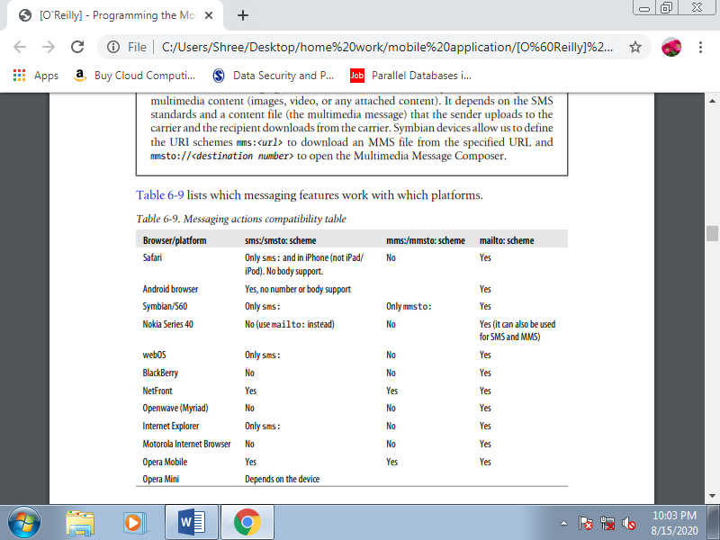
Adding a contact to the phonebook.
It might be useful to ask users to feature your company’s contact information to their phonebooks for future communication. A WTAI function is out there for this purpose for older and WML-compatible devices, and there’s also a difficult way of doing it for modern devices.
The WTAI library is wp, as for creating phone calls, and therefore the function is ap (Add to Phonebook). The parameters are the amount and optionally a name to be assigned thereto, separated by a semicolon. For example:
<a href="wtai://wp/ap;+12024561111;White%20House">
Add <strong>White House</strong> to contacts
</a>
For modern browsers, the trick is to create a vCard file (vCard is a standard file format for electronic business cards). If you link to this file, most browsers will send the file to the device’s Phonebook application, and the user will be invited to add the contact to the database.
A simple vCard 2.1 file will look like this:
BEGIN:VCARD
VERSION:2.1
N:Maximiliano;Firtman
ORG:O'Reilly Media
TITLE:Author
TEL;CELL;VOICE:+133MFIRTMAN
TEL;WORK;VOICE:+541150320077
END:VCARD
For the device to detect this document as a valid vCard, we must deliver it with the MIME type text/x-vcard. The file, if static, is usually a .vcf file.
Unfortunately, many modern mobile browsers, like Safari, don’t understand vCards if you provide them as links during a document. However, they are doing understand them if the user receives them by email! the answer , therefore, is to retrieve the user’s email address and, from the server, send the vCard as an attachment.
Another excellent feature to supply to compatible devices is to automatically increase the user’s calendar details a few meeting or appointment scheduled online, or a reminder about an occasion that the user has bought tickets. If you’re selling tickets to a concert or a theater show, this is often an excellent way to make sure that the user won’t forget it.
There isn’t a WTAI way to do that actually, in 1998 mobile devices generally didn’t have calendar programs. For compatible devices we will use the iCalendar format, supported an older vCalendar standard almost like vCard. ICalendar files should be served with the MIME type text/calendar. There are a lot of server libraries for creating this format, although as Table 6-10 shows, it really only works with Symbian devices immediately.
4. Integrating with other applications
Some devices allow us to integrate our websites with other native installed applications. This is often dramatically nonstandard, though, and it depends considerably on the device and therefore the applications.
IOS URL schemes.
Safari supports some standard URL schemes which will open other native applications. For instance , we will open the YouTube and Google Maps applications just by using the classic URLs for every service (youtube.com/…and maps.google.com/ …). Safari will automatically open the native application, showing the information we would like . This method also works for App Store and iTunes links.
Prior to iOS 4.0, when the user clicks a link that opens another application, the browser closes. To get back to your website, the user must reopen the browser. An updated list of URL schemes for iOS is maintained at http://wiki.akosma.com/IPhone _URL_Schemes, and an inventory of applications, URL schemes, and optional parameters for Safari are often found at http://www.handleopenurl.com.
For instance , consistent with these sites we will open the Facebook iPhone native application showing the user’s list of friends using the URL fb://friends, and if the user has installed Twitterrific, we will directly post a message using twitterrific://post?message=<msg>. Here’s a sample:
<a href="twitterrific://post?message=I%20have%20just%20visit%20a%20site">Tweet this on
Twitterrific</a>
Symbian local applications.
Symbian devices also allow us to open applications using the nonstandard localapp scheme. For instance , for opening the Calendar, Contacts, or Messages, we will use localapp:calendar, localapp:contacts, or localapp:messaging.
Android intents.
Android also has the power to communicate with other applications, via intents. A native Android application can register an intent as a particular call , from a URL, or from a MIME type. For instance , we will open the default PDF viewer on the user’s device by delivering a PDF file with the MIME type application/pdf. To open an application without sending a file, we will use the URI schemes defined by the intent. For instance , linking to a YouTube video will fire the YouTube internal application .
When the intention call is implicit, there could also be quite one installed application which will answer that URL. During this case, the user will receive a pop-up asking her to pick the application to use. The user also can select a default application for future usages.
Among the internal URLs that Android supports are those for Google Maps placemarks using geo:<latitude>, <longitude>, Google Maps searches using geo:0,0?q=<search>,and Google street views using google.streetview:cbll=<latitude>, <longitude>&cbp=1.
Similarly, using market://search?q=<search> in Android will open Android Market with a query search.
Unfortunately, at the time of this writing there are not any websites that list all the possible URI schemes to use on Android. Some individual applications do offer developer websites to point out this information, though. For instance , Twidroid (a Twitter client) has http://twidroid.com/plugins, where you'll see documentation about employing a URL to point out a pleasant Twitter pop-up over the page. The URL syntax is twitter://send?<message>. Therefore, the instance we checked out earlier for Twitterrific are often converted to:
<a href="twitter://send?I%20have%20just%20visit%20a%20site">Tweet this on Twidroid</a>
5. Document download
Linking to a document that isn’t an (X) HTML file produces different results depending on the device. Your first considered this might be that it depends on the applications installed on the device. This is often true, in part. Some mobile browsers, just like the iPhone’s, don’t allow document downloading although the user has installed a compatible reader for that document type, as shown in Figure. Others, just like the Symbian browser shown in Figure 3.11(III), let the user store the file.
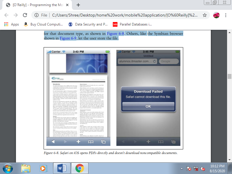
Figure 3.11(III) Safari on iOS opens PDFs directly and doesn’t download noncompatible documents
E. HTML5 Mobile Boilerplate
Even for the foremost skilled of designer veterans, getting started with a brand new standard are often a frightening affair, even when a language is meant to form coding easier, like HTML5. Saying that, a thorough knowledge of HTML 4.01 are some things which will be built upon, it’s just a case of knowing which tags are in and which are out.
HTML5 Boilerplate helps designers to urge started with the new standard by offering an expert front-end template that permits you to make a quick , robust and adaptable site with a group of HTML5-ready features and elements.
It was created by Paul Irish and Divya Manian and is an open source project that's perfect for creating cross-browser sites that employment with older browsers, while being HTML5 ready.
It are often downloaded from the HTML5 Boilerplate website in its full form, or a stripped down version that doesn’t include all of the explanatory documentation. The lighter version is suggested for those that have worked with it before and may be used once you’re aware of the template. For those of you that are confident you'll work with it fully, there’s also a customizable option that permits you to decide on the weather you would like .
What’s within the box?
Core features to be found in HTML5 Boilerplate include all of the required elements that you simply will got to begin, also as supporting documentation:
• HTML
• CSS
• JavaScript
• .htaccess (Apache web server configuration)
• Crossdomain.xml
• Miscellaneous (ignore file, gitignore then on)
Modernizr is additionally included so as to permit you to style the new HTML5 elements in IE and helps with detecting HTML5 or CSS3 features altogether browsers, including earlier versions of IE (before v9).
Let’s look first at the HTML, which at its core is comprised of variety of IE conditional comments for relevant IE-specific classes and CSS for older versions of IE. These allow for a particular number of advantages to the designer using the conditional classes technique, like easier integration with CMSs like WordPress and Drupal.
It also fixes a lot of the CSS for older versions of IE, also as IE classes that apply to the tag. This validates as HTML5 and therefore the no-js class allows you to feature custom styles when JavaScript is enabled or disabled within the end-user browser. The HTML also includes an equivalent elements as Modernizr and Dojo, also as options for Google Frame, Google CDN for jQuery, and Google Analytics Tracking Code within the content area.
You can also use HTML5 Boilerplate with Initializr (get the demo page here), which generates templates supported Boilerplate that allow you to decide on the weather you would like and those you don’t. With this, you furthermore may have the choice of employing a responsive template from the outset, instead of starting with a blank page.
Getting started
Once you’ve downloaded HTML5 Boilerplate, it’s time to set up the basic structure of the site, add content, style and functionality and start testing! The basic structure will look something like the below in the first instance:
.
├── css
│ ├── main.css
│ └── normalize.css
├── doc
├── img
├── js
│ ├── main.js
│ ├── plugins.js
│ └── vendor
│ ├── jquery.min.js
│ └── modernizr.min.js
├── .htaccess
├── 404.html
├── index.html
├── humans.txt
├── robots.txt
├── crossdomain.xml
├── favicon.ico
└── [apple-touch-icons]
So, let’s check out how these are often used, starting with CSS, the directory which should contain all of your site’s CSS files. Note that this directory already includes some CSS to assist you start , also because the normalize CSS.
The starting CSS includes:
• HTML5 Boilerplate defaults
• Common helpers
• Placeholder media queries
• Print styles
This doesn’t believe conditional classnames, conditional style sheets or Modernizr and may be used ‘out of the box’, whatever your development preferences.
Common helpers
The .ir class are often added to elements that you’re applying image-replacement to. When replacing content with a picture , it’s necessary to line a selected width and height element in order that the image appears.
.ir {
Background-image: url(http://yoursite.com/images/logo.jpg);
Background-size: 100% auto;
Width:450px;
Height:450px
}
To detail snippets for all of the CSS classes would involve an awful lot of text, so we’ll check out the foremost relevant. However, bear in mind that the subsequent classes exist:
• .hidden (add to any elements you would like to hide)
• .visuallyhidden (hides text from browsers but makes available to screen readers)
• .invisible (add to any element to hide without affecting layout)
• .clearfix (adding ensures that any floated children are contained within an element)
• Paged media styles (only supported during a few browsers)
Media Queries
One of the beautiful things about HTML5 Boilerplate is that it makes it an easy interest start with ‘Mobile First’ and RWD sites. However, not everyone would agree that using media queries is that the best approach, as discussed by Jason Grigsby in 2010.
In HTML5 Boilerplate, placeholders are included to assist build mobile styles for various resolutions and screen sizes. The documentation recommends that you simply adapt media queries supported the site content, instead of “mirroring the fixed dimensions of specific devices”.
While the ‘mobile first’ approach may be a sensible one recently, not everyone will want to require that approach and if you're one among them, then you'll just edit or remove the placeholder media queries. For mobile apps, you'll want to require a look at Mobile Boilerplate.
Input forms are common features of web applications. Within the mobile world, we should always keep forms and therefore the amount of typing they require to the minimum. The input controls should be inside the classic form tag, with method="GET" or "POST" and therefore the action URL as any web form.
A. Form design
Avoid using tables for form layout. The simplest solution is to use definition lists, labels, and input controls. We’ll enhance this type design within the next chapter with JavaScript for smartphones.
A typical key/value form should look like this:
<form action="formAction" method="POST">
<dl>
<dt><label for="name">Name</label></dt>
<dd><input type="text" name="name" /></dd>
</dl>
</form>
The usage of the label tag is very important for mobile input controls, and used for touch devices. For example, if you insert a checkbox without a label tag, the user will need to tap (click) over the checkbox to select it. Using a label allows the user to tap anywhere in the text assigned to the checkbox.
So, a form with a checkbox should look something like this:
<form action="formAction" method="POST">
<input type="checkbox" name="accept" id="accept" value="yes" />
<label for="accept">I accept terms and conditions</label>
</form>
We can also assign access keys to the form controls and show which keys are assigned in the labels, with a CSS class. This method is very useful in devices with QWERTY keyboards, where you can assign a letter to each field instead of numeric values:
<form action="formAction" method="POST">
<input type="checkbox" name="accept" id="accept" value="yes" accesskey="a" />
<label for="accept">I <span class="accesskey">A</span>ccept terms and
Conditions</label>
</form>
A typical form should include one or more fieldset tags, each with a legend inside. The fieldset is just a container for form controls, and the legend is a child tag that defines the title or legend for its parent:
<fieldset>
<legend>Personal Information</legend>
<!-- controls here -->
</fieldset>
B. Select lists
The select tag should be during a ll|one amongst|one in every of"> one among the most-used tags in a mobile form. Selection from a list is that the first option for reducing typing. During a mobile browser, once you click on a get element, typically you'll see a pop-up window showing all the choices . As shown in Figures how select lists are rendered varies across devices.
You'll use the size property of the select tag to define a list with a predefined height, and you'll specify that the list accepts multiple selection using the multiple="multiple" property. The multiple-selection feature is more useful in mobile forms than desktop forms. During a desktop form, the user generally uses Shift or Control to pick multiple options.
During a mobile form, we generally present a pop-up window with checkboxes for the user to form his selections and a confirm action to travel back to the most page. The code for the select lists shown within the previous two figures seems like this:
<form action="formAction" method="post">
<dl>
<dt><label for="country">Country</label></dt>
<dd>
<select name="country">
<option>Argelia</option>
<option>Argentina</option>
<option>Bolivia</option>
<option>Brazil</option>
</select>
</dd>
<dt><label for="filter">Looking for</label></dt>
<dd>
<select name="filter" multiple="multiple">
<option>Flights</option>
<option>Hotels</option>
<option>Restaurants</option>
<option>Car Rental</option>
</select>
</dd>
</dl>
</form>
Option groups.
Option groups are an underused feature of select lists, even in desktop web development. Defining an optgroup allows you to provide a label for a set of children, so you can group the available options by category. Here’s an example:
<dl>
<dt><label for="country">Country</label></dt>
<dd>
<select name="country">
<optgroup label="America">
<option value="ar">Argentina</option>
<option value="bo">Bolivia</option>
<option value="br">Brazil</option>
</optgroup>
<optgroup label="Europe">
<option value="at">Austria</option>
<option value="be">Belgium</option>
<option value="bg">Bulgaria</option>
</optgroup>
</select>
</dd>
</dl>
C. Radio buttons and checkboxes
The usage of radio buttons and checkboxes is that the same on mobile devices as on desktops. The only recommendation I can offer you is to avoid the usage of those controls if there are quite four options, using therein case a get with single or multiple selection, as appropriate. a group of quite four radio buttons is probably going to extend the page height and should require scrolling, which may impact the usability of the form.
D. Buttons
(x)HTML has five types of buttons:
1. Image map buttons: <input type="image" />
2. Submit buttons: <input type="submit" />
3. Clear buttons: <input type="reset" />
4. Custom buttons: <input type="button" />
5. Submit buttons with HTML support: <button></button>
The image map button allows us to use an image as a button and receive on the server the coordinates of the purpose inside the image where the user clicked. Of course, this functionality is merely possible on mobile devices supporting touch- or cursor-based navigation. This sort of button should be avoided if possible and replaced with a classic submit button.
The submit button is that the most generally compatible, and for the lowest common denominator devices it should work fine. What percentage times have you ever clicked a clear button thinking it had been the submit button? This button should be avoided when developing for mobile devices: why add more scrolling and take up more room for a function that few people use? If does one want to incorporate this functionality in your form, please make certain to use a special style for the clear button than the design you use for the submit button.
The custom buttons should be avoided if you would like full mobile compatibility, because they only work with JavaScript. For compatible devices, you'll still use submit buttons and capture the submit action with JavaScript. Finally, remember that the button tag isn't compatible with all devices. In fact, it had been only added to the newest versions of the standards.
E. Hidden fields
Hidden fields are fully compatible with mobile browsers.
F. File upload
The file upload control isn't included within the mobile web standards, but many devices still accept it. When the user selects this control a modal pop-up window appears, allowing the user to pick a file from the general public internal memory folders or from the extra memory card. An easy upload form might appear as if this:
<dl>
<dt><label for="file">Upload a photo</label></dt>
<dl><input type="file" name="photo" /></dl>
</dl>
The usage is typical: the form tag must be defined with enctype="multipart/form data". Selecting multiple files using a single selection dialog isn't allowed, and displaying the upload progress isn't supported. In desktop websites this is often typically done employing a Flash invisible movie, and at the time of this writing there are not any devices that are compatible with this feature. Beginning with Flash Player 10.1 in mobile browsers, this is often scheduled to change; however, this mechanism won't be compatible with all devices because Flash Player won't be widely supported.
The BlackBerry browser features a property called accept that you simply can use to define a comma-separated list of MIME types that the server will accept. This will reduce sending of noncompatible files. For example:
<dl>
<dt><label for="file">Upload a photo</label></dt>
<dl>
<input type="file" name="photo" accept="image/jpeg,image/gif,image/png" />
</dl>
</dl>
Table 3.12(I) File upload compatibility table
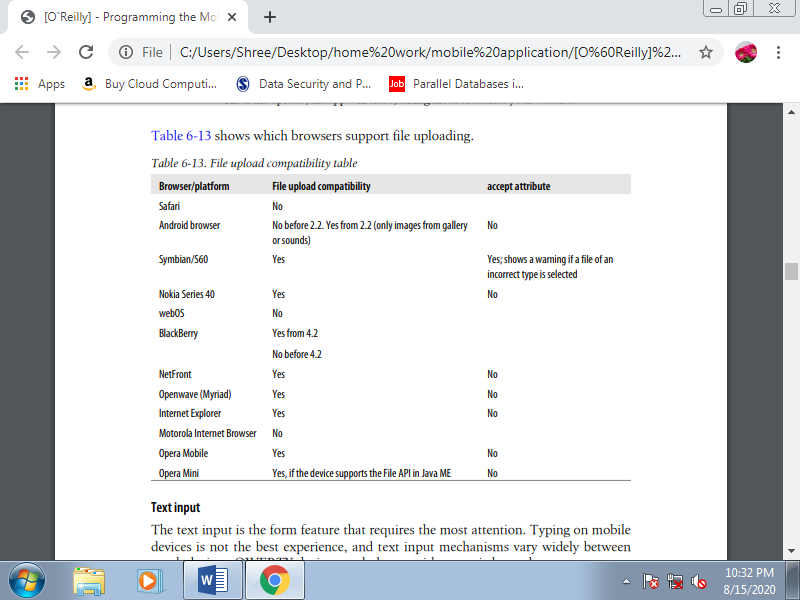
F. Text input
The text input is that the form feature that needs the foremost attention. Typing on mobile devices isn't the simplest experience, and text input mechanisms vary widely between touch devices, QWERTY devices, and phones with numeric keypads. QWERTY devices are the only ones that don’t require a new window to insert the text: when the text input has focus, the user can start typing.
Altogether other device types, when the sector has focus the user can either click (or tap) in it or start typing to open a modal pop-up window with all of the OS’s typical text typing features (e.g., predictive text, onscreen keyboard, character recognition). Some devices show a full-screen text input window et al. Show a smaller window inside the browser window. Within the first case, a descriptive label is required therefore the user knows what to type.
Multiline text inputs (using the textarea tag) should be used very carefully. Generally speaking, we don’t want the user to type an excessive amount of text during a form. However, when extra space is required (like during a mail message body), we will use a textarea, and counting on the device the experience should be an equivalent like a traditional text input. Rich text input controls aren't quite common within the mobile world, and it's really difficult to implement due to the browser internals. The only solution is to capture keypresses using JavaScript events and emulate your own text input control.
Placeholder
A placeholder may be a hint that's shown inside the text box until the user inserts text therein field. When the user starts typing, the placeholder is hidden. This feature is extremely useful in mobile designs due to the shortage of space. Rather than employing a label we will use a placeholder, reducing the quantity of space required for the sector .
The large problem with placeholders is that they're nonstandard. There are two possible approaches for implementing them: using an HTML 5 attribute (placeholder), and using JavaScript. The placeholder attribute is compatible with some modern browsers, and for the others we will create a little script to offer this functionality, even using the quality label because the source. The JavaScript solution are going to be implemented later during this book. For now, we'll just use the HTML attribute:
<input type="text" name="zip" placeholder="Your ZIP Code" />
Text input validation
To reduce the client-side scripts and server-side trips for validation and to enhance the usability of our forms, we should always provide as many input validation properties as we will. The primary typical option is to define the maximum size accepted for the text input using the maxlength property, expressed as variety of characters. Many platforms automatically add a character counter while the user is typing.
WAP CSS added the property -wap-input-format, which allows us to define the sort and number of characters that the user can input. Specifying an input mask will reduce the user’s error possibilities. We’ve also talked about the -wap-input-required attribute, which prevents the user from moving the main target faraway from a field until she has entered some text in it.
Table 3.12(II) WAP CSS input format patterns
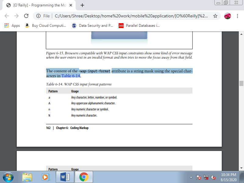
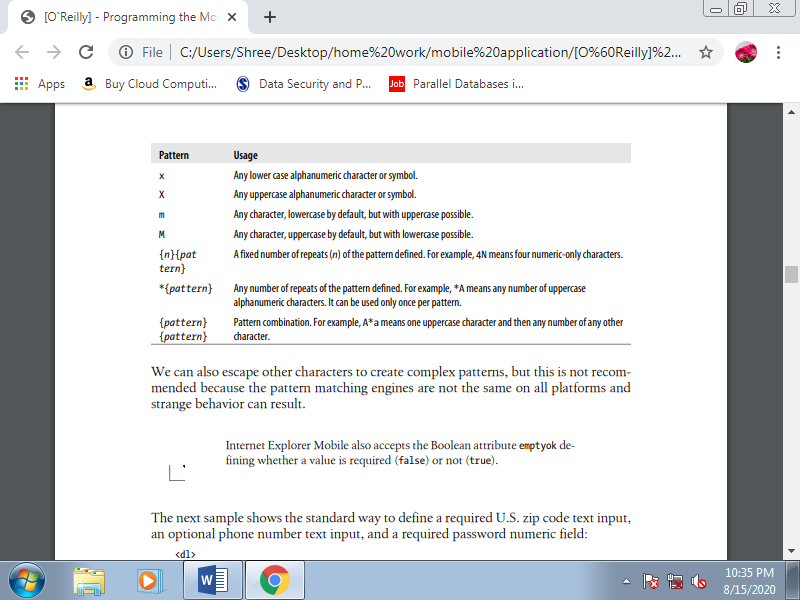
We can also escape other characters to create complex patterns, but this is not recommended because the pattern matching engines are not the same on all platforms and strange behavior can result.
The next sample shows the standard way to define a required U.S. Zip code text input, an optional phone number text input, and a required password numeric field:
<dl>
<dt><label for="zip">ZIP Code</label></dt>
<dl><input type="text" name="zip" style="-wap-input-format: '5N';
-wap-input-required: true" /></dl>
<dt><label for="phone">Phone Number</label></dt>
<dl><input type="text" name="phone" maxlength="15" style="-wap-input-format:
'*n';" /></dl>
<dt><label for="password">Password</label></dt>
<dl><input type="password" maxlength="8" name="password"
Style="-wap-input-format: '8N'; -wap-input-required: true'" /></dl>
</dl>
Many older XHTML mobile browsers understand the nonstandard inputformat or format attribute, imported from WML. The syntax is the same as for the WAP CSS attribute. If we want to add the same feature for older Openwave-based devices, for example, we can use the inputformat attribute. Internet Explorer uses the format attribute with the same pattern inside:
<input type="text" name="zip" inputformat="5N" format="5N" maxchars="5" />
Safari extensions
Safari for iPhone and iPod Touch has different onscreen QWERTY keyboards for various situations, with the keys rearranged or with special onscreen keys added to enhance usability. For instance , there's an email-optimized keyboard that has the @ character, and a URL-optimized keyboard with a “.com” button.
If your site includes a search field, you'll define it as a type="search" input; this changes the default keyboard button from “Go” to “Search” (also in Android 2.2).
Before iOS 3.0, an undocumented feature allows us to force a numeric keyboard using the name property of the text input. If the name of the input contains the string “zip” or “phone,” the keyboard will change to numeric. However, using this feature isn't good practice, because it’s inconvenient in non-U.S. Countries where the zip code can contain letters.
IOS 3.1 and later allow us to define new HTML 5 input types: email, tel, url, and number. If you specify one among these values rather than text for the sort attribute, the user are going to be presented with the proper keyboard for that type when the field has focus:
<input type="email" name="user_email" />
<input type="tel" name="user_phone" />
<input type="text" name="quantity" pattern="[0-9]*" />
The number value isn't official, but it works. Officially, we should always use a text field and supply the HTML 5 attribute pattern with a daily expression inside. The regular expressions accepted are quite small though. One among the good things about these new controls is that if a browser doesn’t understand the new input type values, it'll render a text input by default. Other extensions include autocorrect="on/off" and autocapitalize="on/off", to activate/deactivate automatic spelling correction and automatic capitalization for the input.
BlackBerry extensions
BlackBerry 4.7.1 and later also add partial support for brand new HTML 5 form controls. At the time of this writing, the values accepted are number, email, search, url, color, date, datetime, time, week, month, and range. From version 5.0, the browser also accepts the inputmode attribute with a commaseparated list of tokens. The tokens are often script tokens or modifier tokens.
The available script tokens are:
• arabic
• bopomofo
• cyrillic
• georgian
• greek
• han
• hangul hebrew
• hiragana
• kanji
• katakana
• latin
• simplifiedhanzi
• thai
• traditionalhanzi
• user
The possible modifiers are:
• lowerCase
• upperCase
• titleCase
• startUpper
• digits
• symbols
• predictOn
• predictOff
Autocomplete.
Many mobile browsers maintain a dictionary that's updated with nonincluded words the user inserts in text inputs and offer the user an autocomplete feature while he's typing or when he first clicks within the text input. For BlackBerry 5.0 devices, we should always also add inputmode="predictOff".
G. Tables
Repeat after me: “I won't use tables for document layout.” Write it with a red marker on your bedroom ceiling, if it'll assist you remember. Using tables for document layout is bad in desktop web development. It’s hell for the mobile web. Table support is extremely limited in some mobile browsers and, even when devices have great support, the screen size isn't table-friendly. Mobile browsing is more a one-column experience, even in landscape browsers.
If you are doing want or got to use a table, you must limit it to at the most five columns of tabular data. Nested table support is even worse; there are not any good samples of mobile web designs using nested tables, so don’t even try it. You’ll do whatever you're thinking of using a nested table for using CSS and clean markup. XHTML 1.0 and 1.1 added tons of tags for tables, not all compatible with mobile browsers.
We will define the table title (caption), the header (thead), the body (tbody), the footer (tfoot), the columns (colgroup, col) and eventually, the rows (tr), the header cells (th), and therefore the data cells (td). Cells are often merged using the rowspan and colspan attributes, and therefore the design should be defined in CSS. As an exercise, let’s emulate the subsequent table in XHTML and see how the various mobile browsers render it.
The XHTML 1.1 code is:
<table>
<caption>
Sales of the Company in 1998
</caption>
<colgroup align="left" />
<colgroup span="2" align="right" style="color: blue" />
<thead>
<tr>
<th rowspan="2">City</th>
<th colspan="2">Sales</th>
<th rowspan="2"># Clients</th>
</tr>
<tr>
<th>Half 1</th>
<th>Half 2</th>
</tr>
</thead>
<tbody>
<tr>
<td>New York</td>
<td>445,000</td>
<td>233,000</td>
<td>589</td>
</tr>
<tr>
<td>Paris</td>
<td colspan="2">No operations</td>
<td>0</td>
</tr>
<tr>
<td>Barcelona</td>
<td>233,400</td>
<td>344,000</td>
<td rowspan="2">422</td>
</tr>
<tr>
<td>Madrid</td>
<td>133,400</td>
<td>239,000</td>
</tr>
</tbody>
<tfoot>
<tr>
<td>Total</td>
<td>811,800</td>
<td>816,000</td>
<td>1,011</td>
</tr>
</tfoot>
</table>
H. Frames
Frames are one among the “better if you avoid it” features within the mobile world. I remember back in 1997 being proud of the frames technique, creating fixed menu bars and handling links between frames. It had been a cheerful time, until search crawlers came into action and frames became the worst thing you'll ever do in a web site. OK, background music are often even worse, but it's true that today the usage of frames is suitable just for intranet sites and non-crawled applications. Similar functionality can now be given the far more versatile Ajax.
The HTML frames mechanism allows the developer to separate a document into n subdocuments, vertically and/or horizontally. Every frame may be a different document, and each frame manages its own scrolling. We already know that within the mobile world, although the viewport are often large, the screen is little. Splitting this small screen into smaller windows as frames are often difficult.
The only situation where it are often useful is to define fixed toolbars at the highest or bottom of a document. However, this may still cause problems with search engines, and what’s more, there are many mobile browsers that don’t work with frames.
So, the ultimate advice is: don’t use frames when developing for the mobile web. The inline frame (or iframe) may be a modern way to do frames. The iframe tag isn't a part of the XHTML standards, but in mobile browsers it does produce better results than frames. Today, iframes are often used for ad servers to serve advertisements from a third-party server. If you’ll, it’s still best to avoid them; if you can’t, consult the list in Table 6-18 to ascertain which browsers support iframes.
I. Plug-ins and Extensions
By their very nature, you can’t calculate plug-ins to figure on every browser, but they're even less likely to be reliably available on the mobile web.
J. Adobe Flash
The Flash Player may be a de facto standard in desktop browsers: Flash Player 8 penetration was at quite 99.5% as of September 2009.* However, the mobile world may be a very different jungle. Adobe is trying to bring an equivalent experience to the mobile browser, but it's found many stones within the road. That’s why Adobe so far has no official upto-date penetration percentages for the mobile world.
Adobe currently has two mobile lines: Flash Lite and therefore the major Flash Player 10 for mobile devices. The primary one is meant for low- and mid-end devices, and therefore the major player are going to be available for Android, Symbian, and Palm Pre (but not iPhone) devices starting in 2010.
The Flash Lite player are often utilized in menus, backgrounds, games/apps, and within the browser. Having Flash Lite installed on the device doesn’t mean that the Flash player are often used from the browser, though.
Even if Adobe does achieve decent penetration within the mobile world, the differences between Flash Lite 1.0 and 4.0 are really huge. For instance, Flash Lite 1.0 has no support for arrays or functions as we all know them during a programing language. That’s why the utilization of Flash during a mobile website should be considered as long as you're working with a controlled suite of devices and will be tested thoroughly.
If you’re using Flash, keep the subsequent guidelines in mind:
1. Optimize the ActionScript the maximum amount as you’ll.
2. Avoid effects that demand complex mathematical processing.
3. Don’t use object-oriented programming.
4. Don’t believe click events if you’re developing for non-touch devices.
5. Maximize usability using keyboard event listening. 6. Compress images and sounds to the utmost.
Flash on the iPhone
The out-of-the-box thinking some people exhibit really surprises me. Tobias Schneider has developed an open source Flash runtime, totally created using JavaScript and SVG, called Gordon. If you're wondering why the name, remember the comic hero “Flash Gordon” and you'll have the solution.
Gordon may be a JavaScript library, compatible with SVG browsers, that renders an Adobe Flash SWF enter the browser without using the Flash Player. Moreover, as you'll be wondering, it works great on iPhone devices. It’s a heavy-JavaScript library, so don’t abuse it; use it just for important animations. You’ll test some sample animations at http://paulirish.com/work/gordon/demos. At the time of this writing, the library is in its first version, and it supports only a subset of the SWF format and no ActionScript 2 or 3.
It’s best suited for animations and straightforward buttons, and it's compatible with the SWF 1 format, with a pre-release version supporting the SWF 4 format. Usage is simple: you only got to download the library from http://github.com/tobeytai lor/gordon and insert the gordon.js file and therefore the src folder in your website. Your HTML should appear as if this:
<html xmlns="http://www.w3.org/1999/xhtml">
<head>
<title>Gordon: An open source Flash" runtime written in pure JavaScript</title>
<script type="text/javascript" src="gordon.js"></script>
</head>
<body onload="new Gordon.Movie('movie.swf', {id: 'stage', width: 500,
Height: 400})">
<div id="stage"></div>
</body>
</html>
K. Microsoft Silverlight
Silverlight may be a technology for Rich Internet Application development almost like Flash. It’s new within the desktop market and incipient within the mobile world. At the time of this writing, there are betas available for Windows Mobile, Windows Phone, and Symbian 5 th edition, so we should always expect the Silverlight Player to be preinstalled on future devices. Today, Silverlight isn't an option for mobile web development.
L. SVG
Standard Vector Graphics is an open XML specification describing 2D vector graphics. An SVG document are often static or dynamically generated from a JavaScript file. As a vector-rendering engine, an excellent feature is that the adaptation to different screen sizes without loss of quality.
SVG may be a W3C standard for desktop platforms, with two subsets prepared for mobile platforms: SVG Basic and SVG Tiny. Because of this standards fight (as with XHTML mobile versions), we will use either SVG Basic or SVG Tiny with an equivalent code and results. However, the small sub-version appears to have won the battle. The newest version available is SVG Tiny 1.2, but the foremost compatible version of SVG Tiny for mobile browsers is 1.1 (SVGT 1.1), which offers some support for animation.
This version has been adopted by OMA and therefore the 3rd Generation Partnership Project (3GPP). Opacity and gradients aren't a part of the mobile standard, but some devices still render them. This addition is understood within the market as SVGT 1.1+. One compatibility issue between SVGT devices is text support. Some devices allow us to use system fonts to declare text within the SVG, but others don’t, forcing us to convert text to curves during a graphic design tool.
1. Tools for SVGT
Most vector graphic design software supports SVG as an export format. Adobe Illustrator, for instance , can export to SVGT 1.1, SVGT 1.1+, and SVGT 1.2. Corel Draw is another useful tool for SVG conversion.
Sometimes the markup generated by Illustrator has more tags than you would like , so you'll want to open it with another tool and export it again. The foremost useful tool for mobile SVG currently on the market is Ikivo Animator. It's intended for mobile devices and may create animations using SVGT 1.1. Within the open source world, Inkscape offers SVG support, and for Windows only we will use SVGmaker Tiny, a printer driver that converts any printed document into SVGT.
The recommendations for SVG Tiny document generation are:
• Keep the quantity and size of the objects wont to the minimum.
• Avoid big gradient areas; they decrease performance.
• Reduce path points to the minimum.
• If the thing is just too complex, a raster PNG could also be better.
• Use GZIP if compatible.
• Combine paths when possible.
• Maintain one copy of every object online.
• Export text as curves.
• for easy shapes, don’t use a graphic design tool.
2. SVG for beginners
SVG is beyond the scope of this book, but here may be a very quick lesson on SVG Tiny. An SVG document is an XML document with a root svg tag defining an original viewport size (width and height), but remember that it's a vector image, so you'll resize it. Inside the image, we will draw the subsequent kinds of shapes:
• Rectangles (rect)
• Circles (circle)
• Ellipse (ellipse)
• Line (line)
• Polyline (polyline)
• Polygon (polygon)
• Path (path)
The subsequent is an SVG Tiny 1.1+ compatible document (it uses a LinearGradient, which isn't included within the SVGT 1.1 standard):
<?xml version="1.0" encoding="utf-8"?>
<!DOCTYPE svg PUBLIC "-//W3C//DTD SVG 1.1 Tiny//EN"
"http://www.w3.org/Graphics/SVG/1.1/DTD/svg11-tiny.dtd">
<svg version="1.1" baseProfile="tiny" xmlns="http://www.w3.org/2000/svg"
Xmlns:xlink="http://www.w3.org/1999/xlink" x="0px" y="0px" width="200px" height="200px">
<linearGradient id="grad1" gradientUnits="userSpaceOnUse" x1="54" y1="61"
x2="147" y2="61">
<stop offset="0" style="stop-color:#FFFFFF"/>
<stop offset="1" style="stop-color:#000000"/>
</linearGradient>
<rect x="0" y="0" fill="url(#grad1)" stroke="#000000"/>
<ellipse fill="#FF0000" stroke="#000000" cx="30" cy="100" rx="25" ry="25"/>
</svg>
This document creates a 200×200-pixel SVG image with a rectangle (rect tag) and a circle (ellipse tag with equal radius rx and ry centered at cx, cy). The circle is filled with a clear red color and therefore the rectangle is filled with a linear gradient defined with an id of grad1. This gradient isn't compatible with SVGT 1.1.
This document features a size of 670 bytes (0.6 KB) as an SVG file. A 24-bit PNG with an equivalent image features a size of 5.77 KB, and an 8-bit PNG with quality loss features a size of 1.31 KB. Clearly, SVG is best from a size perspective. The bad thing is that the browser has got to render the image on the mobile device.
3. Embedding the SVG
To insert an SVG document inside an XHTML document we will use the thing tag, defining the info attribute with the URL of the SVG, the sort as image/svg+xml, and therefore the width and height. As an SVG may be a vector-based image, we will use percentages for the dimensions attributes to adapt the content to the viewport size. If SVG isn't available, we will use the fallback feature to make an alternate image in another format as a child of the thing tag:
<object data="logo.svg" type="image/svg+xml">
<img src="logo.jpg" alt="Logo not SVG" />
</object>
Some browsers (such as Safari on iOS) also use the classic img tag for SVG files:
<img src="logo.svg" />
Reference Text Book
1. Jeff McWherter, Scott Gowell, Professional Mobile Application Development, John Wiley & Sons, Ref: www.it-ebooks.org
2. Maximiliano Firtman, Programming the mobile Web, Oreilly, 2nd Edition, 2013, ISBN: 978-1-449-33497-0
Reference link
1. Https://www.sitepoint.com/introduction-html5-boilerplate/