Unit - 3
Application Architectures and Designs
Q1) Write a short note on Emulator.
A1)
Emulators and Simulators
The most useful tools for our work are going to be emulators and simulators. Generally speaking, an emulator may be a piece of software that translates compiled code from an original architecture to the platform where it's running. It allows us to run an OS and its native applications on another OS. Within the mobile development world, an emulator may be a desktop application that emulates mobile device hardware and a mobile OS, allowing us to test and debug our applications and see how they're working.
The browser, and even the OS, isn't aware that it's running on an emulator, so we will execute an equivalent code which will execute on the important device.
Emulators are created by manufacturers and offered to developers for free of charge, either standalone or bundled with the Software Development Kit (SDK) for native development. There also are OS emulators that don’t represent any real device hardware but rather the OS as an entire. These exist for Windows Mobile and Android. On the opposite hand, a simulator may be a less complex application that simulates a number of the behavior of a device, but doesn't emulate hardware and doesn't work over the real OS.
These tools are simpler and fewer useful than emulators. A simulator could also be created by the device manufacturer or by another company offering a simulation environment for developers. Because the simulator doesn't simulate all the device features, we will also find tools which will not be helpful for mobile web development but rather for other technologies, like Java ME.
In mobile browsing, there are simulators with pixel-level simulation and others that neither create a skin over a typical desktop browser (e.g., Firefox or Safari) with real typography nor simulate their rendering engines. For mobile web development, we'll find emulators from Nokia, Symbian, BlackBerry, Android, Palm Pre, and Windows Mobile and simulators from Apple for the iPhone.
A multiple mobile browser simulator is out there from Adobe, called Device Central, but we'll not find any help from Sony Ericsson, LG, Motorola, or Samsung with their proprietary OSs. Some browser-based emulators, just like the Opera Mini emulator, also are available.
1. Android emulator
The Android emulator is out there in conjunction with the SDK to make native Java applications for Android. The Android emulator is out there for Windows, Mac OS X, and Linux. Once you’ve downloaded it, create a folder for the contents on your disk drive and unzip the package. Within the folder where you extracted the package, there's an android terminal command on Mac OS X/Linux and an SDK Setup.exe application for Windows that opens the Android SDK and AVD Manager, where you'll download and configure Android platforms after installing the base SDK.
Opening the Android emulator are often a little tricky the first time. You’ll open it from an IDE like Eclipse, but first you would like to put in the Android plug-in and make a native empty application. Alternatively, you'll open the emulator from a console window or from the SDK and AVD Manager.
Once you’ve installed a platform, you would like to make a new Virtual Device using the SDK and AVD Manager. Creating a new device involves selecting the target, defining a name, and specifying the dimensions of the SD card, the screen size, and other optional hardware features. One you’ve created the device, you'll attend Virtual Devices and click on Launch to succeed in a result just like the one. You’ll also install new tools from vendors, just like the Droid device for Motorola.
With the emulator opened, you'll open a mobile website by finding the browser using your mouse and typing the URL in its location bar. Up to Android 2.0, the emulator doesn’t support opening local files, so you’ll got to set up a local web server (e.g., Apache) or upload your files to a web server on the net.
2. Nokia emulators
Nokia has always had the higher emulators, since the start of mobile web development. Rather than one emulator per device, you’ll find one emulator for every version of every platform. You’ll download emulators for Series 40 (mid- and low-end devices) and for S60 (Symbian smartphones) at http://www.forum.nokia.com. In some cases there also are specific model emulators with specific features, like for the Nokia N97.
Unfortunately, Series 40 and S60 Nokia emulators, like that shown in Figure 4-5, are available just for the Windows OS , and a few of the old ones have problems with Windows Vista and Windows 7. It’s an honest idea to install a minimum of the last three emulators for every platform; for instance, Series 40 6th edition, Series 40 5th edition FP1 (Feature Pack 1), and Series 40 3rd edition FP2.
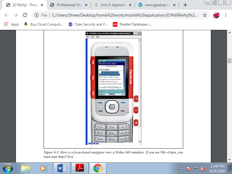
Figure. Here may be a focus-based navigator over a Nokia S40 emulator. If you employ File→Open, you want to type http:// first.
If you would like to emulate a Nokia device, first find the right platform version for that device at http://forum.nokia.com/devices then download the emulator for that platform. A Nokia guarantee that each device supported an equivalent platform version has an equivalent browser and rendering engine and even an equivalent hardware features.
The Nokia emulators will add shortcut icons to your Start menu, so it'll be easy to seek out them. Once you’ve launched the emulator, you'll open the browser and type within the URL or use the shortcut File→Open, which allows you to type or paste a URL or browse for a enter your local filesystem. The emulator will open the browser automatically.
Nokia S40 emulators support the use of localhost or 127.0.0.1 to attach together with your desktop host computer.
Q2) Write a note on online simulators.
A2)
Online simulators
Online simulators are an alternative choice for exploring the mobile web.
1. Opera Mini Simulator
At http://www.opera.com/mini/demo, you'll enjoy a full Opera Mini simulation during a Java applet. This URL is for the newest version of the software, but you'll also find simulators for previous versions, like 4.2 at http://www.opera.com/mini/demo/?ver=4.
Opera also offers an emulator for Opera Mobile that works on Windows, Mac OS X, and Linux and may be downloaded for free of charge at http://www.opera.com/developer/tools.
2. Ready.mobi.
The website http://ready.mobi features a great testing tool. It also has a web simulator for a few older devices, like the following:
• Nokia N70
• Samsung Z105
• Sony Ericsson K850i
• Motorola v3i
• Sharp GX-10
3. IPhone web simulation.
Some websites, like http://www.testiphone.com and http://www .iphonetester.com, attempt to simulate the iPhone browser, but the experience isn’t the important thing; they're just iframes with the skin of the iPhone.
Q3) Write a note on WML.
A3)
WML
WML was incorporated into the WAP 1.1 standard and was the first standard of the mobile web. It wasn’t standardized by the planet Wide Web Consortium (W3C), but rather by the WAP Forum, an organization made from many players from the mobile industry performing on standards during this market.
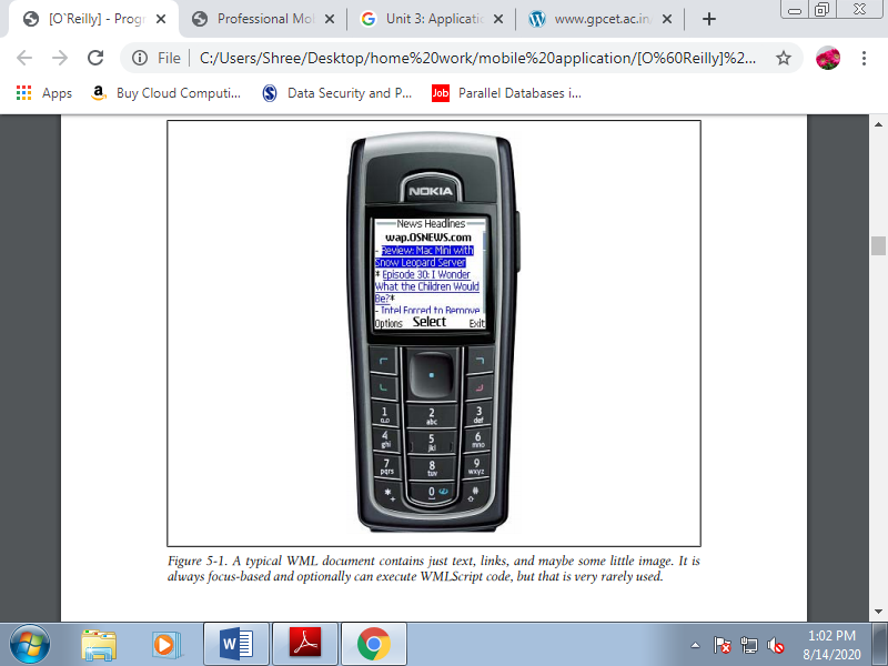
Figure. A typical WML document contains just text, links, and perhaps some little image. It's always focus-based and optionally can execute WMLScript code, but that's very rarely used.
In fact, some modern browsers supported WebKit (iPhone, Android, Palm) don't read this format anymore. It had been the markup for WAP 1.1, and therefore the first version was created in 1998! Just believe what mobile phones were like therein year. Still, if you look for “filetype:wml” in Google, you’ll find quite 2 million results using this format. And Google didn't index the bulk of the WAP 1.1 mobile web!
Internal no audited private reports of U.S. Traffic on The Weather Channel’s mobile site indicate that 50 of traffic in 2008 was WML-only, decreasing to 20 in 2009 and even less in early 2010. A WML file is an XML file, normally using the .wml extension.
It’s almost like HTML in some ways and really different in others. Let’s take a look at a typical WML file:
<?xml version="1.0"?>
<!DOCTYPEwml PUBLIC "-//WAPFORUM//DTD WML 1.1//EN"
"http://www.wapforum.org/DTD/wml_1.1.xml" >
<wml>
<card id="home" title="Welcome to Old Mobile">
<p mode="wrap">this is a <b>typical</b> paragraph in WML</p>
<p mode="wrap">It can include images,
<a href="http://wap.yahoo.com">External Links</a> and
<a href="#two">Internal Links</a>.
</p>
</card>
<card id="two" title="Second screen">
<p>This is like a second page in the same document</p>
</card>
</wml>
Recognize many tags found in HTML here, like p, b, and a, and that they have equivalent functionality. Other tags the 2 standards have in common include img, br, and input.
Firstly, a WML file starts with a root wml tag after the DOCTYPE declaration. A WML document is additionally called a deck. Every deck can contain many cards. A card, identified by a tag with an equivalent name, is one visible page during a browser; it's just like the contents of a body tag in HTML. WML file can contain many pages within the same document. This was an excellent feature for speeding up the performance of the mobile web within the early 2000s.
WML was conceived for mobile devices. We'll find tags and attributes supporting mobile device functionality for e.g., voice calls, keyboard support, adding contacts to the phonebook, and accessing the SIM card within the standard. The simplest part is that we will use the well-known anchor tag to make an absolute link, a link to a relative document, or a link to a different card within the same document using the #card_name URL.
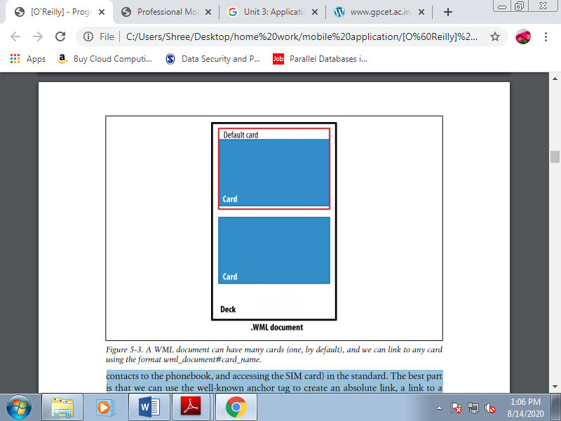
Figure. A WML document can have many cards, and we can link to any card using the format wml_document#card_name.
A. WML wasn't alone
WML doesn't generally support GIF, JPG, or PNG images. Images in WML files were in WBMP (Wireless Bitmap) format. WML also supports scripting employing a language called WMLScript, loosely supported ECMAScript. They aren’t worth discussing; just know that they existed and ask your grandchildren about them. A WBMP file is simply a 1 bit per pixel bitmap file, in black and white. Other common scenarios involved compiled WML and WMLScript files. These files were compiled by the developer or by a proxy or WAP gateway between the user and therefore the web server.
B. Serving WML
To serve WML, you only got to configure your server to deliver the proper MIME type.
Table. WAP 1.0 MIME types and extensions
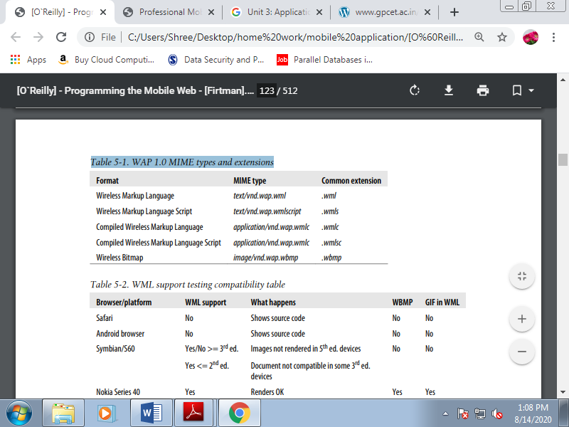
Table. WML support testing compatibility table
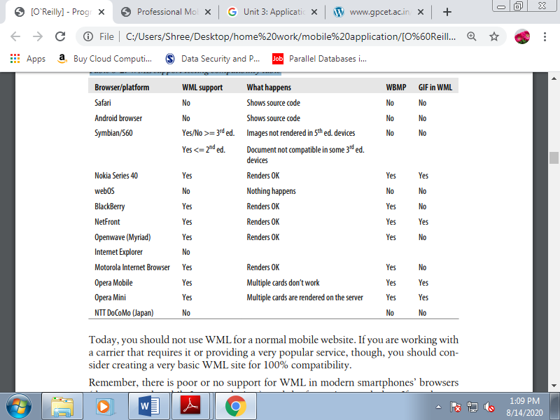
Today, you must not use WML for a traditional mobile website. If you're working with a carrier that needs it or providing a really popular service, though, you should consider creating a really basic WML site for 100% compatibility. Remember, there's poor or no support for WML in modern smartphones’ browsers, and therefore the future is even darker. If you've got a WML-only site, you must consider migrating it quickly; you're losing valuable customers.
Q4) Explain CSS for mobile.
A4)
CSS for Mobile
Web browsers have an excellent feature that creates our lives much easier. If we use any selector or attribute that the browser doesn’t understand, the browser will just ignore it. This may be very helpful within the following pages. Usage of CSS 2.1, CSS 3.0, CSS Mobile Profile, and WAP CSS is that the same; we specify CSS selectors and attributes for those selectors.
The standards only tell us which selectors and attributes are supported, and that we will find browsers that don't properly render standard ones and do properly render noncompatible tags. If you're curious about having W3C-valid markup, remember that XHTML Basic 1.0 doesn’t support CSS, and 1.1 added support, but just for a method or link tag with external styles. The W3C standard doesn’t support the inner styles defined within the style attribute. WCSS, or WAP CSS, may be a CSS 2.0 subset, like CSS MP.
A. WCSS extensions
The Open Mobile Alliance standard added to CSS 2 some new attributes that we will use in mobile browsers. As this is often how CSS defines extensions, every new attribute features a dash (-) as a prefix.
1. Access key
The first attribute is -wap-accesskey; it's the counterpart of the XHTML accesskey attribute. It are often used with any interactive element. The possible values are the digits 0 through 9 and therefore the special values * and #. For a few browsers on devices with numerical keypads, this attribute are often wont to create shortcuts to access those elements. Some browsers do nothing with it, some browsers set the main target thereon element when the user presses the key, and other browsers directly fire the action related to it.
We can only assign an equivalent key to at least one element within the same page. That’s why the -wap-accesskey attribute is beneficial only with ID selectors or with inline styles. You shouldn’t use this attribute with element or class selectors. Subsequent three samples all have an equivalent result:
<a href="http://mobilexweb.com" accesskey="0">Our website</a>
<input type="submit" value="Send" accesskey="9" />
<a href="http://mobilexweb.com" style="-wap-accesskey: 0">Our website</a>
<input type="submit"" value="Send" style="-wap-accesskey: 9" />
<style type="text/css">
#linkWeb {
-wap-accesskey: 0;
}
#btnSubmit {
-wap-accesskey: 9;
}
</style>
<a href="http://mobilexweb.com" id="linkWeb">Our website</a>
<input type="submit"" value="Send" id="btnSubmit" />
2. Marquee
If you’ve been doing web development for an extended time, like me, you almost certainly hate the nonstandard marquee element that a lot of people won’t to insert in sites. WAP CSS revived this system to make small animations without images that don't require Flash. A marquee is usually a text that scrolls from one side of the screen to the other, wrapping around continuously.
In some mobile browsers it can contain any HTML code, including images and even tables. However, don’t scroll an excessive amount of heavy markup, for the sake of your visitors and therefore the performance of your website. To make floating, scrolling text, use any paragraph element, like p or div, define the display attribute as -wap-marquee.
Table. Marquee WAP CSS attributes
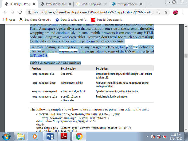
The following sample shows how to use a marquee to present an offer to the user:
<!DOCTYPE html PUBLIC "-//WAPFORUM//DTD XHTML Mobile 1.0//EN"
"http://www.wapforum.org/DTD/xhtml-mobile10.dtd">
<html xmlns="http://www.w3.org/1999/xhtml">
<head>
<meta http-equiv="Content-Type" content="text/html; charset=UTF-8" />
<title>Mobile Web Test</title>
<style type="text/css">
.offer {
Display: -wap-marquee;
-wap-marquee-dir: rtl;
-wap-marquee-speed: medium;
-wap-marquee-loop: infinite;
-wap-marquee-style: scroll;
}
.offer strong {
Color: red;
}
</style>
</head>
<body>
<div class="offer"><strong>Fly to the Moon</strong> Special offers this month starting at US$ 145.000. Apply now and see us from the sky.</div>
<h1>TravelWithUs.com</h1>
(...)
</body>
</html>
Try to avoid marquees for important information. You'll want to use them to scale back the space taken up by information that's indirectly relevant, or to have some quite animation free of plug-ins. Avoid the usage of links, images, or the other non-text markup inside a marquee, and make an alternate CSS stylesheet for noncompatible devices.
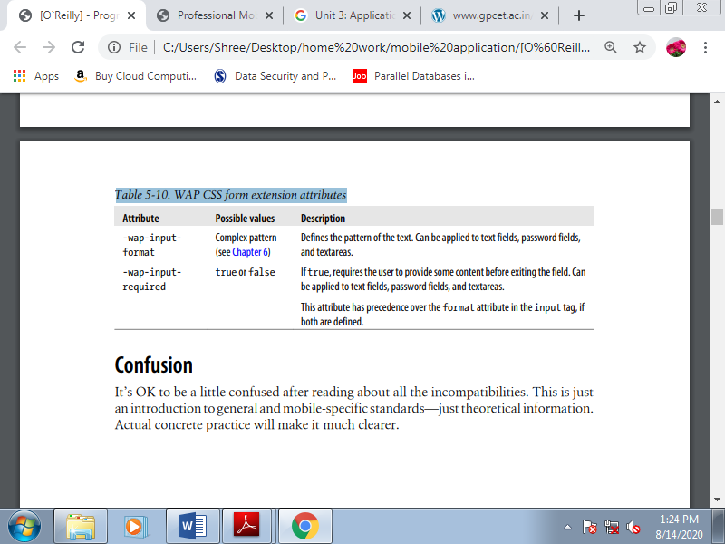
3. CSS form extensions
Another great enhancement in WAP CSS is that the ability to define useful information for form input. Now let’s see what extensions are included within the standard.
Table. WAP CSS form extension attributes
Q5) Explain different CSS Techniques.
A5)
CSS Techniques
1. Reset CSS Files
It is quite common in desktop web design to make a CSS hack to reset all the default margins and padding for common HTML elements. We will use this system when developing for the mobile web, with some considerations: we should always only reset the weather we are getting to use, we should always avoid the usage of the worldwide selector (*) for performance purposes, and if we are using an external reset CSS file we should always consider merging it with our local CSS file.
Some browsers always create a margin round the whole document that can't be deleted. And within the browsers that do allow you to delete the margin, remember that a zero margin might not be a good design decision.
2. Box Model
The box model, show how the browser represents every context box. Every block element (paragraph, image, title) features a content size, padding, borders, and outer margins. The sum of all of those defines the ultimate size of the entire box. Fortunately, most mobile browsers have good compatibility with all of those features.
3. Text Format
Showing text is that the most common situation during a mobile website, and styling it during a way that maximizes compatibility are often a little tricky. Bold (font-weight: bold) and italics (font-style: italic) are reliably compatible, but support for other text-formatting features varies.
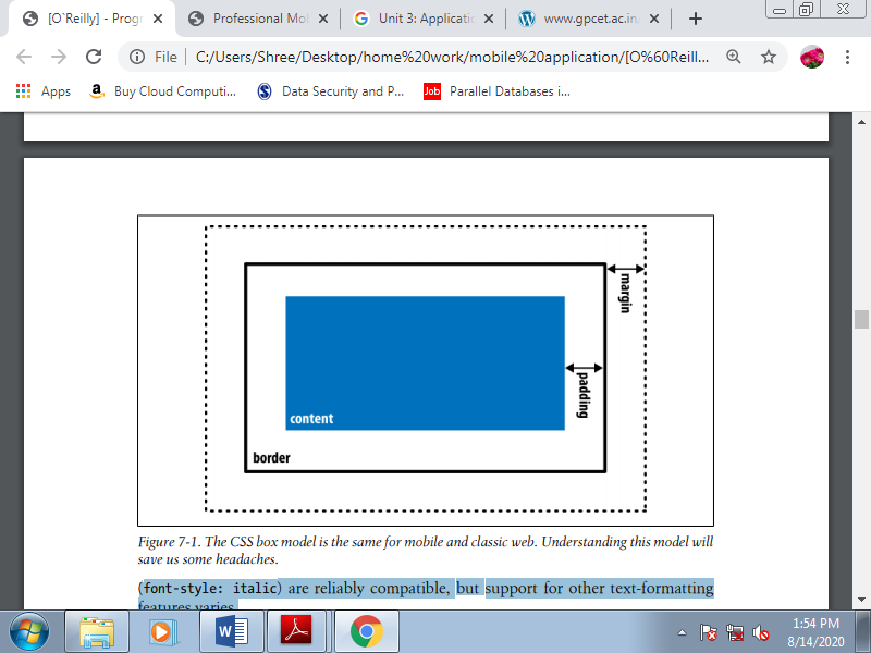
Figure. The CSS box model is that the same for mobile and classic web. Understanding this model will save us some headaches.
Font family
This will be our first problem in styling text for mobile browsers. There are not any standards in terms of fonts for mobile operating systems, and most platforms have just one system font.
We can provide specific font names (like Arial, Verdana, or Times New Roman) or generic font types (like serif, sans-serif, monospace, cursive, or fantasy).
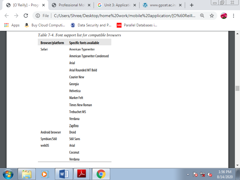
For the simplest compatibility, you should use the default font and apply other attributes (color, size, etc.). If you would like to define a font name, you must consider providing a list of alternatives. If the primary font isn’t available, the browser will try the second, then the third, then on; if none of the listed fonts is available, it'll use the default one.
Table. Font support list for compatible browsers
Custom fonts
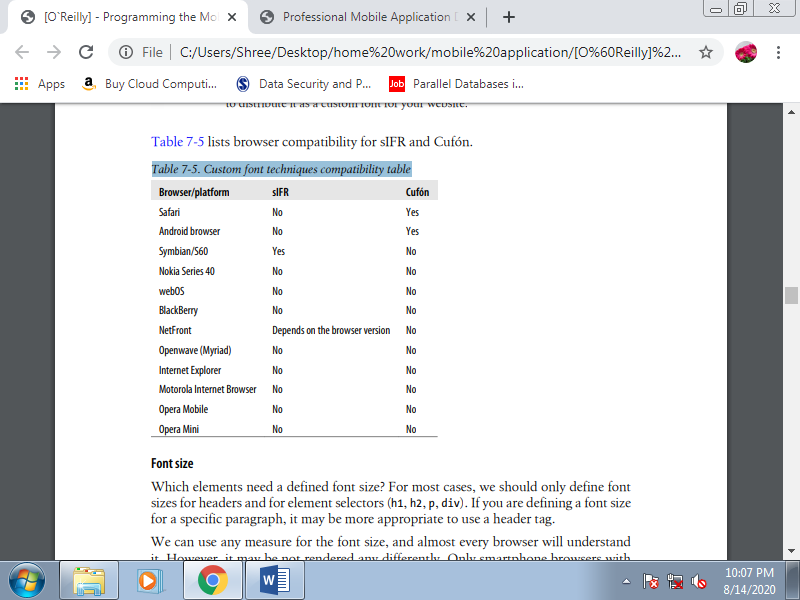
If you thought defining a system font was a headache, using custom fonts is even worse. No browsers support the CSS @font-face rule. If you would like to use your own font for text, you must think again. If it’s a matter of life or death, you'll think about using an image or a special approach on compatible browsers: sIFR on Flash-enabled devices, or Cufón for HTML 5 devices.
Compatibility is restricted, though, and albeit these solutions work, they will be slow. SIFR may be a nonintrusive JavaScript and Flash technique that replaces normal HTML text with a Flash movie with an equivalent text and an embedded vector font
Table. Custom font techniques compatibility table
Font size
For many cases, we should always only define font sizes for headers and for element selectors (h1, h2, p, div). If you're defining a font size for a selected paragraph, it's going to be more appropriate to use a header tag. Use any measure for the font size, and almost every browser will know it . However, it's going to be not rendered any differently. Only smartphone browsers with smart zoom support allow any font size to be rendered (like 13.5px in Safari on iOS).
For most of the mobile browsers, the simplest font size technique is to use relative constants (xx-small, x-small, smaller, small, medium, large, larger, x-large, xx-large). Operating systems have different font support. A number of them have only three possible sizes for text, and if we use the typical pixel definitions, two different sizes could also be rendered identically.
If we use relative constants (e.g., large), we've more probability of that text being rendered during a larger font. Another compatible way of specifying font sizes is to use em values. Using em values is ideal for supporting different screen sizes and DPIs because this unit is relative and scalable to the quality font within the device. The default font size is usually the right size within the OS for normal paragraph text, and for normal text we should always leave it that way.
Text alignment
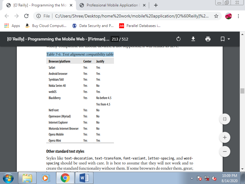
We can align the text using text-align over a block element with a value of right, left, center, or justify. As shown in Table justify value is that the least widely compatible for mobile devices; if not supported, it'll render as left.
Table. Text alignment compatibility table
Other standard text styles
Styles like text-decoration, text-transform, font-variant, letter-spacing, and word spacing should be used with care. It’s best to assume that they're going to not work and to make the quality functionality without them. If some browsers do render them, great; however, don’t believe them.
Text shadows
Another non-mobile CSS 2.1 feature is text-shadow. It allows us to define the colour , x-offset, y-offset, and blur radius of a shadow to be applied to a text selector. For instance, we will produce a shadowed headline like that shown in Figure with code like this:
h1 {
Text-shadow: 0.1em 0.1em #AAA
}
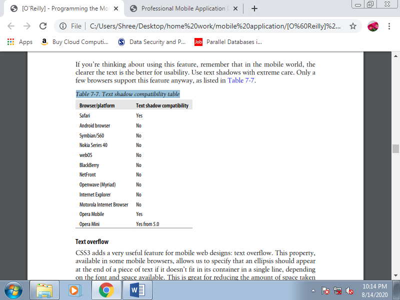
If you’re thinking about using this feature, remember that in the mobile world, the clearer the text is the better for usability.
Table. Text shadow compatibility table
Text overflow
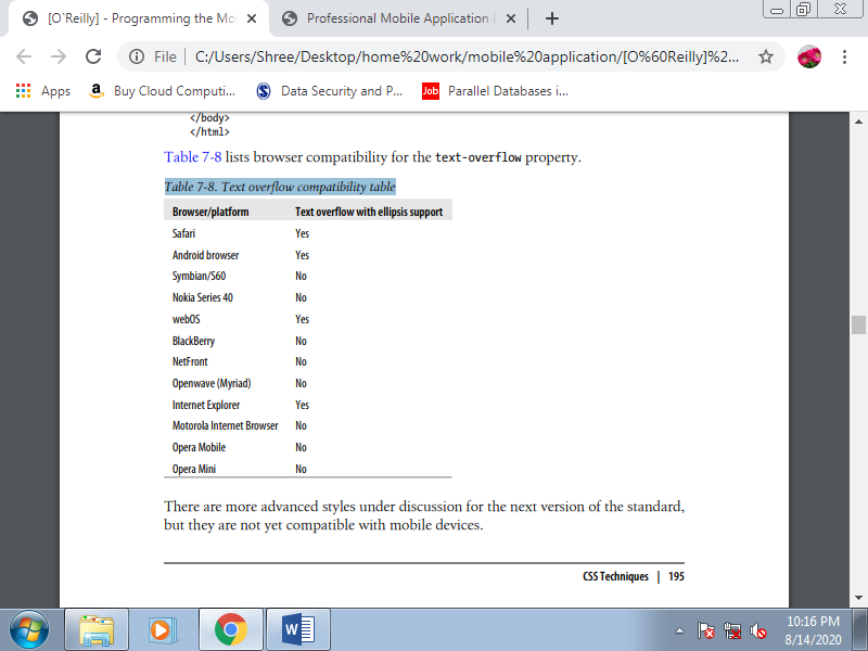
CSS3 adds a really useful feature for mobile web designs: text overflow. This property, available in some mobile browsers, allows us to specify that an ellipsis should appear at the end of a piece of text if it doesn’t fit in its container during a single line, depending on the font and space available. This is often great for reducing the quantity of space taken up by links, and for previews or summaries which will be shown completely during a details page after the user clicks on them.
For instance, we will show a title, and an outline with text-overflow set to ellipsis. When the user clicks on the title, via JavaScript, we remove the text-overflow property and therefore the whole text is shown. This maximizes the quantity of content we will display on a page. This feature also works well on devices that support both landscape and portrait orientations: with text overflow we will assure the usage of just one line in both modes.
To use this feature, the paragraph must have overflow: hidden to avoid the continuing of the overflow text on subsequent line, whitespace: nowrap to avoid wrapping, and a few value for text-overflow. In mobile browsers, the possible values for text-overflow are clip and ellipsis. The ellipsis value causes an ellipsis to seem after the last character that matches within the box. Clip is that the default value, which truncates the text without showing the ellipsis.
Here is a sample that produces :
<!DOCTYPE html PUBLIC "-//WAPFORUM//DTD XHTML Mobile 1.0//EN"
"http://www.wapforum.org/DTD/xhtml-mobile10.dtd">
<html xmlns="http://www.w3.org/1999/xhtml">
<head>
<meta http-equiv="Content-Type" content="text/html; charset=utf-8" />
<title>Documento sin título</title>
<style type="text/css">
ul p {
Text-overflow: ellipsis;
Overflow: hidden;
White-space: nowrap;
}
</style>
</head>
<body>
<h1>Latest news</h1>
<ul id="news">
<li>
<a href="#">Teletransporter discovered</a>
<p>Beam me up, Scotty! Finally scientists from London have discovered
Teletransportation</p>
</li>
<li>
<a href="#">Teletransporter discovered</a>
<p>Beam me up, Scotty! Finally scientists from London have discovered
Teletransportation</p>
</li>
</ul>
</body>
</html>
Table. Text overflow compatibility table
IPhone text adjustment
Safari on iOS supports a CSS style especially for controlling the dimensions of text prepared for the zooming action: -webkit-text-size-adjust. This style accepts values of auto, none, and a percentage. By default, iOS overwrites the site’s font sizes to permit the text to be read with none problems when the user zooms over a paragraph.
Override this behavior with this style, turning it off or defining a percentage zoom level to be applied on the default font defined for the desktop website. If we would like to enhance a desktop website for iPhone browsing, we should always leave this style set to auto. However, if we are creating a mobile-only website, we'll typically want to define our own font sizes, so we should always turn this feature off:
Body {
-webkit-text-size-adjust: none
}
If a paragraph is ready to be read during a desktop browser with an outsized viewport width, we will change this behavior using the -webkit-text-sizeadjust attribute to enhance the iPhone reading experience without changing the desktop appearance.
Q6) Explain frames in HTML.
A6)
Frames
Frames are one among the “better if you avoid it” features within the mobile world. I remember back in 1997 being proud of the frames technique, creating fixed menu bars and handling links between frames. It had been a cheerful time, until search crawlers came into action and frames became the worst thing you'll ever do in a web site. OK, background music are often even worse, but it's true that today the usage of frames is suitable just for intranet sites and non-crawled applications. Similar functionality can now be given the far more versatile Ajax.
The HTML frames mechanism allows the developer to separate a document into n subdocuments, vertically and/or horizontally. Every frame may be a different document, and each frame manages its own scrolling. We already know that within the mobile world, although the viewport are often large, the screen is little. Splitting this small screen into smaller windows as frames are often difficult.
The only situation where it are often useful is to define fixed toolbars at the highest or bottom of a document. However, this may still cause problems with search engines, and what’s more, there are many mobile browsers that don’t work with frames.
So, the ultimate advice is: don’t use frames when developing for the mobile web. The inline frame (or iframe) may be a modern way to do frames. The iframe tag isn't a part of the XHTML standards, but in mobile browsers it does produce better results than frames. Today, iframes are often used for ad servers to serve advertisements from a third-party server. If you’ll, it’s still best to avoid them; if you can’t, consult the list.
Q7) Write a short note on SVG.
A7)
Standard Vector Graphics is an open XML specification describing 2D vector graphics. An SVG document is often static or dynamically generated from a JavaScript file. As a vector-rendering engine, an excellent feature is that the adaptation to different screen sizes without loss of quality.
SVG may be a W3C standard for desktop platforms, with two subsets prepared for mobile platforms: SVG Basic and SVG Tiny. Because of this standards fight (as with XHTML mobile versions), we will use either SVG Basic or SVG Tiny with an equivalent code and results. However, the small sub-version appears to have won the battle. The newest version available is SVG Tiny 1.2, but the foremost compatible version of SVG Tiny for mobile browsers is 1.1 (SVGT 1.1), which offers some support for animation.
This version has been adopted by OMA and therefore the 3rd Generation Partnership Project (3GPP). Opacity and gradients aren't a part of the mobile standard, but some devices still render them. This addition is understood within the market as SVGT 1.1+. One compatibility issue between SVGT devices is text support. Some devices allow us to use system fonts to declare text within the SVG, but others don’t, forcing us to convert text to curves during a graphic design tool.
1. Tools for SVGT
Most vector graphic design software supports SVG as an export format. Adobe Illustrator, for instance, can export to SVGT 1.1, SVGT 1.1+, and SVGT 1.2. Corel Draw is another useful tool for SVG conversion.
Sometimes the markup generated by Illustrator has more tags than you would like , so you'll want to open it with another tool and export it again. The foremost useful tool for mobile SVG currently on the market is Ikivo Animator. It intended for mobile devices and may create animations using SVGT 1.1. Within the open source world, Inkscape offers SVG support, and for Windows only we will use SVGmaker Tiny, a printer driver that converts any printed document into SVGT.
The recommendations for SVG Tiny document generation are:
• Keep the quantity and size of the objects wont to the minimum.
• Avoid big gradient areas; they decrease performance.
• Reduce path points to the minimum.
• If the thing is just too complex, a raster PNG could also be better.
• Use GZIP if compatible.
• Combine paths when possible.
• Maintain one copy of every object online.
• Export text as curves.
• For easy shapes, don’t use a graphic design tool.
2. SVG for beginners
SVG is beyond the scope of this book, but here may be a very quick lesson on SVG Tiny. An SVG document is an XML document with a root svg tag defining an original viewport size (width and height), but remember that it's a vector image, so you'll resize it. Inside the image, we will draw the subsequent kinds of shapes:
• Rectangles (rect)
• Circles (circle)
• Ellipse (ellipse)
• Line (line)
• Polyline (polyline)
• Polygon (polygon)
• Path (path)
The subsequent is an SVG Tiny 1.1+ compatible document (it uses a LinearGradient, which isn't included within the SVGT 1.1 standard):
<?xml version="1.0" encoding="utf-8"?>
<!DOCTYPEsvg PUBLIC "-//W3C//DTD SVG 1.1 Tiny//EN"
"http://www.w3.org/Graphics/SVG/1.1/DTD/svg11-tiny.dtd">
<svg version="1.1" baseProfile="tiny" xmlns="http://www.w3.org/2000/svg"
Xmlns:xlink="http://www.w3.org/1999/xlink" x="0px" y="0px" width="200px" height="200px">
<linearGradient id="grad1" gradientUnits="userSpaceOnUse" x1="54" y1="61"
x2="147" y2="61">
<stop offset="0" style="stop-color:#FFFFFF"/>
<stop offset="1" style="stop-color:#000000"/>
</linearGradient>
<rect x="0" y="0" fill="url(#grad1)" stroke="#000000"/>
<ellipse fill="#FF0000" stroke="#000000" cx="30" cy="100" rx="25" ry="25"/>
</svg>
This document creates a 200×200-pixel SVG image with a rectangle (rect tag) and a circle (ellipse tag with equal radius rx and ry centered at cx, cy). The circle is filled with a clear red color and therefore the rectangle is filled with a linear gradient defined with an id of grad1. This gradient isn't compatible with SVGT 1.1.
This document features a size of 670 bytes (0.6 KB) as an SVG file. A 24-bit PNG with an equivalent image features a size of 5.77 KB, and an 8-bit PNG with quality loss features a size of 1.31 KB. Clearly, SVG is best from a size perspective. The bad thing is that the browser has got to render the image on the mobile device.
3. Embedding the SVG
To insert an SVG document inside an XHTML document we will use the thing tag, defining the info attribute with the URL of the SVG, the sort as image/svg+xml, and therefore the width and height. As an SVG may be a vector-based image, we will use percentages for the dimensions attributes to adapt the content to the viewport size. If SVG isn't available, we will use the fallback feature to make an alternate image in another format as a child of the thing tag:
<object data="logo.svg" type="image/svg+xml">
<imgsrc="logo.jpg" alt="Logo not SVG" />
</object>
Some browsers (such as Safari on iOS) also use the classic img tag for SVG files:
<imgsrc="logo.svg" />