Unit - 4
Devices, Images, Multi-Media
Q1) Explain Device Detection in details.
A1)
Device Detection
Device detection is a technique for identifying devices accessing online content. Knowledge of visiting devices is an important asset for all businesses who want to maximize revenues from their websites and online services. It powers various aspects of web optimization, user experience, targeted advertising and device-aware web analytics tools.
Based on entries within the device database, an answer like DeviceAtlas can report on the characteristics of visiting devices with an API, and this is used for any purpose which needs device awareness. Read on to higher understand how it works, what it’s used for, and the way it’s deployed.
Device detection works by analyzing User-Agent (UA) strings, and, in some cases, other HTTP headers. The detection mechanism searches for patterns within the User-Agent to match with a tool entry within the device database in real time. High speed API calls can return the acceptable values for any device characteristic stored within the database.
For example, the API used to return the device’s OS. This information used for any purpose where knowledge of the OS is required, like to optimize website content, or to serve targeted ads.
Mobile Detection
Before talking about detection of mobile devices and services on the server, we'd like to travel back a small amount and consider an old friend: the HyperText Transfer Protocol, also referred to as HTTP. Knowing a bit about its internals will help us determine what we will do in terms of mobile web development.
A. HTTP
HTTP may be a protocol defined in 1991 for document transportation over TCP/ IP networks. It’s two main versions: 1.0 and 1.1. This same protocol is that the one that we'd like to use from the server side in mobile web development.
The last sentence isn’t strictly true if we consider WAP 1.1, where the device communicates with the WAP gateway and therefore the WAP gateway is that the one connecting to our server via HTTP. An identical approach is used in proxied browsers, like Opera Mini and Bolt. However, from the server’s point of view the requests coming in will always be HTTP requests.
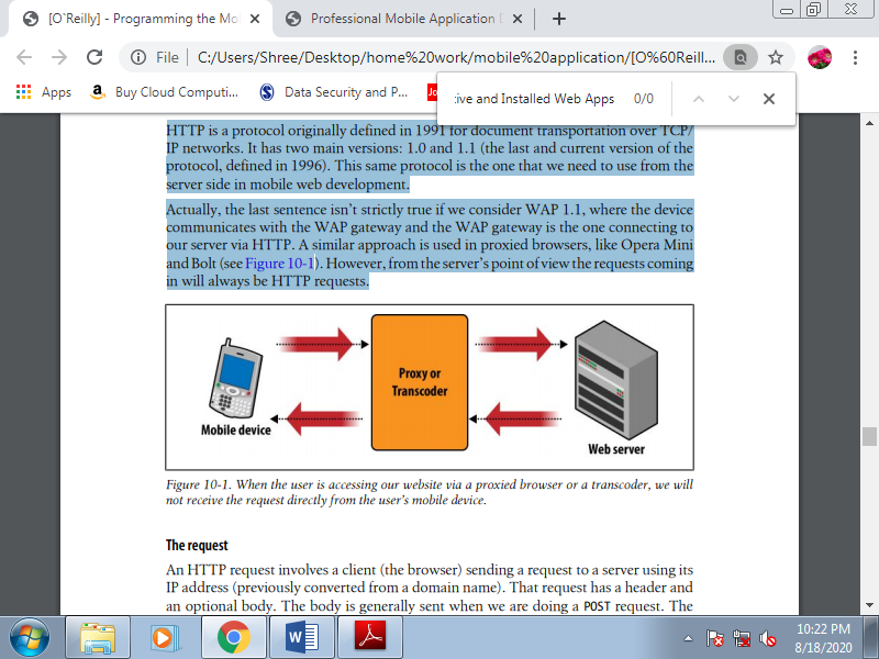
Figure. When the user is accessing our website via a proxied browser or a transcoder, we will not receive the request directly from the user’s mobile device.
1. The request
An HTTP request involves a client sending a request to a server using its IP address. That request features a header and an optional body. The body is usually sent once we do a POST request. The foremost common request type may be a GET, requesting a document or a file from the server.
The server responds with a response status code, a header, and an optional body. The body is that the requested file. Why are we taking this two-minute networking class? Because it illustrates many of the techniques we'll use in server-side detection.
2. The request header
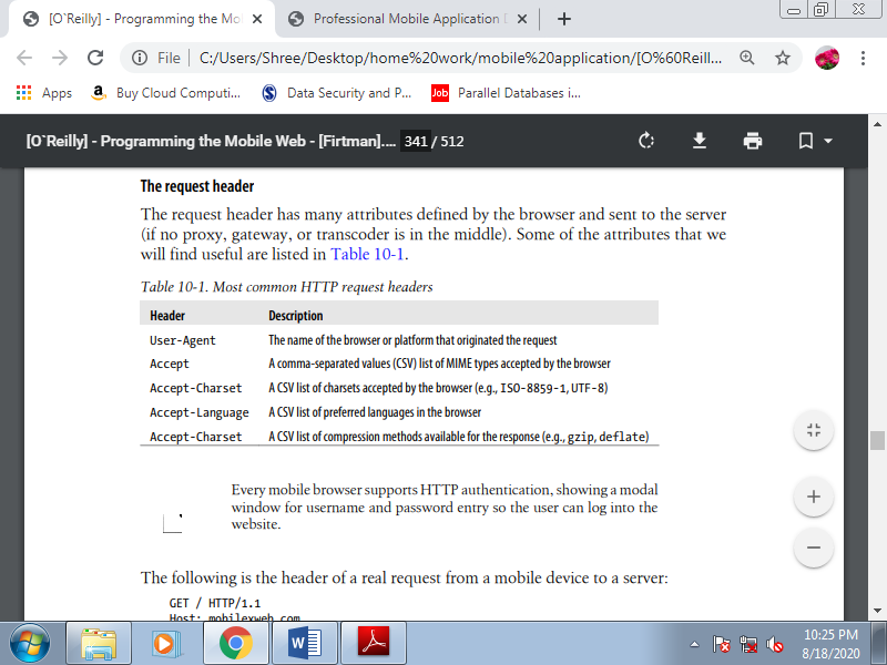
The request header has many attributes defined by the browser and sent to the server. A number of the attributes that we'll find useful are listed below.
Table. Most common HTTP request headers
The following is the header of a real request from a mobile device to a server:
GET / HTTP/1.1
Host: mobilexweb.com
Accept: application/vnd.wap.wmlscriptc, text/vnd.wap.wml,
Application/vnd.wap.xhtml+xml, application/xhtml+xml, text/html, multipart/mixed, */*
Accept-Charset: ISO-8859-1, US-ASCII, UTF-8; Q=0.8, ISO-10646-UCS-2; Q=0.6
Accept-Language: en
DRM-Version: 2.0
Cookie2: $Version="1"
Accept-Encoding: gzip, deflate
User-Agent: Nokia5300/2.0 (03.50) Profile/MIDP-2.0 Configuration/CLDC-1.1
x-wap-profile: "http://nds1.nds.nokia.com/uaprof/N5300r100.xml"
3. The user agent
The user-agent string identifies the browser. It’s had a complex history, with the result that today there are browsers that identify themselves as six different browsers at an equivalent time within the same string. This somewhat complicates browser detection.
In the beginning of the web era developers often searched for a specific string within the User-Agent header to see what content to deliver, many browsers, starting with Microsoft Internet Explorer, started employing a hack that today has resulted in user agent hell.
The hack was for Internet Explorer to identify itself as Mozilla. After this first identification, it clarified that it had been not actually Mozilla, but rather a compatible browser (IE). Microsoft also added other information to the user-agent string, just as the OS and details on the plug-ins and languages supported. The top result was really complex user agent syntax with no standards.
In the mobile world, things are even worse. Some browsers use the IE hack and identify themselves as Mozilla, others identify themselves with the right browser name, and still others send the device brand and model number within the User-Agent header.
Even an equivalent device may provide a special user-agent string depending on the OS version or the firmware used. This makes device detection using this string a bit complex.
The following is a list of some mobile user-agent strings provided by a Nokia N95, a Nokia 3510, a Motorola v3, a BlackBerry, an iPhone 3.0, a Windows Mobile device, and a Japanese phone from the carrier Au:
• Mozilla/5.0 (SymbianOS/9.2; U; Series60/3.1 NokiaN95/20.0.015 Profile/
MIDP-2.0 Configuration/CLDC-1.1)AppleWebKit/413 (KHTML, like Gecko)
Safari/413
• Nokia3510i/1.0 (05.30) Profile/MIDP-1.0 Configuration/CLDC-1.0
• MOT-V3i/08.B4.34R MIB/2.2.1 Profile/MIDP-2.0 Configuration/CLDC-1.1
• BlackBerry8100/4.2.0 Profile/MIDP-2.0 Configuration/CLDC-1.1 VendorID/125
• Mozilla/5.0 (iPhone; U; CPU like Mac OS X; en) AppleWebKit/420+ (KHTML, like
Gecko) Version/3.0 Mobile/1A538a Safari/419.3
• Mozilla/4.0 (compatible; MSIE 4.01; Windows CE; PPC; 240×320)
• UP.Browser/3.04-TS14 UP.Link/3.4.4
There's no standard for this string. So, the initial approach is to look for a few term for instance, “iPhone” or “Symbian” to try to see which device or platform a request has originated from.
4. What we can identify
Identification is beneficial for context definition. We’d like to recollect that the user may be a mobile user, and for these users the context is extremely important. We would like to get all the data we will that context, so we will provide the foremost useful experience possible.
The mobile browser doesn’t send information about:
• The International Mobile Equipment Identity (IMEI) or serial number to spot the device uniquely
• The sort of network used (WiFi, 3G, GPRS, EDGE, CDMA)
• The carrier (operator) providing service to the device
• The country of the user
• If the user is roaming
• The phone number of the user
• The device’s brand and model number (not directly)
Some of this information are inferred, but the other identification data won't be available. That’s why we cannot identify users automatically without a login, as in desktop web applications.
Here’s what we will glean from the device headers:
• The carrier and country, from the IP address of the request (if it's using a 2G or 3G network).
• The country (and maybe city or maybe location), from the IP address of the request (if it's using a WiFi network).
• The brand and model number, inferred from the User-Agent header.
• The language during which the OS is defined.
• What markups and document types are accepted, if the header isn't defined as */*.
5. The User Agent Profile
The UAProf (User Agent Profile) may be a voluntary standard defined by the Open Mobile Alliance (formerly WAP Forum). It takes the form of an XML file defining the abilities of the device, including its screen size, download features, and markup support.
The XML is defined by the manufacturer or the carrier, and a link to the XML is defined during a header (typically x-wap-profile).
x-wap-profile: http://nds1.nds.nokia.com/uaprof/N5300r100.xml
This URL will are defined when the browser was created, which can are several years before. If the URL remains working, we should always get XML just like the following extract:
<prf:ImageCapable>Yes</prf:ImageCapable>
<prf:Keyboard>Qwerty</prf:Keyboard>
<prf:Model>BlackBerry 8100</prf:Model>
<prf:NumberOfSoftKeys>0</prf:NumberOfSoftKeys>
<prf:PointingResolution>Character</prf:PointingResolution>
<prf:PixelAspectRatio>1x1</prf:PixelAspectRatio>
<prf:ScreenSize>240x260</prf:ScreenSize>
<prf:ScreenSizeChar>26x18</prf:ScreenSizeChar>
UAProf files have many problems. First, we'd like to download the XML for every request, process it, and either extract the properties we would like or make a local copy on our server. Second, the community has found many bugs and problems during this official information.
Some devices don’t define a UAProf file, and that they don’t define equivalent properties. Also, UAProf doesn't have the right granularity of information; for instance, you'll read that Flash is supported, but no information is there about which version.
Q2) Write a note on Transcoders.
A2)
Transcoders
With WAP 1.1, operator gateways were required to precompile WML and make it lighter and more easily useable by devices with limited memory/CPU resources. Gateways were also relied upon to manage cookies on behalf of the devices and for integration with the operator’s backend.
With WAP 2 pre-compilation was not needed, but other aspects of gateways were and still are today, to some extent. During a lot of various contexts, the presence of a WAP gateway is useful to developers and content providers. Around 2002, some companies started selling tools to “mobilize” web page .
That is, users could A URL into a field, and therefore the transcoder/content reformatter would chop it up into pages that would be viewed by mobile devices.
Around 2006, some quite genetic mutation happened: transcoder vendors realized that transcoders might be deployed in proxy mode and therefore the whole Web might be transcoded behind the backs of the users and content providers, no matter the presence of a mobile-optimized experience for any given site. This dangerous move posed a significant threat to the mobile ecosystem.
1. What is a transcoder?
Defining transcoders requires a bit of care. Not only has the term “transcoders” been utilized in other industries, but there also are other terms within the mobile world that identify mobile-web transcoders and what they do: notably, content transformation and content adaptation.
Content transformation is essentially a synonym for “transcoding,” but content adaptation also can ask development techniques that, while they bear some similarities to transcoding, are more traditional approaches to the creation of mobile websites.
When you say “transcoders” to mobile web developers, they’ll possibly consider the proxies (from companies like Novarra, InfoGin, Openwave, and ByteMobile) that network operators (Vodafone, Verizon, Sprint, etc.) install in their networks to intercept desktop sites on their way to mobile devices and “reformat” them. By “reformatting,” that mean one or more of the following:
• Splitting a page into several smaller pages (which are supposedly more manageable for mobile devices)
• Replacing the initial graphics with images of lower size (and lower quality)
• Adding an operator navigation bar on every page
• Injecting advertising from unknown sources
• Disabling mechanisms to detect successful download of applications, Java ME MIDlets, and other downloadable content
A less obvious effect of transcoders is that they often intercept and modify HTTP requests, removing the UAProf and/or the original user-agent string
2. Why are transcoders a problem?
If you're a content provider otherwise you build mobile websites, transcoders will cause you to furious. As soon as an operator deploys a transcoder, you'll notice that you simply are unable to recognize devices using that operator’s network and its transcoder.
If you've got invested time and money in installing a framework to recognize mobile devices, all of your work are going to be lost: all you'll see are browser requests hitting your server. But that’s not all.
Your branding is extremely likely to be disrupted, then is your business model if, for instance , you're not ready to bill your customers directly, or if the ad banners you were injecting into your pages get discarded. These are things that have happened in practice and driven people mad.
The icing on the cake was when operators started injecting their own advertising into other people’s content, trying to monetize other people’s efforts. It's no surprise that this has caused huge uproar amongst transcoder “victims.”
3. Parties involved in the transcoding problem
There are two main culprits behind the mess caused by transcoders: operators and transcoder vendors. Transcoder vendors are guilty of telling operators, “Look, we've this fantastic technology which will bring the whole Web to all or any of your users. A lot of fantastic content you don’t need to buy . Isn’t this great? And who cares if people that have invested millions in creating mobile sites complain…We are the longer term, after all!”
This was deeply irresponsible, but in fact a part of the blame goes to the operators who actually believed this story, decided to deploy transcoders, and were flooded by a wave of complaints and thrown into disrepute. Of course, I had a role in making mobile developers specialize in the matter intimately , but there have been thousands of irritated developers who backed me instantly once I blogged about the issue.
4. What was the response from carriers after receiving complaints?
Officially, the carriers were silent. After all, these are huge organizations, and getting anyone to face up and talk on behalf of their employees is just not realistic. Behind the scenes, I got a lot of support from people working for operators ( Vodafone Global, Germany, and UK).
5. Operator whitelists
Some operators offer whitelists where you'll explicitly opt your site out of transcoding. Whitelists aren't the way to go, though. Accepting whitelists means accepting the law of the jungle.
If we were to comply with whitelisting our sites with each and each operator around the planet, we might effectively be giving operators a right they are doing not have. The network and HTTP must be an equivalent for everybody, or this is able to represent a large step back for the entire mobile industry.
6. Making content transformation a standard
Transcoding is stealing. How does one standardize stealing? there's just one answer: you don’t. Stealing is against the law and must remain that way. Of course, transcoding vendors try to convince the W3C to make “quasi-standards” that allow transcoding in some instances, which in real deployments will naturally translate into “whenever the heck we would like .” the matter here is that the corporations who sit at the W3C table call the shots in their own interests.
7. Transcoder detection
There is an ongoing battle between transcoder vendors and therefore the remainder of the mobile ecosystem. There are ways to recognize a transcoder, by checking certain headers. Again, the Manifesto has more information. The matter is that the business model of transcoder vendors is in direct conflict with the business model of content owners.
For this reason, transcoders are progressively making it harder for others to detect them, by removing those hints from HTTP requests. Each day may come when developers will got to maintain a list of IP ranges to spot transcoders and treat requests coming from them specially.
8. What to do after detection
Assuming you've got detected a transcoder, adopting the Cache-Control: no-trans form header and using mobile-specific MIME types and DTDs is your best bet to stop your content from being touched. Serving your content from a hostname with a pattern like m.*, wap.*, or *.mobi will usually also help. I say “help” because this is often not a guarantee. Your content remains at the mercy of the operators’ transcoder policies, and no-one will follow them on your behalf if they decide to not respect your directives.
Q3) What is WURFL? Explain in details how it is used for server side detection?
A3)
WURFL
Wireless Universal Resource File (known as WURFL) may be a community-based, open source device capabilities repository created and maintained by the developer Luca Passani, a fellow member of the Forum Nokia Champion program and author of the preceding section on transcoders.
The library is out there within the sort of an XML file. While updates to WURFL data happen a day on the WURFL DB, a publicly available “snapshot” of the DB is produced and published about once per month on the WURFL website.
The sources of data include official technical information published by manufacturers, UAProf files, and data collected by the community after testing on real devices. Today, the WURFL database contains thousands of devices, with information on subversions, operating systems, firmware and hardware variations, and many attributes that we will query for everyone.
WURFL Functionality
The sample code below is from the WURFL repository file (WURFL.xml), which contains groups and capabilities for a device:
<device user_agent="Nokia3650" actual_device_root="true" fall_back="nokia_generic_series60" id="nokia_3650_ver1"><br/>
<group id="image_format"><br/>
<capability name="bmp" value="true"/><br/>
<capability name="colors" value="4096"/><br/>
</group><br/>
</device>
This is the configuration file which is queried for device information. So, if a new device is introduced into the market, we'd like to feature the knowledge during this file.
The functionality of WURFL are often explained in two steps :
1. Device detection : When a request from a tool comes in, the WURFL repository file is queried for the USER_AGENT value. This is often a singular value for every device.
2. Return capability Value : Once the USER_AGENT is obtained, the repository is queried again and corresponding groups and capabilities are obtained. Then the markup is made for the requesting device that corresponds to the potential values. If the capabilities aren't found within the id for USER_AGENT, the capabilities are obtained following the inheritance using the id from the FALL_BACK value. The inheritance chain continues till the capability values are available for markup.
J. Including WURFL
WURFL are often included in various formats like PHP, JSP and .NET. The example below shows how we include a WURFL repository to a JSP page.
A WURFL enabled page must include two files:
• /WEB-INF/tld/wall.tld: This tag library descriptor page is included at the highest of the page.
• /WEB-INF/tld/c.tld: This page is included just above the body tag
The example below demonstrates how WURFL works and shows how a WURFL enabled JSP page hosted within the web server might like look:
<%@ tagliburi="/WEB-INF/tld/wall.tld" prefix="wall" %>
<wall:document>
<wall:xmlpidtd />
<%@ tagliburi="/WEB-INF/tld/c.tld" prefix="c" %>
<wall:load_capabilities />
<wall:body>
<wall:body>
<wall:block>
<c:choose>
<c:when test="${capabilities.resolution_width>= 700}">
<iframeframeborder="0" scrolling="no" src="pageA.html" ></iframe>
</c:when>
<c:otherwise>
<iframeframeborder="0" scrolling="no" src="pageB.html"></iframe>
</c:otherwise>
</c:choose>
</wall:block>
</wall:body>
</wall:document>
In this example, if the page is requested by a web browser whose resolution width is quite 700, the primary a part of the condition are going to be executed and pageA.html would seem on the iframe. Otherwise, pageB.html would seem.
Similarly, we will make use of capabilities to question the device properties and supply markups, display styles, images, and and also manipulate content supported device type.
K. Who is Using WURFL?
Currently, a large number of companies are using WURFL for development of mobile websites. These include companies who are large and medium content providers, but the foremost popular usage of WURFL is in companies that are small content providers. A number of the foremost popular companies that make use of WURFL are Vodafone, Mobile Galleries, and Pepsi UK.
Q4) Write a note on WURFL.
A4)
WURFL
Wireless Universal Resource File (known as WURFL) may be a community-based, open source device capabilities repository created and maintained by the developer Luca Passani, a fellow member of the Forum Nokia Champion program and author of the preceding section on transcoders.
The library is out there within the sort of an XML file. While updates to WURFL data happen a day on the WURFL DB, a publicly available “snapshot” of the DB is produced and published about once per month on the WURFL website.
The sources of data include official technical information published by manufacturers, UAProf files, and data collected by the community after testing on real devices. Today, the WURFL database contains thousands of devices, with information on subversions, operating systems, firmware and hardware variations, and many attributes that we will query for everyone.
Architecture.
WURFL groups the devices into a hierarchy of devices and attributes. Some devices are like other devices from an equivalent series, possibly with some new features, so there's a fallback mechanism in WURFL allowing a tool to increase the features of another one. An equivalent applies for various models within the same brand or maybe different brands with an equivalent OS.
Also, there's a feature called “actual device root” that manages multiple subversions of an equivalent device, therefore the information isn't duplicated in two records; the subversion are going to be supported the most record with any added or different abilities noted.
The WURFL database features a root fallback device called “generic device” that's matched when the device, the brand, and therefore the series can’t be determined.
Patch file.
What do you have to do if you would like to form changes to the WURFL XML, whether to identify new devices or bugs that you’ve found or to feature new private or public capabilities to be queried? Changing the first WURFL XML would be impractical, because you'd have problems within the future once you wanted to download updates from the site.
That’s why a patch file is included within the WURFL architecture. A patch is sort of a miniWURFL. The WURFL API will merge the patch information with the knowledge within the WURFL database when the service starts.
WURFL is meant to be used on mobile websites; that's why this library doesn't detect desktop browsers, or if they're detected misidentifies them as some fallback mobile. If users may access your mobile website from their desktops and you would like to be ready to detect that using WURFL, you'll download a web patch which will detect desktop web browsers like Firefox and Internet Explorer. You’ll got to merge this patch with the most XML.
Capabilities.
Every ability, property, or attribute is named a capability within the WURFL world. Capabilities are organized into groups. Each capability for every device has an optional string value. That value is often converted to a Boolean, a number, a string, or an empty string.
Table. Most useful WURFL capability groups
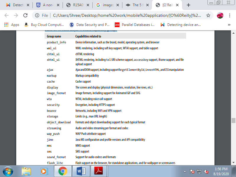
The information that the XML provides is basically complete. If you would like to browse all the capabilities, you'll browse the XML with any reader or use the tools that go along with the Java API. You’ll check the primary device definition, because the generic device and fallback for all devices.
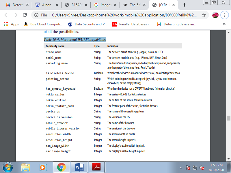
If any property isn't defined within the generic device, there'll be no fallback value to use if the device doesn't define it. Table shows the foremost important capabilities we will query, supported the compatibility problems outlined within the preceding chapters. Remember that there are dozens of other properties that you simply can query; take a look at the library so you’ll have a thought of all the chances.
Table. Most useful WURFL capabilities
2. WURFL usage
You can use WURFL by browsing the file as you'd the other XML file and matching user-agent strings, but the wheel has already been invented, and on an equivalent website where you'll download the XML you'll find APIs for the foremost common server platforms: Java, PHP, and .NET.
Generally speaking you should use the new APIs available on the web site, except for compatibility purposes you'll still find old APIs to download. These APIs allow us to use WURFL during a few lines, with many advantages:
• Automatic device detection using the header information
• Two-step user agent analysis (optimized and clever user-agent searching inside the XML)
• Detection of transcoders and proxies, and matching of the right user agent and device information
• Merging of the static XML provided by WURFL with patches (the web patch or your own), providing an easy and unique thanks to query capabilities
• Caching of the XML parsing for the simplest performance on every request
PHP API installation
To use WURFL in PHP, you should download the PHP API and extract the contents of the GZIP file. The package contains documentation, examples, resources, unit tests, and a WURFL folder where the API resides.
To make it work, follow these steps:
1. Copy the WURFL folder in your web server root folder.
2. Copy the resources or examples/resources folder into your web server root folder.
3. Download the latest wurfl-<version>.zip file from the website and copy it to the new resources folder.
4. Create a cache folder inside the resources folder another place and verify that it PHP scripts have write permissions for this folder.
5. Edit the resources/wurfl-config.xml file and check that the <main-file> tag matches the name of the ZIP file containing the main XML repository. It can be a decompressed XML file.
6. Edit the resources/wurfl-config.xml file, go to the persistence node, and check that the <params> tag matches the name of the cache folder, as in <params>dir=cache</params>. The path needs to be relative to the config XML folder.
Once WURFL is installed, we will create our first PHP script that uses the repository. Using version 1.0 of the API, the code will be:
<?php
Require_once('WURFL/WURFLManagerProvider.php');
$configFile='resources/wurfl-config.xml';
$wurflManager=WURFL_WURFLManagerProvider::getWURFLManager($configFile);
$device=$wurflManager->getDeviceForHttpRequest($_SERVER);
?>
Using the PHP API
The PHP API is an object-oriented API. Once you've got the WURFLManager object, no matter whether you're using version 1.0 or 1.1 of the API, you'll use it.
A typical usage is getting a tool object using the manager’s methods:
• getDeviceForHttpRequest($_SERVER)
• getDeviceForUserAgent($user_agent)
• getDevice($deviceId)
If you would like to access the capabilities of the present device accessing your website, the primary option is that the best one. If you would like to get properties for other devices, you'll use the user_agent method or the deviceId method. Every device in WURFL has an ID that we will store in our databases for statistics or logs. We will then search for its capabilities later, after the mobile request.
You can also get all the possible groups and capabilities using getListOfGroups() and getCapabilitiesNameForGroup(groupId), both methods of the manager. Once you've got the device object, you'll get all properties with the getAllCapabilities() method or query for one particular feature with getCapability($capability Name).
WURFL-related products
A lot of related tools, utilities, and frameworks are available at http://wurfl.sourceforge.net. These include:
• Device Thumbnails (a repository of device images for thumbnails on websites)
• Image Server (a Java servlet for dynamic conversion, scaling, and delivery of images to mobile devices)
• Tera-WURFL (a PHP and MySQL implementation of the WURFL repository)
• GAIA Image Transcoder
• PHP Image Rendering Library (works with an old version of the PHP API)
• Apache Mobile Filter
Q5) Explain the client side detection with its problems.
A5)
Client-side detection
Client-side detection employs JavaScript to detect the sort of browser, also as using DOM objects and properties like screen.width, screen.pixelDepth, navigator.userAgent, and navigator.cookieEnabled. Using CSS, it's now also possible to implement 'progressive enhancement’, which may be a design strategy to enable any browser to access the essential content of a web page, while serving the entire feature set of the page to those browsers that support advanced technologies.
Media queries are another common strategy for adapting content to a tool, supported media type and device width or display size. For more information on media query techniques, see Creating a Mobile-First Responsive Web Design and Mobifying Your HTML5 Site on HTML5 Rocks.
C. Problems with client-side detection
1. Loading delay
Using JavaScript to switch URLs in <img> tags are result in additional delays before images show. This is because the common practice of adding the scripts at the bottom of the <body> of the page means the whole page must load before the scripts can run and therefore before the images are requested by the browser. Other patterns may not be affected.
The techniques described for CSS images in my article perform about as well as server-side techniques.
2. You do the work
Server-side detection could become completely transparent – see below.
Client-side detection, however, will always require quite little bit of developer intervention – and hence be harder to take care of.
D. Advantages of client-side detection
The main advantage of client-side detection is that the ability to react promptly to exact client conditions like size, orientation, and accurately assess support for specific elements and APIs. Capability detection is developed and executed purely on the client, using CSS and JavaScript.
There’s no requirement for web servers to supply device detection or serve alternative content, and installation and maintenance of a tool database isn't required.
Client-side detection can provide a useful fallback and may implement run-time tweaks in response to behavior like changes in device orientation. On more advanced devices, client-side Ajax and CSS are often wont to download additional content and enhancements without having to refresh a whole page.
E. Disadvantages of client-side detection
When incorrectly implemented, client-side detection cause a tool to request content that's unsupported. During this case, a user are going to be notified that the browser isn't capable of rendering the content only after time and bandwidth are wasted delivering it.
Because JavaScript and CSS execute locally, a whole page may need to be downloaded before scripts can process and manipulate the Document Object Model DOM. Additionally, JavaScript and media queries aren't supported on some older devices, and there could also be a delay between page load and execution of client-side adaptation.
Q6) Explain the Server-side Detection.
A6)
Server-side detection of devices and capabilities is typically performed by analyzing HTTP request headers received from the client (also called the user agent). In most cases, only the User-Agent string is required, but sometimes a mixture of quite one header is required.
For more information about specific server-side detection techniques, see:
Server-Side Detection: History, Benefits and How-To
A Non-Responsive Approach to putting together Cross-Device Webapps.
A. The History Of Sever-Side Device Detection
First-generation mobile devices had no DOM and small or no CSS, JavaScript or ability to reflow content. In fact, the phone browsers of the first 2000s were so limited that the utmost HTML sizes that a lot of of them handled was well under 10 KB; many didn’t support images, and so on. Pages that didn’t cater to a device’s particular capabilities would often cause the browser or maybe the whole phone to crash.
During this very limited environment, server-side device detection was the only way to safely publish mobile web page , because each device had restrictions and bugs that had to be worked around. Thus, from the very earliest days of the mobile Web, device detection was an important a part of any developer’s toolkit.
With device detection, the HTTP headers that browsers send as a part of every request they create are examined and are usually sufficient to uniquely identify the browser or model and, its properties. The foremost important HTTP header used for this purpose is that the user-agent header.
The designers of the HTTP protocol anticipated the necessity to serve content to user agents with different capabilities and specifically found out the user-agent header as a way to do this; namely, RFC 1945 (HTTP 1.0) and RFC 2616 (HTTP 1.1). Device-detection solutions use various pattern-matching techniques to map these headers to data stores of devices and properties.
With the arrival of smartphones, a couple of things have changed, and lots of the device limitations described above are overcome. This has allowed developers to require shortcuts and make full-fledged websites that partially adapt themselves to mobile devices, using client-side adaptation.
This has sparked the thought that client-side adaptation could ultimately make device detection unnecessary. The concept of a “one-size-fits-all” website is extremely romantic and seductive, because of the potential of JavaScript to form the device-fragmentation problem disappear.
The prospect of not having to take a position during a device-detection framework makes client-side adaptation appealing to CFOs also. However, we strongly believe that reality isn't quite that easy.
B. The Importance Of Device Detection
Creating mobile websites with a pure client-side approach, including techniques like progressive enhancement and responsive Web design (RWD), often takes one only thus far. Admittedly, this could be far enough for companies that want to minimize the value of development, but is it what every company really wants? From our long experience within the mobile space, we all know one thing for sure: companies want control over the user experience.
No two business models are alike, and slightly different requirements could affect the way an internet site and its content are managed by its stakeholders. That’s where client-side solutions often come short.
We will look more deeply at the most issue, one that engineers and project managers alike will recognize: regardless of how clever they're , usually “one-size-fits-all” approaches cannot really address the wants of a large brand’s Web offering.
1. Catering To Devices and Business Requirements
The first point to notice is that not all devices support modern HTML5 and JavaScript features equally, so a number of the issues from the first days of the mobile Web still exist. Client-side feature detection can help work around this issue, but many browsers still return false positives for such tests.
The other problem is that a website might look okay to a user on a high-end device with great bandwidth, but within the process of making it, several bridges are burned and really little room has been left for the adjustments, backtracking and corrections caused by the company’s always-evolving business model. The maintenance of responsive internet sites is difficult.
As an analogy, an engineer who deals with responsive Web design is sort of a funambulist, up within the air, on an extended wire, with a pole in their hands for balance, standing on one leg, with a pile of dishes on their head. They could have performed well thus far, but there's little else that one can reasonably ask them to do at now.
Device-detection engineers are during a luckier situation. All of them features a lot more freedom to deliver the final result to the varied target platforms, be it desktop, mobile or tablet. They’re also better positioned to deal with unexpected events and changes in requirements. Extending the analogy, device-detection engineers have chosen alternative ways to reach their destinations.
One person is driving, another is on a train, yet one more is biking, and a fourth is on a helicopter. The one with the car decided to prevent at a motel for the night and rest a touch. The one within the helicopter was asked to bring the CEO to Vegas for a few of days. No big deal; those changes were unexpected, but things remains in check.
No analogy is ideal, but this one is pretty close. Device detection might sound to cost significantly quite responsive design, but device detection is what gives a company control. When the business model changes, device detection enables a corporation to shuffle quite few things around and still avoid panic mode. a method to seem at it's that device detection is one application of the favored divide-and-conquer strategy. On the other hand, RWD could be very limiting.
While many designers embrace the flexible nature of the online, with device detection, you'll fine-tune the experience to precisely match the wants of the user and therefore the device they're using. This is often the most argument for device detection it enables you to deliver a little contained experience to feature phones, an upscale JavaScript-enhanced solution to smartphones and a lean-back experience to TVs, all from an equivalent URL.
In my opinion, no other technique has this expressive range today. This is often the reason why Facebook, Google, eBay, Yahoo, Netflix and lots of other major Internet brands use device detection. I’ve written about how Facebook and Google deliver their mobile Web experiences over on mobiForge.
2. Speed and Efficiency
Device detection has some key attributes in addition to flexibility and control:
- Rendering speed.Because device-detection solutions can prepare just the proper package of HTML and resources on the server, the browser is left to do much less add rendering the page. This will make a big difference to the end-user experience and evidently is a component of the reason why Twitter recently abandoned its client-side rendering approach in favor of a server-side model.
- Efficiency.Device-detection solutions allow the developer to send only the content required to the requesting browser, making the method as efficient as possible. Remember that even if you've got a 3G or Wi-Fi connection, the effective bandwidth available to the user might be greatly but it should be; ask anyone who has used airport Wi-Fi or congested cellular data on their mobile device. This will make the difference between a page that loads during a few seconds and one that never finishes loading, causing the user to abandon the web site in frustration.
- Choice of programming language.You can implement the difference logic in whatever programing language you would like, rather than being limited to only JavaScript.
3. Fine-Tuning Content to Device Capabilities
Another area where device detection has a plus is in fine-tuning media formats and other resources delivered to the device in question. A good device-detection system is in a position to tell you of the exact media types supported by the given device, from simple image formats like PNG, JPEG and SVG to more advanced media formats involving video codecs and bit rates.
4. Server-Side vs. Client-Side Detection
Many client-side JavaScript libraries have recently been released that enable developers to work out certain properties of the browser with an easy JavaScript API. The simplest known of those libraries is undoubtedly Modernizr. These feature tests are often including “polyfills” that replace missing browser capabilities with JavaScript substitutes.
These clients-side feature-detection libraries are very useful and are often combined with server-side techniques to offer the simplest of both worlds, but there are limitations and differences in approach that limit their usefulness:
• They detect only browser features and can't determine the physical nature of the underlying device. In many cases, browser features are all that's required, but if, for instance, you would like to provide a deep link to an app download for a specific Android OS version, a feature detection library cannot tell you what you would like to understand.
• The browser features are available only after the DOM has loaded and therefore the tests have run, by which time it's too late to form major changes to the page’s content. For this reason, client-side detection is usually wont to tweak visual layouts, instead of make substantive changes to content and interactions. That said, the features determined via client-side detection are often stored during a cookie and used on subsequent pages to form more substantive changes.
• While some browser properties are often queried via JavaScript, many browsers still return false positives surely tests, and causing incorrect decisions to be made.
• Some properties aren't available in the least via Javascript; for instance , whether a tool may be a phone, tablet or desktop, its model name, vendor name and maximum HTML size, whether it supports click-to-call, and so on.
While server-side detection does impose some load on the server, it's typically negligible compared to the value of serving the page and its resources. Locally deployed server-side solutions can typically manage well in more than tens of thousands of recognitions per second and much higher for Apache and NGINX module variants that are supported C++.
Cloud-based solutions make a question over the network for every new device they see, but they cache the resulting information for a configurable period afterward to reduce latency and network overhead.
The main disadvantages of server-side detection are the following:
• The device databases that they utilize got to be updated frequently. Vendors usually make this as easy as possible by providing sample cron scripts to download daily updates.
• Device databases might get out of date or contain bad information causing wrong data to be delivered to specific range of devices.
• Device-detection solutions are typically commercial products that have got to be licensed.
• Not all solutions allow personalization of the information stored for every device.
C. Time fora Practical Example
Having covered all of that, it’s time for a practical example. Let’s say that a company wishes to supply optimized user experience for a spread of devices: desktop, tablets and mobile devices. Let’s also say that the company splits mobile devices into two categories: smartphone and legacy devices.
This categorization is dictated by the company’s business model, which needs optimal placement of advertising banners on the various platforms. This breakdown of “views” supported the kind of HTTP client is usually mentioned as “segmentation.” during this example, we've four segments: desktop, tablets, smartphones and legacy mobile devices.
Some notes:
• The green boxes below represent the advertising banners. Obviously, the corporate expects them to be positioned differently for every segment. Ads are typically delivered by different ad networks (say, Google AdSense for the web and for tablets, and a mobile-specific ad network for mobile).
• In addition to banners, the content and content distribution will vary wildly. Not all desktop web page is equally relevant for mobile, so a less cluttered navigation model would make more sense.
• We want certain content to be available within the sort of a carousel (i.e. slideshow) for tablets, but not other devices.
• Mobile should be broken down in smartphone and legacy devices.
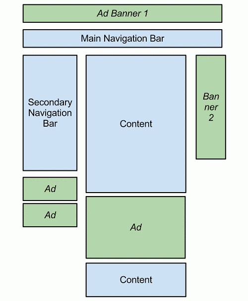
Figure. Structure of a desktop website.
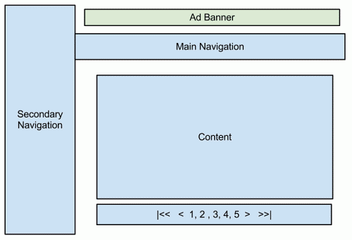
Figure. Structure tablet site.
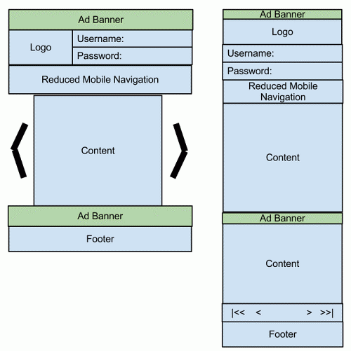
Figure. On the left: Structure Smartphone site. On the right: Structure legacy device site.
We will show how the segmentation above are often achieved through device detection. A note about the most device-detection frameworks out there first.
D. Server-Side Detection Frameworks
Device-detection frameworks are essentially built around two components: a database of device information and an API that lets one associate an HTTP request or other device ID to the list of its properties. The most device-detection frameworks out there are WURFL by ScientiaMobile and DeviceAtlas by dotMobi. Another player during this area is DetectRight.
The code snippets below ask the WURFL and DeviceAtlas APIs and show a rough outline of how an application might be made to route HTTP requests in several directions to support each segment.
The two frameworks are available either as a standalone self-hosted option or within the cloud. The pseudo-code below is inspired by the frameworks’ respective cloud APIs and will be easily adaptable by PHP programmers also as programmers on other platforms.
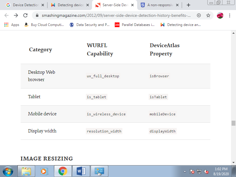
For the sake of simplicity, let’s define a smartphone as any device whose screen is wider than 320 pixels. This probably doesn't quite cut it for you. Engineers can use any capability or combination of capabilities to define smartphones during a way that creates sense for the given company’s business model.
The following table lists the capabilities involved within the example above. Each device-detection solution comes with many capabilities which will be wont to adapt a company’s Web offering to the foremost specific requirements. Forinstance , Adobe Flash support, video and audio codecs, OS and OS version, browser and browser version are all dimensions of the issues which may be relevant to supporting an organization’s business model.
1. Image Resizing
One aspect that we didn't touch on in our example but that certainly represents one among the most use cases of device detection is image resizing. Serving a large picture on a daily website is ok, but there are multiple reasons why sending an equivalent picture to a mobile user isn't OK: mobile devices have much smaller screens, more limited bandwidth and more limited computation power.
By providing a lower resolution and/or a smaller size of the image, the mobile UX is formed acceptable. There are two approaches to image resizing:
• Each published image are often created in multiple versions, with device detection wont to serve a pointer to the foremost appropriate version for that device or browser.
• Software libraries like JAI, ImageMagick and GD are often wont to resize images on the fly, supported the properties of the requesting HTTP client.
An interesting article on .net magazine, “Getting Started With RESS,” shows an example of server-side enhanced RWD i.e. how an internet site built with RWD can still enjoy image resizing and server-side detection. This system is usually mentioned as RESS.
2. Single-Url Entry Points
Segmenting your content could lead on to the mapping of various segments into different URLs. This in itself isn't good because users might exchange links across devices, leading to URLs that time to the incorrect experience. It doesn’t got to be that way, though.
Proper design of your application makes it possible to have common URL entry points for all segments. All you would like to do is dispatch your request internally. This is often easily achievable with just about any development language and framework around.
Q7) Explain Debugging and Performance in Mobile Application.
A7)
Testing and Debugging
Emulators and simulators are very useful and supply an easy, fast, and fairly accurate testing solution. If it doesn’t add the emulator, it probably won't work on the important device, and if it works within the emulator, it probably will work on the important device.
There are some problems with this testing approach, though. For one thing, there are many differences between real devices, and many bugs. Furthermore, there are several platforms without emulation. That’s why real device testing is mandatory. But how can we get access to multiple real devices? Here are a couple of suggestions:
• Acquire as many friends as you will (with different devices, if possible).
• Buy or rent devices. Some vendors offer promotions for purchasing or renting devices for developers and their partners.
• Use a testing house company. This is an expensive solution and not recommended for mobile web developers; we'd like to be as close as possible to the devices.
• Create a beta tester program, for receiving feedback.
• Use a remote lab.
1. Remote Labs
“Any sufficiently advanced technology is indistinguishable from magic,” said sci-fi writer Arthur C. Clarke in 1961. A remote lab may be a web service that permits us to use a true device remotely without being physically within the same place. It’s an easy but very powerful solution that provides us access to thousands of real devices, connected to real networks everywhere the world, with one click. You’ll consider it as a remote desktop for mobile phones. There are three sorts of remote lab solutions for mobile devices:
• Software-based solutions, employing a resident application on the device that captures the screen, sends it to the server, and emulates keyboard input or touches on the screen.
• Hardware-based solutions, using some technology to attach the server to the hardware components of the device (screen, touchscreen, keypad, lights, audio, etc.).
• Mixed solutions, having some hardware connection, some software additions, and perhaps a video camera for screen recording.
Remote Device Access
Forum Nokia offers a free remote lab solution for Symbian and Maemo devices called Remote Device Access (RDA). You’ll need Java Runtime 5.0 or newer, because RDA may be a WebStart Java application. At the present , usage is restricted to eight hours per day. The most features are:
• Complete usage of the device
• 3G and WiFi connection support
• Application installation
• Device rebooting
• Changing screen orientation
• Browser and widget WRT support
• Reservation of devices for future usage
• Usage of devices with SIM cards connected in Europe
• Saving screenshot images
• Incoming calls and SMS available
At the time of this writing, there are quite 50 devices available. There’s no audio or accelerometer support, and counting on your network bandwidth you'll select the video quality you would like.
Samsung Lab.Dev
Samsung also offers a free remote lab web service, using an equivalent solution provider as Nokia’s RDA, called Lab.Dev. It includes some Windows Mobile devices. Counting on your membership with Samsung you'll have access to more duplicated devices for testing purposes.
Lab.Dev has an equivalent features as RDA, so you'll test web applications and widgets using this solution. The devices don’t have SIM cards, though, so you'll only test WiFi connections (not 3G).
DeviceAnywhere
DeviceAnywhere is that the leader and pioneer in remote lab solutions for mobile testing. It offers a hardware solution that permits any device (low-end, mid-end, or smartphone, from any vendor) to plug into the architecture.
2. Server-Side Debugging
To debug server-side detection, adaptation, or content delivery scripts, we will use some HTTP tools before turning to real devices.
When you’ve installed this plug-in, you'll find a new submenu within the Tools menu of Firefox using the name of the present user agent. The plug-in changes the user-agent string that Firefox uses for creating HTTP requests to the server. It comes with some user agents preinstalled, like iPhone 3.0, and you'll add as many others as you would like using the Edit User Agent option.
You can then browse to any website and see how the server manages the user agent and which content it serves. Remember to go back to the default user agent after finishing the debug session, otherwise you may encounter problems in your browser.
When using real devices, it'll be useful while debugging to store in some log all the request and response headers from the server-side code, so you'll see the info the device is sending and receiving.
DeviceAnywhere includes an answer for this purpose for all devices, otherwise you can use any emulator that supports HTTP sniffing, just like the Nokia and BlackBerry emulators. If you work with the ASP.NET platform on the server, you'll activate the remote tracing mechanism and you'll see every header and response from your mobile devices.
3. Markup Debugging
There is no automatic way to debug XHTML. This is often a manual operation on every emulator, device, or remote device you'll access. Safari on iOS features a console window that we will check for markup errors, but before doing this it's an honest practice to validate the code using one among the web tools available for mobile markup.
W3C mobileOK Checker
The W3C offers a mobile markup checker that you simply can use for free of charge at http://validator .w3.org/mobile. You’ll upload a file, copy and paste the code, or use a URL if you have already got your mobile site on your server.
This markup checker is predicated on best practices published within the Mobile Web Best Practices standard defined at http://www.w3.org/TR/mobile-bp. It doesn’t guarantee that your code will work perfectly on all mobile devices if it passes; it's just intended to assist you discover possible problems in your code and areas that don’t conform to best practices. The checker validates:
Ready.mobi
The dotMobi team has created a free validator that has the W3C mobileOK Checker tests and a few others, plus some emulators and detailed error reports with suggestions. The validator is out there at http://www.ready.mobi. You'll use it for one document by providing a URL or copying and pasting the code, or to report on a whole site, including site-wide testing.
As an advanced feature, you'll specify the user agent that we would like the checker to use, and a list of accepted MIME types.
After analyzing your document, ready.mobi will assign you a score on a scale of 1 (very bad) to five (excellent). It'll also report on the dimensions of your document and resources and therefore the estimated time and download costs for the user.
Firefox plug-ins
There is a plug-in for Firefox which will allow this browser to support the XHTML MP MIME type. You’ll download the plug-in from http:// xhtmlmp.mozdev.org.
4. Client-Side Debugging
JavaScript debugging is one among the foremost painful activities in mobile web development. Every browser features a different JavaScript engine, and sometimes code that works on one device doesn’t work on another. Typical desktop JavaScript techniques should be used first to debug logic problems in our code.
This includes using the developer tools from Chrome, Safari, or Internet Explorer, or the classic Firebug for Firefox. But simply because everything works during a desktop browser doesn’t mean that it'll add a mobile browser. Rich Internet Application techniques are the worst problem areas.
Browser-based solutions
Some mobile browsers offer developer tools for JavaScript debugging or console logging features.
Safari on iOS Debug Console
Safari includes a debugging console that we will activate (both in simulators and on real devices) by getting to Settings→Safari→Developer→Debug Console. With the debug console activated, you'll find a new 60-pixel-high toolbar below the highest toolbar of the browser.
Clicking this toolbar opens a full-screen Console window, as shown in Figure, where you'll see advice, warnings, errors, and console output, which you'll filter into HTML, JavaScript, and CSS categories. For better detail reading, use landscape orientation.
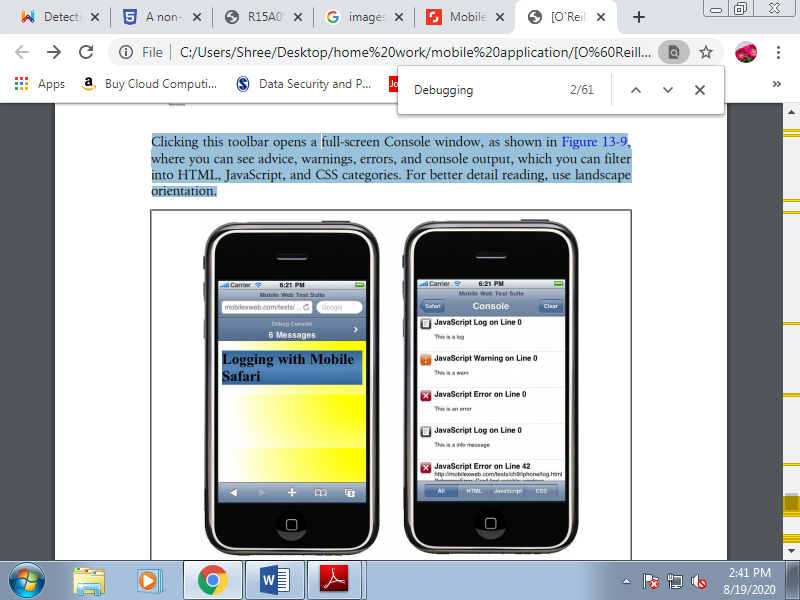
Figure. Once you activate the debug console you'll see the console toolbar (left), which you'll click on to access a details list (right).
From JavaScript, you'll send messages to the console using the log, warn, error, and info methods of the console global object available within the iPhone browser. All of those methods receive a string. The difference between them is that the icon won’t to show the text. For example:
Console.log("This text will appear on the Console");
Opera Dragonfly
From Opera Mobile 9.5, we will debug mobile web applications using the remote debugging tool Dragonfly. To use this tool you'll need Opera 9.5 or afterward you’re desktop. You’ll open Dragonfly by getting to Tools→Advanced→Developer Tools and checking the Remote Debug option. When you’re done, enter opera:debug in your Opera Mobile browser and specify your desktop IP address . You’ll then have access to an equivalent debugging features (DOM, CSS, and JavaScript) that you simply would if you were debugging an area desktop file.
Android Debug Bridge.
Android doesn’t have as nice a console output as Safari on iOS, but we will still read the console errors and even use an equivalent console object using the Android Debug Bridge (adb). Adb may be a command-line application available within the tools folder of your SDK.
BlackBerry web development tools
BlackBerry offers two plug-ins which will be wont to develop and also to debug, profile, and package web applications. Both provide JavaScript debugging with breakpoints, Ajax requests visibility, and time-to-load reporting for web page .
Widget debuggers.
The BONDI SDK for widgets offers a remote debugging feature which will be used from the Google Chrome Developer Tools. WRT plug-ins for Aptana Studio and Visual Studio also support debugging over the emulator (remember that it's not the important engine). The LG SDK and therefore the BlackBerry web development tools have great debugging tools for widgets, too.
JavaScript solutions
There are some scripts that job as a sort of debugger, including DOM and CSS inspectors and a few that job for JavaScript debugging, too. The mobile compatibility for these tools is complicated, though, due to the shortage of space on the screen to point out all the knowledge.
There also are some Ajax-based solutions which will work better, allowing you to look at the debug results and panes from a desktop. Creating an easy log console is straightforward, using a floating div or another visual element to point out messages sent by a console.log call.
For example:
If (console==undefined) {
Var console = new Object();
Console.log = function (text) {
If (document.getElementById("console")==undefined) {
Document.getElementsByTagName("body")[0].innerHTML = "<div id='console'></div>";
}
Document.getElementById("console").innerHTML += "<p>" + text + "</p>";
}
}
With some CSS to the console and console p selectors, you'll see a console. With some scripts, you'll also create an object browser and a console JavaScript execution engine using eval.
B. Performance Optimization
Performance is that the key to mobile web success. People want high-performance websites. We hate to attend on our desktops, and therefore the situation is way worse on mobile devices, with their constrained resources. I could write an entire book about mobile web performance, except for now i will be able to just attempt to distill some best practices and share some hacks that you simply can easily apply to enhance your website’s performance.
Performance has recently become a hot topic within the desktop web world. Generally mobile web developers should follow an equivalent practices, but there are some new ones to stay in mind also, and a few desktop web best practices which will not work on these devices.
Mobile browsers aren’t an equivalent as desktop web browsers, and not all mobile browsers are created equal. Specifically, the number of resources which will be downloaded in parallel and therefore the cache functionality differ. Nevertheless, it's better to approach mobile performance optimization from here than from the bottom.
Q8) Explain different File Delivery Models in content delivery.
A8)
File Delivery
To deliver a file, there are three models:
• Direct linking
• Delayed linking
• OMA Download
You can use any of those three methods to deliver the files, either using the physical file (video, audio, game, etc.) directly or via a script (PHP, ASPX, etc.). If you employ a script to deliver a file, you'll log, secure, and even charge for each download. If the file is out there directly through the online server, anyone with the URL can download the file.
1. Direct linking
Direct linking is that the easiest method to deliver content. a direct link is simply a link to the file, a link to a script which will deliver the file, or a link to a script which will redirect the user to the file. For example:
<a href="game.jad">Download This Game</a>
<a href="download.php?id=22222">Download This Game</a>
The download.php script can save the download to the database, check permissions, and then deliver the content using the suitable MIME type, writing the file to the response output or redirecting the browser to the file:
<?php
If ($everything_ok) {
Header('Location: game.jad');
} else {
Header('Location: download_error.php');
}
2. Delayed linking
Delayed linking is a technique utilized in download sites for desktop browsers. It allows us to point out a landing page before the download starts. This landing page also will be the document the user will see after the download has finished or, if the browser supports background downloading, while it's downloading.
The technique involves linking to an XHTML document which will show the user some information and can use a refresh metatag to redirect the user to the direct link in X seconds.
So, the download page will redirect to:
<a href="download.html">Download This Game</a>
And download.html will contain code like the following:
<!DOCTYPE html PUBLIC "-//WAPFORUM//DTD XHTML Mobile 1.0//EN"
"http://www.wapforum.org/DTD/xhtml-mobile10.dtd">
<html xmlns="http://www.w3.org/1999/xhtml">
<head>
<meta http-equiv="Content-Type" content="text/html; charset=UTF-8" />
<meta http-equiv="refresh" content="5;game.jad" />
<title>Download File</title>
</head>
<body>
<h1>Your game is being downloaded</h1>
<p>If the file is not downloaded in 5 seconds,
<a href="game.jad">click here</a>
<h2>Brought to you by "Your favourite ad here"</h2>
<p>Trouble downloading this game? <a href="sms:611">Send us an SMS</a>
<a href="tel:611">Call Us</a></p>
<a href="/">More Downloads</a>
</body>
</html>
3. OMA Download
OMA Download a standard defined in 2004 by the Open Mobile Alliance to permit us more control over the delivery of media objects. It also has support for Digital Rights Management (DRM) in two versions, OMA DRM 1.0 and OMA DRM 2.0. The specification was used because the basis for the Java ME MIDlet OTA installation method that we'll see later during this chapter, therefore the two are very similar.
OMA Download adds two phases to the download process: before download and after download. The before download process involves an outline file downloaded using HTTP before the real file is downloaded.
This description file is an XML file containing meta information for the OS and instructions for doing the download. This process gives the user a chance to check information about the content (name, compatibility, size) before accepting it.
The after download process involves an HTTP request posted to your web server from the OS, confirming the ultimate status of the download. This enables you to verify that the file has been correctly downloaded and installed.
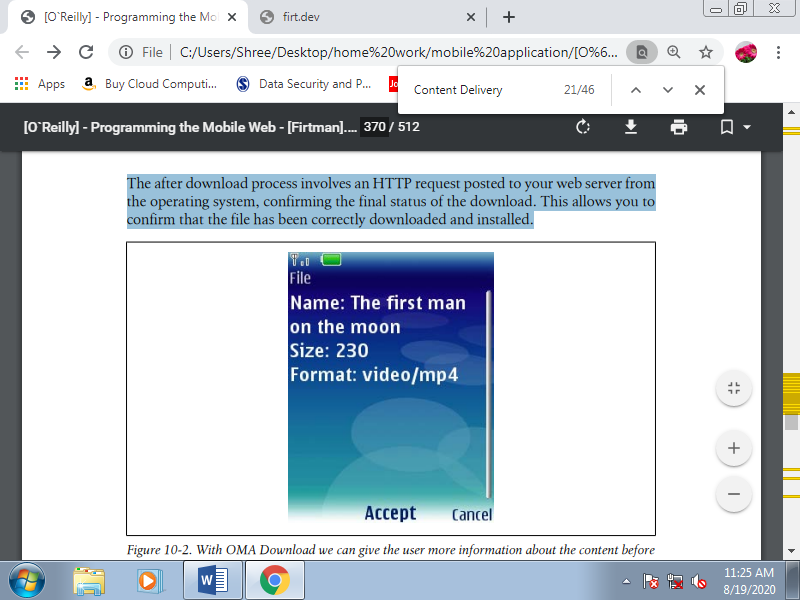
Figure. With OMA Download we can give the user more information about the content before she downloads it.
OMA DRM supports the ability to define the proper to play, display, or execute a media object or a file a limited number of times. DRM should be managed with care, and you would like to check compatibility with the devices you’re targeting before using it.
Download descriptor
The descriptor is an XML-based file that should be served using the MIME type application/vnd.oma.dd+xml.
Here’s a simple example of this file:
<?xml version="1.0"?>
<media xmlns="http://www.openmobilealliance.org/xmlns/dd">
<name>The first man on the moon</type>
<type>video/mp4</type>
<objectURI>http://mobilexweb.com/video.mp4</objectURI>
<size>230</size>
<installNotifyURI>http://mobilexweb.com/download/notify.php?id=3333
</installNotifyURI>
</media>
These are the standard attributes: name, the user-readable name of the content file; type, the MIME sort of the file; objectURI, absolutely the URL of the file; size, the file size expressed in KB; and installNotifyURI, the URL which will receive the after-download status.
Additional properties also are available, like nextURL (the URL of a web site to go to after the download has finished), description (a short description of the media file), vendor (the organization providing the file), and iconURI (an optional icon to be shown with the file information).
Post-download status report.
If you define the installNotifyURI within the download descriptor, you'll receive a POST request thereto URL when the download finishes. This URL will receive because the POST body an integer code with a standing message.
The important thing is that this request doesn't are available the traditional URL-encoded way, so you can’t use the standard $_FORM or Request.Form. To read the status code, you’ll got to read the request body during a low-level format.
Table. OMA Download status codes
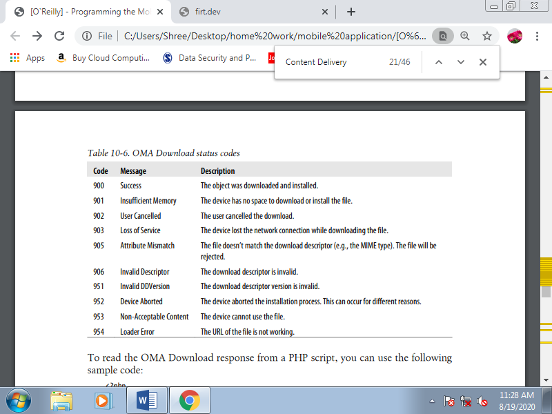
To read the OMA Download response from a PHP script, you can use the following sample code:
<?php
// We get the post body from the input
$post = file_get_contents('php://input');
// We get the first three characters without spaces
$status = substr(trim($post), 0, 3);
If ($status==900) {
// Download OK, save information to the database
} else {
}
?>
If you're delivering premium content that the user has purchased , if the download fails you must deliver an equivalent content without forcing the user to pay again. Even though the download has succeeded, many carriers insist that the content be made available freed from charge for twenty-four hours. Some new application stores also allow the users to download the premium content again although they modify their mobile devices.
Table. OMA Download compatibility table
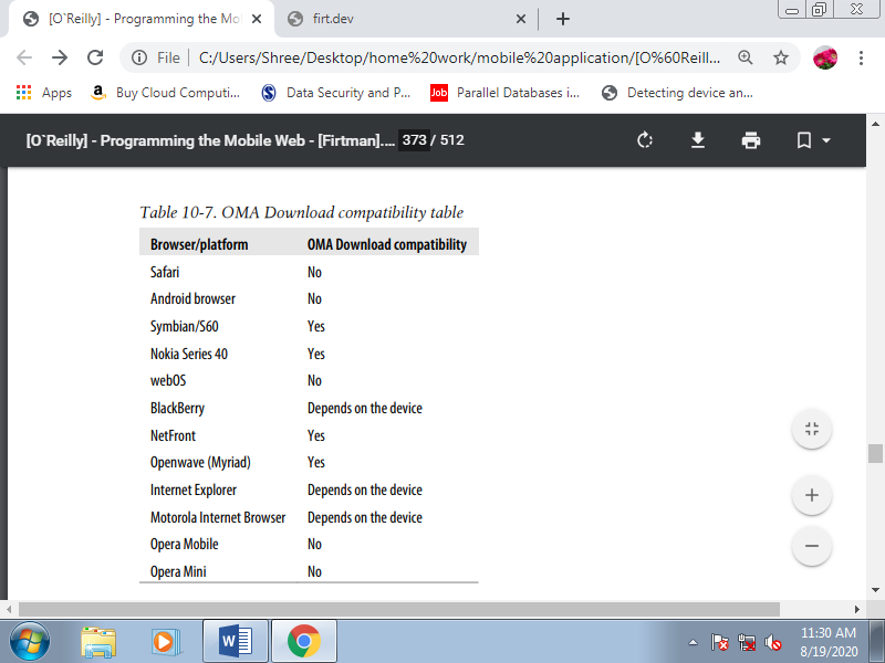
Q9) Differentiate between Native and Mobile Web App.
A9)
A. What is a Native App?
A native app is an app for a particular mobile device (smartphone, tablet, etc.) They’re installed directly onto the device. Users typically acquire these apps through a web store or marketplace like The App Store or Android Apps on Google Play.
Examples of native apps are Camera+ for iOS devices and KeePassDroid for Android devices.
B. What is a Mobile Web App?
Mobile web apps are referring to Internet-enabled apps that have specific functionality for mobile devices. They’re accessed through the mobile device’s browser (i.e. on the iPhone, this is often Safari by default) and that they don’t got to be downloaded and installed on the device.
Comparison of Native App vs. Mobile Web AppLet’s do a fast rundown and evaluate native apps versus mobile web apps under these factors:
- User interface
- Development
- Capabilities
- Monetization
- Method of delivery
- Versioning of the app
- Strengths
- Weaknesses
1. User Interface
Some companies prefer to develop both a native app and a mobile web app. Here’s a side-by-side check out Facebook’s native app and mobile web app:
2. Development
NATIVE APPS | MOBILE WEB APPS |
Each mobile application development platform (e.g. IOS, Android) needs its own development process | Runs in the mobile device’s web browser and each have its own features and quirks |
Each mobile application development platform has its own native programming language: Java (Android), Objective-C (iOS), and Visual C++ (Windows Mobile), etc. | Mobile web apps are written in HTML5, CSS3, JavaScript and server-side languages or web application frameworksof the developer’s choice for example PHP, Rails, Python |
Standardized software development kits (SDKs), development tools and common user interface elements such as buttons, text input fields, etc. are provided by the manufacturer of the platform | There are no standard software development kits (SDKs) that developers are need to use to create a mobile web app |
There are many tools and frameworks to help in developing apps for deployment on multiple mobile OS platforms and web browsers (e.g. PhoneGap, Sencha Touch 2,Appcelerator Titanium, etc.) | |
3. Capabilities
NATIVE APPS | MOBILE WEB APPS |
Can interface with the device’s native features, information and hardware like (camera, accelerometer, etc.) | Mobile web apps access a limited amount of the device’s native features and information orientation, geolocation, media, etc. |
4. Monetization
NATIVE APPS | MOBILE WEB APPS |
Mobile-specific ad platforms like AdMob (though there can be restrictions set by the mobile device’s manufacturer) | Mobile web apps can monetize through site advertisement and subscription fees |
Developers have the ability to charge a download price and app stores will handle the payment process | Charging users to use the mobile web app need you to set up your own paywall or subscription-based system |
5.Method of Delivery
NATIVE APPS | MOBILE WEB APPS |
Downloaded in a mobile device | Accessed with help of a mobile device’s web browser |
Installed and runs as a standalone application web browser not required | No need to install new software |
Users need to manually download and install app updates | Updates are made to the web server without any user intervention |
There are stores and marketplaces to help users search your app | Since there is no app store for the Mobile Web then difficult for users to find your app |
6. Versioning of the App
NATIVE APPS | MOBILE WEB APPS |
Some users may choose to ignore an update, resulting in different users running different versions of the app | All users are on the same version |
7. Strengths
NATIVE APPS | MOBILE WEB APPS |
Perform faster than mobile web apps | Having a common code base across all platforms |
App stores and marketplaces which help to users find native apps | Users don’t have to go to a store or marketplace, download and install the app |
App store approval processes help to assure users of the quality and safety of the app | Released in any form and time as there isn’t an app store that has to approve the app |
Tools, support and standard development best practices provided by device manufacturers supports speed up development | If you already have a web app, you can retrofit it with a responsive web design |
8. Weaknesses
NATIVE APPS | MOBILE WEB APPS |
Are more expensive to develop, if you’re supporting many mobile devices | Mobile web apps can’t access all of the device’s features |
Supports different platforms needs to maintain multiple code bases and can result in more costs in development, maintenance, pushing out updates, etc. | Supports multiple mobile web browsers result in higher costs in development and maintenance, etc. |
Users work on different versions and can make your app harder to maintain and provide support | Users work on different mobile browsers and make your app difficult to maintain and provide support |
App store approval processes take a time to the launch of the app or prevent the release of the app | For users, it is difficult to find a mobile web app because of the lack of a centralized app store (though listings do exist such as Apple’s |