Unit - 6
Data Visualization and Hadoop
Q1) Introduce data visualization?
A1) Data visualization
● Knowledge of data visualization is capable of expanding data science’s relevance to companies. This article series shares essential knowledge for you to turn your data into powerful actions.
● After all, there’s no use on repeating Big Data is important to your company if this ocean of data available is not easily analyzed and distilled into useful insights to support strategic business decisions.
● We call Data Visualization or “DataViz” the study and design of data visual representation. In other words, creating charts! Equally important, “Visual Literacy” is the capability to present and interpret data visually. That means not only creating graphs but knowing how to choose the most adequate for each kind of information available and understanding the story that your dataset has to tell.
● Data Visualization is important to communicate the message quickly and efficiently. Visual information is processed 60.000 times faster than text, and most of what our brains absorb daily is visual information.
● Besides, our capacity to absorb and store visual information is much more powerful than simply reading or attending a lecture. Do you want to go far beyond doing pretty charts? It’s time to create graphs that bring insights.
● Data visualization is viewed by many disciplines as a modern equivalent of visual communication. It involves the creation and study of the visual representation of data.
● To communicate information clearly and efficiently, data visualization uses statistical graphics, plots, information graphics and other tools. Numerical data may be encoded using dots, lines, or bars, to visually communicate a quantitative message. Effective visualization helps users analyze and reason about data and evidence. It makes complex data more accessible, understandable and usable.
● Data Visualization is the graphical articulation of data presented in a meaningful way. The assimilation of big data has allowed data visualization to flourish. Tools and standards are developed for best practices in how to visually communicate data. Data visualization is, in part, an analytical tool that gathers data and finds trends, patterns or commonalities among the data.
Q2) What are the challenges to Big data visualization?
A2) Challenges to Big data Visualization
● A large assemblage of data and datasets that are so large or complex that traditional data processing applications are inadequate and data about every aspect of our lives has all been used to define or refer to big data.
● Visualization of big data with diversity and heterogeneity (structured, semi-structured, and unstructured) is a big problem. Speed is the desired factor for the big data analysis. Designing a new visualization tool with efficient indexing is not easy in big data. Cloud computing and advanced graphical user interface can be merged with the big data for the better management of big data scalability.
● Big data will be transformative in every sphere of life. But just to process and analyze those data is not enough, human brain tends to find pattern more efficiently when data is represented visually. Data Visualization and Analytics plays important role in decision making in various sectors.
● It also leads to new opportunities in the visualization domain representing the innovative ideation for solving the big-data problem via visual means. It is quite a challenge to visualize such a mammoth amount of data in real time or in static form.
● Visualization systems must contend with unstructured data forms such as graphs, tables, text, trees, and other metadata. Big data often has unstructured formats. Due to bandwidth limitations and power requirements, visualization should move closer to the data to extract meaningful information efficiently. Visualization software should be run in an in situ manner.
● Because of the big data size, the need for massive parallelization is a challenge in visualization. The challenge in parallel visualization algorithms is decomposing a problem into independent tasks that can be run concurrently.
● There are also following problems for big data visualization:
○ Visual noise: Most of the objects in dataset are too relative to each other. Users cannot divide them as separate objects on the screen.
○ Information loss: Reduction of visible data sets can be used, but leads to information loss.
○ Large image perception: Data visualization methods are not only limited by aspect ratio and resolution of device, but also by physical perception limits.
○ High rate of image change: Users observe data and cannot react to the number of data change or its intensity on display.
○ High performance requirements: It can be hardly noticed in static visualization because of lower visualization speed requirements—high performance requirement.
● Perceptual and interactive scalability are also challenges of big data visualization. Visualizing every data point can lead to over-plotting and may overwhelm users’ perceptual and cognitive capacities; reducing the data through sampling or filtering can elide interesting structures or outliers. Querying large data stores can result in high latency, disrupting fluent interaction.
● In Big Data applications, it is difficult to conduct data visualization because of the large size and high dimension of big data. Most of current Big Data visualization tools have poor performances in scalability, functionalities, and response time. Uncertainty can result in a great challenge to effective uncertainty-aware visualization and arise during a visual analytics process.
Potential solutions to some challenges or problems about visualization and big data were presented:
● Meeting the need for speed: One possible solution is hardware. Increased memory and powerful parallel processing can be used. Another method is putting data in-memory but using a grid computing approach, where many machines are used.
● Understanding the data: One solution is to have the proper domain expertise in place.
● Addressing data quality: It is necessary to ensure the data is clean through the process of data governance or information management.
● Displaying meaningful results: One way is to cluster data into a higher-level view where smaller groups of data are visible and the data can be effectively visualized.
● Dealing with outliers: Possible solutions are to remove the outliers from the data or create a separate chart for the outliers.
Q3) Write the types of data visualization?
A3) Data visualization
● With the growing amount and accessibility of data, data visualisation is becoming increasingly important. Not only does visualised data represent large quantities of data coherently, it doesn’t distort what the data has to say and helps the user discern relationships in the data.
● According to the writers of A Tour Through the Visualization Zoo, “The goal of visualization is to aid our understanding of data by leveraging the human visual system’s highly-tuned ability to see patterns, spot trends, and identify outliers.”
● In general, there are two basic types of data visualisation: exploration, which helps find a story the data is telling you, and explanation, which tells a story to an audience. Both types of data visualisation must take into account the audience’s expectations.
● Within these two basic categories, there are many different ways data can be made visual. In this article, we’ll go through the most common types of data visualisation that fall under the 2D area, temporal, multidimensional, hierarchical and network categories.
Following are the visualization types
● ID/Linear
● 2D∕Planar (incl. Geospatial)
● 3D∕Volumetric
● Temporal
● nD/Multidimensional
● Tree/Hierarchical
● Network
2D Area
2D area types of data visualisation are usually geospatial, meaning that they relate to the relative position of things on the earth’s surface.
● Cartogram: A cartogram distorts the geometry or space of a map to convey the information of an alternative variable, such as population or travel time. The two main types are area and distance cartograms.
● Choropleth: A choropleth is a map with areas patterned or shaded to represent the measurement of a statistical variable, such as most visited website per country or population density by state.
● Dot Distribution Map: A dot distribution or dot density map uses a dot feature on a map, relying on visual scatter to show spatial pattern.
Temporal
Temporal visualisations are similar to one-dimensional linear visualisations, but differ because they have a start and finish time and items that may overlap each other.
● Connected Scatter Plot: A connected scatter plot is a scatter plot, a plot that displays values of two variables for a set of data, with an added line that connects the data series.
● Polar Area Diagram: A polar area diagram is similar to a traditional pie chart, but sectors differ in how far they extend from the centre of the circle rather than by the size of their angles.
● Time Series: A time series is a sequence of data points typically consisting of successive measurements made over a time interval, such as the number of website visits over a period of several months.
Multidimensional
Multidimensional data elements are those with two or more dimensions. This category is home to many of the most common types of data visualisation.
● Pie Chart: A pie or circle chart is divided into sectors to illustrate numerical proportion; the arc length and angle of each sector is proportional to the quantity it represents.
● Histogram: A histogram is a data visualisation that uses rectangles with heights proportional to the count and widths equal to the “bin size” or range of small intervals.
● Scatter Plot: A scatter plot displays values for two variables for a set of data as a collection of points.
Hierarchical
Hierarchical data sets are orderings of groups in which larger groups encompass sets of smaller groups.
Dendrogram: A dendrogram is a tree diagram used to illustrate an arrangement of clusters produced by hierarchical clustering.
Ring Chart: A ring or sunburst chart is a multilevel pie chart that visualises hierarchical data with concentric circles.
Tree Diagram: A tree diagram or tree structure represents the hierarchical nature of a structure in graph form. It can be visually represented from top to bottom or left to right.
Network
Network data visualisations show how data sets are related to one another within a network.
● Alluvial Diagram: An alluvial diagram is a type of flow diagram that represents changes in network structure over time.
● Node-Link Diagram: A node-link diagram represents nodes as dots and links as line segments to show how a data set is connected.
● Matrix: A matrix chart or diagram shows the relationship between two, three, or four groups of information and gives information about said relationship.
Q4) Explain techniques of data visualization?
A4) The existing visualization methods for analyzing data can be categorized based on several factors. According to user task or their requirements the visualization techniques are decided.
● The visualization techniques include ID, 2D, 3D, multidimensional, temporal, tree, and network. The user tasks comprises of history, detailed representation of data, general overview of data. Sometimes interaction/distortion techniques are also used for visualize massive volume of data.
● Some of the important data visualization techniques used by the big data environment to get deep insights about the large volume of data are discussed. Most of the companies are using these techniques for analyzing the data.
One Dimensional (I-D)
The data set which comes under the 1 d consists of one variable and it has only a value per each data item. The histograms are used for carrying data visualizations for one dimensional data
Two Dimensional (2-D)
Mostly two dimensional is used for visualize the data set, which contains two variables. It can be done easily by knowing the relationship between two variables.
The 2D visualizations can be represented in the form of line graphs, by comparing the relationship between two variables and plotting can be done according to it. The 2d can also be represented in form of bar charts, area charts, pie charts, maps, scatter plots and stream line and arrow visualizations.
Three Dimensional (3-D)
The 3 d representation of data will give more knowledge to the user, where they can easily find the merits and demerits of their business flow, study etc. It contains values in three dimensional spaces, it gives information in the form of slicing techniques, 3D bar charts, Isosurface and realistic renderings.
Multi-Dimensional
The multi dimensional visualization gives the user a clear idea in different perspective. The different techniques used such as parallel coordinates, maps, scatterplot matrices, auto glyphs.
Temporal Technique
It is a technique, where most of the data can be easily displayed and the temporal technique has the ability to display the data in many views such as timeline, time series and scatter plot.
Tree Map
It is also known as hierarchical model, where the data is nested in form of rectangle and it represents each branch of the tree. The sub branch is represented as in form of smaller rectangles and leaf node is used for describing the specified dimension on the data. Sometimes the coloured leaf nodes are used to display a separate dimension of data. It also provides the user a proper display of data in a hierarchical manner.
Network Technique
It is mostly used for analyzing all kinds of data extracted from variety of data fields. It has the ability to collect the data in social media, website and blog and present in the form of network. The end user can know which area has to be improved and where the company gains more profit etc. By gaining knowledge from these results the company will have some global idea about their products and place themselves in a better position in the market
Q5) How to visualize Big data?
A5) Visualizing Big data
● Big Data visualization calls to mind the old saying: “a picture is worth a thousand words.” That’s because an image can often convey “what's going on”, more quickly, more efficiently, and often more effectively than words.
● Big data visualization techniques exploit this fact: they are all about turning data into pictures by presenting data in pictorial or graphical format This makes it easy for decision- makers to take in vast amounts of data at a glance to “see” what is going on what it is that the data has to say.
● Big Data visualization involves the presentation of data of almost any type in a graphical format that makes it easy to understand and interpret. But it goes far beyond typical corporate graphs, histograms and pie charts to more complex representations like heat maps and fever charts, enabling decision makers to explore data sets to identify correlations or unexpected patterns.
● A defining feature of Big Data visualization is scale. Today’s enterprises collect and store vast amounts of data that would take years for a human to read, let alone understand. But researchers have determined that the human retina can transmit data to the brain at a rate of about 10 megabits per second.
● Big Data visualization relies on powerful computer systems to ingest raw corporate data and process it to generate graphical representations that allow humans to take in and understand vast amounts of data in seconds.
● Big data visualization refers to the implementation of more contemporary visualization techniques to illustrate the relationships within data. Visualization tactics include applications that can display real-time changes and more illustrative graphics, thus going beyond pie, bar and other charts. These illustrations veer away from the use of hundreds of rows, columns and attributes toward a more artistic visual representation of the data.
Importance Of Visualization Big Data
● The amount of data created by corporations around the world is growing every year, and thanks to innovations such as the Internet of Things this growth shows no sign of abating. The problem for businesses is that this data is only useful if valuable insights can be extracted from it and acted upon.
● To do that decision makers need to be able to access, evaluate, comprehend and act on data in near real-time, and Big Data visualization promises a way to be able to do just that. Big Data visualization is not the only way for decision makers to analyze data, but Big Data visualization techniques offer a fast and effective way to:
● Review large amounts of data - data presented in graphical form enables decision makers to take in large amounts of data and gain an understanding of what it means very quickly - far more quickly than poring over spreadsheets or analyzing numerical tables.
● Spot trends - time-sequence data often captures trends, but spotting trends hidden in data is notoriously hard to do - especially when the sources are diverse and the quantity of data is large. But the use of appropriate Big Data visualization techniques can make it easy to spot these trends, and in business terms a trend that is spotted early is an opportunity that can be acted upon.
● Identify correlations and unexpected relationships - One of the huge strengths of Big Data visualization is that enables users to explore data sets - not to find answers specific questions, but to discover what unexpected insights the data can reveal. This can be done by adding or removing data sets, changing scales, removing outliers, and changing visualization types. Identifying previously unsuspected patterns and relationships in data can provide businesses with a huge competitive advantage.
● Present the data to others - An oft-overlooked feature of Big Data visualization is that it provides a highly effective way to communicate any insights that it surfaces to others. That’s because it can convey meaning very quickly and in a way that it is easy to understand: precisely what is needed in both internal and external business presentations.
● Techopedia explains Big Data Visualization - Normally when businesses need to present relationships among data, they use graphs, bars and charts to do it. They can also make use of a variety of colours, terms and symbols. The main problem with this setup, however, is that it doesn’t do a good job of presenting very large data or data that includes huge numbers. Data visualization uses more interactive, graphical illustrations - including personalization and animation - to display figures and establish connections among pieces of information.
Q6) What kind of tools are used in data visualization?
A6) Tools used in Data visualization
● Data visualization is a general term that describes any effort to help people understand the significance of data by placing it in a visual context. Patterns, trends and correlations that might go undetected in text-based data can be exposed and recognized easier with data visualization software.
● Today’s data visualization tools go beyond the standard charts and graphs used in Microsoft Excel spreadsheets, displaying data in more sophisticated ways such as infographics, dials and gauges, geographic maps, spark lines, heat maps, and detailed bar, pie and fever charts.
● The images may include interactive capabilities, enabling users to manipulate them or drill into the data for querying and analysis. Indicators designed to alert users when data has been updated or predefined conditions occur can also be included.
● Data visualization tools have been important in democratizing data and analytics and making data-driven insights available to workers throughout an organization. They are typically easier to operate than traditional statistical analysis software or earlier versions of BI software.
● This has led to a rise in lines of business implementing data visualization tools on their own, without support from IT. Data visualization tools play a very drastic role in Software Testing world. Data visualization encompasses designing and analysis of the visual representation of data.
Following are Tools used in data visualization
Tableau
● Tableau handles significant and rapidly changing data with ease. Integrating Hadoop, My SQL, SAP, Amazon AWS, and Teradata with AI and machine learning capabilities tweaks the presentation into dynamic visualisation which is easy to understand.
QlikView
● Some of the most promising features are that it has a customizable set-up, a very widely used feature range, and a clutter-free interface. It does suffer in taking a little more time for full use of its potential but can be used for data discovery and exploration in conjunction with Qlik Sense for BI solutions with excellent reporting, analytics and intelligence capabilities.
Fusion Charts
● Widely used over 90 chart types which integrate across platforms and frameworks give it flexibility. Fusion Charts significant improvement is its use instead of starting a new visualisation from scratch by just using the “live” example templates and plugging in their data sources as needed.
High charts
● Its focus on cross-browser support makes it an excellent choice when fast and flexible solutions with minimum need for specialist data visualisation training are needed.
Data wrapper
● The package is widely used by media organisations to create charts, upload and present statistics in StraightForward charts, maps etc. that allow quick embedding into reports.
● Polly and Sisense also find mention among the top few. In selecting the best data visualisation tools for 2018, the following devices have earned their place with Sisense and Tableau being apparent frontrunners.
Zoho Reports
● With seamless integration, Zoho is user-friendly, has automatic report generation and impressive support availability. It is a business intelligence and analytics software that helps create insightful dashboards and data visualisations with reports on project status, burn down charts, utilisation of time, planned reports vs actual reports and so much more.
Domo
● Domo offers storage, great sharing features and a range of connectors but is a little short when it comes to its interface and learning curve.
Microsoft Power BI
● Known for its superior capabilities, compatibility and easy usability, Power BI has a horde of pluses including data preparation, data discovery and interactive dashboards. Users also can load custom visualisations. However, it only falters because the desktop and web versions divide the data prep tools with the refresh cycle being limited.
Google Analytics
● This exceptional platform for the website and mobile app analytics relies on third parties for training and has way too much automation in customer support.
● Chart SAP Analytics Cloud, IBM Watson Analytics and the evergreen Sales force Einstein Analytics platform are also climbing the charts steadily.
● Data is an invaluable resource and managing it, is a tricky task for business solutions. Larger enterprises can afford data analysis teams, but the smaller firms rely on data visualisation tools. If one uses technology, infrastructure, big data, and visualisation tools, it is possible to streamline operations, internally to become leaner and more efficient. Last but not the least, it helps to understand your customers and earn their loyalty.
Q7) Explain Hadoop ecosystems?
A7) Hadoop ecosystem
● While Apache Hadoop may not be as dominant as it once was, it's nearly impossible to talk about big data without mentioning this open source framework for distributed processing of large data sets. Last year, Forrester predicted, “100% of all large enterprises will adopt it (Hadoop and related technologies such as Spark) for big data analytics within the next two years.”
● Over the years, Hadoop has grown to encompass an entire ecosystem of related software, and many commercial big data solutions are based on Hadoop. In fact, Zion Market Research forecasts that the market for Hadoop-based products and services will continue to grow at a 50 percent CAGR through 2022, when it will be worth $87.14 billion, up from $7.69 billion in 2016.
● Key Hadoop vendors include Cloudera, Hortonworks and MapR, and the leading public clouds all offer services that support the technology.
Hadoop Architecture
● The Hadoop architecture is a package of the file system, Map Reduce engine and the HDFS (Hadoop Distributed File System). The Map Reduce engine can be Map Reduce∕MRl or YARN∕MR2.
● A Hadoop cluster consists of a single master and multiple slave nodes. The master node includes Job Tracker, Task Tracker, Name Node, and Data Node whereas the slave node includes Data Node and Task Tracker.
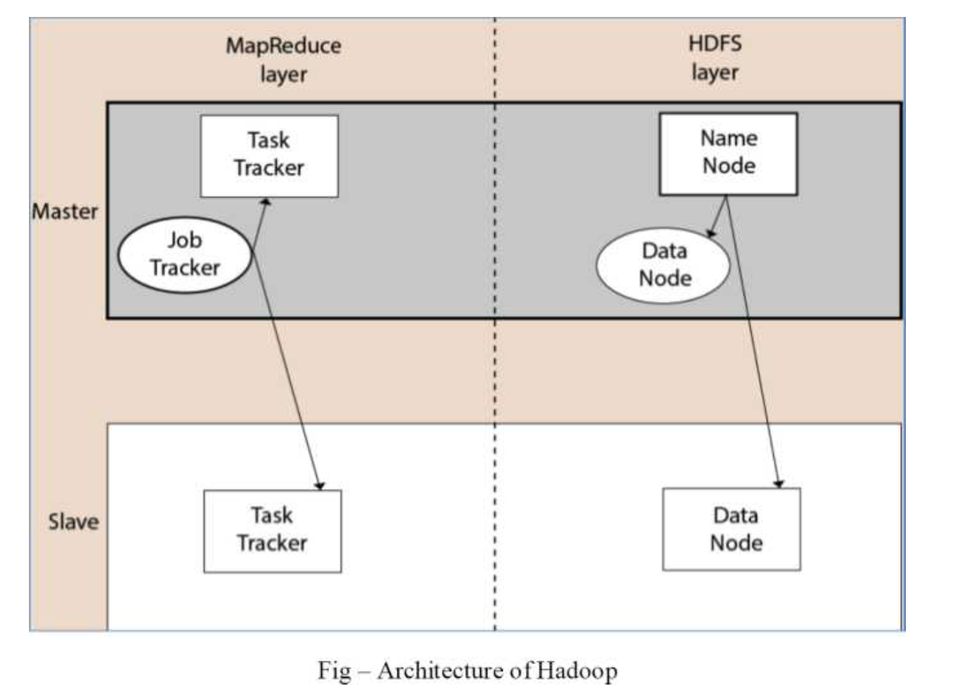
Fig 1: Hadoop architecture
Hadoop Distributed File System
● The Hadoop Distributed File System (HDFS) is a distributed file system for Hadoop. It contains master/slave architecture. This architecture consist of a single Name Node performs the role of master, and multiple Data Nodes performs the role of a slave.
● Both Name Node and Data Node are capable enough to run on commodity machines. The Java language is used to develop HDFS. So any machine that supports Java language can easily run the Name Node and Data Node software.
Name Node
● It is a single master server exists in the HDFS cluster.
● As it is a single node, it may become the reason of single point failure.
● It manages the file system namespace by executing an operation like the opening, renaming and closing the files.
● It simplifies the architecture of the system.
Data Node
● The HDFS cluster contains multiple Data Nodes.
● Each Data Node contains multiple data blocks.
● These data blocks are used to store data.
● It is the responsibility of Data Node to read and write requests from the file system’s clients.
● It performs block creation, deletion, and replication upon instruction from the Name Node.
Job Tracker
● The role of Job Tracker is to accept the Map Reduce jobs from client and process the data by using Name Node.
● In response, Name Node provides metadata to Job Tracker.
Task Tracker
● It works as a slave node for Job Tracker.
● It receives task and code from Job Tracker and applies that code on the file. This process can also be called as a Mapper.
Map Reduce Layer
The Map Reduce comes into existence when the client application submits the Map Reduce job to Job Tracker. In response, the Job Tracker sends the request to the appropriate Task Trackers. Sometimes, the Task Tracker fails or time out. In such a case, that part of the job is rescheduled.
Q8) Define map reduce?
A8) Map reduce
● Map Reduce is a programming paradigm that enables massive scalability across hundreds or thousands of servers in a Hadoop cluster. The Map Reduce concept is simple to understand for those who are familiar with clustered scale-out data processing solutions.
● For people new to this topic, it can be somewhat difficult to grasp, because it’s not typically something people have been exposed to previously. If you’re new to Hadoop’s Map Reduce jobs, don’t worry: we’re going to describe it in a way that gets you up to speed quickly.
● As the processing component, Map Reduce is the heart of Apache Hadoop. The term ”Map Reduce” refers to two separate and distinct tasks that Hadoop programs perform. The first is the map job, which takes a set of data and converts it into another set of data, where individual elements are broken down into tuples (key/value pairs).
● The reduce job takes the output from a map as input and combines those data tuples into a smaller set of tuples. As the sequence of the name Map Reduce implies, the reduce job is always performed after the map job.
● Hadoop Map Reduce is a programming paradigm at the heart of Apache Hadoop for providing massive scalability across hundreds or thousands of Hadoop clusters on commodity hardware.
● The Map Reduce model processes large unstructured data sets with a distributed algorithm on
a Hadoop cluster.
● The term Map Reduce represents two separate and distinct tasks Hadoop programs perform- Map Job and Reduce Job. Map job scales takes data sets as input and processes them to produce key value pairs.
● Reduce job takes the output of the Map job i.e. the key value pairs and aggregates them to produce desired results. The input and output of the map and reduce jobs are stored in HDFS.
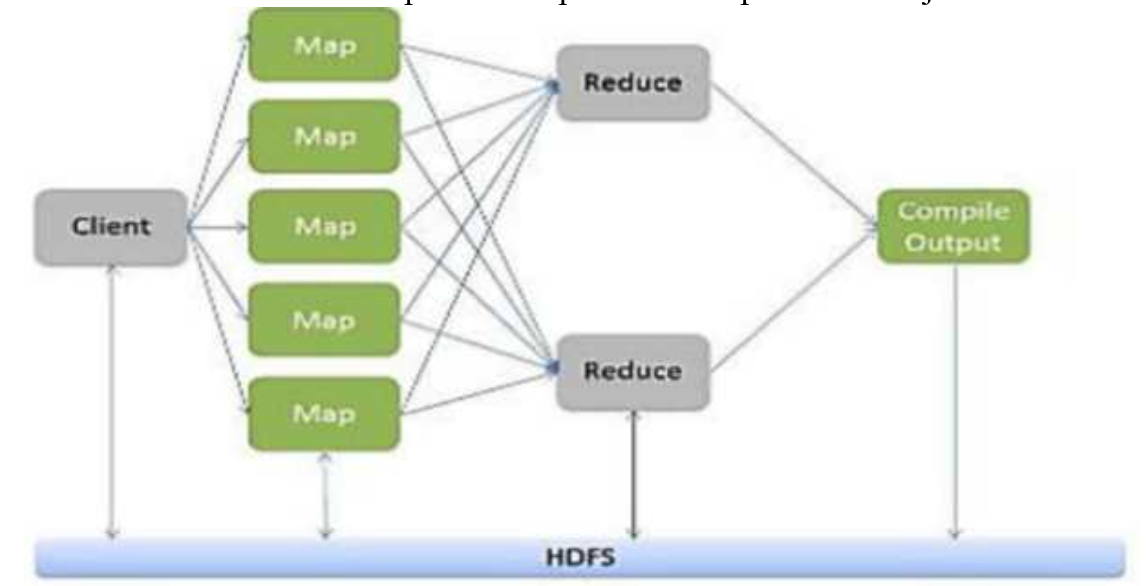
Fig 2: Map Reduce paradigm
● Hadoop Map Reduce (Hadoop Map/Reduce) is a software framework for distributed processing of large data sets on computing clusters. It is a sub-project of the Apache Hadoop- project.
● Apache Hadoop is an open-source framework that allows to store and process big data in a distributed environment across clusters of computers using simple programming models. Map Reduce is the core component for data processing in Hadoop framework.
● In layman’s term Map reduce helps to split the input data set into a number of parts and run a program on all data parts parallel at once. The term Map Reduce refers to two separate and distinct tasks.
● The first is the map operation, takes a set of data and converts it into another set of data, where individual elements are broken down into tuples (key/value pairs). The reduce operation combines those data tuples based on the key and accordingly modifies the value of the key.
Map Reduce programming offers several benefits to help you gain valuable insights from your big data:
● Scalability. Businesses can process petabytes of data stored in the Hadoop Distributed File System (HDFS).
● Flexibility. Hadoop enables easier access to multiple sources of data and multiple types of data.
● Speed. With parallel processing and minimal data movement, Hadoop offers fast processing of massive amounts of data.
● Simple. Developers can write code in a choice of languages, including Java, C++ and Python.
Q9) Describe Pig?
A9) Pig
Pig is a cover around MapReduce. It's a tool/platform for analysing enormous amounts of data and portraying them as data flows. Pig is commonly used with Hadoop; we may use Apache Pig to conduct all data manipulation functions in Hadoop.
Pig is a high-level platform or tool for processing massive datasets. It provides a high-level of abstraction for MapReduce computation. It comes with a high-level scripting language called Pig Latin, which is used to write data analysis routines. First, the programmers will use the Pig Latin Language to develop scripts to process the data stored in the HDFS. Pig Engine (an Apache Pig component) converted all of these scripts into a single map and reduced tasks. However, in order to give a high level of abstraction, these are not visible to programmers. The Apache Pig tool is made up of two key components: Pig Latin and Pig Engine. Pig's output is always kept in HDFS.
The pig Engine provides two types of execution environments: local execution in a single JVM (used when the dataset is small) and distributed execution in a Hadoop cluster.
To use Apache Pig to analyse data, programmers must develop scripts in the Pig Latin language. Internally, all of these scripts are turned to Map and Reduce jobs. Pig Engine is a component of Apache Pig that accepts Pig Latin scripts as input and turns them into MapReduce jobs.
Needs
One of MapReduce's drawbacks is its lengthy development cycle. It takes time to write the reducer and mapper, compile and package the code, submit the job, and retrieve the output. Using a multi-query method, Apache Pig reduces development time. Pig is also useful for programmers who do not have a Java background. Using the Pig Latin language, 200 lines of Java code may be written in only 10 lines. Pig Latin was easier to learn for programmers who already knew SQL.
Pig's Evolution
Apache Pig was created by Yahoo's researchers in 2006. Pig was created with the primary goal of executing MapReduce operations on extraordinarily big datasets at the time. It was moved to the Apache Software Foundation (ASF) in 2007, making it an open source project. Pig's first version (0.1) was released in 2008. The most recent version of Apache Pig is 0.18, which was released in 2017.
Application
● Pig Scripting is used to explore huge datasets.
● Provides support for ad-hoc queries over huge data sources.
● Processing algorithms for massive data collections are prototyping.
● Processing time-sensitive data loads is required.
● Search logs and web crawls are used to acquire vast amounts of data.
● When analytical insights are required, sampling is used.
Features of Pig
The following features are included with Apache Pig:
● It has a large number of operators that may be used to conduct operations such as join, sort, filer, and so on.
● Ease of programming Pig Latin is comparable to SQL, therefore if you know SQL, writing a Pig script is simple.
● Opportunities for optimization The tasks in Apache Pig optimise their execution automatically, allowing programmers to focus solely on the language's semantics.
● Users can create their own functions to read, process, and write data by extending the existing operators.
● User-defined Functions (UDFs) in other programming languages, such as Java, can be created and invoked or embedded in Pig Scripts using UDF's Pig.
● Examines all types of data Apache Pig analyses all types of data, structured and unstructured. The findings are saved in HDFS.
Q10) Write the difference between Pig and Mapreduce?
A10) Difference between Pig and MapReduce
Pig | Map reduce |
It is a scripting language. | It is a compiled programming language. |
The level of abstraction has increased. | The level of abstraction is lower. |
When compared to MapReduce, it has fewer lines of code. | There are additional lines of code. |
Pig requires less effort. | MapReduce will necessitate more development efforts. |
When compared to MapReduce, code efficiency is lower. | When compared to Pig, the code efficiency is higher. |
Q11) Explain Hive?
A11) The term ‘Big Data’ is used for collections of large datasets that include huge volume, high velocity, and a variety of data that is increasing day by day. Using traditional data management systems, it is difficult to process Big Data. Therefore, the Apache Software Foundation introduced a framework called Hadoop to solve Big Data management and processing challenges.
● Hive is a data warehouse infrastructure tool to process structured data in Hadoop. It resides on top of Hadoop to summarize Big Data, and makes querying and analyzing easy.
○ Hive is a data warehouse infrastructure tool to process structured data in Hadoop. It resides on top of Hadoop to summarize Big Data, and makes querying and analyzing easy.
○ Initially Hive was developed by Facebook, later the Apache Software Foundation took it up and developed it further as an open source under the name Apache Hive. It is used by different companies. For example, Amazon uses it in Amazon Elastic MapReduce.
Features of Hive
● It stores schema in a database and processed data into HDFS.
● It is designed for OLAP.
● It provides SQL type language for querying called HiveQL or HQL.
● It is familiar, fast, scalable, and extensible.
Architecture of Hive
The following component diagram depicts the architecture of Hive:
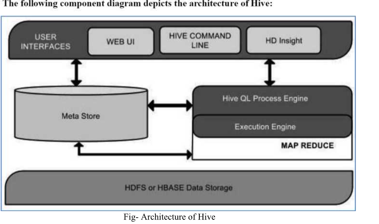
Fig 3: Architecture of Hive
This component diagram contains different units. The following table describes each unit:
Unit name | Operations |
User Interface | Hive is a data warehouse infrastructure software that can create interaction between user and HDFS. The user interfaces that Hive supports are Hive Web UI, Hive command line, and Hive HD Insight (In Windows server). |
Meta Store | Hive chooses respective database servers to store the schema or Metadata of tables, databases, columns in a table, their data types, and HDFS mapping. |
HiveQL Process Engine | Hive QL is similar to SQL for querying on schema info on the Meta store. It is one of the replacements of traditional approach for Map Reduce program. Instead of writing Map Reduce program in Java, we can write a query for Map Reduce job and process it. |
Execution Engine | The conjunction part of Hive QL process Engine and Map Reduce is Hive Execution Engine. Execution engine processes the query and generates results as same as Map Reduce Results. It uses the ∩avor of Map Reduce. |
HDFS or HBASE | Hadoop distributed file system or HBASE are the data storage techniques to store data into file system. |
Q12) What are Analytical techniques used in Big data visualization?
A12) Big data visualization techniques description. Each description contains arguments for method classification to one of the big data classes. We assume the following data criteria:
(i) large data volume
(ii) data variety
(iii) data dynamics.
Tree Map
● This method is based on space-filling visualization of hierarchical data. And as follows from the definition, there is a strict requirement applied to data—data objects which have to be hierarchically linked. The Tree map is represented by a root rectangle, divided into groups, also represented by the smaller rectangles, which correspond to data objects from a set.
● Examples of this method are free space on hard drive visualization, profitability from different organizations, and its affiliates.
● Method can be applied to large data volumes, iteratively representing data layers for each level of hierarchy. In case of device resolution exciding, the analyst always can move forward to the next block to continue his research into more detailed data on lower level of hierarchy. So, the large data volume criterion is satisfied.
● Because method is based on shapes volume estimation, calculated from one or more data factors, every change in data is followed by total repaint of whole image for the currently visible level of hierarchy. Changes on higher levels don’t require the image repainting because the data it contains is not visible for an analyst.
● The visualization acquired by this method can only show two data factors. The first one is the factor used for a shape volume calculation. And the second is a colour, used for grouping the shapes. Also, factors used for volume estimation must be presented by computable data types, so the criterion data variety is not met.
● And the last criterion also cannot be satisfied, because Tree map only shows data representation at one moment in time.
Method advantages:
● Hierarchical grouping clearly shows data relations.
● Extreme outliers are immediately visible using special colour.
Method disadvantages:
● Data must be hierarchical and, even more, Tree Maps are better for analyzing data sets where there is at least one important quantitative dimension with wide variations.
● Not suitable for examining historical trends and time patterns.
● The factor used for size calculation cannot have negative values.
Circle Packing
● This method is a direct alternative to tree map, besides the fact that as primitive shape it uses circles, which also can be included into circles from a higher hierarchy level. The main profit of this method is that possibly we can place and percept larger a amount of objects, by using classical Tree map.
● Because the circle packing method is based on the Tree map method, it has the same properties. So, we can assume that only large data volumes criterion is met by this method.
● Still, there are some differences in methods merits and demerits as follows.
Method advantages:
● space-efficient visualization method compared to Tree map.
Method disadvantages:
● the same disadvantages as for Tree map Method.
Sunburst
● This method is also an alternative to Tree map, but it uses Tree map visualization, converted to polar coordinate system. The main difference between these methods is that the variable parameters are not width and height, but a radius and arc length. And this difference allows us not to repaint the whole diagram upon data change, but only one sector containing new data by changing its radius. And because of that property, this method can be adapted to show data dynamics, using animation.
● Animation can add dynamics to data, manipulating only with sunburst rays radius, so, it can be said, that data dynamics criterion is met.
Q13) What is the line plot?
A13) This is the plot that can be found in the nooks and crannies of any two-variable study. The values on a sequence of data points will be connected with straight lines in line plots. Although the plot appears to be basic, it has a wide range of applications, not just in machine learning but also in a variety of other fields.
The code is rather straightforward, and matplotlib's plot function handles line graphs admirably.
Plt.plot(x,y)
The Line Chart is a simple data visualisation in Python that is part of the Matplotlib package.
On the relevant axis, line charts are used to depict the relationship between two data points X and Y. Let's have a look at some examples.
Plt.show()
Sample #2
x = np.array([1, 2, 3, 4])
y = np.array([2, 4, 6, 8])
Plt.plot(x, y)
Plt.xlabel("Time in Hrs")
Plt.ylabel("Distance in Km")
Plt.title("Time Vs Distance")
Plt.show()
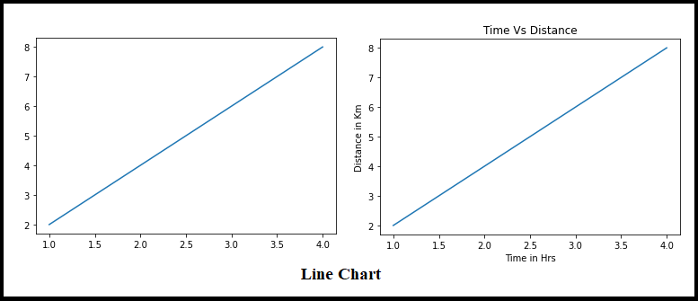
Fig 4: Line plot
Line charts always have a linear relationship between the X and Y axes, as shown in the image above.
Q14) Write about Scatter plot?
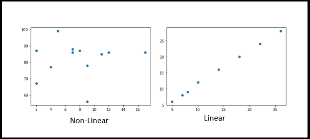
A14) Scatter plots are used to demonstrate how each axis correlated with each other by plotting data points across both axes (Horizontal and Vertical). Generally, before implementing Data Science/Machine Learning and before the EDA process, we should assess how dependent and independent are aligned. It might be positive or negative, or it could be strewn throughout the graph.
Import matplotlib.pyplot as plt
x = [5,7,8,7,2,17,2,9,4,11,12,9]
y = [99,86,87,88,67,86,87,78,77,85,86,56]
Plt.scatter(x, y)
Plt.show()
Import matplotlib.pyplot as plt
x = [5,7,8,10,14,18,22,26]
y = [6,8,9,12,16,20,24,28]
Plt.scatter(x, y)
Plt.show()
Q15) Define Histogram?
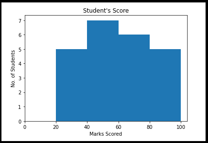
A15) The histogram is a graphical depiction of the distribution of numerical data across a range of values. It's a bar graph with the bin ranges and frequency represented on the X and Y axes, respectively. What is the best way to read or describe this graph?
Take, for example, a group of students who scored in the ranges and with the frequency listed below. We could clearly see the frequency and range cutoffs here.
From matplotlib import pyplot as plt
Import numpy as np
Fig,ax = plt.subplots(1,1)
a = np.array([25,42,48,55,60,62,67,70,30,38,44,50,54,58,75,78,85,88,89,28,35,90,95])
Ax.hist(a, bins = [20,40,60,80,100])
Ax.set_title("Student's Score")
Ax.set_xticks([0,20,40,60,80,100])
Ax.set_xlabel('Marks Scored')
Ax.set_ylabel('No. Of Students')
Plt.show()
Characteristics
● The histogram is used to find any out-of-the-ordinary observations in a dataset.
● With multiple data bins, measured on an interval scale of given numerical values.
● The amount of percent of occurrences in the data is represented on the Y-axis.
● Data distributions are represented on the X-axis.
Q16) What is Density plot?
A16) The distribution of data over a continuous interval is depicted by a distribution or density map. A density plot, similar to a smoothed histogram, depicts the distribution of data over a continuous range. As a result, a density plot can reveal information about the population's distribution.
Sns.distplot(df["fare"])
We may use the seaborn library's distplot() function to create the distribution plot.
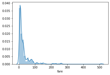
Fig 5: Density plot for fare
Q17) Write short notes on Box - plot?
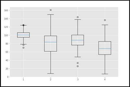
A17) A boxplot is a form of graphic that is frequently used throughout the Data Science life cycle, particularly during Explanatory Data Analysis (EDA). In the form of quartiles or percentiles, this reflects the distribution of data. The first quartile (25th percentile) is represented by Q1, the second quartile (50th percentile/median) is represented by Q2, the third quartile (Q3) is represented by Q3, and the fourth quartile (Q4) is represented by Q4.
We were able to rapidly and readily identify the outliers using this visualisation. Among the plots, this is a really effective plot. Following the removal of outliers, the data set must be subjected to a statistical test and fine-tuning in preparation for future analysis.
#import matplotlib.pyplot as plt
Np.random.seed(10)
One=np.random.normal(100,10,200)
Two=np.random.normal(80, 30, 200)
Three=np.random.normal(90, 20, 200)
Four=np.random.normal(70, 25, 200)
To_plot=[one,two,three,four]
Fig=plt.figure(1,figsize=(9,6))
Ax=fig.add_subplot()
Bp=ax.boxplot(to_plot)
Fig.savefig('boxplot.png',bbox_inches='tight')
